-
Notifications
You must be signed in to change notification settings - Fork 30.6k
New issue
Have a question about this project? Sign up for a free GitHub account to open an issue and contact its maintainers and the community.
By clicking “Sign up for GitHub”, you agree to our terms of service and privacy statement. We’ll occasionally send you account related emails.
Already on GitHub? Sign in to your account
Git status in File Explorer #178
Comments
|
|
Would be cool if this was exposed as an extension in some way. I worry that in some cases, the tree can be a bit polluted with color and look like a Christmas tree. Or if not, at least have the option to toggle it on and off. |
|
Yes I agree. I created a separate issue to have this exposed in extension API (see #1394). |
|
+1 |
|
Would love that too. The Git tab is very handy but this is for another purpose - having colors like in Atom would be very complimentary to see at a glance what's changed and where (with the color propagating automatically up to the top directory). That's probably the feature I miss the most from Atom. Usually, you don't have 10s or 100s of modified files uncommitted, so it's unlikely to look like a Christmas tree :) |
|
So it looks like the PR for this was closed. @bpasero @joaomoreno - any updates on the status of this work? |
|
Check this #8462 |
|
No updates... |
|
Thanks so much for your interest in this issue! It is currently assigned to the backlog. Every month we pick items from the backlog to plan for the current iteration. Please see https://github.com/Microsoft/vscode/wiki/Issue-Tracking#planning for more information. Since we are a small team of developers, there is only so many feature requests and issues we can work on for one milestone. Nevertheless we always welcome pull requests and are happy to accept them if they meet our quality standards. |
|
+1 |
1 similar comment
|
+1 |
|
@WadeShuler @jrieken The current SCM viewlet (1.17.2) marks an untracked file with a grey U, and an added file with a green A. So I understand the confusion with a green U for an untracked file. I also foresee my eyes hurting from green Us mixing with green As. Atom colours both untracked and staged new files as green, and Xcode marks added files as A as long as it’s a new file. Both of which never bothered me in the slightest (but a green U does). So I’ll all for using green As for untracked and staged new files. |
|
Lets continue the 'U' vs 'A' vs '?' discussion in #36912. Thanks. |
|
I agree. I think its better to continue with the letters used in the interface today. I don't like the 'U' too but I think this is kinda out of the scope of this feature request. If this changed, it should change in the entire program. |
|
OK this is a huge thread and I only have time to skimread it, so I'll just say here: I hope there is a setting to disable this. I prefer all the filenames in the same colour and when I need to see their status I type |
|
Is this product abandoned? Seems to be. |
|
Currently, |
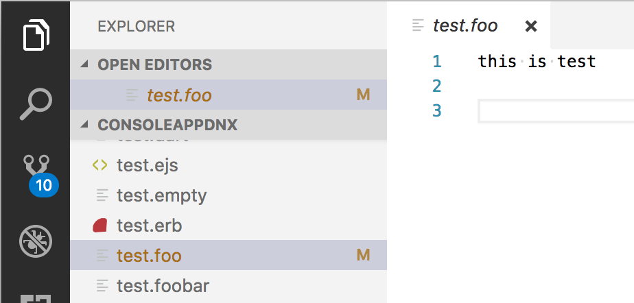
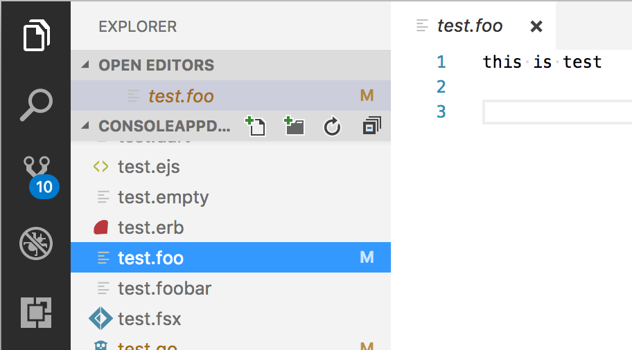
Indeed, same here on the very latest insiders (just updated). When I click on the file name in the project tree, the color of the file entry is changed (say, from yellow/modified to neutral). I also think that this is a rather confusing behavior. The color of the file should not change when user clicks on the file. Btw, the same problem with the open files list, when you click on the file there, the git status color is replaced by the neutral selection color. |
Well, it was done on purpose because the selection-foreground color often conflicts with the decoration colors. Adding more colors, like |
|
Atom doesn't seem to have a problem with it.... There is no need for new settings... The themes will update to accommodate if the selected item background color interferes. Those who fail to do so, the community will decide to not use those themes. I haven't checked, but I hope the "badges" (ie: U, M), aren't still svg files. They should just be raw text that can be styled/colored. Honestly, VSCode should have just went with stylesheets for these things instead of clunky config settings. It overcomplicated a rather simple process. |
|
@WadeShuler There is selection and focus and because I see an editor cursor in your screen shot I believe your item is only selected, not focused. In fact I don't see a difference in Atom between selected and focused. This is how it's in VS Code selected but not focused |
|
@jrieken I have double checked, and in my Atom, selected vs focused produce the same result. It never loses the I have tried the default dark and light Atom themes, as well as about 3 other themes. My default (as you see in my SS) is Seti (both UI and theme). I am unable to get Atom to drop the Out of the box, VS Code should preserve the git status color regardless of selected or focused states. If your issue is themes, it isn't your problem. That is the responsibility of the theme developers to update and accommodate. On a side note: I haven't checked out the latest insiders or viewed the code, but the |
|
@WadeShuler thanks for your feedback on how theme managers should handle their business! How dare VSCode team provide an API to help them doing that? Those lazy developers! |
|
@fernandofleury Nobody said anything about not providing theme managers an API to manage it. My post said nothing of the sort. So your snarky comment, is simply invalid and unwarranted. @jrieken said:
I said:
The issue would be a conflict between the foreground (actually, it's a background color) color of the file/folder tree item (normal, selected, focused), and the font color choices for the various git statuses. This would be the responsibility of theme developers. They should choose both the foreground colors of the items in the tree and the font colors for the various git statuses so that they don't conflict. For example: A theme developer has ThemeX and his font color for the items in the explorer file tree is |
|
Is this postponed now? |
|
@iljadaderko I don't think so since it shows up in the upcoming Release Note v1.18 of the next Stable version. The question might be more, will this be closed or is there still more work to be done? |
|
@iljadaderko VSCode v1.18 is already out and it includes the changes discussed here. |
|
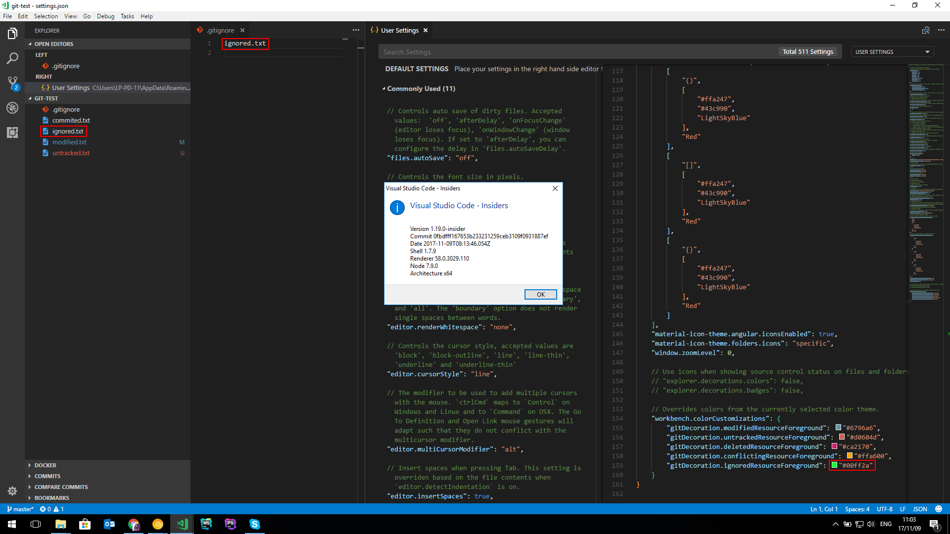
Are ignored file colors supposed to be a part of the v1.18 update? The docs say |
|
Same here (about ignored color). Hasn't been working for me either, since this whole Git implementation started. Using Insiders. |
|
It's working for me and it looks SPECTACULAR. |
|
Finally it's here 🥇 |
|
@arxpoetica This is what I get: How can it work for some and not for others, I don't get it. It's just that one setting OS: Windows 10 PRO (1709) |
|
Is it in Insiders? How can I use it? Congrats, everyone! |
|
@nkkollaw In both 😎 insiders and stable (1.18) |
|
As we have shipped this feature in our latest stable build it's time to close and lock this issue. Please create new issues for topic discussions and bug reports. Issues around this area are tagged with the Everyone, thanks for the great and continued feedback that made this feature what it is! To summarise and repeat my previous comment. A couple of things
|


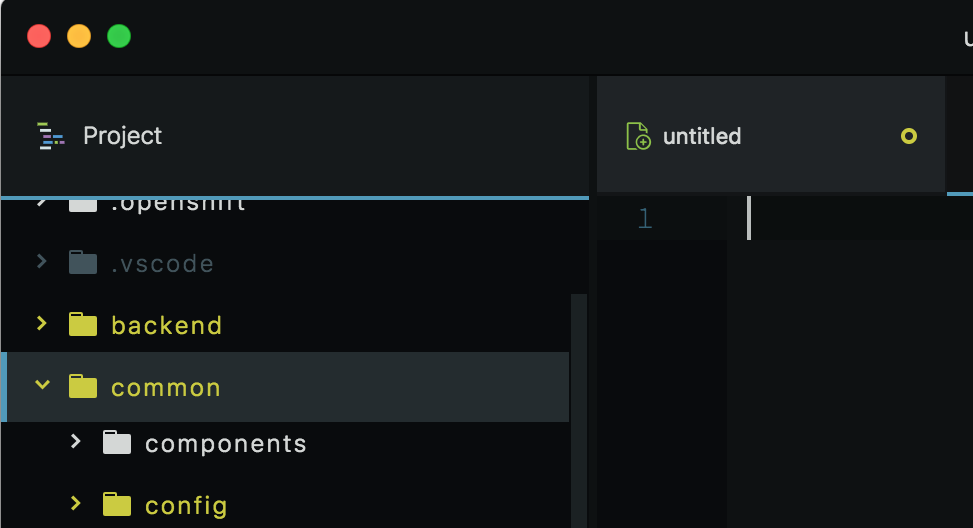
Similar to what atom provides in the project explorer:
Thanks
The text was updated successfully, but these errors were encountered: