[Bug]: Button styling adjustments (missing selected state, icon color, icon style) #25032
Description
Library
React Components / v9 (@fluentui/react-components)
System Info
https://fluentuipr.z22.web.core.windows.net/heads/master/public-docsite-v9/storybook/index.html?path=/docs/components-button-button--default#iconAre you reporting Accessibility issue?
no
Reproduction
Bug Description
1. Primary, secondary/default button variant icon change
Current: While hovered the icon changes from outlined -> filled. See hover behavior in codesandbox.

Expected: The primary and default/secondary button variant should not change from outlined to filled icon in hover, pressed, selected state.

2. Subtle variant icon color in hover, pressed, and selected states
Current: While in hovered, pressed, and selected state the icon is styled using neutral color.

Expected: While in hovered, pressed, and selected state the icon should be styled using brand accent color according to our design specs. Link to Subtle button spec.
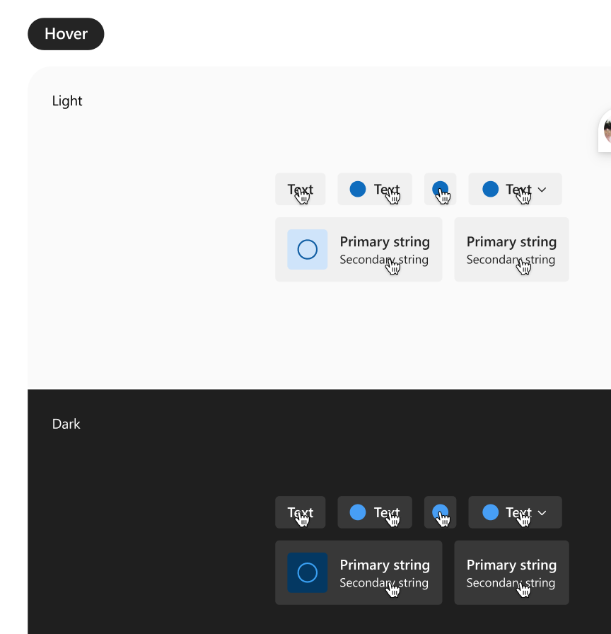
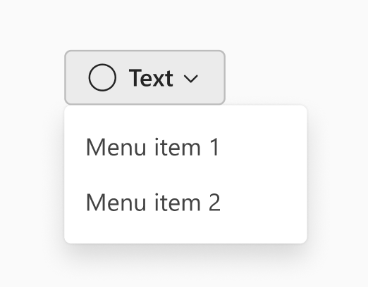
3. Selected state missing from all menu button variants
Current: While the button is selected the styling of the button defaults to the rest state. The example below shows the default/secondary variant button, but this also applies to primary, subtle, outline, and transparent buttons.

Expected: While selected, the button should follow the styling provided by our specs. Link to spec, see token allocation under "Toggle press on" section.
Logs
https://fluentuipr.z22.web.core.windows.net/heads/master/public-docsite-v9/storybook/index.html?path=/docs/components-button-button--defaultRequested priority
Normal
Products/sites affected
No response
Are you willing to submit a PR to fix?
no
Validations
- Check that there isn't already an issue that reports the same bug to avoid creating a duplicate.
- The provided reproduction is a minimal reproducible example of the bug.