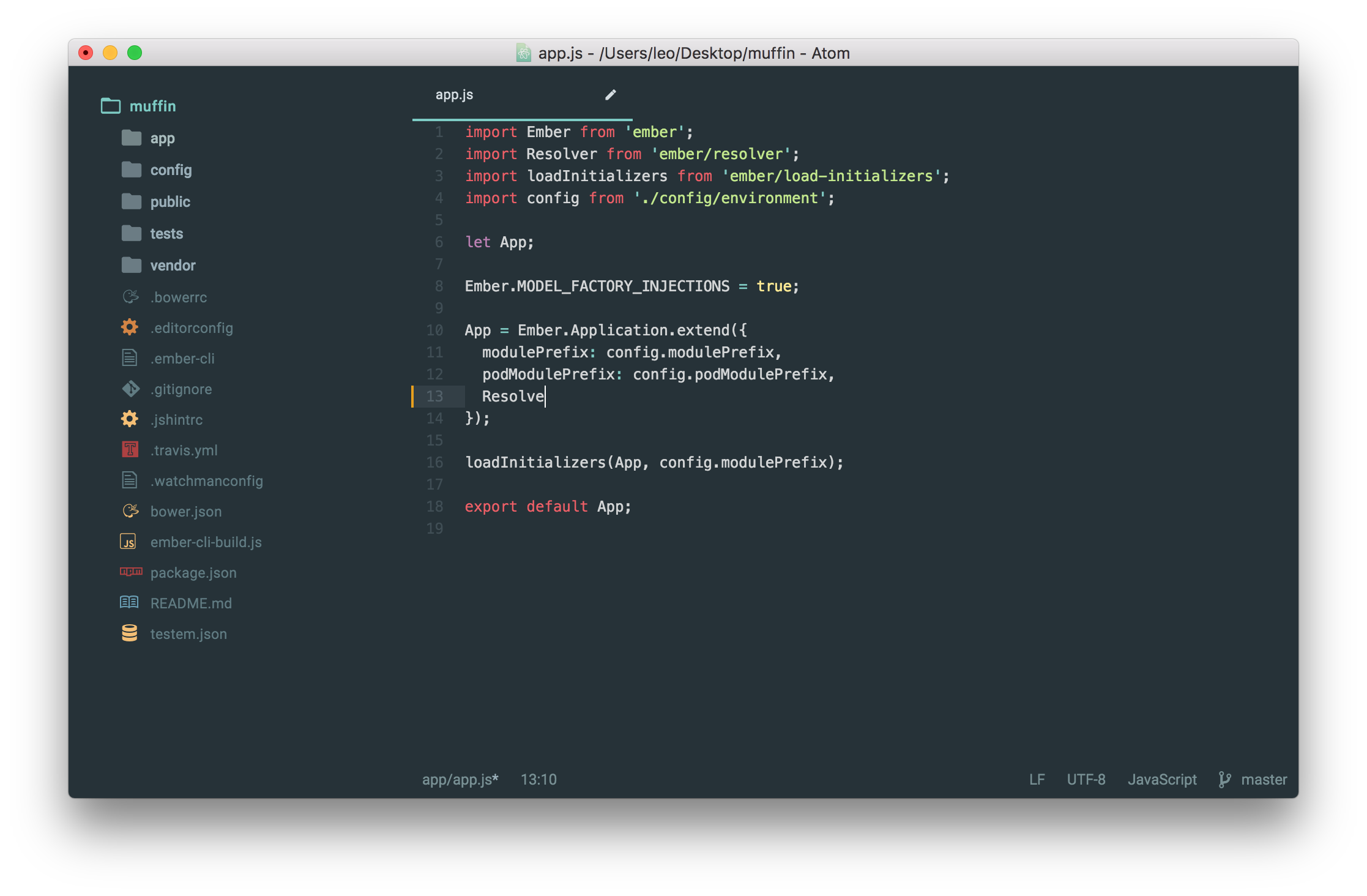
This theme converts Atom into a good looking and minimal editor without unnecessary clutter. Although it was inspired by Google's Material design, it's not completely based on the same. There are some places in which I've decided to make some decisions by my own to make the design look less haptic.

Simply go to the Settings > Install section, click the "Themes" tab and search for "material-ui". After installing it, you only need to activate it within the Settings > Themes section under "UI Theme". Or fire up a terminal and type in the following to have it installed automatically:
apm install material-uiBy the way, the UI theme should be used together with the syntax theme One Dark (which is already installed by default) and File Icons. Using those packages, you'll get the best experience.
I'm also suggesting you to enable Use Preview Tabs within the "Tabs" core package. This will improve your experience with the theme a lot.
If you already have the theme installed, remove it:
apm uninstall material-uiClone this repo:
git clone https://github.com/leo/material-ui
cd material-ui
Add the theme to ~/.atom/packages:
apm linkOpen Atom in development mode
atom --dev .Now enable the theme using the drop-down in the "Themes" section of Atom's settings and start making changes. Although the theme will automatically get updated if you make changes, you can use cmd + alt + ctrl + L to reload Atom completely.
Read more about the development workflow.
This theme was inspired by Mattia Astorino's awesome [material-theme][https://github.com/equinusocio/material-theme] for Sublime Text.
Leo Lamprecht (@notquiteleo)