Conversation
 hans2103
left a comment
hans2103
left a comment
hans2103
left a comment
There was a problem hiding this comment.
tested and reviewed... both look good
|
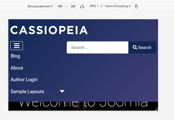
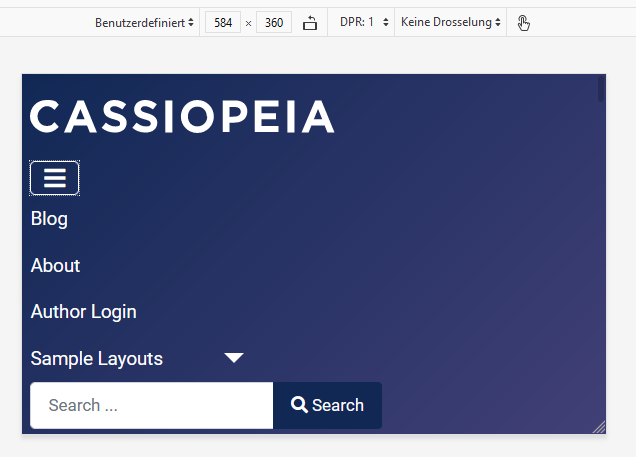
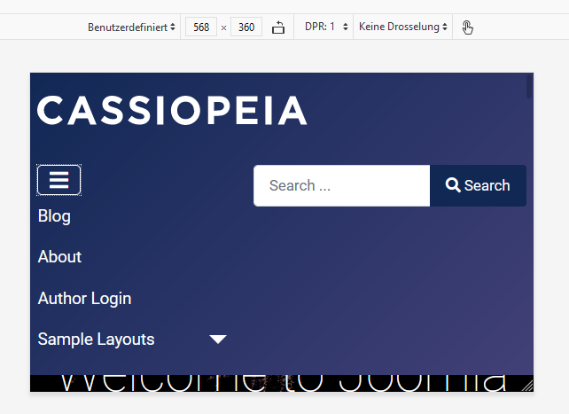
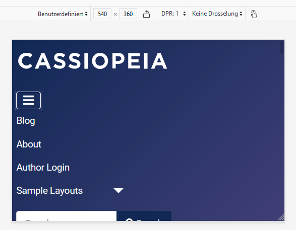
There is something wrong. The following screenshots show from top to botton ongoing reduction of width, using Firefox screen size simulator. The sizes are shown at the top in the control field.
As you can see, the search module is still right beside the (now with this PR vertical) menu => OK. Reducing width more, the search module goes below the menu => OK. Reducing width more, the search module goes back to right beside the menu => ??? Reducing width more, the search module goes back to below the menu => OK. |
|
There seems to be only one solution which works always: |
Should solve the weird behavior of hamburger menu and search
|
@richard67 can you please test the last commit? |
|
@drmenzelit Yes, it solves the issue. |
|
I have tested this PR ✅ with success. |
|
Thanks! |
4 participants
Pull Request for Issue #86 .
Summary of Changes
Changed navbar-expand-lg to navbar-expand-md to have the same media query for hamburger menu and for the switch from horizontal to vertical in the top menu
Testing Instructions
Install patch, no npm needed
Expected result
When hamburger menu appears the menu items have a vertical layout
Actual result
Hamburger menu -> menu still horizontal