User case one
In this user case we will use a MOB (mouse olfactory bulb) dataset to look at specific markers and then do a DEA (differential expression analysis) of two regions based on the results of the clustering tool.
- Launch the ST Viewer
- Go to Views -> Datasets
- Load the MOB REP 6 dataset (matrix of counts and image) from the Github repository of the ST Viewer (the folder data)
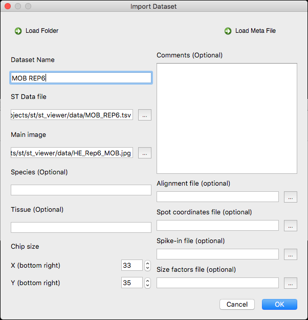
- Name the dataset MOB REP6. The Import dataset window should look like this:
- Open the dataset by double clicking on it. The loaded dataset should look like this in the main window:

- Search for the gene "Penk" in the gene panel and assign the colour green to it, then click on show. The main window should look like this:

- This gene should be expressed mainly in the GCL area so we will change the visualization mode to "heatmap2" in the visual settings. The main window should look like this:

- The gene is clearly over-expressed in the GCL so we will play around with the individual gene thresholds so to get a nicer distribution. We will use an individual gene threshold of 5 (remember to enable the individual gene thresholds in the visual settings). Now the visual distribution of the gene looks better (default visualization mode):

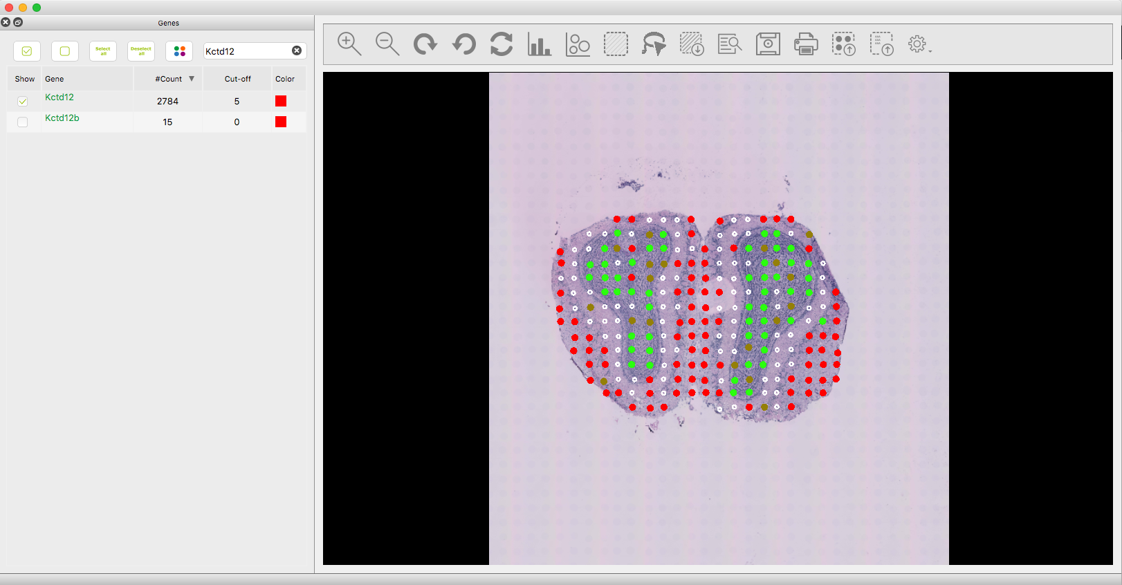
- Search now for the gene "Kctd12" in the gene panel and assign the colour red to it, then click on show. The main window should look like this:

-
Kctd12 should be more expressed in the outer GL and as we can see now there is a lot overlapping with the GCL where Penk is over-expressed.
-
We will now change the visualization mode to "heatmap2" and enable the "Scran" normalization in the visual settings. We can see that there is over-expression in the GL region. The main window should look like this:

- We will apply an individual threshold to Kctd12 of 5. Now the visual distribution of both genes looks better (default visualization mode):
- We are interested in comparing the GCL and GL regions and for that we can make two selections using the lasso or rubberband tools but we will use the clustering tool instead. Open the clustering tool, choose Scran as normalization, log mode, 3 clusters and click on Run. The main window and clustering window should look like this:

- We will now use the clustering windows to select the areas of interest using the left click mouse onto the clustering window scatter plot. We are interested in the blue and read areas (Note that you may get different colors for the same areas). Here you can one region (red) selected:

- Once the GL and GCL areas have been selected and the selections have been created, we are ready to do some analysis. Open the Views -> Selections window, select both selections and click on the "Correlation" button. You should get the following:

- The correlation is relatively high but we can see some outliers (you can click on a point to inspect what gene it is). We will now close the correlation window and open the "Differential Expression Analysis" window. Select "Scran" as normalization and click on Run (may take few minutes). You should get the following window:

-
We can see several genes that are differently expressed between the two regions. One could export the list of genes and do further analysis (for example pathway analysis). We will select one of the genes and plot it back on the main window.
-
Search now for the gene "Gpr123" in the gene panel and assign the colour blue to it, then click on show. The main window should look like this:

- As we can see the gene is expressed in the outer regions even without having to use a threshold :)