What is the context for this discussion?
Issue to summarise the discussion on slack over here and add on some points. The following is to act as a checklist for the searchResultCard--media card's design and development.
Child issue of #38
Elaborate on the discussion topic.
Tasks needed to be tackled:
Decide on standard height and width for all cards
To decide on dimensions to hold common for searchResultCard--collection, searchResultCard--media and searchResultCard--account cards.
Currently, all cards are 180 px wide.
Make all images occupy the same space while avoiding distortion of the original image aspect ratio
Currently, the plan for image thumbnails is to fix a container size, preserve the image aspect ratio and scale the image as large as possible within the container.
A disadvantage would be that since nearly all images vary in dimensions, they would have black borders/filling on the top and bottom.
Some currently fixed image dimensions to keep in mind for future decisions:
All images are 180px wide.
The image not found icon is 180x124

The image not found icon for audio is 180x45

All images for search results for TV news captions are 180x124
Change the information areas for borrow/waitlist/sensitive into image overlays
All of our media cards don't have information areas. This causes a discrepancy in card heights.


The current appearance of our information areas for borrow/waitlist/sensitive confuses users into thinking that they are buttons, even though they aren't.
Additionally, they take up extra vertical space.
Using a small badge (and reducing the badge description length) will resolve the above. Placing it on the upper left corner will help in visibility since users tend to look first at the upper left. Unlike a strip, it won't cover up much of the image and letting the badge extend into the margin area will help make it even less so.
Disadvantages are that we risk users overlooking the small badge, and having to look into removing the hover image component.

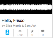
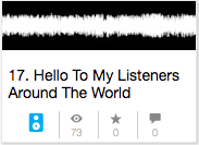
Fix the number of lines to be allotted to the title
Title lengths currently vary between 1 to 2 lines and cause a discrepancy in card heights.
Fix the number of lines to be allotted to author-text
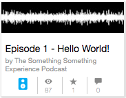
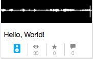
Author text length currently varies from 0 lines to 2 lines and cause a discrepancy in card heights.
Make cards more screen reader friendly
Tabbing through the cards reads out the card link's entire href followed by its title.
For example for this card
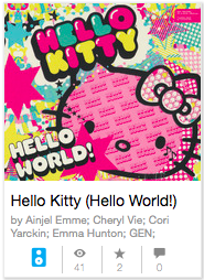
The screen reader reads out link, /cd_hello-kitty-hello-world_various-artists-ainjel-emme-cheryl-vie-cor Hello Kitty (Hello World!)
Implement an accessible colour palette
List of components failing WebAIM's color contrast check
author-text: Contrast ratio
statbar: Contrast ratio
hidden-list--sin: Contrast ratio
Borrow Information area: Contrast ratio
Join waitlist information area: Contrast ratio
Content may be inappropriate: Contrast ratio
Stakeholders
@pezvi @iisa @bfalling
What is the context for this discussion?
Issue to summarise the discussion on slack over here and add on some points. The following is to act as a checklist for the searchResultCard--media card's design and development.
Child issue of #38
Elaborate on the discussion topic.
Tasks needed to be tackled:
Decide on standard height and width for all cards
To decide on dimensions to hold common for searchResultCard--collection, searchResultCard--media and searchResultCard--account cards.
Currently, all cards are 180 px wide.
Make all images occupy the same space while avoiding distortion of the original image aspect ratio
Currently, the plan for image thumbnails is to fix a container size, preserve the image aspect ratio and scale the image as large as possible within the container.
A disadvantage would be that since nearly all images vary in dimensions, they would have black borders/filling on the top and bottom.
Some currently fixed image dimensions to keep in mind for future decisions:
All images are 180px wide.
The image not found icon is 180x124

The image not found icon for audio is 180x45

All images for search results for TV news captions are 180x124
Change the information areas for borrow/waitlist/sensitive into image overlays
All of our media cards don't have information areas. This causes a discrepancy in card heights.


The current appearance of our information areas for borrow/waitlist/sensitive confuses users into thinking that they are buttons, even though they aren't.
Additionally, they take up extra vertical space.
Using a small badge (and reducing the badge description length) will resolve the above. Placing it on the upper left corner will help in visibility since users tend to look first at the upper left. Unlike a strip, it won't cover up much of the image and letting the badge extend into the margin area will help make it even less so.

Disadvantages are that we risk users overlooking the small badge, and having to look into removing the hover image component.
Fix the number of lines to be allotted to the title
Title lengths currently vary between 1 to 2 lines and cause a discrepancy in card heights.


Fix the number of lines to be allotted to author-text
Author text length currently varies from 0 lines to 2 lines and cause a discrepancy in card heights.


Make cards more screen reader friendly
Tabbing through the cards reads out the card link's entire href followed by its title.

For example for this card
The screen reader reads out
link, /cd_hello-kitty-hello-world_various-artists-ainjel-emme-cheryl-vie-cor Hello Kitty (Hello World!)Implement an accessible colour palette
List of components failing WebAIM's color contrast check
author-text: Contrast ratio
statbar: Contrast ratio
hidden-list--sin: Contrast ratio
Borrow Information area: Contrast ratio
Join waitlist information area: Contrast ratio
Content may be inappropriate: Contrast ratio
Stakeholders
@pezvi @iisa @bfalling