Skip to content

Tweaks to cloud integration page#7878

Merged
bramkragten merged 4 commits intohome-assistant:devfrom
spacegaier:cloud-int-tweaks
Jan 16, 2021
Merged

Tweaks to cloud integration page#7878
bramkragten merged 4 commits intohome-assistant:devfrom
spacegaier:cloud-int-tweaks

Conversation

@spacegaier
Copy link
Copy Markdown
Member

@spacegaier spacegaier commented Dec 2, 2020

Breaking change

Proposed change

A few tweaks:

  1. Fix tags that included blanks.
  2. Made the "Forgot password" look more consistent
  3. Disabled the "Sync to Amazon" button if integration was disabled (a´same behavior now as the google button).
  4. Various translation tweaks.

image

image

Type of change

  • Dependency upgrade
  • Bugfix (non-breaking change which fixes an issue)
  • New feature (thank you!)
  • Breaking change (fix/feature causing existing functionality to break)
  • Code quality improvements to existing code or addition of tests

Example configuration

Additional information

  • This PR fixes or closes issue: fixes #
  • This PR is related to issue or discussion:
  • Link to documentation pull request:

Checklist

  • The code change is tested and works locally.
  • There is no commented out code in this PR.
  • Tests have been added to verify that the new code works.

If user exposed functionality or configuration variables are added/changed:

@SeanPM5
Copy link
Copy Markdown
Contributor

SeanPM5 commented Dec 3, 2020

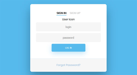
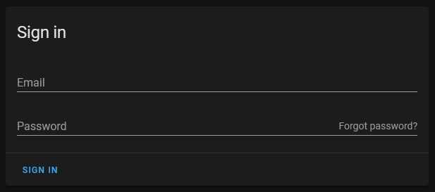
I agree with @spacegaier that having the forgot password button be a completely different style had the unintended effect of making it stick out more. Especially on the dark theme where that link is bright white (rather than blue like everything else), it becomes one of the first things my eyes get drawn to.

I think this way looks nicer, and there's a lot of spacing between the two buttons so I don't think there will be any confusion or accidental clicks. And imo the sign in button works well on the left because it makes it more likely you'll spot any potential typos in your email address when the button is underneath it.

@bramkragten
Copy link
Copy Markdown
Member

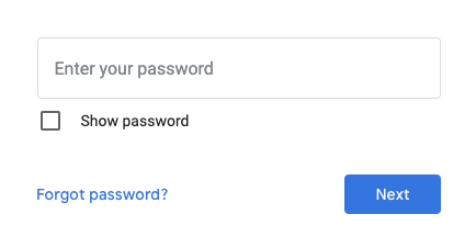
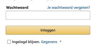
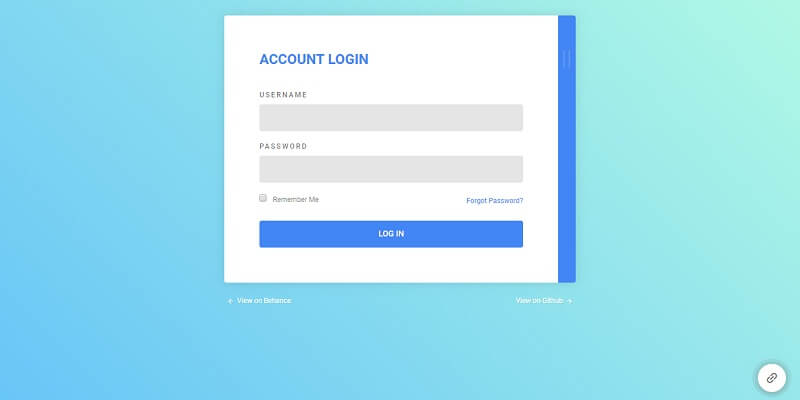
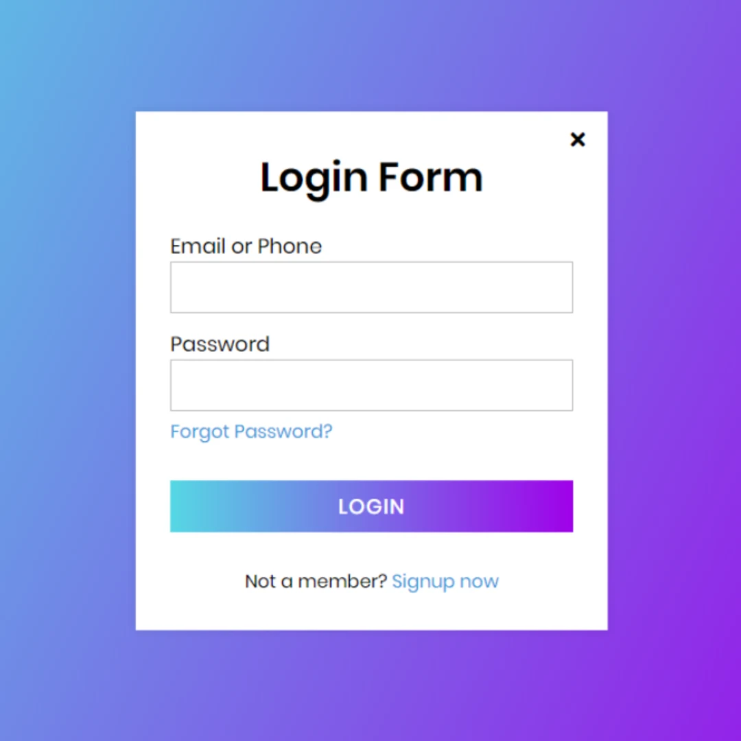
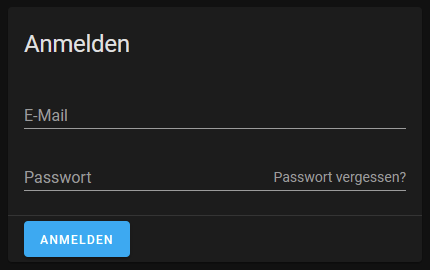
Just grabbed a couple of login forms, none of them have the same styling for the login button and the forgot password button.

If the forgot password is white in a dark theme, we should fix that (make it the secondary color?). If the login button is not clear enough, we should fix that (make it outlined/unelevated?).

But I don't think they should have the same emphasis.

image
image
image
image
image
image
image

@spacegaier
Copy link
Copy Markdown
Member Author

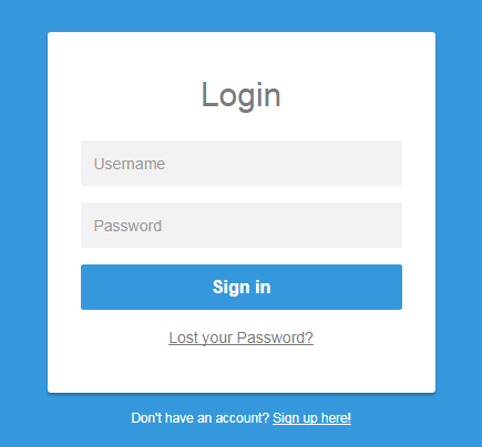
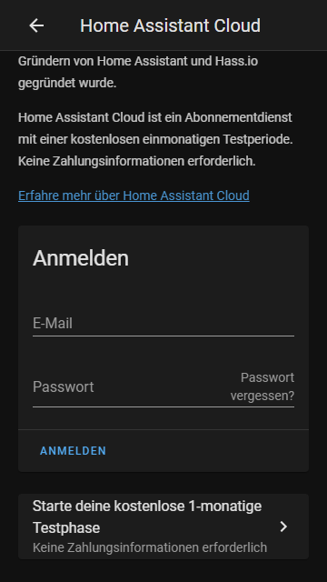
Moving the button below the password input looks really weird in our use case:
image

So I would propose putting it in the suffix slot of the input field:
image

@bramkragten
Copy link
Copy Markdown
Member

We could also make the sign in button unelevated?

I think this text is too large for a suffix, have you tried it on mobile?

@spacegaier
Copy link
Copy Markdown
Member Author

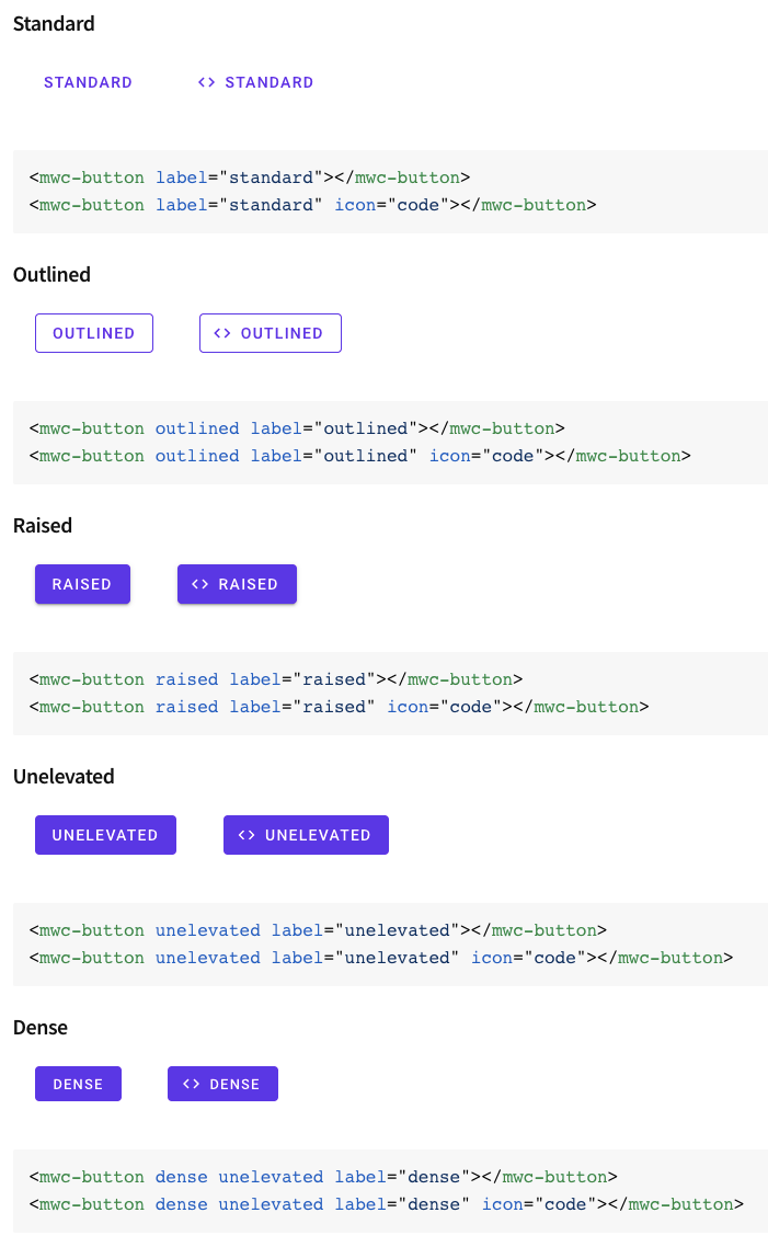
Isn't it already "unelevated"? We could "raise" it, so it gets a colored background. But we rarely do that elsewhere in the UI?

image

I just tested in Chrome dev tools mobile simulator. On smaller screens the "Forgot password?" gets broken into two lines, so there is enough space for the password (around 35 characters before the field input has to scroll):

image

@bramkragten
Copy link
Copy Markdown
Member

Unelevated is contained, but without the drop shadow:

image

@spacegaier
Copy link
Copy Markdown
Member Author

ha-progress-button currently only supports raised, which I used for my screenshot above. But of course we can add unelevated as well. Currently there are 5 occurrences in the frontend where this is already used (without ha-progress-button but direct mwc-button instead).

I personally don't think we need to have the button color filled here, since it's already very easy to spot and quite clear since every login form will have a matching button at the bottom.

=> Which way do we want to go?

@spacegaier
Copy link
Copy Markdown
Member Author

Adjusted to Bram's preference: Visually mark as link and move below the password field to the right. Image in first post.

@bramkragten bramkragten merged commit bb77d34 into home-assistant:dev Jan 16, 2021
@github-actions github-actions bot locked and limited conversation to collaborators Jan 17, 2021
@spacegaier spacegaier deleted the cloud-int-tweaks branch May 26, 2021 06:44
Sign up for free to subscribe to this conversation on GitHub. Already have an account? Sign in.

Projects

None yet

Development

Successfully merging this pull request may close these issues.

4 participants