Make moon icon more readable#6969
Merged
bramkragten merged 1 commit intohome-assistant:devfrom Sep 13, 2020
Merged
Conversation
Contributor
|
Can you add an image of the comparisons? |
Contributor
Author
|
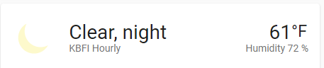
Previous: |
bramkragten
approved these changes
Sep 13, 2020
Contributor
|
I'm going to tag this for .115. |
Merged
This file contains hidden or bidirectional Unicode text that may be interpreted or compiled differently than what appears below. To review, open the file in an editor that reveals hidden Unicode characters.
Learn more about bidirectional Unicode characters
Sign up for free
to subscribe to this conversation on GitHub.
Already have an account?
Sign in.
4 participants
Add this suggestion to a batch that can be applied as a single commit.This suggestion is invalid because no changes were made to the code.Suggestions cannot be applied while the pull request is closed.Suggestions cannot be applied while viewing a subset of changes.Only one suggestion per line can be applied in a batch.Add this suggestion to a batch that can be applied as a single commit.Applying suggestions on deleted lines is not supported.You must change the existing code in this line in order to create a valid suggestion.Outdated suggestions cannot be applied.This suggestion has been applied or marked resolved.Suggestions cannot be applied from pending reviews.Suggestions cannot be applied on multi-line comments.Suggestions cannot be applied while the pull request is queued to merge.Suggestion cannot be applied right now. Please check back later.
Proposed change
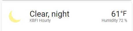
Increase the saturation value of the moon icon, so it has more contrast with white.
Type of change
Example configuration
Additional information
Checklist
If user exposed functionality or configuration variables are added/changed:
Probably there are lots of snippets of the moon icon being that color, but it'd be too hard to update all of them.