[Lens] (Accessibility) Added focus state and accessible name to suggestions #84653
Conversation
 mbondyra
added
Team:Visualizations
mbondyra
force-pushed
the
lens/accessibility-suggestions-name-focus
branch
from
mbondyra
added
Team:Visualizations
mbondyra
force-pushed
the
lens/accessibility-suggestions-name-focus
branch
from
a4874d6 to
07d8b6b
Compare
|
@mbondyra: FYI, left a comment on the related issue with my suggestions. |
mbondyra
force-pushed
the
lens/accessibility-suggestions-name-focus
branch
from
07d8b6b to
9041ea5
Compare
|
Pinging @elastic/kibana-app (Team:KibanaApp) |
|
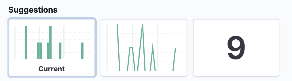
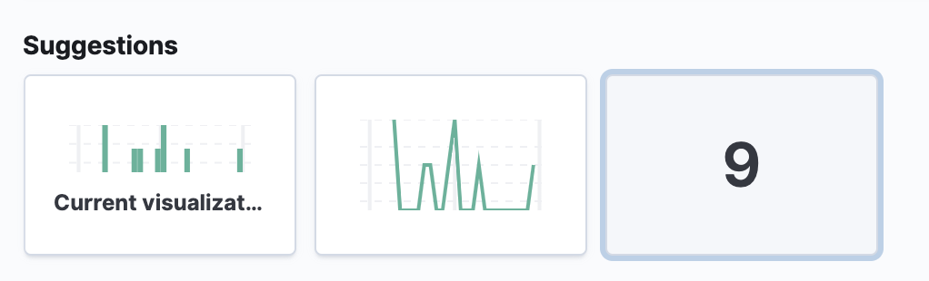
Something happened to the embedded expression renderers - the padding is much larger: old: new: Did you do this on purpose? I think it's also causing "Current visualization" to be cut of. |
x-pack/plugins/lens/public/editor_frame_service/editor_frame/suggestion_panel.tsx
Show resolved
Hide resolved
…uggestion_panel.tsx


padding oops
 myasonik
left a comment
myasonik
left a comment
myasonik
left a comment
There was a problem hiding this comment.
The a11y looks good! 🎉
Adding @MichaelMarcialis to take a look at the styles
 MichaelMarcialis
left a comment
MichaelMarcialis
left a comment
MichaelMarcialis
left a comment
There was a problem hiding this comment.
This looks great to me. Left two small last second suggestions. Otherwise, this should be good to go. Approving now so I don't hold you up any further.
| } | ||
| } | ||
|
|
||
| .lnsSuggestionPanel__button-isSelected { |
There was a problem hiding this comment.
Please add a border-color: $euiColorMediumShade; within this selector's (.lnsSuggestionPanel__button-isSelected) styles. I think this added contrast will help the selected button stand out just a bit more.
| } | ||
| } | ||
|
|
||
| .lnsSuggestionPanel__button-isSelected { |
There was a problem hiding this comment.
Please also add the following nested styles within this selector's (.lnsSuggestionPanel__button-isSelected) styles. Doing so will prevent the selected button from transitioning up 2px on hover (which feels odd on the selected button).
&:hover {
  transform: none !important; // sass-lint:disable-line no-important
}
 flash1293
left a comment
flash1293
left a comment
flash1293
left a comment
There was a problem hiding this comment.
Tested in Chrome and Firefox and works fine, LGTM, just left a nit
| icon: | ||
| visualizationMap[currentVisualizationId].getDescription(currentVisualizationState) | ||
| .icon || 'empty', | ||
| title: i18n.translate('xpack.lens.suggestions.currentVisLabel', { |
There was a problem hiding this comment.
nit: Please remove the translations for this phrase
💚 Build SucceededMetrics [docs]Async chunks
History
To update your PR or re-run it, just comment with: |
…stions (elastic#84653)

* [Lens] (Accessibility) Added focus state and accessible name to suggestions

* Apply suggestions from code review

* Update x-pack/plugins/lens/public/editor_frame_service/editor_frame/suggestion_panel.tsx

padding oops

* cr
6 participants
Fixes #83602
(gif didn't pick up the color difference between light background of selected vis but it's there)
aria-current={true}for current visaria-labelwith suggestion name