Always show row actions for the fields list in the Mappings Editor#53731
Conversation
|
Pinging @elastic/es-ui (Team:Elasticsearch UI) |
|
Hi CJ, I will work up a prototype to try some things out as I think there's perhaps a couple ways to tackle the concerns you're addressing in this PR. Grouping all the actions next to and converting it to only icons makes sense, apart from the multi-field. I wonder how many people will know what that does without a text description? The edit/remove icons are pretty standard so I understand that. I do think there could be more space between the icons as well so the hit area is a bit more forgiving. Again, i'm not sold yet on removing the hover effect for the actions. Perhaps we only show the 'add' on hover (and maybe dim back the 'edit/remove' unless hovering). However, let me mockup some ideas to give clearer direction. |

💚 Build Succeeded
History
To update your PR or re-run it, just comment with: |
|
There was also a concern that @pcsanwald mentioned at one of our syncs. The big gap between the field name and the actions on the right, especially on big screens. I might throw a dumb idea here, but what if we had somehow a tooltip with actions that follows the mouse when hovering each field? So you hover and right there you can act on the field. Just an idea 😊 |
83ff029 to
54e807b
Compare
|
@sebelga I'm going to narrow the purpose of this PR down to just resolving our keyboard-accessibility problems, so for now I'm going to defer new interaction methods like your tooltip idea. Here's where I ended up:
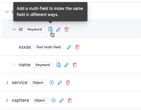
I chose an icon for the "Add multi-field" button that I think is a little clearer (multiple documents):
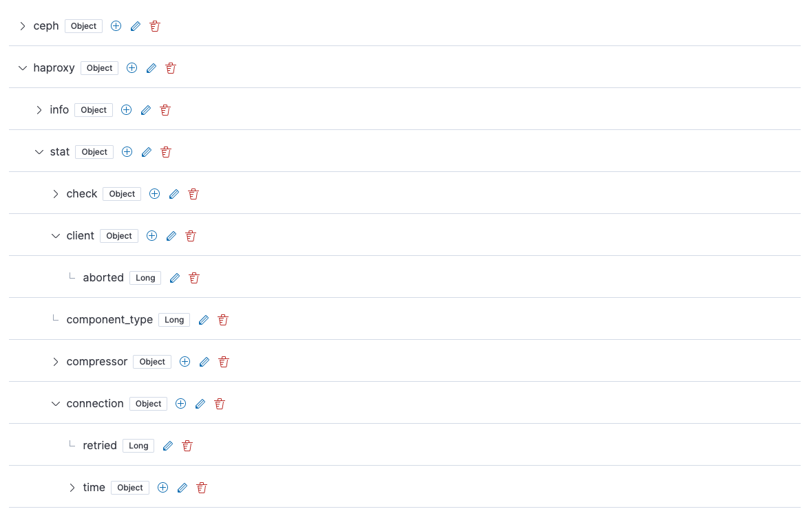
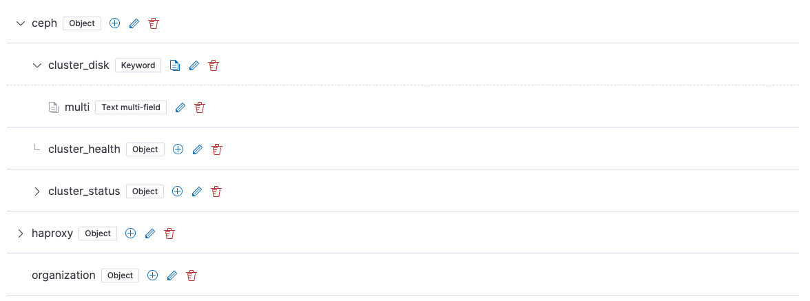
I also experimented with putting the actions on the right, but I think putting them closer to the node name as @mdefazio suggested makes it way easier to associate an action with the node that's affected. I did find myself afraid of accidentally clicking on the delete button because in some situations it doesn't show the confirmation modal, so I tweaked the delete provider logic so that the confirmation modal will show up for all nodes, not just those with children, aliases, or multi-fields. Here are the icons on the right:
And on the left (this is what I settled on):
I think this gets us in a good place accessibility-wise, and I think the UX is a step forward from what we currently have, too. I think we can continue to improve this based on @mdefazio's guidance after feature freeze. Do you think this is an acceptable step forward, or do you see any major issues? In order to mirror these changes, I think we will have to adapt the UI of your search results in the following ways:
|
|
@mdefazio Re your comment from earlier:
I'll try to update the PR with this, thanks for pointing it out! |
996fb24 to
190856c
Compare
 sebelga
left a comment
sebelga
left a comment
There was a problem hiding this comment.
@cjcenizal I think we are making progress! Thanks for making those changes. I like to have the button near the field name. For the DeleteProvider, I understand why you did it. It makes me think of something I wanted to work on: a toast system with undo embedded (like gmail has).
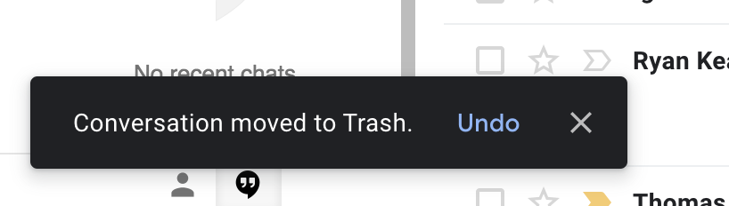
This would free us from those confirmation modal and let a user quickly delete 3 fields without having a modal popping up each time when he knows he wants to delete them.
I also liked the blue background behind the icons from @mdefazio design with the hover emphasis, do you think it would be possible to add those? (From our conversation about Phases II, I am afraid the "I think we can continue to improve this based on @mdefazio's guidance after feature freeze." would never happen).
I personally don't like having the actions visible at all times as it clutters the UI. I think we should understand how EUI makes it work and reproduce it here in the mappings editor.
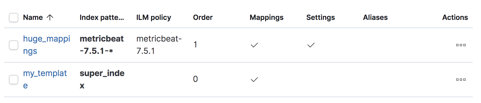
As an example, a EUI table
Hover a table row:
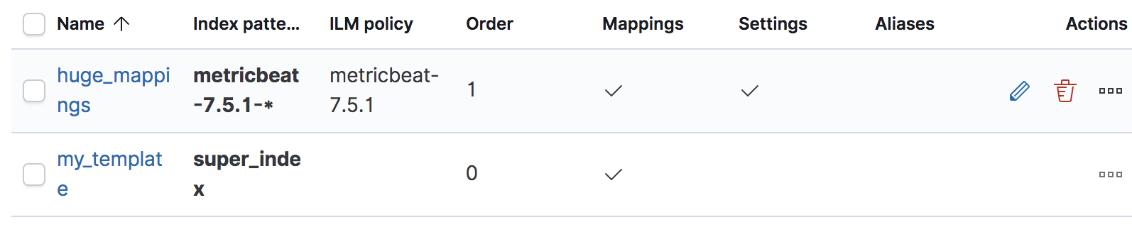
Could you explain the difficulty to do the same in the mappings editor?
|
@elasticmachine merge upstream |
sebelga
left a comment
There was a problem hiding this comment.
Ok, let's give this UX a try! 👍
8cbdd71 to
2c310ef
Compare
|
I brought back the original spacing and use of row icons per @mdefazio's suggestions, except I changed the multi-field row icon to be "documents".
|
…i-field icon to documents.
…iases, children, or multi-fields.
2c310ef to
610d3af
Compare
|
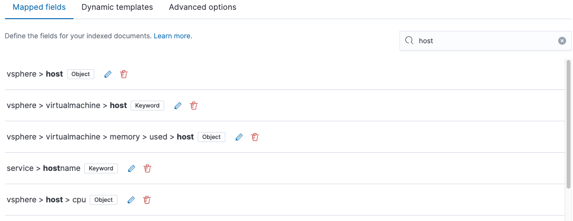
Search results are now consistent with this approach:
|
💚 Build SucceededHistory
To update your PR or re-run it, just comment with: |
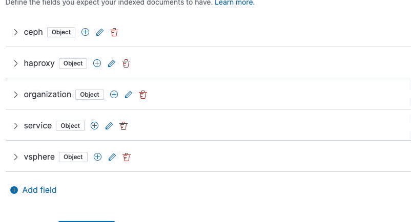
Closes #53012
In this PR:
@mdefazio WDYT?
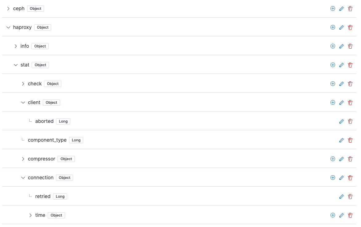
Simple example
Example with a lot of rows