Skip to content
Merged
Show file tree
Hide file tree
Changes from 13 commits
Commits
File filter

Filter by extension

Filter by extension

Conversations
Failed to load comments.
Loading
Jump to
Jump to file
Failed to load files.
Loading
Diff view
Diff view
4 changes: 4 additions & 0 deletions CHANGELOG.md
Original file line number Diff line number Diff line change
Expand Up @@ -3,6 +3,10 @@
- Added support for `ghost` and `text` `EuiIcon` colors on Elastic logos ([#5245](https://github.com/elastic/eui/pull/5245))
- Added a default `data-test-subj` to `EuiErrorBoundary` ([#5232](https://github.com/elastic/eui/pull/5232))

**Bug fixes**

- Fixed missing `id` for `EuiCombobox` by generating one if `prepend` or `append` exists ([#5229](https://github.com/elastic/eui/pull/5229))

## [`39.0.0`](https://github.com/elastic/eui/tree/v39.0.0)

- Added `maxWidth` prop to `EuiTour`, made `subtitle` optional, and fixed heading levels and footer background ([#5225](https://github.com/elastic/eui/pull/5225))
Expand Down
39 changes: 34 additions & 5 deletions src-docs/src/views/combo_box/combo_box_example.js
Original file line number Diff line number Diff line change
Expand Up @@ -75,15 +75,24 @@ const groupsSnippet = `<EuiComboBox
/>`;

import SingleSelection from './single_selection';
import SingleSelectionPrepend from './single_selection_prepend';
const singleSelectionSource = require('!!raw-loader!./single_selection');
const singleSelectionHtml = renderToHtml(SingleSelection);
const singleSelectionPrependSource = require('!!raw-loader!./single_selection_prepend');
const singleSelectionSnippet = `<EuiComboBox
placeholder="Select a single option"
singleSelection={{ asPlainText: true }}
options={options}
selectedOptions={selectedOptions}
onChange={onChange}
/>`;
const singleSelectionPrependSnippet = `<EuiComboBox
prepend="Prepend"
singleSelection={{ asPlainText: true }}
options={options}
selectedOptions={selectedOptions}
onChange={onChange}
/>`;

import SingleSelectionCustomOptions from './single_selection_custom_options';
const singleSelectionCustomOptionsSource = require('!!raw-loader!./single_selection_custom_options');
Expand Down Expand Up @@ -402,19 +411,39 @@ export const ComboBoxExample = {
{'singleSelection={{ asPlainText: true }}'}
</EuiCode>
</p>
</Fragment>
),
props: { EuiComboBox, EuiComboBoxOptionOption },
snippet: singleSelectionSnippet,
demo: <SingleSelection />,
},
{
title: 'Single selection with prepended label',
source: [
{
type: GuideSectionTypes.JS,
code: singleSelectionPrependSource,
},
{
type: GuideSectionTypes.HTML,
code: singleSelectionHtml,
},
],
text: (
<Fragment>
<p>
<strong>Note:</strong> <EuiCode>append</EuiCode> and{' '}
<EuiCode>prepend</EuiCode> props only work if
<EuiCode>append</EuiCode> and <EuiCode>prepend</EuiCode> props only
work if
<EuiCode>singleSelection</EuiCode> prop is not set to{' '}
<EuiCode>false</EuiCode> to avoid multilines that makes combobox
<EuiCode>false</EuiCode> to avoid multi-lines that makes combobox
height greater than that of <EuiCode>append</EuiCode> and{' '}
<EuiCode>prepend</EuiCode>.
</p>
Comment thread
1Copenut marked this conversation as resolved.
</Fragment>
),
props: { EuiComboBox, EuiComboBoxOptionOption },
snippet: singleSelectionSnippet,
demo: <SingleSelection />,
snippet: singleSelectionPrependSnippet,
demo: <SingleSelectionPrepend />,
},
{
title: 'Single selection with custom options',
Expand Down
2 changes: 1 addition & 1 deletion src-docs/src/views/combo_box/single_selection.js
Original file line number Diff line number Diff line change
Expand Up @@ -51,9 +51,9 @@ export default () => {
canDisabled={false}
canReadOnly={false}
canLoading={false}
canPrepend={false}
canIsDisabled
canAppend
canPrepend
>
<EuiComboBox
placeholder="Select a single option"
Expand Down
57 changes: 57 additions & 0 deletions src-docs/src/views/combo_box/single_selection_prepend.js
Original file line number Diff line number Diff line change
@@ -0,0 +1,57 @@
import React, { useState } from 'react';

import { EuiComboBox } from '../../../../src/components';
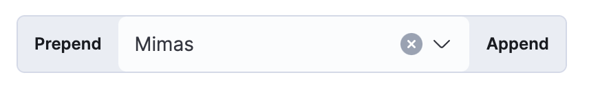
const options = [
{
label: 'Titan',
'data-test-subj': 'titanOption',
},
{
label: 'Enceladus',
},
{
label: 'Mimas',
},
{
label: 'Dione',
},
{
label: 'Iapetus',
},
{
label: 'Phoebe',
},
{
label: 'Rhea',
},
{
label:
"Pandora is one of Saturn's moons, named for a Titaness of Greek mythology",
},
{
label: 'Tethys',
},
{
label: 'Hyperion',
},
];

export default () => {
const [selectedOptions, setSelected] = useState([options[2]]);

const onChange = (selectedOptions) => {
// We should only get back either 0 or 1 options.
setSelected(selectedOptions);
};

return (
<EuiComboBox
prepend="Prepend"
singleSelection={{ asPlainText: true }}
options={options}
selectedOptions={selectedOptions}
onChange={onChange}
/>
);
};
58 changes: 57 additions & 1 deletion src/components/combo_box/__snapshots__/combo_box.test.tsx.snap
Original file line number Diff line number Diff line change
Expand Up @@ -27,6 +27,7 @@ exports[`EuiComboBox is rendered 1`] = `
<input
aria-controls=""
data-test-subj="comboBoxSearchInput"
id="generated-id__eui-combobox-id"
role="textbox"
style="box-sizing:content-box;width:1px"
value=""
Expand Down Expand Up @@ -70,6 +71,7 @@ exports[`props autoFocus is rendered 1`] = `
compressed={false}
fullWidth={false}
hasSelectedOptions={true}
id="generated-id__eui-combobox-id"
inputRef={[Function]}
isListOpen={false}
noIcon={false}
Expand Down Expand Up @@ -100,6 +102,50 @@ exports[`props autoFocus is rendered 1`] = `
</div>
`;

exports[`props custom ID is rendered 1`] = `
<div
aria-expanded={false}
aria-haspopup="listbox"
className="euiComboBox"
onKeyDown={[Function]}
role="combobox"
>
<EuiComboBoxInput
autoSizeInputRef={[Function]}
compressed={false}
fullWidth={false}
hasSelectedOptions={true}
id="test-id-1"
inputRef={[Function]}
isListOpen={false}
noIcon={false}
onChange={[Function]}
onClear={[Function]}
onClick={[Function]}
onCloseListClick={[Function]}
onFocus={[Function]}
onOpenListClick={[Function]}
onRemoveOption={[Function]}
rootId={[Function]}
searchValue=""
selectedOptions={
Array [
Object {
"label": "Mimas",
},
Object {
"label": "Iapetus",
},
]
}
singleSelection={false}
toggleButtonRef={[Function]}
updatePosition={[Function]}
value="Mimas, Iapetus"
/>
</div>
`;

exports[`props delimiter is rendered 1`] = `
<div
aria-expanded={false}
Expand All @@ -113,6 +159,7 @@ exports[`props delimiter is rendered 1`] = `
compressed={false}
fullWidth={false}
hasSelectedOptions={true}
id="generated-id__eui-combobox-id"
inputRef={[Function]}
isListOpen={false}
noIcon={false}
Expand Down Expand Up @@ -156,6 +203,7 @@ exports[`props full width is rendered 1`] = `
compressed={false}
fullWidth={true}
hasSelectedOptions={true}
id="generated-id__eui-combobox-id"
inputRef={[Function]}
isListOpen={false}
noIcon={false}
Expand Down Expand Up @@ -196,6 +244,7 @@ exports[`props isClearable=false disallows user from clearing input when no opti
compressed={false}
fullWidth={false}
hasSelectedOptions={false}
id="generated-id__eui-combobox-id"
inputRef={[Function]}
isListOpen={false}
noIcon={false}
Expand Down Expand Up @@ -229,6 +278,7 @@ exports[`props isClearable=false disallows user from clearing input when options
compressed={false}
fullWidth={false}
hasSelectedOptions={true}
id="generated-id__eui-combobox-id"
inputRef={[Function]}
isListOpen={false}
noIcon={false}
Expand Down Expand Up @@ -271,6 +321,7 @@ exports[`props isDisabled is rendered 1`] = `
compressed={false}
fullWidth={false}
hasSelectedOptions={true}
id="generated-id__eui-combobox-id"
inputRef={[Function]}
isDisabled={true}
isListOpen={false}
Expand Down Expand Up @@ -324,6 +375,7 @@ exports[`props options list is rendered 1`] = `
<input
aria-controls="generated-id_listbox"
data-test-subj="comboBoxSearchInput"
id="generated-id__eui-combobox-id"
role="textbox"
style="box-sizing: content-box; width: 2px;"
value=""
Expand Down Expand Up @@ -632,6 +684,7 @@ exports[`props selectedOptions are rendered 1`] = `
compressed={false}
fullWidth={false}
hasSelectedOptions={true}
id="generated-id__eui-combobox-id"
inputRef={[Function]}
isListOpen={false}
noIcon={false}
Expand Down Expand Up @@ -675,6 +728,7 @@ exports[`props singleSelection is rendered 1`] = `
compressed={false}
fullWidth={false}
hasSelectedOptions={true}
id="generated-id__eui-combobox-id"
inputRef={[Function]}
isListOpen={false}
noIcon={false}
Expand Down Expand Up @@ -706,7 +760,7 @@ exports[`props singleSelection prepend and append is rendered 1`] = `
<div
aria-expanded={true}
aria-haspopup="listbox"
className="euiComboBox euiComboBox-isOpen"
className="euiComboBox euiComboBox--prepended euiComboBox--appended euiComboBox-isOpen"
onKeyDown={[Function]}
role="combobox"
>
Expand All @@ -716,6 +770,7 @@ exports[`props singleSelection prepend and append is rendered 1`] = `
compressed={false}
fullWidth={false}
hasSelectedOptions={false}
id="generated-id__eui-combobox-id"
inputRef={[Function]}
isListOpen={true}
noIcon={false}
Expand Down Expand Up @@ -845,6 +900,7 @@ exports[`props singleSelection selects existing option when opened 1`] = `
compressed={false}
fullWidth={false}
hasSelectedOptions={true}
id="generated-id__eui-combobox-id"
inputRef={[Function]}
isListOpen={true}
noIcon={false}
Expand Down
12 changes: 12 additions & 0 deletions src/components/combo_box/combo_box.test.tsx
Original file line number Diff line number Diff line change
Expand Up @@ -92,6 +92,18 @@ describe('props', () => {
expect(component).toMatchSnapshot();
});

test('custom ID is rendered', () => {
const component = shallow(
<EuiComboBox
id="test-id-1"
options={options}
selectedOptions={[options[2], options[4]]}
/>
);

expect(component).toMatchSnapshot();
});

describe('isClearable=false disallows user from clearing input', () => {
test('when no options are selected', () => {
const component = shallow(
Expand Down
7 changes: 6 additions & 1 deletion src/components/combo_box/combo_box.tsx
Original file line number Diff line number Diff line change
Expand Up @@ -936,6 +936,9 @@ export class EuiComboBox<T> extends Component<
matchingOptions,
} = this.state;

// Make sure we have a valid ID if users don't pass one as a prop
const inputId = id ?? this.rootId('_eui-combobox-id');

// Visually indicate the combobox is in an invalid state if it has lost focus but there is text entered in the input.
// When custom options are disabled and the user leaves the combo box after entering text that does not match any
// options, this tells the user that they've entered invalid input.
Expand All @@ -946,6 +949,8 @@ export class EuiComboBox<T> extends Component<
const classes = classNames('euiComboBox', className, {
'euiComboBox--compressed': compressed,
'euiComboBox--fullWidth': fullWidth,
'euiComboBox--prepended': prepend,
'euiComboBox--appended': append,
'euiComboBox-isDisabled': isDisabled,
'euiComboBox-isInvalid': markAsInvalid,
'euiComboBox-isOpen': isListOpen,
Expand Down Expand Up @@ -1030,7 +1035,7 @@ export class EuiComboBox<T> extends Component<
}
fullWidth={fullWidth}
hasSelectedOptions={selectedOptions.length > 0}
id={id}
id={inputId}
inputRef={this.searchInputRefCallback}
isDisabled={isDisabled}
isListOpen={isListOpen}
Expand Down
Original file line number Diff line number Diff line change
Expand Up @@ -264,6 +264,7 @@ export class EuiComboBoxInput<T> extends Component<
<EuiFormControlLayout
icon={icon}
{...clickProps}
inputId={id}
isLoading={isLoading}
compressed={compressed}
fullWidth={fullWidth}
Expand Down
34 changes: 34 additions & 0 deletions src/themes/eui-amsterdam/overrides/_form_control_layout.scss
Original file line number Diff line number Diff line change
@@ -1,3 +1,37 @@
.euiComboBox {
// Round the left border when we append a label
&--appended {

Copy link
Copy Markdown
Contributor Author

Choose a reason for hiding this comment

The reason will be displayed to describe this comment to others. Learn more.

@cchaos I found a better way to isolate these rounded corners from your original comment, and was able to include the smaller rounded border for compressed views.

Copy link
Copy Markdown
Contributor

Choose a reason for hiding this comment

The reason will be displayed to describe this comment to others. Learn more.

😬 Looks like still an issue when both are exist. lol
Screen Shot 2021-10-13 at 17 56 17 PM

Copy link
Copy Markdown
Contributor Author

Choose a reason for hiding this comment

The reason will be displayed to describe this comment to others. Learn more.

That it is. I didn't anticipate this scenario, so I'll pick it up in the morning for another look. Thanks Caroline!

Copy link
Copy Markdown
Contributor Author

Choose a reason for hiding this comment

The reason will be displayed to describe this comment to others. Learn more.

@cchaos I've posted a fix and added a Visual Testing Matrix comment to the description. I think we should have them all bracketed this time.

.euiFormControlLayout__childrenWrapper {
border-top-left-radius: $euiFormControlBorderRadius;
border-bottom-left-radius: $euiFormControlBorderRadius;
}

// Half size rounded left corners
.euiFormControlLayout--compressed {
.euiFormControlLayout__childrenWrapper {
border-top-left-radius: $euiFormControlCompressedBorderRadius;
border-bottom-left-radius: $euiFormControlCompressedBorderRadius;
}
}
}

// Round the right border when we prepend a label
&--prepended {
.euiFormControlLayout__childrenWrapper {
border-top-right-radius: $euiFormControlBorderRadius;
border-bottom-right-radius: $euiFormControlBorderRadius;
}

// Half size rounded right corners
.euiFormControlLayout--compressed {
.euiFormControlLayout__childrenWrapper {
border-top-right-radius: $euiFormControlCompressedBorderRadius;
border-bottom-right-radius: $euiFormControlCompressedBorderRadius;
}
}
}
}

.euiFormControlLayout--group {
border-radius: $euiFormControlBorderRadius;
background-color: $euiFormInputGroupLabelBackground;
Expand Down