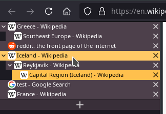
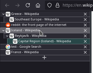
| With all the style rules enabled: | Only updated tab height and font size, using a tree style tab theme: |
|
|
| With the update to Firefox Quantum, I was no longer able to use Tab Tree by Sergey Zelentsov. Looking for a replacement, I found that Tree Style Tab by Piro was working in Firefox Quantum. By default, with that extension, the tabs are very large and too bright. It takes 5 steps to get the proper vertical tabs experience. |
- Install the "Tree Style Tab" addon for Firefox. It can be downloaded from here.
- Enable Firefox dark theme.
Open Tools->Add-ons and Themes->Themes. Press enable for the "Dark" theme. - Disable the horizontal tabs and the Sidebar Header (large field above your vertical tabs).
You'll first need to open your Firefox profile folder. In Firefox, open the url: "about:support".
There's an entry titled Application Basics->Profile Folder or Application Basics->Profile Directory. Clicking the button "Open Folder" should open the profile folder. If that doesn't work, navigate to the listed directory in your file browser.
In the profile folder, create a folder named "chrome". Then create a file called "userChrome.css" in the chrome folder.
Paste this content into your userChrome.css file:
@namespace url("http://www.mozilla.org/keymaster/gatekeeper/there.is.only.xul");

#TabsToolbar {
  visibility: collapse;
}

#sidebar-box[sidebarcommand="treestyletab_piro_sakura_ne_jp-sidebar-action"] #sidebar-header {
  visibility: collapse;
}
Open the url: "about:config" and search for "toolkit.legacyUserProfileCustomizations.stylesheets". Ensure that the value says "true" (you might need to toggle the value). This step is necessary in order to make Firefox read the userChrome.css file.
Restart Firefox to apply the userChrome CSS - the regular tabs are now hidden.
- Change the style of Tree Style Tab.
Under Tools->Addons->Extensions->Tree Style Tab->Preferences->Advanced->Extra style rules, you can write your own style rules. Copy and paste the style rules (CSS) below, for a compact, dark/gray look. You can change the colors, the tab-height, and the font-size to your liking. - Change Tree Style Tab appearance:
Under Tools->Addons->Extensions->Tree Style Tab->Preferences, in the top, either choose "No Decoration" if you want to use the many style rules, or choose one of the themes, and use the two rules at the bottom of this page, which only make your tabs compact, and will work for all themes. You'll most likely also want to disable "Enable animation effects".
You're done. It should be working now!
Remember that if you close the vertical tabs area by mistake, or you use the area to show bookmarks, you can always press F1 to bring the tabs back again. Have fun.
:root {
  --colorA: rgb(255,192,77); /* active tab(s) */
  --colorB: rgb(255,201,102); /* hovered tab */
  --colorC: white; /* scrollbar */
  --colorD: #5ceaff; /* child tab counter */
  --colorE: #4D404B; /* tab background */
  --colorF: #5ceaff; /* sound indicator icon */
  --colorG: #392F39; /* new tab button */
  --colorH: #1c1b22; /* background below new tab button + indent */
  --colorI: rgb(215,139,1); /* on drag select tabs (for Multiple Tab Handler extension) */
  --tab-height: 19px; /* tab height, default: 19px */
  --font-size: 11px;  /* tab height, default: 11px */
}

/* the x on each tab */
:root.simulate-svg-context-fill .closebox::after {
  background: white;
}

/* sound indicator */
:root.simulate-svg-context-fill .sound-button::after {
  background: var(--colorF);
}

/* set x and sound indicator color when tab is active, highlighted, drag-select or hovered */
:root.simulate-svg-context-fill .tab.highlighted .closebox::after,
:root.simulate-svg-context-fill .tab.mth-ready-to-select .closebox::after,
:root.simulate-svg-context-fill .tab.active .closebox::after,
:root.simulate-svg-context-fill .tab:hover .closebox::after,
:root.simulate-svg-context-fill .tab.highlighted .sound-button::after,
:root.simulate-svg-context-fill .tab.mth-ready-to-select .sound-button::after,
:root.simulate-svg-context-fill .tab.active .sound-button::after,
:root.simulate-svg-context-fill .tab:hover .sound-button::after {
  background: black;
}

/* indented area before tab */
tab-item .extra-items-container.indent {
  background-color: var(--colorH);
}

/* tab container, opened tabs */
.tab {
  background-color: var(--colorE);
  height: var(--tab-height);
}

/* tab contents */
.label {
  margin-top: -2px;
  margin-left: 2px;
  font-size: var(--font-size);
  color: white;
  line-height: var(--tab-height);
}

/* number of tab children */
.tab .counter {
  margin-top: -3px;
  color: var(--colorD);
}

/* unloaded tab */
.tab.discarded {
  background-color: black;
}

/* active tab(s) text + during drag selection (for Multiple Tab Handler extension) */
.tab.active .label,
.tab.highlighted .label,
.tab.mth-ready-to-select .label {
  color: black;
}

/* active tab(s), whole area */
.tab.active,
.tab.highlighted {
  background-color: var(--colorA);
}

/* tabs during drag selecting tabs (for Multiple Tab Handler extension) */
.tab.mth-ready-to-select {
  background-color: var(--colorI);
}

/* hovered tab, text */
.tab:hover .label {
  color: black;
}

/* hovered tab, whole line */
.tab:hover, .tab:not(.active):hover {
  background-color: var(--colorB);
}

/* hide hidden tabs (it some times displays white area on larger tab sizes if this is not set) */
tab-item.collapsed {
  display: none;
}

/* drop tab location */
tab-item[data-drop-position="self"] tab-item-substance {
  outline-color: white !important; /* border around text */
  background-color: white;         /* make drop tab white */
}

/* drop tab location label */
tab-item[data-drop-position="self"] tab-item-substance .label {
 color: black;
}

/* drop tab location line after/before tab */
tab-item[data-drop-position]:not([data-drop-position="self"]) tab-item-substance::before {
  background-color:white !important;
}

/* open/close tree chevron on tab move */
tab-item:not(.collapsed):not(.subtree-collapsed) tab-twisty {
  color: white !important;
}

/* open/close tree chevron on the left of the tab*/
tab-twisty::before {
  background-color: white !important;
}

/* active/hovered/drag-select tabs tree chevron */
.tab:hover tab-twisty::before,
.tab.active tab-twisty::before,
.tab.highlighted tab-twisty::before,
.tab.mth-ready-to-select tab-twisty::before {
  background-color: black !important;
}

/* scrollbar */
#tabbar {
  scrollbar-color: var(--colorC) rgba(0,0,0,0.8);
}

/* new tab button */
:root.simulate-svg-context-fill .newtab-button {
  background-color: var(--colorG);
  border-top: 1px solid rgba(0,0,0,0.2);
  line-height: 20px;
}

/* new tab button hover */
:root.simulate-svg-context-fill .newtab-button:hover {
  background-color: grey !important;
}

/* new tab plus sign */
:root.simulate-svg-context-fill .newtab-button::after {
  background-color: white;
  vertical-align: middle;
  margin-top: -3px;
}

/* new tab plus sign on hover */
:root.simulate-svg-context-fill .newtab-button:hover.newtab-button::after {
  background-color: black;
}

/* background under new tab button */
#background {
  background: var(--colorH);
}The following css will only make the tabs more compact, without changing any of the colors. Works for all appearances.
.tab {
  height: 19px;
}

.label {
  font-size: 11px;
}