The modified version of Minima by @adisaktijrs used in my blog. Font changed to Fira Sans and dark mode button moved to nav menu.
Minima is an undoubtedly simple and lightweight dark/light mode theme for Hexo. I created this from scratch using Skeleton CSS boilerplate. It only uses CSS and Vanilla JS, without using unnecessary third-party 'render-blocking' libraries.
Simplicity is a must! When I decided to move to Hexo for my personal blogging platform, the main reason was to find a simple and clean design, no fancy looks, unnecessary images and colors either. I'd like to have a blog that focuses on the content of my posts rather than turning readers attention to a 'cluttered' user interface. I found lots of beautiful themes on the Hexo themes page, but finally I decided to make my own.
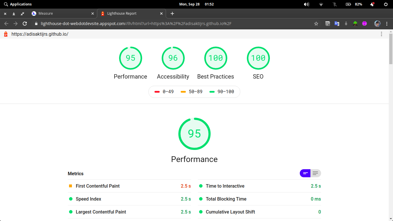
This 'lightweight' means the theme uses as few design stuff as possible. Fewer JavaScript and CSS files. Minima only uses Skeleton for the CSS-boilerplate and nanobar.js for the top loading bar. The following is the 'gross' performance of my blog with the Minima theme:
Minima uses vanilla JavaScript, vanilla CSS, and EJS. So it will be very easy for everyone to edit and customize the theme.
- Pass the core of Hexo Theme Unit Test
- Fully responsive design
- Support post, page, tags, archives, and pagination
- SEO: post meta description and images (appears in Facebook/Twitter shared-link)
- [Customizable] icon Dark/light mode instant switch 🌑/☀️
- [Customizable] theme color
- Code highlighting with Prism.js
- Disqus for post comments
- Show comments section button for faster posts loading
See the quick start instruction and documentation here
Everyone is welcome to contribute! Go ahead, fork and make pull request 😁
Big thanks to @pduchnovsky and yukimuon to help me making this theme even better!
Minima is released under MIT License. Copyright © 2020 Adi Sakti Jrs

