Feature Request: change setEnabled(...) to enable / disable GUI component responsiveness #74
Comments
braitsch
added a commit
that referenced
this issue
May 10, 2016
|
I agree and just added |
|
updated docs here https://braitsch.github.io/ofxDatGui/components.html#toggle-buttons |
Sign up for free
to join this conversation on GitHub.
Already have an account?
Sign in to comment
The current functionality of toggle->setEnabled(...) either checks or unchecks the toggle button. This method has no apparent impact on regular buttons as far as I can tell. I haven't yet investigated the impact of changing the enabled state on other widget types.
I'm trying to develop a GUI where widgets are either "enabled" (responsive to user interactions) or "disabled" (grayed out and non-responsive). This is the nature of the "enabled" state in other GUI's, such as those made in Visual Studio. I was hoping the setEnabled method would have this effect, but discovered it doesn't.
For example, in the following image, the right-most column of widgets are disabled, whereas the two left-most columns of widgets are enabled:
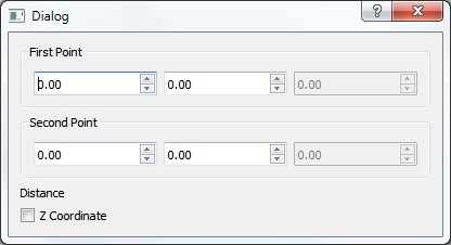
Would it be possible to change the setEnabled method so that when a widget is enabled (getEnabled() == true), the user can change its value(s), and it has a normal coloring scheme, and that when it's disabled (getEnabled() == false), the widget retains the same value(s), but is unchangeable and has a muted coloring scheme?
As a replacement for the origional get/setEnable(d) methods, a get/setValue(...) method could be implemented that would either return true/false for the Toggle widget and other widgets of similar behavior.
The text was updated successfully, but these errors were encountered: