feat: homepage features styling #522
Conversation
|
✔️ Deploy Preview for asyncapi-website ready! 🔨 Explore the source changes: 3fb1190 🔍 Inspect the deploy log: https://app.netlify.com/sites/asyncapi-website/deploys/61d31ee1cd0d580007adf5b3 😎 Browse the preview: https://deploy-preview-522--asyncapi-website.netlify.app |
There was a problem hiding this comment.
Welcome to AsyncAPI. Thanks a lot for creating your first pull request. Please check out our contributors guide useful for opening a pull request.
Keep in mind there are also other channels you can use to interact with AsyncAPI community. For more details check out this issue.
|
One more thing: in the last commit, I just matched the grid gap of this section: to this section: So now, the features section looks like this: Yay for consistent grid spacing!! 😄 |

|
@mcturco Great to see your first PR in website ❤️ I like the current changes, but we could still change more things:
That two things for consistency, rest things looks good :) |
|
And last thing, because I tested it in mobile devices. In some breakpoint I see this:
I think that the content on the right should be aligned to the top without margin-top, maybe with some extra margin on the left to increase gap between left content and right?. What do you think? :) |
|
@magicmatatjahu thanks for your review!! And I am happy to be making code contributions 😄
Good call! I didn't notice that at first. Just added a commit for that!
AGREED!! I just made those adjustments and I think it looks a lot cleaner. Thank you!! 🤩 |
|
@magicmatatjahu YAY how exciting!!! 😄 |
|
/rtm |
|
/rtm |
ci: update global workflows
I am proposing a few quick styling tweaks as follows:
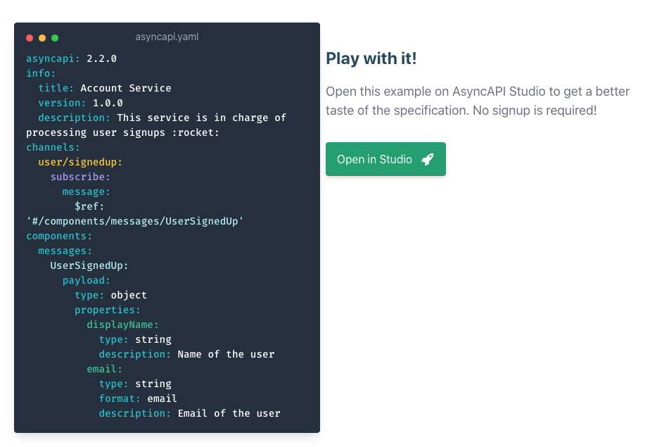
1. Left-align block of text next to home page animation
Seems silly, but I think this section looks a little more polished with the text left-aligned. On mobile, the text goes back to being centered.
Before:
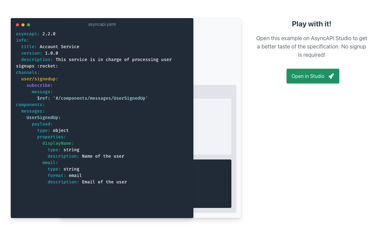
After:
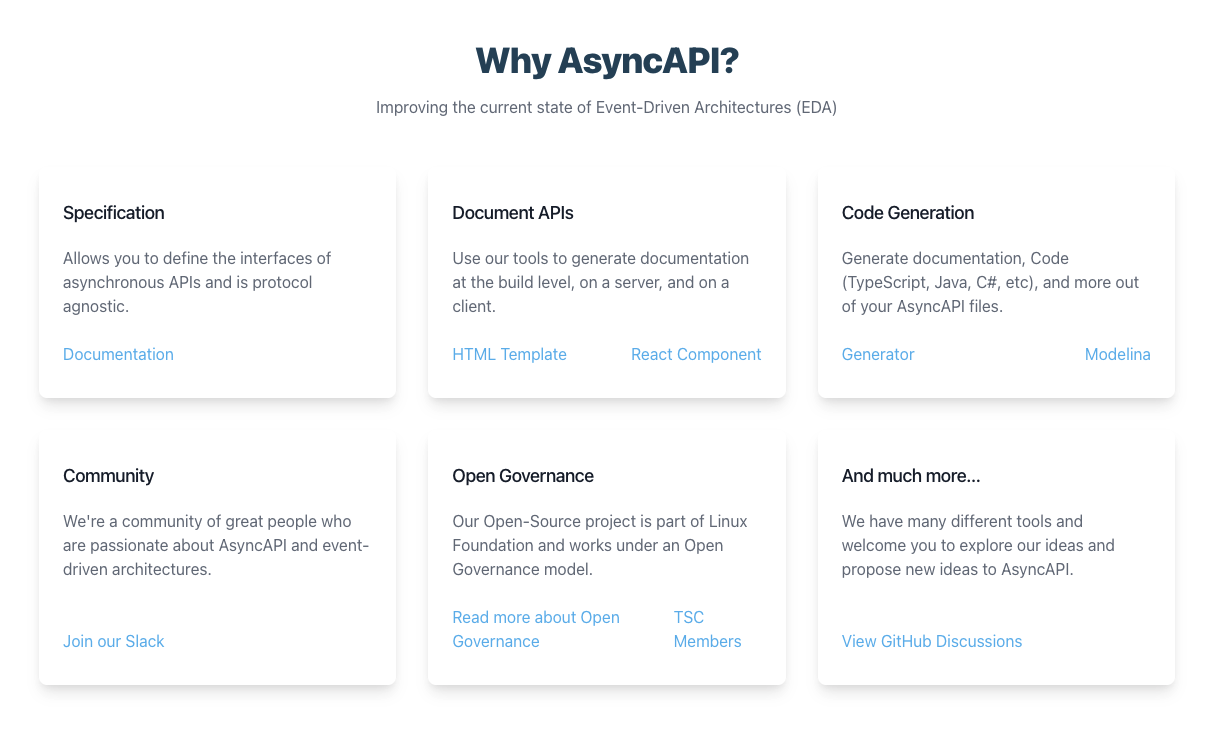
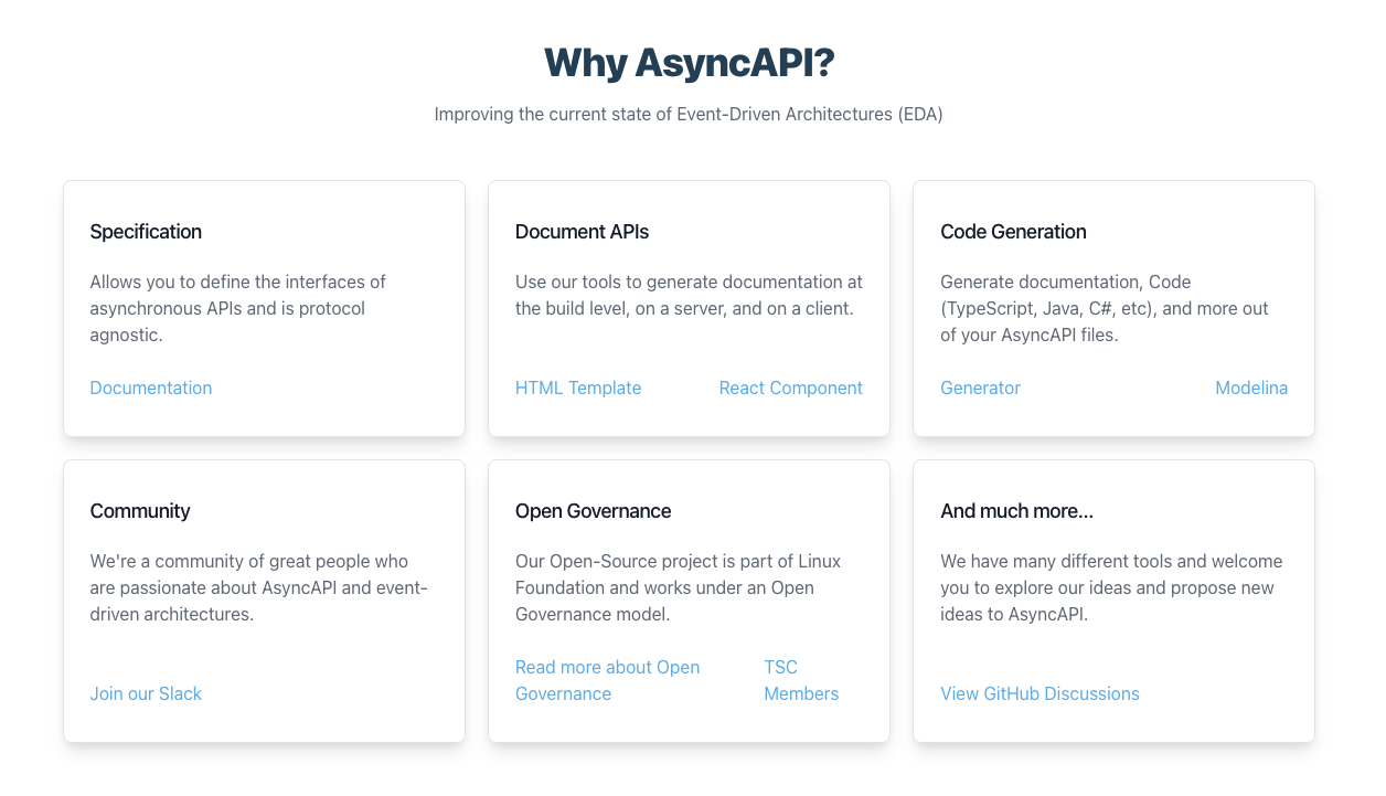
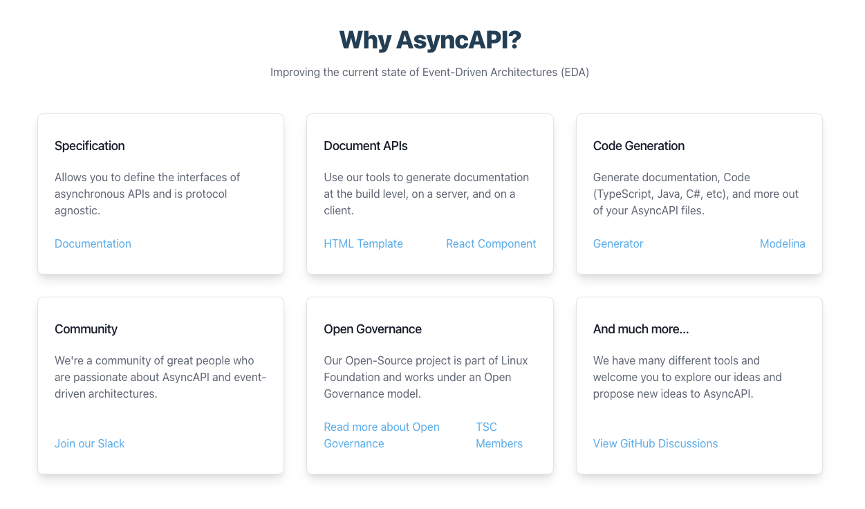
2. Add a thin gray border around the cards in the Features section
Also a very minor visual tweak, but I thought that these cards should visually compare to the next chapter links in the docs. It also just sets the white cards a bit more from the background, whereas right now they look like they are blending in with the white background towards the top.
Before:

After:
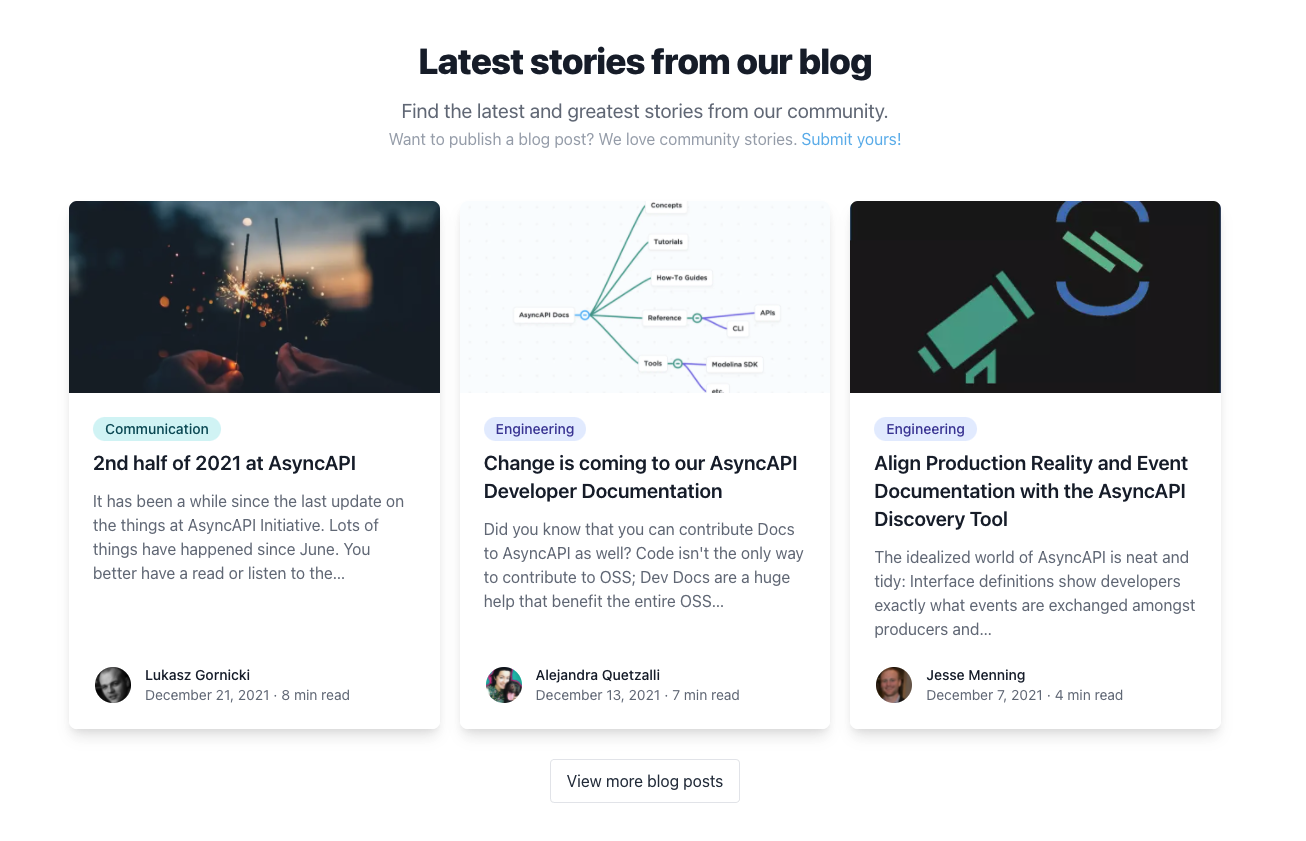
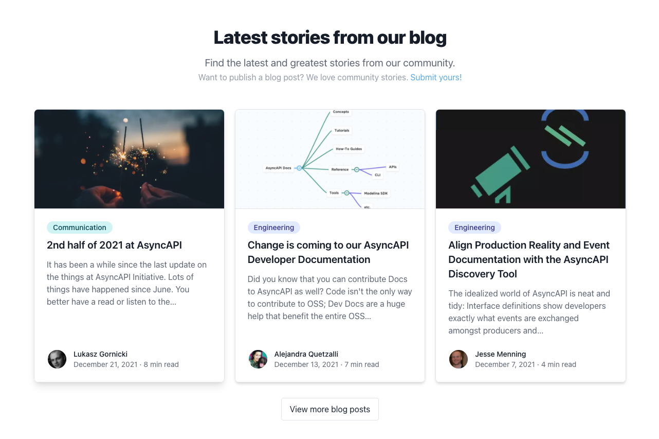
3. Adding a thin gray border around the blog cards on the home page as well as hover states
Again, just matching the card style on the docs pages for consistency.
Before:
After:
P.S. This is also just me trying to get a feel for how styles are applied to the website and I just found some easy things to improve on along the way 😄