Repository navigation
fix(bulma-ui): make auto leave room for an in-place picker panel's themed offset - #915
Conversation


…emed offset

An in-place DateInput, TimeInput or DateTimeInput panel carried its gap in its `top` or
`bottom`, which the positioning hook cannot read, so `position="auto"` budgeted the hook's
default 4px below the input whatever `--bulma-picker-popover-offset` was set to. With a larger
offset it could pick a bottom corner the panel then ran past the viewport from.

The in-place corners now put the gap in a margin on the side facing the input, as Popover and
the portaled panel do, and the hook reads it off the panel on both paths. The inset and the
margin add up to the inset each corner had, so the panel lands where it did. TimeInput's sheet
on a phone drops the margin, so a top corner's gap does not lift it off the bottom and `auto`
reads no gap for it on any corner.

Fixes #904

|
Warning Review limit reachedYou've used all free OSS reviews for now. Wait for the free limit to reset to keep reviewing this public repository. Next included review available in 50 seconds. View limit detailsLimit details: You’ve used the included review currently available. Review configuration: ⚙️ Run configuration
📒 Files selected for processing (7)
Thanks for using CodeRabbit! It's free for OSS, and your support helps us grow. If you like it, consider giving us a shout-out. Comment |

Preview DeploymentPreview URL: https://eb734426.bestax.pages.dev |
![claude[bot]](https://avatars.githubusercontent.com/in/1236702?s=60&v=4)

There was a problem hiding this comment.
Deep review — 0 blocking · 3 advisory
| # | Severity | Area | Finding | Location |
|---|---|---|---|---|
| 1 | 🔵 Advisory | Coverage | The inset→margin move is asserted only symbolically in jsdom; the repo's one browser-level placement check covers the portaled path only | bulma-ui/src/scss/form/_picker-popover.scss:48 |
| 2 | 🔵 Advisory | Coverage | The new margin guard covers only the block axis — margin-left/margin-right/margin-inline* are in neither PLACEMENT nor isIndirect, so edges()'s horizontal lookup is dead and an inline-axis margin would move the panel undetected |
bulma-ui/src/form/__tests__/PickerPopover.styles.test.tsx:307 |
| 3 | 🔵 Advisory | API | With both call sites now passing offset: 0, the hook's offset = 4 default is reachable only from its own unit test |
bulma-ui/src/form/_pickerInternals/PickerPopover.tsx:85 |
Overall: The change is sound and lands the fix the issue asked for. I verified the failure shape against #904, then verified the fix empirically: the two new tests both discriminate — pre-PR, offset: appendToBody ? 0 : undefined makes the in-place gap 4 + marginGap, so PickerPopover.test.tsx's 680 + 300 + 20 = 1000 case becomes 1004 and resolves top-left instead of bottom-left, and the styles test's 20px/19px pair fails on the pre-PR stylesheet too (gap read as 4, so both rows resolve bottom-left). Full suite: 158 files, 6065 tests, green; typecheck:tests and format:check clean; check:conformance clean apart from version-regression, which is the shallow-clone artefact of this checkout and not the PR. The riskiest part is the one thing no test here can observe — jsdom does no layout, so "lands exactly where it did" rests on the abs-positioned inset/margin equation rather than on a measurement; that risk is small because _popover.scss:76-105 has shipped the identical shape for a while, with the same offset: 0 and the same margin-bottom: 0 in its portal block, so this PR converges PickerPopover onto a pattern already in production. Look at finding 1 first.
Residual risk:
autocan still push an in-place panel past the top of the viewport. Open, but pre-existing and untouched:resolveAutotestsfitsBelowonly and returns a top corner unconditionally, with no height check above. The geometry above the input is unchanged by this PR (bottom: calc(100% + gap)andbottom: 100%+margin-bottom: gapput the border-box bottom edge in the same place), so a large themed offset overflows the top exactly as much as before.marginGaptakesmax(abs(marginTop), abs(marginBottom)), so a consumerclassNameadding an unrelated vertical margin inflates the gapautobudgets, on the in-place path now as well as the portaled one. Refuted as a new defect: no published stylesheet sets both margins non-zero on the panel — the cascade test now ranks both and checks every flavor, at both widths, and it passes.- The TimeInput phone sheet reading no gap. Refuted: the reset is load-bearing and tested. The sheet rule is
:not(.is-portal):has(.timeinput-panel)at three classes, so it beats the two-class corner rules; removemargin-top: 0/margin-bottom: 0and the "a sheet on a phone" case readsvar(--bulma-picker-popover-offset)and fails. The cornerautopicks for the sheet is inert —top: autoplusbottom: 1remandleft/right: 1removerride every corner's insets in all published sheets. DateTimeInputtripping the sheet rule. Refuted:timeinput-panelis rendered only byTimeInputBase;DateTimeInputBasecomposesTimeWheelsdirectly, so:has()never matches and the phone-width in-place corner cases cover it.- A browser without
:has()support drops the sheet rule whole, leaving an in-place TimeInput as a normal corner panel with its margins intact. Self-consistent —marginGapthen reads the gap that is really there — and pre-existing.
🏄 Clean little swap, dude — the gap paddled off the inset and onto the margin, which is where Popover's been riding it all along, and the cascade test now watches both. Nothing gnarly in the lineup; good to go.
…margin side

The cascade test can only compare declarations, so a DateInput story now opens an in-place panel
from each corner and measures it against the input in a real browser, sharing the play check the
portaled story already ran. The test runner runs it on every PR.

The published-sheet check ranked only the vertical margins, so a later rule adding a horizontal
or inline margin to the panel would have moved it off its corner with nothing failing. It now
ranks every margin side and refuses the `margin-inline` forms too.
…offset

Popover and the pickers' popover both pass `offset: 0` and take their gap from a margin read
through `styledGap`, so the hook's default is reached only by its own test. Its TSDoc now says
so, so that a new panel built on the hook does the same rather than inherit a gap no stylesheet
sees. The default itself is unchanged.

|
deep-review: verify Every open thread has a reply: fixed, with the commit, or refuted with a reason. This settles them on 7a35a85. |
Preview DeploymentPreview URL: https://dfa14db1.bestax.pages.dev |
There was a problem hiding this comment.
Deep review (verify) — 3 resolved · 0 open
| # | Severity | Area | Thread | Outcome |
|---|---|---|---|---|
| 1 | 🔵 Advisory | Coverage | Inset→margin move never checked by a layout engine | ✅ Verified fixed · resolved |
| 2 | 🔵 Advisory | Coverage | Margin guard covered only the block axis; edges() implied otherwise |
✅ Verified fixed · resolved |
| 3 | 🔵 Advisory | API | useAnchoredPosition's offset default reachable only from its own test |
✅ Verified fixed · resolved |
What I checked
- #1 —
DateInput.stories.tsxnow exportsPositions, rendering all four corners in place (noappendToBody) through the sharedplayCorners, which assertsbox.top === anchor.bottom + gapfor the bottom corners andbox.bottom === anchor.top - gapfor the top ones, withgapread from the computed--bulma-picker-popover-offset.anchorisinputs[i].parentElement, i.e. the*-containerthat_picker-popover.scss:148makesposition: relative— the exact containing block the100%insets resolve against, so the assertion really does measure the inset-plus-margin sum..github/workflows/ci.yml:140runstest-storybook:cion every PR, andtypecheck:testspasses on the new story. - #2 —
INITIALgainedmargin-right/margin-left, so (viaPLACEMENT = Object.keys(INITIAL)) they are collected byplacementRules, cascaded inplacement(), and returned —edges()'s horizontal lookups are no longer dead.isIndirectnow matchesmargin-inline*, so the hard assertion insideplacement()refuses those forms.jest src/form/__tests__/PickerPopover.styles.test.tsx→ 360 passed. - #3 —
useAnchoredPosition.ts:34-41documents that both shipped panels pass0and take the gap from a margin viastyledGap; verified true againstPopover.tsx:242-243andPickerPopover.tsx:85-86. The default is unchanged, as the finding allowed.
Overall: This pass settled threads and reviewed no commits — all three open advisories were answered as fixed, verified against the current code, and resolved; none were blocking to begin with. The one thing worth a human's glance is that the browser-level Positions play test could not be executed here (playwright install chromium has no network in this sandbox — ECONNREFUSED cdn.playwright.dev) and CI's Build and Test was still in_progress on 7a35a858, so confirm that job goes green. The assertions themselves are the right ones.
Residual risk:
- The browser run is unobserved — open. Reading the code says
Positionsfails if the top corners'margin-bottomis dropped (off(box.bottom, anchor.top - gap)becomes 4), but only CI's storybook smoke step proves the real layout engine agrees, and it had not finished on the head commit. - Inline-axis drift on
.picker-popover— refuted. Amargin-left/margin-rightnow reaches both theedges()comparison and the two literal'0'expectations;margin-inline*trips theisIndirectassertion inplacement(). - A future hook caller inheriting the 4px default — open, documented rather than enforced. The TSDoc is guidance, not a gate, which is the trade-off thread 3 accepted.
🏄 Three mellow advisories, three clean answers — the author paddled back out and caught every one of 'em. Only thing left is waiting on the CI set to roll in; after that this one glides all the way to the beach.
 allxsmith
added
the
needs-human-review
allxsmith
added
the
needs-human-review
📸 Story screenshots at handoff —
|
| Light | Dark |
|---|---|
 |
 |
form-dateinput--controlled · Form/DateInput · Controlled
| Light | Dark |
|---|---|
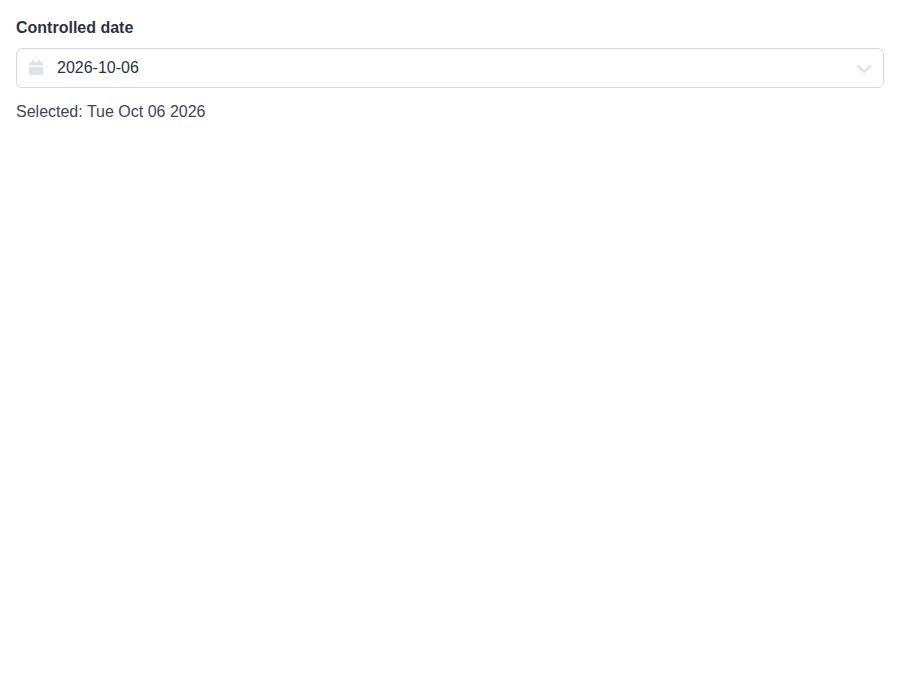 |
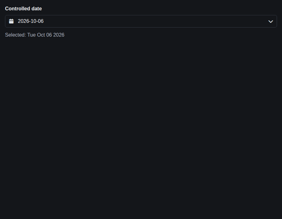 |
form-dateinput--sizes · Form/DateInput · Sizes
| Light | Dark |
|---|---|
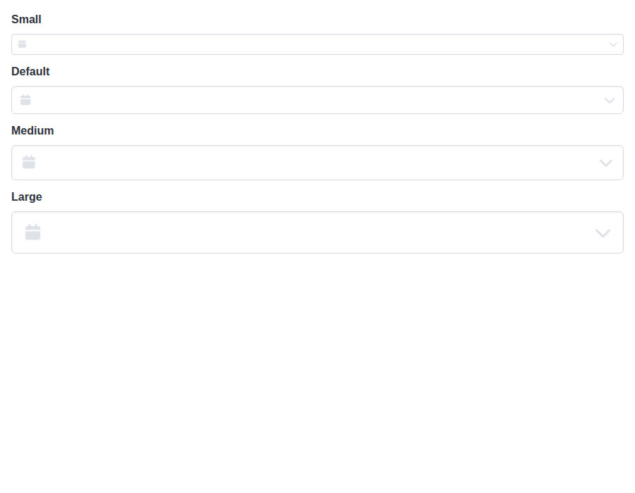 |
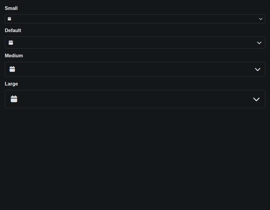 |
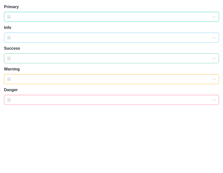
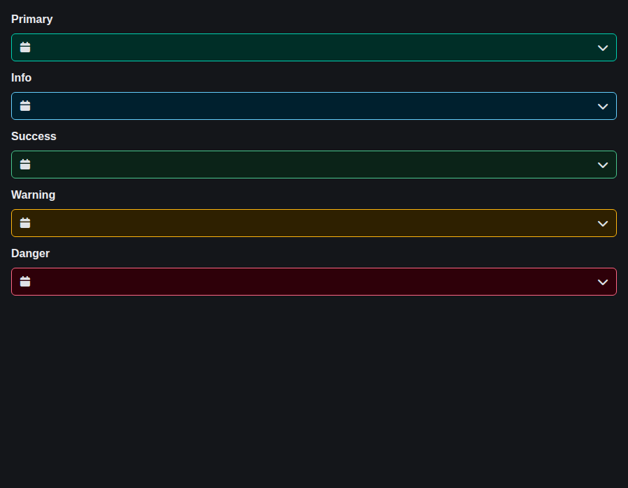
form-dateinput--colors · Form/DateInput · Colors
| Light | Dark |
|---|---|
 |
 |
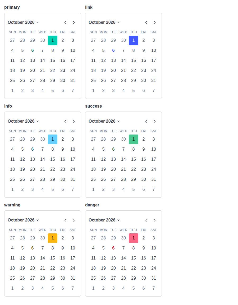
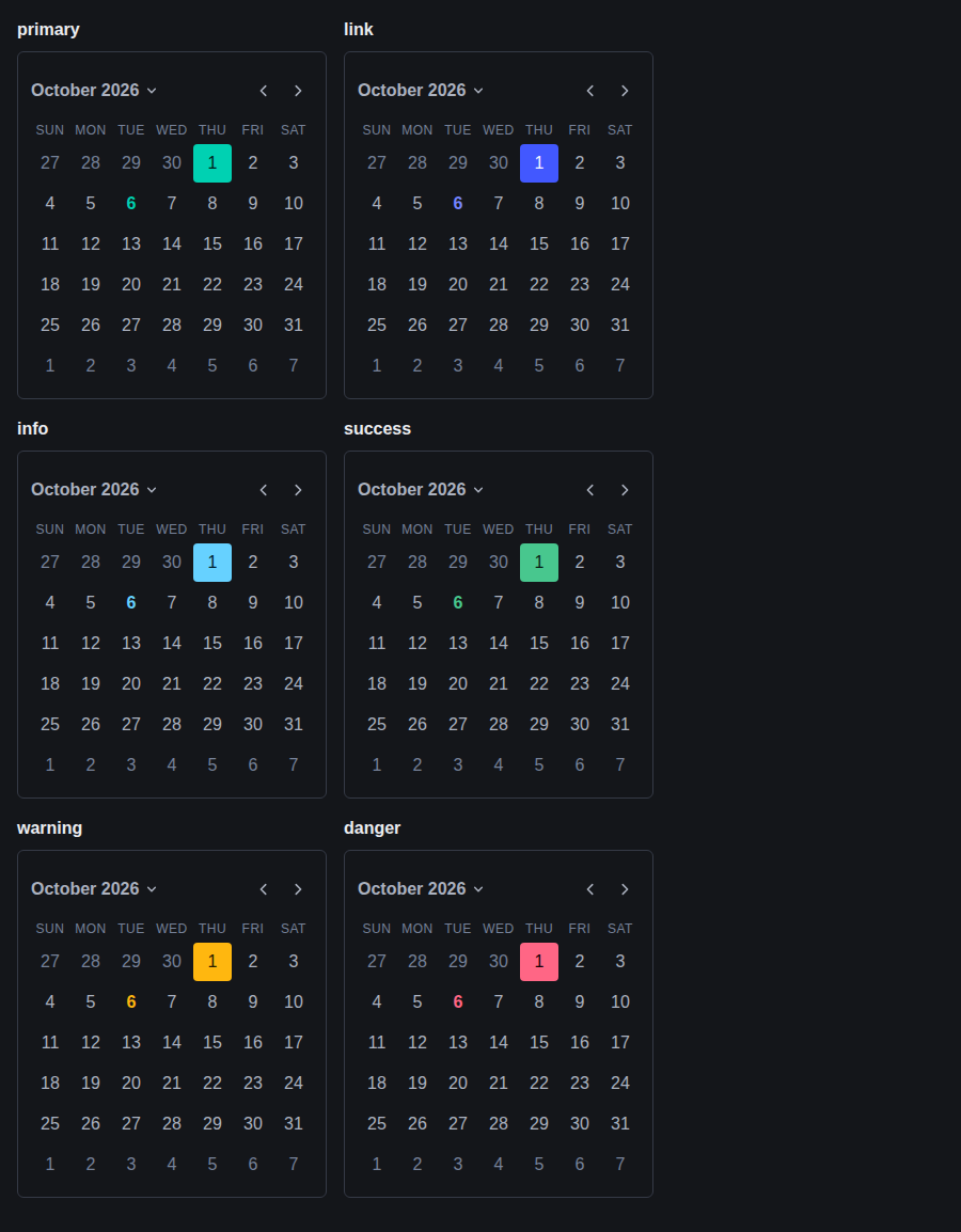
form-dateinput--inline-colors · Form/DateInput · Inline Colors
| Light | Dark |
|---|---|
 |
 |
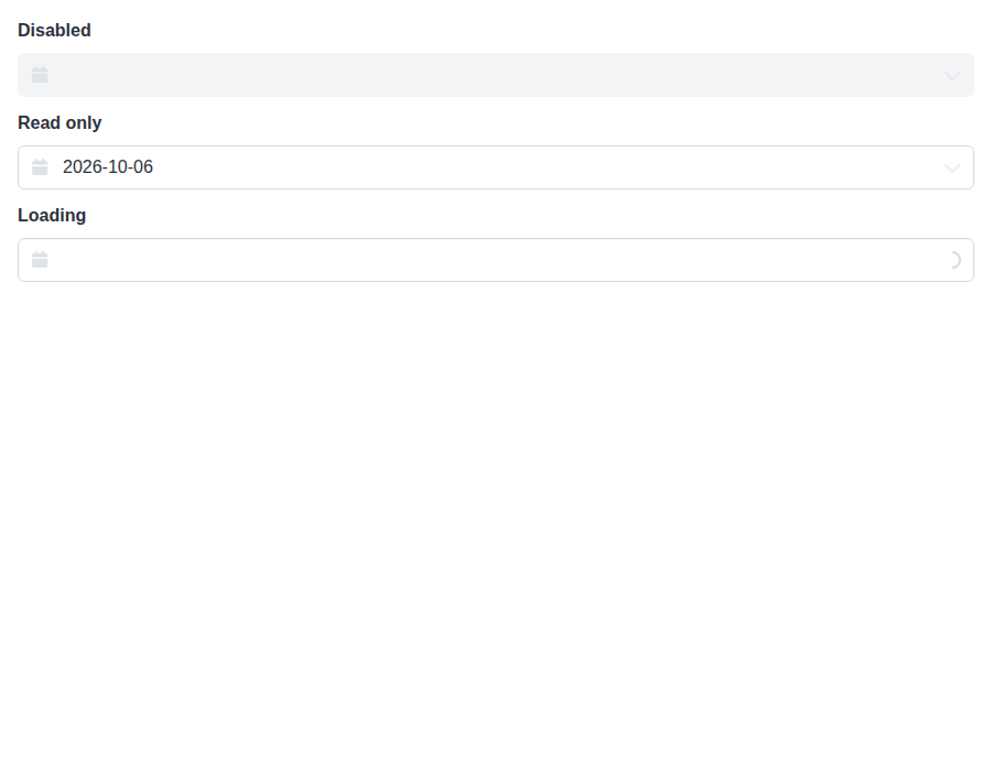
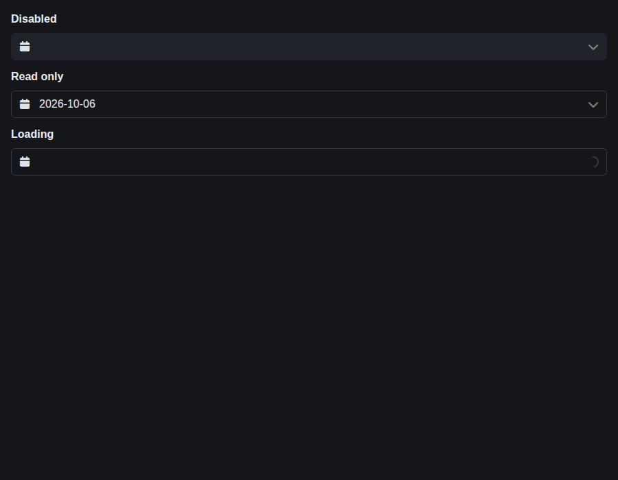
form-dateinput--states · Form/DateInput · States
| Light | Dark |
|---|---|
 |
 |
form-timeinput--default · Form/TimeInput · Default
| Light | Dark |
|---|---|
 |
 |
form-timeinput--controlled · Form/TimeInput · Controlled
| Light | Dark |
|---|---|
 |
 |
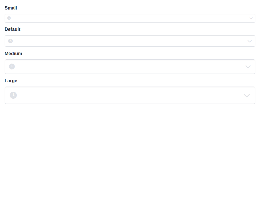
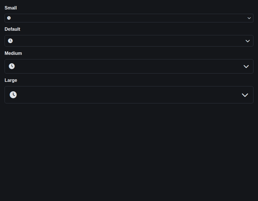
form-timeinput--sizes · Form/TimeInput · Sizes
| Light | Dark |
|---|---|
 |
 |
form-timeinput--format-12-h · Form/TimeInput · Format 12 H
| Light | Dark |
|---|---|
 |
 |
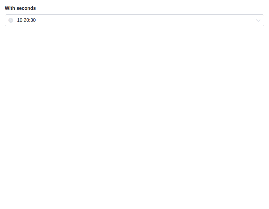
form-timeinput--with-seconds · Form/TimeInput · With Seconds
| Light | Dark |
|---|---|
 |
 |
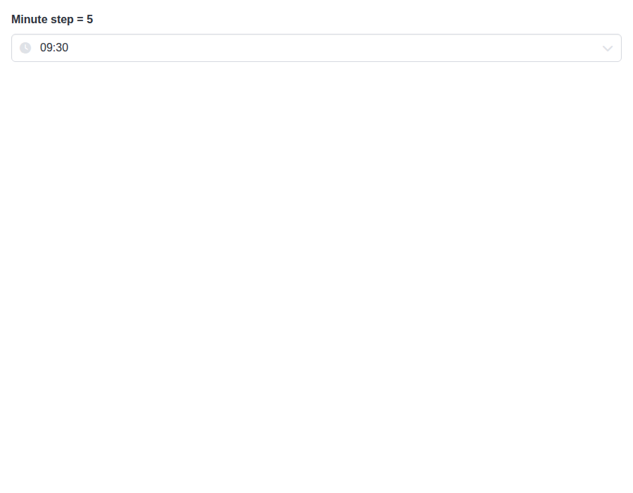
form-timeinput--increment-steps · Form/TimeInput · Increment Steps
| Light | Dark |
|---|---|
 |
 |
 github-actions
Bot
added
the
review-converged
github-actions
Bot
added
the
review-converged
|
🎉 This PR is included in version 5.26.4 🎉 The release is available on: Your semantic-release bot 📦🚀 |
|
🎉 This PR is included in version 2.25.0 🎉 The release is available on: Your semantic-release bot 📦🚀 |
|
🎉 This PR is included in version 4.2.13 🎉 The release is available on: Your semantic-release bot 📦🚀 |
|
🎉 This PR is included in version 1.14.1 🎉 The release is available on: Your semantic-release bot 📦🚀 |
1 participant

An in-place DateInput, TimeInput or DateTimeInput panel carried its gap to the input in its
toporbottominset. The positioning hook can't read that, soposition="auto"budgeted its own default gap below the input, whatever--bulma-picker-popover-offsetwas set to. With a larger themed offset,autocould choose a bottom corner where the panel then ran past the bottom of the viewport. A portaled panel didn't have this problem, because its gap has been a margin since #886.This moves the in-place corners' gap into a margin on the side facing the input, the way Popover and the portaled panel already do it. The hook then reads the gap off the panel on both paths, and PickerPopover stops adding an estimate of its own. Each corner's inset and its new margin add up to the inset it had, so with the default offset an in-place panel lands exactly where it did. TimeInput's bottom sheet on a narrow screen resets both margins: otherwise a top corner's gap would lift the sheet off the bottom, and
autowould leave room for a gap the sheet doesn't have.The styles test proves the placement is unchanged. It now ranks margins in the cascade along with insets, across every published stylesheet including the prefixed flavors, at a phone and a desktop width. It checks that each in-place corner's edge is the offset past the input, that a portaled panel keeps its margins, and that the TimeInput sheet sits where it did with no margin. A new test resolves the offset the way a browser would and shows
autochoosing a top corner once a larger offset no longer fits below.The other way to close this was to measure the gap from the panel's resolved inset, picking the inset by corner. That leaves the stylesheet alone but depends on the containing block's size and needs a special case for the fixed TimeInput sheet. The margin approach matches the existing pattern, and the cascade test can prove it in full. One consequence: a consumer stylesheet that overrode an in-place corner's
toporbottomto set its own gap now gets the offset margin on top of it. The supported way to theme the gap is the variable, which behaves as before.pnpm allpasses locally.Fixes #904