Add link UI with autocomplete to the image block #15570
Conversation
 jorgefilipecosta
added
[Type] Enhancement
jorgefilipecosta
requested review from
aduth,
ajitbohra,
ellatrix,
gziolo,
noisysocks,
notnownikki,
Soean,
talldan and
youknowriad
as code owners
jorgefilipecosta
added
[Type] Enhancement
jorgefilipecosta
requested review from
aduth,
ajitbohra,
ellatrix,
gziolo,
noisysocks,
notnownikki,
Soean,
talldan and
youknowriad
as code owners
|
I think we went back and forth on this one in previous releases. |
|
Thanks for this, very nice work. Overall GIF:
The concern that Riad highlights is, correct me if I'm wrong, summarized in this GIF:
The concern is that it's duplicate UI. Usually when there are two ways to accomplish the same, it begs a question of the user: which way is the right way? Note that this is different from redundant UI, which is also duplicate, but is identical. This challenge is exactly why I was a bit sad to see the old image link UI being moved to the sidebar as part of what is currently in master. I knew that it was a temporary stopgap to ensure feature parity, but that the UI implemented was not very good because it had to happen fast. This is where it bites us. Not saying that to disparage, just as context — I've been around for the ride, and sometimes you have to take detours, and I'm happy we're now looking at it again. To resurrect that discussion a little bit — linking an image feels like a basic operation. Following our principles, that makes it primary UI, which means it should not be in the sidebar. For that reason, I quite like that it's now a primary operation, and the fact that it's similar to the paragraph UI is good. Technically the two also work nicely side by side — one is aware of the other and you can go about your day. As such, I have no objection to this PR being merged as is, so long as we ticket improvements to the sidebar link UI. However those sidebar improvements are important. As a strawman, this seems like it would be an improvement:
At least then, the two UI's would be unified into one. I also noticed something interesting:
Notice the extra small 1px gray border around the formatting buttons — that's a regression. It's also in master, so it's not the fault of this branch, but it is just more visible here because the button pops out a popover and the extra border lingers there. I'll investigate. |


|
PR for the lingering outline thing in #15592 |
Some thoughts on the design ... The user's interaction with with the link popover naturally flows:
With the 'Link To' option that order doesn't make sense because 'Link To' modifies the URL that was initially entered. In the sidebar's link settings, it's the first step, which makes sense to me. I wonder if there's another way to express that setting in the popover version that would allow the user to have a more natural editing flow. 🤔 edit: Alternatively, maybe this link popover doesn't have any additional settings, so that there's less duplication. |
This is a good point, and speaks to the existing limitations of the legacy UI. It definitely needs a re-think overall. I don't think additional buttons are the solution — in my mind "attachment page" and "media file" have more in common with auto-complete suggestions than they do modal options for the entire link interface. They're all just links. My suggestion for putting it in the advanced dropdown for now was more to at least group the link UIs together so we can keep moving. @kjellr do you have any magical insights here that eldude me? There could be some simple elegant solution I'm not seeing. |
|
What if we add the Link to option to the popover before the URL input? The open in a new tab would still be an andavanced option. |
|
Noting that if you rebase, that lingering focus thing is gone :) — if not, it will be gone post merge.
Can you elaborate a little bit? As mentioned, I don't feel it necessary to re-do the link UI to be able to ship THIS PR, if we mean to ship it quickly. Just ticket the improvement and we can move. However if there is bandwidth for a re-think, I would suggest that Google Docs has a solid interface:
It is a single link UI, but it also shows contextual options at the bottom of the dropdown. Just press tab in that link dialog to access those options. The equivalent for us is almost there already: you can search for an existing page to link to, and an "autocomplete-esque" UI will pop out. We could do so that when you invoke the link dialog on the image, that autocomplete UI is already open, and shows two options at the bottom: link to attachment page, or link to media file. The keyboard flow would be this:
Does that make sense? Need a mockup? |
Yep, I fully endorse this. 🙌 I actually mocked this up a while back and just dug it up:
Also, is it possible for us to be smart and say "Link to image file" here instead of "media file"? I think that will be more clear to folks. |

|
Killer mockup! I do think a separator and some icons next to those two options will give them slightly more presence, but the idea feels solid. |
|
Yeah — I figured we'd still be using the same component we're used to here, right? If so, we don't usually put icons in there. For the separator, were you thinking that'd be a separator between these and other options in the dropdown (once they appear)? I'd figured that these options would just disappear once you typed something else, since they're not technically auto-completes. |
|
An absent icon wouldn't block anything, but it would make it less "missable" — right now it's a little invisible down there.
Good point. Yes those options available right off the bat would disappear as soon as you type, so no need to separate them. |
|
Here's a revised mockup with icons. Not totally sure what to use for the
|
 jorgefilipecosta
force-pushed
the
add/link-ui-with-auto-complete-to-image
branch
from
jorgefilipecosta
force-pushed
the
add/link-ui-with-auto-complete-to-image
branch
from
927e84f
to
eb41254
Compare
|
The UI was updated yesterday to follow the mockups and can be tested. I felt the need to add some UI elements like a button that allows the user to remove the link (now we don't have the option to set the link to none). |
jorgefilipecosta
force-pushed
the
add/link-ui-with-auto-complete-to-image
branch
from
888f4bf
to
12a6cea
Compare
|
Discussed during today's accessibility bug scrub. At a first glance, anything that moves us away from the concept of “Sidebar” sounds good 🙂 Needs to be tested for implementation details. Keeping the "Needs a11y feedback" label for now. |
|
Additional note: One more concern is consistency. Not just for accessibility, also for general usability. These “Link” buttons do very different things across the various blocks: Image, Video, Audio, etc. Not sure forcing users to learn a new UI each time is the best user experience. On the other hand, if this pattern turns out to work well, it could be considered also for other blocks. |
|
Discussed during today's accessibility bug scrub. At a first glance and looking at the GIFs this seems a step in the right direction, as it moves the UI link from the sidebar (not so accessible) to the block. Having the relevant UI pieces "in place" within the block sounds sensible. Would need some testing with assistive technologies and some real user testing. WCEU could be a good opportunity. |
 afercia
added
[Focus] Accessibility (a11y)
jorgefilipecosta
force-pushed
the
add/link-ui-with-auto-complete-to-image
branch
3 times, most recently
from
afercia
added
[Focus] Accessibility (a11y)
jorgefilipecosta
force-pushed
the
add/link-ui-with-auto-complete-to-image
branch
3 times, most recently
from
bbbe4d3
to
ec7b647
Compare
jorgefilipecosta
force-pushed
the
add/link-ui-with-auto-complete-to-image
branch
from
ec7b647
to
c0d7d38
Compare
|
I did some tests on this PR with voice over and things worked as expected. I guess this PR should be ready merge. |
| </div> | ||
| ) } | ||
| </Popover> | ||
| ); | ||
| } | ||
| } | ||
|
|
||
| const LinkEditor = ( { |
There was a problem hiding this comment.
I think we need to reorganize all the link related comments better. For example why is this in the popover? It can be used without it right? Also the relationships between all these components is not obvious. we should probably have a README for each one of these components and organize them in a common folder or something like that.
Makes me wonder if we should mark all these things as "Experimental" before doing the reorganization.
There was a problem hiding this comment.
Yes, I think it may be possible to use these components outside the URLPopover, but they are precise UI pieces, and the most probable use case is inside a URLPopover component.
I don't think we should expose these components directly as part of wp.components otherwise we populate the module with particular UI pieces, I agree we should mark these components as experimental until we decide on a more profound reorganization.
jorgefilipecosta
force-pushed
the
add/link-ui-with-auto-complete-to-image
branch
from
c0d7d38
to
bbf72fe
Compare
jorgefilipecosta
force-pushed
the
add/link-ui-with-auto-complete-to-image
branch
from
bbf72fe
to
2e30904
Compare
| @@ -38,45 +31,6 @@ function isShowingInput( props, state ) { | |||
| return props.addingLink || state.editLink; | |||
| } | |||
|
|
|||
| const LinkEditor = ( { value, onChangeInputValue, onKeyDown, submitLink, autocompleteRef } ) => ( | |||
| // Disable reason: KeyPress must be suppressed so the block doesn't hide the toolbar | |||
There was a problem hiding this comment.
While it's technically fair to say the comment was no longer necessary because the changes remove the need to disable the ESLint rule, there was some value in having an explanation here previously for why we stop propagation. Considering the purpose of a specific Event#stopPropagation is almost never easily understandable at a glance, we should strive to retain as much information for their existence as possible.
Coincidentally, I see it as similar to why we have these "Disable reason:" comment, in that it's similarly non-obvious to a future maintainer why we disable an ESLint rule without a comment explaining the rationale (and, to an arguably greater effect, forcing ourselves to explain it might actually deter us from going through with hastily introducing an escape hatch).
For context: I arrived here after trying to determine whether I could remove the stopKeyPropagation in a refactor, because I can't understand based on the current code why it needs to exist.
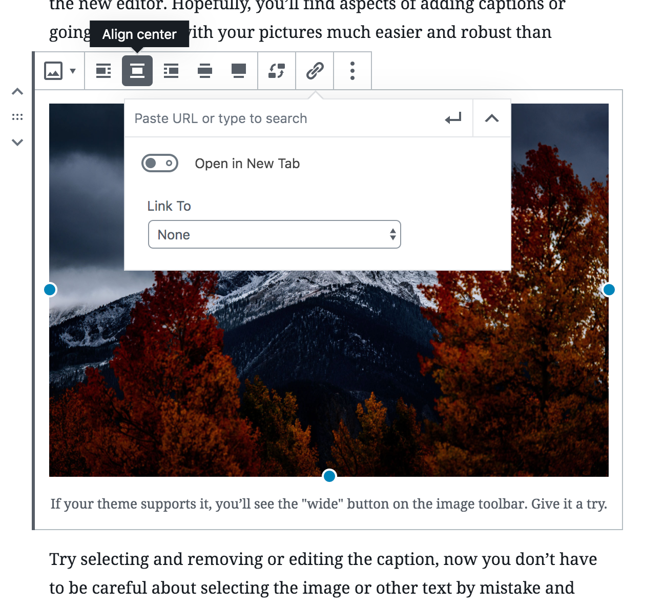
Description
Fix: #8265
This PR implements a button in the image block that allows users to use the link UI already available in the paragraph.
Some components were extracted from the link format, to make them available in the image block.
How has this been tested?
I added an image block.
I selected an image.
I pressed the link button in the toolbar.
I tried to add a link, I verified I can use autocomplete; I selected a link; I verified the link was applied.
I verified in the block inspector that the "Link To" field was changed to "Custom Url".