Developed with 💙 by Very Good Ventures 🦄
A library for easily displaying paginated data, created by Very Good Ventures.
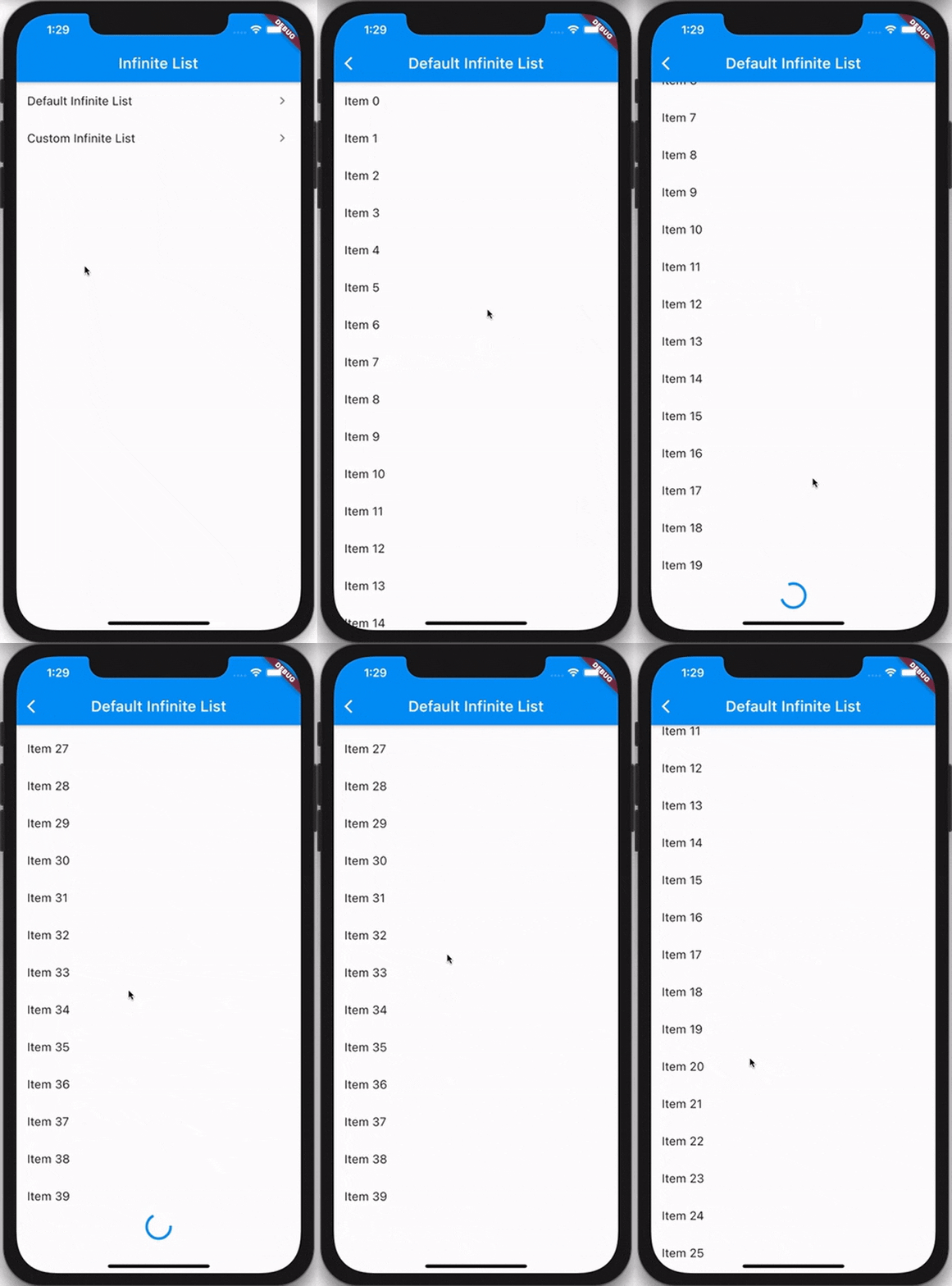
InfiniteList comes in handy when building features like activity feeds, news feeds, or anywhere else where you need to lazily fetch and render content for users to consume.
The InfiniteList API is very similar to that of ListView.builder. A basic implementation requires four parameters:
- An
itemCountthat represents the amount of items that should be rendered using theitemBuilder. - An
itemBuilderthat is responsible for returning a widget for every index of theitemCount. - A
hasReachedMaxflag that indicates if any more data is available. - An
onFetchDatacallback that's triggered whenever new data should be fetched.
import 'package:flutter/material.dart';
import 'package:very_good_infinite_list/very_good_infinite_list.dart';

void main() => runApp(MyApp());

class MyApp extends StatefulWidget {
  @override
  _MyAppState createState() => _MyAppState();
}

class _MyAppState extends State<MyApp> {
  var _items = <String>[];
  var _isLoading = false;

  void _fetchData() async {
    setState(() {
      _isLoading = true;
    });

    await Future.delayed(const Duration(seconds: 1));

    if (!mounted) {
      return;
    }

    setState(() {
      _isLoading = false;
      _items = List.generate(_items.length + 10, (i) => 'Item $i');
    });
  }

  @override
  Widget build(BuildContext context) {
    return Scaffold(
      appBar: AppBar(
        title: const Text('Simple Example'),
      ),
      body: InfiniteList(
        itemCount: _items.length,
        isLoading: _isLoading,
        onFetchData: _fetchData,
        separatorBuilder: (context, index) => const Divider(),
        itemBuilder: (context, index) {
          return ListTile(
            dense: true,
            title: Text(_items[index]),
          );
        },
      ),
    );
  }
}InfiniteList has multiple optional parameters which allow you to customize the loading and error behavior.
InfiniteList<String>(
  itemCount: 3,
  hasReachedMax: false,
  onFetchData: () => _fetchData(),
  itemBuilder: (context, index) => ListTile(title: Text('$index')),

  // An optional [ScrollController] this [InfiniteList] will attach to.
  // It's used to detect when the list has scrolled to the appropriate position
  // to call [onFetchData].
  //
  // Is optional and mostly used only for testing. If set to `null`, an
  // internal [ScrollController] is used instead.
  scrollController: _scrollController,

  // Indicates if new items are currently being loaded.
  //
  // While set to `true`, the [onFetchData] callback will not be triggered
  // and the [loadingBuilder] will be rendered.
  //
  // Is set to `false` by default.
  isLoading: false,

  // Indicates if an error has occurred.
  //
  // While set to `true`, the [onFetchData] callback will not be triggered
  // and the [errorBuilder] will be rendered.
  //
  // Is set to `false` by default.
  hasError: false,

  // Indicates if the list should be reversed.
  //
  // If set to `true`, the list of items, [loadingBuilder] and [errorBuilder]
  // will be rendered from bottom to top.
  //
  // Is set to `false` by default.
  reverse: false,

  // The duration with which calls to [onFetchData] will be debounced.
  //
  // Is set to a duration of 100 milliseconds by default.
  debounceDuration: const Duration(milliseconds: 100),

  // The offset, in pixels, that the internal [ScrollView] must be scrolled over
  // to trigger [onFetchData].
  //
  // Defaults to the same as [RenderAbstractViewport.defaultCacheExtent], which is 250.
  cacheExtent: 250.0,

  // The amount of space by which to inset the list of items.
  //
  // Is optional and can be `null`.
  padding: const EdgeInsets.all(16.0),

  // An optional builder that's shown when the list of items is empty.
  //
  // If `null`, nothing is shown.
  emptyBuilder: (context) => const Center(child: Text('No items.')),

  // Flag used to center the empty builder, it is optional and defaults to false
  centerEmpty: true,

  // An optional builder that's shown at the end of the list when [isLoading]
  // is `true`.
  //
  // If `null`, a default builder is used that renders a centered
  // [CircularProgressIndicator].
  loadingBuilder: (context) => const Center(child: CircularProgressIndicator()),

  // Flag used to center the loading builder, it is optional and defaults to false
  centerLoading: true,

  // An optional builder that's shown when [hasError] is not `null`.
  //
  // If `null`, a default builder is used that renders the text `"Error"`.
  errorBuilder: (context) => const Center(child: Text('Error')),

  // Flag used to center the error builder, it is optional and defaults to false
  centerError: true,

  // An optional builder that, when provided, is used to show a widget in
  // between every pair of items.
  //
  // If the [itemBuilder] returns a [ListTile], this is commonly used to render
  // a [Divider] between every tile.
  //
  // Is optional and can be `null`.
  separatorBuilder: (context, index) => const Divider(),

  // An optional [Axis] to be used by the internal [ScrollView] that defines
  // the axis of scroll.
  //
  // Is set to `Axis.vertical` by default.
  scrollDirection: Axis.vertical,

  // An optional [ScrollPhysics] to be used by the internal [ScrollView].
  //
  // Default to tha same as [ScrollView].
  physics: const AlwaysScrollableScrollPhysics(),
);
Refer to the example to see both basic and complex usage of InfiniteList.


