Add toolbars to list info items with fast actions #3936
Conversation
Use same class (by extending it) both to append an item to a playlist and to choose a playlist tab
Fixes ui issues with select playlist tab dialog
|
Oh my! What is it with this Apple-like secretiveness and flashy reveal? XD |
|
Right off the bat, I noticed that long press on a list item does nothing. I think rather than a single tap to expand and another to open, it would be more intuitive to open on single press and expand on long press instead. After expansion, you could still let another tap open the item. Edit: Are Subscriptions tab channels not list info items?
Agreed. Now that you mention it, it seems obvious. Edit 2: Once you've expanded the list info item, having a play button seems pointless, since that would be the default action on another tap. In the case of Soundcloud, having both play and headphone buttons is redundant. I think having only the play button would be clearer for non-tech savvy users. Edit 3: Wait. Having either button would be pointless in the case of Soundcloud, so both of them could be removed. |
|
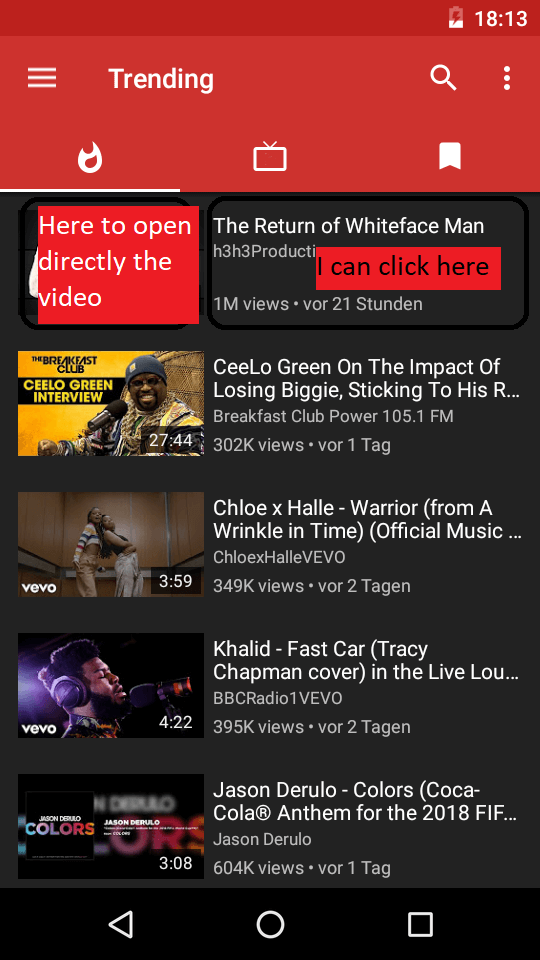
Can you separate actions, when I click to text It appears icons list and when I click to image it open directly and with one press the video. |
|
|
I have to say I just tried this and I am a big fan of the one-click menu popup. Maybe making the play button more prominent would be a suggestion I could make (simply putting it closer to the middle of the screen would work). To be honest I never used the long press anyway. If you just added the download button in there I would be very happy with this change myself. |
|
Crash: Malformed URL when opening a channel page on any service. |
|
bug: "add to playlist" button is showing in playlists toolbar when it should not. |
|
I love how long pressing acts as enqueue however this should be mentioned in like a tips section or how to use introduction when using newPipe for the first time.. it also long pressing on the play button could act as enqueue next (play next). this would be even more useful after updating to unified player. I also like previous suggestion. having the toolbar while pressing on thumbnail to play video directly is a great combination. |
|
#3076 reminded me: Since text has been replaced with just icons, you should absolutely show tooltips for all of them. The current "hold to append" tooltip for background and popup icons should show for the list item icons as well, if the toggle is on. |
|
in your proposal, you mentioned multi select feature... I hope that is not gone. this online is considered a big update. imagine how much less clicking is needed whenever y want to add or remove a bunch of videos from playlists or queues. |
|
could be related ..#4405 (comment) |
679bc75 to
2aeccc0
Compare
|
I will not continue thir PR, as I changed my mind about #2583: having such a menu popping up below items, with rather small buttons, would feel strange and probably also difficult to use. |
What is it?
Description of the changes in your PR
The issue is, I realized this could not be the best UI for non-techy people, as it is not usual that clicking on a list item does not open it but only shows some related actions. So I would like to get some feedback from you: do you find this ui comfortable or did you prefer the long-press menu?
Btw, even though in #2583 I said I would make two different actions for thumbnail and other data double-press, I realised it is better not to put too many things into a small item without a clear indication. So for now clicking twice anywhere on the item first opens the toolbar and then shows info.
Fixes the following issue(s)
Relies on the following changes
Testing apk
This apk is not complete at all. There are many issues (one of them is: adding local playlists to other local playlists is disabled because strange loops would arise). So don't expect a pleasant experience, but please tell me if the overall way of doing things is in your opinion better or worse.
app-debug.zip
Agreement