refactor(button): style with pseudo-private custom properties #1038
Conversation
✅ Deploy Preview for stacks ready!
To edit notification comments on pull requests, go to your Netlify site settings. |
* refactor(button-group): remove --container; add radio layout

* refactor(button-group): standardize less
…xchange/Stacks into dcormier/btn-css-refactor
 b-kelly
left a comment
b-kelly
left a comment
b-kelly
left a comment
There was a problem hiding this comment.
Excellent work! Visually, this PR doesn't appear to introduce any regressions (tested all combos between light/dark, standard/custom theme, highcontrast on/off). Code-wise, the organization of this file has been greatly improved (dropping ~200 lines of duplicated selectors/properties in the process).
I do have a few easily addressed concerns:
- Looks like the removal of the documented
s-btn-group--containerclass is a breaking change. I'd prefer to avoid this if at all possible. Any chance we can put a shim in here with a deprecation note in the changelog? - Radio based buttons don't have focus rings. Since this syntax is new to this PR, we could do one of the following:
- just add the checked selectors to the focused selectors, much like you did for
.is-selected - change the markup to have the input inside of the label, then drop the special selector casing for
:focus-within(in addition to:focus)
- just add the checked selectors to the focused selectors, much like you did for
- I also spotted an existing bug you can fix while you're in here: Primary buttons don't change their BG color when hovering over them in dark mode
| "description": "Base button group style." | ||
| }, | ||
| { | ||
| "class": ".s-btn-group--container", |
There was a problem hiding this comment.
Looks like this is a breaking change. How should we handle this?
There was a problem hiding this comment.
So, I originally intended this to be a non-breaking change, but a deprecation. In 77c425c, I've targeted the form element and once again made this a deprecation. Basically with the PR as it is now, the changes should be backwards compatible.
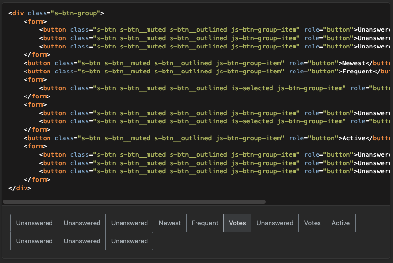
Note
Image for demo purposes only. Don't worry. I didn't change the docs to this permanently.
Should we reintroduce .s-btn-group--container? I know targeting a HTML tag feels a little icky but it doesn't feel totally wrong here. That said, I'm fine with targeting that class and punting on any of this and FWIW it's pretty low stakes since I only found it used in one place in Core.
PS: .s-btn-group--container previously just set any nested button border radius to 0. That means if the button was at the start or end of the button group, it would get squared off. I've addressed this in 77c425c.
🎉
Yeah, I thought that it could be deprecated and any relevant CSS could be removed, but I guess I didn't compensate for this properly (bottom row includes
I'll have to reconsider removing this class before merging this PR.
Fixed in e946105
Ah, nice catch! I'll fix that. Update: fixed in e519ab4 |

b-kelly
left a comment
b-kelly
left a comment
There was a problem hiding this comment.
lgtm, thanks for the updates
This PR refactors the CSS for
.s-btnand.s-btn-groupto use pseudo-private custom properties.New features
.s-btn-groupusinginput[type="radio"]This PR includes changes to
.s-btn-groupto support implementation withinput[type="radio"]. Normally, I'd separate these into unique PRs, but this and.s-btnare pretty tightly coupled, so I've included the change here.Bugs fixes
I noticed a few issues that I resolved by preventing CSS rule conflicts.
High contrast primary button active state
In
develop, the high contrast primary button style doesn't change on:active. This PR resolves that.High contrast borders
Some buttons variants had inconsistent borders in high contrast (Primary style selected state, for example). This PR resolves those issues.
TODO
--_btnshould become--_bt).s-btn-groupusinginput[type="radio"]