[Navigation] Allow the NavItem to highlight on hover/action uniformly #7793
Conversation
This file contains hidden or bidirectional Unicode text that may be interpreted or compiled differently than what appears below. To review, open the file in an editor that reveals hidden Unicode characters.
Learn more about bidirectional Unicode characters
 Rmnlly
force-pushed
the
navitem-fullwidth-highlight
branch
from
Rmnlly
force-pushed
the
navitem-fullwidth-highlight
branch
from
9683209 to
3923df6
Compare
size-limit report 📦
|
Rmnlly
force-pushed
the
navitem-fullwidth-highlight
branch
from
3923df6 to
a8e0d8b
Compare
|
/snapit |
|
🫰✨ Thanks @Rmnlly! Your snapshots have been published to npm. Test the snapshots by updating your yarn add @shopify/[email protected]yarn add @shopify/[email protected]yarn add @shopify/[email protected]yarn add @shopify/[email protected] |
Rmnlly
force-pushed
the
navitem-fullwidth-highlight
branch
from
a8e0d8b to
6a0e598
Compare
|
/snapit |
|
🫰✨ Thanks @Rmnlly! Your snapshots have been published to npm. Test the snapshots by updating your yarn add @shopify/[email protected]yarn add @shopify/[email protected]yarn add @shopify/[email protected]yarn add @shopify/[email protected] |
sam-b-rose
approved these changes
Nov 28, 2022
henryyi
reviewed
Nov 29, 2022
Rmnlly
force-pushed
the
navitem-fullwidth-highlight
branch
from
6a0e598 to
a400750
Compare
henryyi
requested changes
Nov 30, 2022
… highlight uniformly
Rmnlly
force-pushed
the
navitem-fullwidth-highlight
branch
from
a400750 to
63bc73a
Compare
|
/snapit |
|
🫰✨ Thanks @Rmnlly! Your snapshots have been published to npm. Test the snapshots by updating your yarn add @shopify/[email protected]yarn add @shopify/[email protected]yarn add @shopify/[email protected]yarn add @shopify/[email protected] |
henryyi
reviewed
Nov 30, 2022
henryyi
approved these changes
Nov 30, 2022
Merged
laurkim
pushed a commit
that referenced
this pull request
Nov 30, 2022
…#7793)

<!--
  ☝️How to write a good PR title:
- Prefix it with [ComponentName] (if applicable), for example: [Button]
  - Start with a verb, for example: Add, Delete, Improve, Fix…
  - Give as much context as necessary and as little as possible
  - Prefix it with [WIP] while it’s a work in progress
-->

### WHY are these changes introduced?

As part of an effort to port bug fixes and style changes over from admin
I am adding this highlight change into polaris.

Fixes: Shopify/core-workflows#633

<!--
  Context about the problem that’s being addressed.
-->

### WHAT is this pull request doing?

I have added a wrapper around the Nav Item contents to allow the nav
item to extend its highlighting over to the secondary actions as well.
This was part of UX changes made to the navigation in Admin during the
pinning work.

This applies for both hover and active state highlights, the secondary
action will now appear as if its part of the navigation items hover
instead of being separate, the focus rings/tab order is maintained.

<!--
  Summary of the changes committed.

Before / after screenshots are appreciated for UI changes. Make sure to
include alt text that describes the screenshot.

If you include an animated gif showing your change, wrapping it in a
details tag is recommended. Gifs usually autoplay, which can cause
accessibility issues for people reviewing your PR:

    <details>
      <summary>Summary of your gif(s)</summary>
      <img src="..." alt="Description of what the gif shows">
    </details>
-->

Before:
  <details>
    <summary>video of original interactions</summary>


https://user-images.githubusercontent.com/33904740/203415160-147a03a0-dbf3-41ca-b9d6-0164aec33ea0.mov
  </details>
Active and Active hover highlighting:
<img width="290" alt="Original 'various states and sections' showing
that the secondary action highlight when hovered and active is separate
from the text in the navItem'"
src="https://user-images.githubusercontent.com/33904740/203415460-169d648c-24f5-492d-ba7c-ad55719ee076.png">
Hover Highlighting:
<img width="267" alt="Original NavItem hover highlight when not active
showing the secondary item not highlighting on hover"
src="https://user-images.githubusercontent.com/33904740/203415621-d5a329bb-cfad-4cc1-84af-ccbcd018aeb9.png">

After:
<details>
<summary>Video of new interactions and how the highlights appear uniform
now</summary>


https://user-images.githubusercontent.com/33904740/203418162-5c84130d-7b7a-4975-b826-f612b3a2750c.mov
</details>

Active and Active hover highlighting:
<img width="280" alt="New 'various states and sections' showcasing that
the highlight is now uniform across the text and secondary action"
src="https://user-images.githubusercontent.com/33904740/203415977-ce63bd43-3649-420f-8565-a8a8ac483c7e.png">
Hover Highlighting (notice the highlight ends just before the secondary
action):
<img width="262" alt="New NavItem hover highlight when not active
showing that the highlight is also uniform then"
src="https://user-images.githubusercontent.com/33904740/203416068-cc1e4d60-ee45-431e-8f87-b6d061ad81d0.png">

Here we can see that the highlight now is uniform across the text of the
nav item and the secondary action, similarly to how we have in the admin
nav today.

One thing you will notice is that the secondary action spacing is
slightly different than before, it is now identical to the left hand
spacing of the nav item. This is mainly so that the different highlights
can be uniform in the nav now, so they're all aligned. Its a bit
difficult to see but the secondary action highlight juts out past the
non-secondary action items, so now they are the same width.

<img width="293" alt="showcasing-secondaryactionhover-misalignment"
src="https://user-images.githubusercontent.com/33904740/203416721-6cf0678b-c949-464d-9500-c54bb9c8d289.png">


### How to 🎩

🖥 [Local development
instructions](https://github.com/Shopify/polaris/blob/main/README.md#local-development)
🗒 [General tophatting
guidelines](https://github.com/Shopify/polaris/blob/main/documentation/Tophatting.md)
📄 [Changelog
guidelines](https://github.com/Shopify/polaris/blob/main/.github/CONTRIBUTING.md#changelog)

<!--
  Give as much information as needed to experiment with the component
  in the playground.
-->

<details>
<summary>Copy-paste this code in
<code>playground/Playground.tsx</code>:</summary>

```jsx
import React from 'react';
import {Page} from '../src';

export function Playground() {
  return (
    <Page title="Playground">
      {/* Add the code you want to test in here */}
    </Page>
  );
}
```

</details>

### 🎩 checklist

- [ ] Tested on
[mobile](https://github.com/Shopify/polaris/blob/main/documentation/Tophatting.md#cross-browser-testing)
- [x] Tested on [multiple
browsers](https://help.shopify.com/en/manual/shopify-admin/supported-browsers)
- [x] Tested for
[accessibility](https://github.com/Shopify/polaris/blob/main/documentation/Accessibility%20testing.md)
- [ ] Updated the component's `README.md` with documentation changes
- [ ] [Tophatted
documentation](https://github.com/Shopify/polaris/blob/main/documentation/Tophatting%20documentation.md)
changes in the style guide
laurkim
pushed a commit
that referenced
this pull request
Nov 30, 2022
This PR was opened by the [Changesets
release](https://github.com/changesets/action) GitHub action. When
you're ready to do a release, you can merge this and the packages will
be published to npm automatically. If you're not ready to do a release
yet, that's fine, whenever you add more changesets to main, this PR will
be updated.


# Releases
## @shopify/[email protected]

### Minor Changes

- [#7456](#7456)
[`3bc63f7f9`](3bc63f7)
Thanks [@SereneChen-7](https://github.com/SereneChen-7)! - Add
attribution model icons


- [#7724](#7724)
[`d748c20ef`](d748c20)
Thanks [@jaychashop](https://github.com/jaychashop)! - Added passkey
major and minor icons


- [#7686](#7686)
[`6b989379e`](6b98937)
Thanks [@matyikriszta](https://github.com/matyikriszta)! - Update
FormMajor icon

## @shopify/[email protected]

### Minor Changes

- [#7803](#7803)
[`23665dfd2`](23665df)
Thanks [@aveline](https://github.com/aveline)! - Added support for `ul`
element on `Box`


- [#7799](#7799)
[`508e148f1`](508e148)
Thanks [@chazdean](https://github.com/chazdean)! - Updated `Box` to
accept role attribute


- [#7746](#7746)
[`757aeebe3`](757aeeb)
Thanks [@laurkim](https://github.com/laurkim)! - Removed `ContentBlock`
and its examples in the style guide


- [#7775](#7775)
[`300b6d4bc`](300b6d4)
Thanks [@laurkim](https://github.com/laurkim)! - Removed `Tiles` and
examples in style guide


- [#7788](#7788)
[`0eb43a9fd`](0eb43a9)
Thanks [@laurkim](https://github.com/laurkim)! - Added storybook example
for `AlphaCard` with subdued section


- [#7794](#7794)
[`d43e3bc88`](d43e3bc)
Thanks [@aveline](https://github.com/aveline)! - Added support for
responsive spacing on `Bleed`


- [#7790](#7790)
[`dc4540ca7`](dc4540c)
Thanks [@laurkim](https://github.com/laurkim)! - Added support for
responsive padding to `AlphaCard` and updated default padding to be
responsive


- [#7767](#7767)
[`cb24dbb9e`](cb24dbb)
Thanks [@aveline](https://github.com/aveline)! - Updated `Box` and
`AlphaStack` to accept aria attributes


- [#7697](#7697)
[`b7b729235`](b7b7292)
Thanks [@aveline](https://github.com/aveline)! - Added support for
responsive padding to `Box`


- [#7754](#7754)
[`aee0c5c4c`](aee0c5c)
Thanks [@aveline](https://github.com/aveline)! - Added support for
responsive `gap` on `Inline`


- [#7619](#7619)
[`15570cc15`](15570cc)
Thanks [@Rmnlly](https://github.com/Rmnlly)! - Added `truncateText` prop
to `Navigation.Item` to prevent text wrapping


- [#7806](#7806)
[`5f3b61d0a`](5f3b61d)
Thanks [@aveline](https://github.com/aveline)! - Added support for `li`
and `tabIndex` on `Box`

### Patch Changes

- [#7768](#7768)
[`4cb1c6a8b`](4cb1c6a)
Thanks [@laurkim](https://github.com/laurkim)! - Renamed storybook
example names for consistency


- [#7808](#7808)
[`ed3444d77`](ed3444d)
Thanks [@laurkim](https://github.com/laurkim)! - Temporarily removed
console warnings for deprecated typography components


- [#7755](#7755)
[`1e5a2b665`](1e5a2b6)
Thanks [@kyledurand](https://github.com/kyledurand)! - Added position,
opacity, top, left, right, bottom, z-index to `Box`


- [#7761](#7761)
[`81f379315`](81f3793)
Thanks [@laurkim](https://github.com/laurkim)! - Refactored `Columns`
`gap` to use `getResponsiveProps` util


- [#7777](#7777)
[`cb882f460`](cb882f4)
Thanks [@laurkim](https://github.com/laurkim)! - Refactored `position`
properties on `Box` to use logical property names


- [#7757](#7757)
[`f9e1985c9`](f9e1985)
Thanks [@aveline](https://github.com/aveline)! - Fixed typo in
`responsive-props` mixin. Added jsdoc examples for responsive spacing
props in `Box`.


- [#7764](#7764)
[`9ab44a69f`](9ab44a6)
Thanks [@laurkim](https://github.com/laurkim)! - Cleaned up prop
descriptions and added missing default values for `Box`, `AlphaCard`,
`AlphaStack`, `Columns`, `Tiles`, `Bleed`, and `Inline`


- [#7769](#7769)
[`a9e018ec4`](a9e018e)
Thanks [@nabihaalikhan](https://github.com/nabihaalikhan)! - Updated
badge spacing to right align with secondary action icons


- [#7748](#7748)
[`ed3da747e`](ed3da74)
Thanks [@laurkim](https://github.com/laurkim)! - Renamed `spacing` prop
to `gap` on `Inline`, `AlphaStack`, `Columns`, and `Tiles`


- [#7732](#7732)
[`d08e1c30c`](d08e1c3)
Thanks [@kyledurand](https://github.com/kyledurand)! - Removed `spacing`
prop from Bleed component


- [#7779](#7779)
[`7c0a4b6a9`](7c0a4b6)
Thanks [@laurkim](https://github.com/laurkim)! - Updated `Bleed` props
to use logical properties, fixed reversed logic for horizontal/vertical
bleed, and updated style guide


- [#7793](#7793)
[`824aef031`](824aef0)
Thanks [@Rmnlly](https://github.com/Rmnlly)! - Extends Navigation Item
highlight to full width to cover secondary actions

- Updated dependencies
\[[`3bc63f7f9`](3bc63f7),
[`d748c20ef`](d748c20),
[`6b989379e`](6b98937)]:
    -   @shopify/[email protected]

## @shopify/[email protected]

### Patch Changes

- Updated dependencies
\[[`28220456f`](2822045)]:
    -   @shopify/[email protected]

## @shopify/[email protected]

### Patch Changes

- [#7744](#7744)
[`28220456f`](2822045)
Thanks [@laurkim](https://github.com/laurkim)! - Fixed mapping for
`TextStyle` `variation="strong"` to use `Text` `fontWeight="semibold"`
instead of `fontWeight="bold"`

## [email protected]

### Minor Changes

- [#7746](#7746)
[`757aeebe3`](757aeeb)
Thanks [@laurkim](https://github.com/laurkim)! - Removed `ContentBlock`
and its examples in the style guide


- [#7775](#7775)
[`300b6d4bc`](300b6d4)
Thanks [@laurkim](https://github.com/laurkim)! - Removed `Tiles` and
examples in style guide


- [#7790](#7790)
[`dc4540ca7`](dc4540c)
Thanks [@laurkim](https://github.com/laurkim)! - Added support for
responsive padding to `AlphaCard` and updated default padding to be
responsive


- [#7754](#7754)
[`aee0c5c4c`](aee0c5c)
Thanks [@aveline](https://github.com/aveline)! - Added support for
responsive `gap` on `Inline`

### Patch Changes

- [#7745](#7745)
[`70ed3137b`](70ed313)
Thanks [@laurkim](https://github.com/laurkim)! - Updated alpha status
message that documentation is in development for `Bleed`, `Columns`,
`Tiles`, `Inline`, `AlphaCard`, `AlphaStack`, and `Box`


- [#7803](#7803)
[`23665dfd2`](23665df)
Thanks [@aveline](https://github.com/aveline)! - Added support for `ul`
element on `Box`


- [#7799](#7799)
[`508e148f1`](508e148)
Thanks [@chazdean](https://github.com/chazdean)! - Updated `Box` to
accept role attribute


- [#7761](#7761)
[`81f379315`](81f3793)
Thanks [@laurkim](https://github.com/laurkim)! - Refactored `Columns`
`gap` to use `getResponsiveProps` util


- [#7777](#7777)
[`cb882f460`](cb882f4)
Thanks [@laurkim](https://github.com/laurkim)! - Refactored `position`
properties on `Box` to use logical property names


- [#7747](#7747)
[`0ec96f068`](0ec96f0)
Thanks [@kyledurand](https://github.com/kyledurand)! - Fixed bleed
examples


- [#7794](#7794)
[`d43e3bc88`](d43e3bc)
Thanks [@aveline](https://github.com/aveline)! - Added support for
responsive spacing on `Bleed`


- [#7757](#7757)
[`f9e1985c9`](f9e1985)
Thanks [@aveline](https://github.com/aveline)! - Fixed typo in
`responsive-props` mixin. Added jsdoc examples for responsive spacing
props in `Box`.


- [#7764](#7764)
[`9ab44a69f`](9ab44a6)
Thanks [@laurkim](https://github.com/laurkim)! - Cleaned up prop
descriptions and added missing default values for `Box`, `AlphaCard`,
`AlphaStack`, `Columns`, `Tiles`, `Bleed`, and `Inline`


- [#7767](#7767)
[`cb24dbb9e`](cb24dbb)
Thanks [@aveline](https://github.com/aveline)! - Updated `Box` and
`AlphaStack` to accept aria attributes


- [#7778](#7778)
[`e0c64cd5b`](e0c64cd)
Thanks [@laurkim](https://github.com/laurkim)! - Removed link to deleted
`Tiles` component and cleaned up links


- [#7748](#7748)
[`ed3da747e`](ed3da74)
Thanks [@laurkim](https://github.com/laurkim)! - Renamed `spacing` prop
to `gap` on `Inline`, `AlphaStack`, `Columns`, and `Tiles`


- [#7744](#7744)
[`28220456f`](2822045)
Thanks [@laurkim](https://github.com/laurkim)! - Fixed mapping for
`TextStyle` `variation="strong"` to use `Text` `fontWeight="semibold"`
instead of `fontWeight="bold"`


- [#7732](#7732)
[`d08e1c30c`](d08e1c3)
Thanks [@kyledurand](https://github.com/kyledurand)! - Removed `spacing`
prop from Bleed component


- [#7779](#7779)
[`7c0a4b6a9`](7c0a4b6)
Thanks [@laurkim](https://github.com/laurkim)! - Updated `Bleed` props
to use logical properties, fixed reversed logic for horizontal/vertical
bleed, and updated style guide


- [#7806](#7806)
[`5f3b61d0a`](5f3b61d)
Thanks [@aveline](https://github.com/aveline)! - Added support for `li`
and `tabIndex` on `Box`

- Updated dependencies
\[[`3bc63f7f9`](3bc63f7),
[`4cb1c6a8b`](4cb1c6a),
[`d748c20ef`](d748c20),
[`6b989379e`](6b98937),
[`ed3444d77`](ed3444d),
[`1e5a2b665`](1e5a2b6),
[`23665dfd2`](23665df),
[`508e148f1`](508e148),
[`757aeebe3`](757aeeb),
[`300b6d4bc`](300b6d4),
[`0eb43a9fd`](0eb43a9),
[`81f379315`](81f3793),
[`cb882f460`](cb882f4),
[`d43e3bc88`](d43e3bc),
[`f9e1985c9`](f9e1985),
[`dc4540ca7`](dc4540c),
[`9ab44a69f`](9ab44a6),
[`cb24dbb9e`](cb24dbb),
[`b7b729235`](b7b7292),
[`aee0c5c4c`](aee0c5c),
[`a9e018ec4`](a9e018e),
[`ed3da747e`](ed3da74),
[`15570cc15`](15570cc),
[`d08e1c30c`](d08e1c3),
[`7c0a4b6a9`](7c0a4b6),
[`5f3b61d0a`](5f3b61d),
[`824aef031`](824aef0)]:
    -   @shopify/[email protected]
    -   @shopify/[email protected]

Co-authored-by: github-actions[bot] <github-actions[bot]@users.noreply.github.com>
juzser
pushed a commit
to juzser/polaris
that referenced
this pull request
Jul 27, 2023
…Shopify#7793)

<!--
  ☝️How to write a good PR title:
- Prefix it with [ComponentName] (if applicable), for example: [Button]
  - Start with a verb, for example: Add, Delete, Improve, Fix…
  - Give as much context as necessary and as little as possible
  - Prefix it with [WIP] while it’s a work in progress
-->

### WHY are these changes introduced?

As part of an effort to port bug fixes and style changes over from admin
I am adding this highlight change into polaris.

Fixes: https://github.com/Shopify/core-workflows/issues/633

<!--
  Context about the problem that’s being addressed.
-->

### WHAT is this pull request doing?

I have added a wrapper around the Nav Item contents to allow the nav
item to extend its highlighting over to the secondary actions as well.
This was part of UX changes made to the navigation in Admin during the
pinning work.

This applies for both hover and active state highlights, the secondary
action will now appear as if its part of the navigation items hover
instead of being separate, the focus rings/tab order is maintained.

<!--
  Summary of the changes committed.

Before / after screenshots are appreciated for UI changes. Make sure to
include alt text that describes the screenshot.

If you include an animated gif showing your change, wrapping it in a
details tag is recommended. Gifs usually autoplay, which can cause
accessibility issues for people reviewing your PR:

    <details>
      <summary>Summary of your gif(s)</summary>
      <img src="..." alt="Description of what the gif shows">
    </details>
-->

Before:
  <details>
    <summary>video of original interactions</summary>


https://user-images.githubusercontent.com/33904740/203415160-147a03a0-dbf3-41ca-b9d6-0164aec33ea0.mov
  </details>
Active and Active hover highlighting:
<img width="290" alt="Original 'various states and sections' showing
that the secondary action highlight when hovered and active is separate
from the text in the navItem'"
src="https://user-images.githubusercontent.com/33904740/203415460-169d648c-24f5-492d-ba7c-ad55719ee076.png">
Hover Highlighting:
<img width="267" alt="Original NavItem hover highlight when not active
showing the secondary item not highlighting on hover"
src="https://user-images.githubusercontent.com/33904740/203415621-d5a329bb-cfad-4cc1-84af-ccbcd018aeb9.png">

After:
<details>
<summary>Video of new interactions and how the highlights appear uniform
now</summary>


https://user-images.githubusercontent.com/33904740/203418162-5c84130d-7b7a-4975-b826-f612b3a2750c.mov
</details>

Active and Active hover highlighting:
<img width="280" alt="New 'various states and sections' showcasing that
the highlight is now uniform across the text and secondary action"
src="https://user-images.githubusercontent.com/33904740/203415977-ce63bd43-3649-420f-8565-a8a8ac483c7e.png">
Hover Highlighting (notice the highlight ends just before the secondary
action):
<img width="262" alt="New NavItem hover highlight when not active
showing that the highlight is also uniform then"
src="https://user-images.githubusercontent.com/33904740/203416068-cc1e4d60-ee45-431e-8f87-b6d061ad81d0.png">

Here we can see that the highlight now is uniform across the text of the
nav item and the secondary action, similarly to how we have in the admin
nav today.

One thing you will notice is that the secondary action spacing is
slightly different than before, it is now identical to the left hand
spacing of the nav item. This is mainly so that the different highlights
can be uniform in the nav now, so they're all aligned. Its a bit
difficult to see but the secondary action highlight juts out past the
non-secondary action items, so now they are the same width.

<img width="293" alt="showcasing-secondaryactionhover-misalignment"
src="https://user-images.githubusercontent.com/33904740/203416721-6cf0678b-c949-464d-9500-c54bb9c8d289.png">


### How to 🎩

🖥 [Local development
instructions](https://github.com/Shopify/polaris/blob/main/README.md#local-development)
🗒 [General tophatting
guidelines](https://github.com/Shopify/polaris/blob/main/documentation/Tophatting.md)
📄 [Changelog
guidelines](https://github.com/Shopify/polaris/blob/main/.github/CONTRIBUTING.md#changelog)

<!--
  Give as much information as needed to experiment with the component
  in the playground.
-->

<details>
<summary>Copy-paste this code in
<code>playground/Playground.tsx</code>:</summary>

```jsx
import React from 'react';
import {Page} from '../src';

export function Playground() {
  return (
    <Page title="Playground">
      {/* Add the code you want to test in here */}
    </Page>
  );
}
```

</details>

### 🎩 checklist

- [ ] Tested on
[mobile](https://github.com/Shopify/polaris/blob/main/documentation/Tophatting.md#cross-browser-testing)
- [x] Tested on [multiple
browsers](https://help.shopify.com/en/manual/shopify-admin/supported-browsers)
- [x] Tested for
[accessibility](https://github.com/Shopify/polaris/blob/main/documentation/Accessibility%20testing.md)
- [ ] Updated the component's `README.md` with documentation changes
- [ ] [Tophatted
documentation](https://github.com/Shopify/polaris/blob/main/documentation/Tophatting%20documentation.md)
changes in the style guide
juzser
pushed a commit
to juzser/polaris
that referenced
this pull request
Jul 27, 2023
This PR was opened by the [Changesets
release](https://github.com/changesets/action) GitHub action. When
you're ready to do a release, you can merge this and the packages will
be published to npm automatically. If you're not ready to do a release
yet, that's fine, whenever you add more changesets to main, this PR will
be updated.


# Releases
## @shopify/[email protected]

### Minor Changes

- [Shopify#7456](Shopify#7456)
[`3bc63f7f9`](Shopify@3bc63f7)
Thanks [@SereneChen-7](https://github.com/SereneChen-7)! - Add
attribution model icons


- [Shopify#7724](Shopify#7724)
[`d748c20ef`](Shopify@d748c20)
Thanks [@jaychashop](https://github.com/jaychashop)! - Added passkey
major and minor icons


- [Shopify#7686](Shopify#7686)
[`6b989379e`](Shopify@6b98937)
Thanks [@matyikriszta](https://github.com/matyikriszta)! - Update
FormMajor icon

## @shopify/[email protected]

### Minor Changes

- [Shopify#7803](Shopify#7803)
[`23665dfd2`](Shopify@23665df)
Thanks [@aveline](https://github.com/aveline)! - Added support for `ul`
element on `Box`


- [Shopify#7799](Shopify#7799)
[`508e148f1`](Shopify@508e148)
Thanks [@chazdean](https://github.com/chazdean)! - Updated `Box` to
accept role attribute


- [Shopify#7746](Shopify#7746)
[`757aeebe3`](Shopify@757aeeb)
Thanks [@laurkim](https://github.com/laurkim)! - Removed `ContentBlock`
and its examples in the style guide


- [Shopify#7775](Shopify#7775)
[`300b6d4bc`](Shopify@300b6d4)
Thanks [@laurkim](https://github.com/laurkim)! - Removed `Tiles` and
examples in style guide


- [Shopify#7788](Shopify#7788)
[`0eb43a9fd`](Shopify@0eb43a9)
Thanks [@laurkim](https://github.com/laurkim)! - Added storybook example
for `AlphaCard` with subdued section


- [Shopify#7794](Shopify#7794)
[`d43e3bc88`](Shopify@d43e3bc)
Thanks [@aveline](https://github.com/aveline)! - Added support for
responsive spacing on `Bleed`


- [Shopify#7790](Shopify#7790)
[`dc4540ca7`](Shopify@dc4540c)
Thanks [@laurkim](https://github.com/laurkim)! - Added support for
responsive padding to `AlphaCard` and updated default padding to be
responsive


- [Shopify#7767](Shopify#7767)
[`cb24dbb9e`](Shopify@cb24dbb)
Thanks [@aveline](https://github.com/aveline)! - Updated `Box` and
`AlphaStack` to accept aria attributes


- [Shopify#7697](Shopify#7697)
[`b7b729235`](Shopify@b7b7292)
Thanks [@aveline](https://github.com/aveline)! - Added support for
responsive padding to `Box`


- [Shopify#7754](Shopify#7754)
[`aee0c5c4c`](Shopify@aee0c5c)
Thanks [@aveline](https://github.com/aveline)! - Added support for
responsive `gap` on `Inline`


- [Shopify#7619](Shopify#7619)
[`15570cc15`](Shopify@15570cc)
Thanks [@Rmnlly](https://github.com/Rmnlly)! - Added `truncateText` prop
to `Navigation.Item` to prevent text wrapping


- [Shopify#7806](Shopify#7806)
[`5f3b61d0a`](Shopify@5f3b61d)
Thanks [@aveline](https://github.com/aveline)! - Added support for `li`
and `tabIndex` on `Box`

### Patch Changes

- [Shopify#7768](Shopify#7768)
[`4cb1c6a8b`](Shopify@4cb1c6a)
Thanks [@laurkim](https://github.com/laurkim)! - Renamed storybook
example names for consistency


- [Shopify#7808](Shopify#7808)
[`ed3444d77`](Shopify@ed3444d)
Thanks [@laurkim](https://github.com/laurkim)! - Temporarily removed
console warnings for deprecated typography components


- [Shopify#7755](Shopify#7755)
[`1e5a2b665`](Shopify@1e5a2b6)
Thanks [@kyledurand](https://github.com/kyledurand)! - Added position,
opacity, top, left, right, bottom, z-index to `Box`


- [Shopify#7761](Shopify#7761)
[`81f379315`](Shopify@81f3793)
Thanks [@laurkim](https://github.com/laurkim)! - Refactored `Columns`
`gap` to use `getResponsiveProps` util


- [Shopify#7777](Shopify#7777)
[`cb882f460`](Shopify@cb882f4)
Thanks [@laurkim](https://github.com/laurkim)! - Refactored `position`
properties on `Box` to use logical property names


- [Shopify#7757](Shopify#7757)
[`f9e1985c9`](Shopify@f9e1985)
Thanks [@aveline](https://github.com/aveline)! - Fixed typo in
`responsive-props` mixin. Added jsdoc examples for responsive spacing
props in `Box`.


- [Shopify#7764](Shopify#7764)
[`9ab44a69f`](Shopify@9ab44a6)
Thanks [@laurkim](https://github.com/laurkim)! - Cleaned up prop
descriptions and added missing default values for `Box`, `AlphaCard`,
`AlphaStack`, `Columns`, `Tiles`, `Bleed`, and `Inline`


- [Shopify#7769](Shopify#7769)
[`a9e018ec4`](Shopify@a9e018e)
Thanks [@nabihaalikhan](https://github.com/nabihaalikhan)! - Updated
badge spacing to right align with secondary action icons


- [Shopify#7748](Shopify#7748)
[`ed3da747e`](Shopify@ed3da74)
Thanks [@laurkim](https://github.com/laurkim)! - Renamed `spacing` prop
to `gap` on `Inline`, `AlphaStack`, `Columns`, and `Tiles`


- [Shopify#7732](Shopify#7732)
[`d08e1c30c`](Shopify@d08e1c3)
Thanks [@kyledurand](https://github.com/kyledurand)! - Removed `spacing`
prop from Bleed component


- [Shopify#7779](Shopify#7779)
[`7c0a4b6a9`](Shopify@7c0a4b6)
Thanks [@laurkim](https://github.com/laurkim)! - Updated `Bleed` props
to use logical properties, fixed reversed logic for horizontal/vertical
bleed, and updated style guide


- [Shopify#7793](Shopify#7793)
[`824aef031`](Shopify@824aef0)
Thanks [@Rmnlly](https://github.com/Rmnlly)! - Extends Navigation Item
highlight to full width to cover secondary actions

- Updated dependencies
\[[`3bc63f7f9`](Shopify@3bc63f7),
[`d748c20ef`](Shopify@d748c20),
[`6b989379e`](Shopify@6b98937)]:
    -   @shopify/[email protected]

## @shopify/[email protected]

### Patch Changes

- Updated dependencies
\[[`28220456f`](Shopify@2822045)]:
    -   @shopify/[email protected]

## @shopify/[email protected]

### Patch Changes

- [Shopify#7744](Shopify#7744)
[`28220456f`](Shopify@2822045)
Thanks [@laurkim](https://github.com/laurkim)! - Fixed mapping for
`TextStyle` `variation="strong"` to use `Text` `fontWeight="semibold"`
instead of `fontWeight="bold"`

## [email protected]

### Minor Changes

- [Shopify#7746](Shopify#7746)
[`757aeebe3`](Shopify@757aeeb)
Thanks [@laurkim](https://github.com/laurkim)! - Removed `ContentBlock`
and its examples in the style guide


- [Shopify#7775](Shopify#7775)
[`300b6d4bc`](Shopify@300b6d4)
Thanks [@laurkim](https://github.com/laurkim)! - Removed `Tiles` and
examples in style guide


- [Shopify#7790](Shopify#7790)
[`dc4540ca7`](Shopify@dc4540c)
Thanks [@laurkim](https://github.com/laurkim)! - Added support for
responsive padding to `AlphaCard` and updated default padding to be
responsive


- [Shopify#7754](Shopify#7754)
[`aee0c5c4c`](Shopify@aee0c5c)
Thanks [@aveline](https://github.com/aveline)! - Added support for
responsive `gap` on `Inline`

### Patch Changes

- [Shopify#7745](Shopify#7745)
[`70ed3137b`](Shopify@70ed313)
Thanks [@laurkim](https://github.com/laurkim)! - Updated alpha status
message that documentation is in development for `Bleed`, `Columns`,
`Tiles`, `Inline`, `AlphaCard`, `AlphaStack`, and `Box`


- [Shopify#7803](Shopify#7803)
[`23665dfd2`](Shopify@23665df)
Thanks [@aveline](https://github.com/aveline)! - Added support for `ul`
element on `Box`


- [Shopify#7799](Shopify#7799)
[`508e148f1`](Shopify@508e148)
Thanks [@chazdean](https://github.com/chazdean)! - Updated `Box` to
accept role attribute


- [Shopify#7761](Shopify#7761)
[`81f379315`](Shopify@81f3793)
Thanks [@laurkim](https://github.com/laurkim)! - Refactored `Columns`
`gap` to use `getResponsiveProps` util


- [Shopify#7777](Shopify#7777)
[`cb882f460`](Shopify@cb882f4)
Thanks [@laurkim](https://github.com/laurkim)! - Refactored `position`
properties on `Box` to use logical property names


- [Shopify#7747](Shopify#7747)
[`0ec96f068`](Shopify@0ec96f0)
Thanks [@kyledurand](https://github.com/kyledurand)! - Fixed bleed
examples


- [Shopify#7794](Shopify#7794)
[`d43e3bc88`](Shopify@d43e3bc)
Thanks [@aveline](https://github.com/aveline)! - Added support for
responsive spacing on `Bleed`


- [Shopify#7757](Shopify#7757)
[`f9e1985c9`](Shopify@f9e1985)
Thanks [@aveline](https://github.com/aveline)! - Fixed typo in
`responsive-props` mixin. Added jsdoc examples for responsive spacing
props in `Box`.


- [Shopify#7764](Shopify#7764)
[`9ab44a69f`](Shopify@9ab44a6)
Thanks [@laurkim](https://github.com/laurkim)! - Cleaned up prop
descriptions and added missing default values for `Box`, `AlphaCard`,
`AlphaStack`, `Columns`, `Tiles`, `Bleed`, and `Inline`


- [Shopify#7767](Shopify#7767)
[`cb24dbb9e`](Shopify@cb24dbb)
Thanks [@aveline](https://github.com/aveline)! - Updated `Box` and
`AlphaStack` to accept aria attributes


- [Shopify#7778](Shopify#7778)
[`e0c64cd5b`](Shopify@e0c64cd)
Thanks [@laurkim](https://github.com/laurkim)! - Removed link to deleted
`Tiles` component and cleaned up links


- [Shopify#7748](Shopify#7748)
[`ed3da747e`](Shopify@ed3da74)
Thanks [@laurkim](https://github.com/laurkim)! - Renamed `spacing` prop
to `gap` on `Inline`, `AlphaStack`, `Columns`, and `Tiles`


- [Shopify#7744](Shopify#7744)
[`28220456f`](Shopify@2822045)
Thanks [@laurkim](https://github.com/laurkim)! - Fixed mapping for
`TextStyle` `variation="strong"` to use `Text` `fontWeight="semibold"`
instead of `fontWeight="bold"`


- [Shopify#7732](Shopify#7732)
[`d08e1c30c`](Shopify@d08e1c3)
Thanks [@kyledurand](https://github.com/kyledurand)! - Removed `spacing`
prop from Bleed component


- [Shopify#7779](Shopify#7779)
[`7c0a4b6a9`](Shopify@7c0a4b6)
Thanks [@laurkim](https://github.com/laurkim)! - Updated `Bleed` props
to use logical properties, fixed reversed logic for horizontal/vertical
bleed, and updated style guide


- [Shopify#7806](Shopify#7806)
[`5f3b61d0a`](Shopify@5f3b61d)
Thanks [@aveline](https://github.com/aveline)! - Added support for `li`
and `tabIndex` on `Box`

- Updated dependencies
\[[`3bc63f7f9`](Shopify@3bc63f7),
[`4cb1c6a8b`](Shopify@4cb1c6a),
[`d748c20ef`](Shopify@d748c20),
[`6b989379e`](Shopify@6b98937),
[`ed3444d77`](Shopify@ed3444d),
[`1e5a2b665`](Shopify@1e5a2b6),
[`23665dfd2`](Shopify@23665df),
[`508e148f1`](Shopify@508e148),
[`757aeebe3`](Shopify@757aeeb),
[`300b6d4bc`](Shopify@300b6d4),
[`0eb43a9fd`](Shopify@0eb43a9),
[`81f379315`](Shopify@81f3793),
[`cb882f460`](Shopify@cb882f4),
[`d43e3bc88`](Shopify@d43e3bc),
[`f9e1985c9`](Shopify@f9e1985),
[`dc4540ca7`](Shopify@dc4540c),
[`9ab44a69f`](Shopify@9ab44a6),
[`cb24dbb9e`](Shopify@cb24dbb),
[`b7b729235`](Shopify@b7b7292),
[`aee0c5c4c`](Shopify@aee0c5c),
[`a9e018ec4`](Shopify@a9e018e),
[`ed3da747e`](Shopify@ed3da74),
[`15570cc15`](Shopify@15570cc),
[`d08e1c30c`](Shopify@d08e1c3),
[`7c0a4b6a9`](Shopify@7c0a4b6),
[`5f3b61d0a`](Shopify@5f3b61d),
[`824aef031`](Shopify@824aef0)]:
    -   @shopify/[email protected]
    -   @shopify/[email protected]

Co-authored-by: github-actions[bot] <github-actions[bot]@users.noreply.github.com>
Sign up for free
to join this conversation on GitHub.
Already have an account?
Sign in to comment
3 participants
Add this suggestion to a batch that can be applied as a single commit.
This suggestion is invalid because no changes were made to the code.
Suggestions cannot be applied while the pull request is closed.
Suggestions cannot be applied while viewing a subset of changes.
Only one suggestion per line can be applied in a batch.
Add this suggestion to a batch that can be applied as a single commit.
Applying suggestions on deleted lines is not supported.
You must change the existing code in this line in order to create a valid suggestion.
Outdated suggestions cannot be applied.
This suggestion has been applied or marked resolved.
Suggestions cannot be applied from pending reviews.
Suggestions cannot be applied on multi-line comments.
Suggestions cannot be applied while the pull request is queued to merge.
Suggestion cannot be applied right now. Please check back later.
WHY are these changes introduced?
As part of an effort to port bug fixes and style changes over from admin I am adding this highlight change into polaris.
Fixes: https://github.com/Shopify/core-workflows/issues/633
WHAT is this pull request doing?
I have added a wrapper around the Nav Item contents to allow the nav item to extend its highlighting over to the secondary actions as well. This was part of UX changes made to the navigation in Admin during the pinning work.
This applies for both hover and active state highlights, the secondary action will now appear as if its part of the navigation items hover instead of being separate, the focus rings/tab order is maintained.
Before:
video of original interactions
OldVideo.mov

Hover Highlighting:After:
Video of new interactions and how the highlights appear uniform now
NewVideo.mov
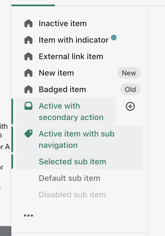
Active and Active hover highlighting:


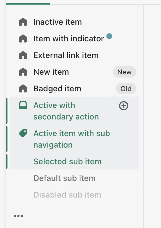
Hover Highlighting (notice the highlight ends just before the secondary action):
Here we can see that the highlight now is uniform across the text of the nav item and the secondary action, similarly to how we have in the admin nav today.
One thing you will notice is that the secondary action spacing is slightly different than before, it is now identical to the left hand spacing of the nav item. This is mainly so that the different highlights can be uniform in the nav now, so they're all aligned. Its a bit difficult to see but the secondary action highlight juts out past the non-secondary action items, so now they are the same width.
How to 🎩
🖥 Local development instructions
🗒 General tophatting guidelines
📄 Changelog guidelines
Copy-paste this code in
playground/Playground.tsx:🎩 checklist
README.mdwith documentation changes