Create Sass color() function migration
#7375
There are no files selected for viewing
This file contains hidden or bidirectional Unicode text that may be interpreted or compiled differently than what appears below. To review, open the file in an editor that reveals hidden Unicode characters.
Learn more about bidirectional Unicode characters
| Original file line number | Diff line number | Diff line change |
|---|---|---|
| @@ -0,0 +1,5 @@ | ||
| --- | ||
| '@shopify/polaris-migrator': minor | ||
| --- | ||
|
|
||
| Add Sass color function migration |
This file contains hidden or bidirectional Unicode text that may be interpreted or compiled differently than what appears below. To review, open the file in an editor that reveals hidden Unicode characters.
Learn more about bidirectional Unicode characters
This file contains hidden or bidirectional Unicode text that may be interpreted or compiled differently than what appears below. To review, open the file in an editor that reveals hidden Unicode characters.
Learn more about bidirectional Unicode characters
| Original file line number | Diff line number | Diff line change |
|---|---|---|
| @@ -0,0 +1,133 @@ | ||
| /* | ||
| * See the legacy Sass API file for the original color palette | ||
| * documentation/guides/legacy-polaris-v8-public-api.scss | ||
| */ | ||
|
|
||
| export interface ColorHue { | ||
| [hue: string]: ColorValue; | ||
| } | ||
|
|
||
| export interface ColorValue { | ||
| [value: string]: string; | ||
| } | ||
|
||
|
|
||
| export const colorMap = { | ||
| blue: { | ||
| dark: '--p-interactive-hovered', | ||
| base: '--p-interactive', | ||
| }, | ||
| green: { | ||
| dark: '--p-text-success', | ||
| base: '--p-text-success', | ||
| }, | ||
| yellow: { | ||
| dark: '--p-text-warning', | ||
| base: '--p-text-warning', | ||
| }, | ||
| red: { | ||
| dark: '--p-text-critical', | ||
| base: '--p-text-critical', | ||
| }, | ||
| ink: { | ||
| base: '--p-text', | ||
| light: '--p-text-subdued', | ||
| lighter: '--p-text-subdued', | ||
| lightest: '--p-text-subdued', | ||
| }, | ||
| sky: { | ||
| dark: '--p-text-subdued-on-dark', | ||
| base: '--p-text-on-dark', | ||
| light: '--p-text-on-dark', | ||
| lighter: '--p-text-on-dark', | ||
| }, | ||
| black: { | ||
| base: '--p-text', | ||
| }, | ||
| white: { | ||
| base: '--p-text-on-dark', | ||
| }, | ||
| }; | ||
|
|
||
| export const backgroundColorMap = { | ||
| green: { | ||
| light: '--p-surface-success', | ||
| lighter: '--p-surface-success-subdued', | ||
| }, | ||
| yellow: { | ||
| light: '--p-surface-warning', | ||
| lighter: '--p-surface-warning-subdued', | ||
| }, | ||
| red: { | ||
| light: '--p-surface-critical', | ||
| lighter: '--p-surface-critical-subdued', | ||
| }, | ||
| ink: { | ||
| dark: '--p-surface-dark', | ||
| base: '--p-surface-neutral-subdued-dark', | ||
| }, | ||
| sky: { | ||
| base: '--p-surface-neutral', | ||
| light: '--p-surface-neutral-subdued', | ||
| lighter: '--p-surface-subdued', | ||
| }, | ||
| black: { | ||
| base: '--p-surface-dark', | ||
| }, | ||
| white: { | ||
| base: '--p-surface', | ||
| }, | ||
| }; | ||
|
|
||
| export const borderColorMap = { | ||
| green: { | ||
| dark: '--p-border-success', | ||
| base: '--p-border-success', | ||
| light: '--p-border-success-subdued', | ||
| lighter: '--p-border-success-subdued', | ||
| }, | ||
| yellow: { | ||
| dark: '--p-border-warning', | ||
| base: '--p-border-warning', | ||
| light: '--p-border-warning-disabled', | ||
| lighter: '--p-border-warning-subdued', | ||
| }, | ||
| red: { | ||
| dark: '--p-border-critical', | ||
| base: '--p-border-critical', | ||
| light: '--p-border-critical-subdued', | ||
| lighter: '--p-border-critical-subdued', | ||
| }, | ||
| ink: { | ||
| lightest: '--p-border', | ||
| }, | ||
| sky: { | ||
| light: '--p-border-subdued', | ||
| }, | ||
| }; | ||
|
|
||
| export const fillColorMap = { | ||
| green: { | ||
| dark: '--p-icon-success', | ||
| base: '--p-icon-success', | ||
| }, | ||
| yellow: { | ||
| dark: '--p-icon-warning', | ||
| base: '--p-icon-warning', | ||
| }, | ||
| red: { | ||
| dark: '--p-icon-critical', | ||
| base: '--p-icon-critical', | ||
| }, | ||
| ink: { | ||
| base: '--p-icon', | ||
| light: '--p-icon', | ||
| lighter: '--p-icon-subdued', | ||
| lightest: '--p-icon-disabled', | ||
| }, | ||
| black: { | ||
| base: '--p-icon', | ||
| }, | ||
| white: { | ||
| base: '--p-icon-on-dark', | ||
| }, | ||
| }; | ||
This file contains hidden or bidirectional Unicode text that may be interpreted or compiled differently than what appears below. To review, open the file in an editor that reveals hidden Unicode characters.
Learn more about bidirectional Unicode characters
| Original file line number | Diff line number | Diff line change | ||||||||||||||||||||||||||||||||
|---|---|---|---|---|---|---|---|---|---|---|---|---|---|---|---|---|---|---|---|---|---|---|---|---|---|---|---|---|---|---|---|---|---|---|
| @@ -0,0 +1,135 @@ | ||||||||||||||||||||||||||||||||||
| import type {FileInfo, API, Options} from 'jscodeshift'; | ||||||||||||||||||||||||||||||||||
| import postcss, {Plugin} from 'postcss'; | ||||||||||||||||||||||||||||||||||
| import valueParser from 'postcss-value-parser'; | ||||||||||||||||||||||||||||||||||
| import {colors as tokenColors} from '@shopify/polaris-tokens'; | ||||||||||||||||||||||||||||||||||
|
|
||||||||||||||||||||||||||||||||||
| import { | ||||||||||||||||||||||||||||||||||
| NamespaceOptions, | ||||||||||||||||||||||||||||||||||
| namespace, | ||||||||||||||||||||||||||||||||||
| isSassFunction, | ||||||||||||||||||||||||||||||||||
| getFunctionArgs, | ||||||||||||||||||||||||||||||||||
| stripQuotes, | ||||||||||||||||||||||||||||||||||
| StopWalkingFunctionNodes, | ||||||||||||||||||||||||||||||||||
| } from '../../utilities/sass'; | ||||||||||||||||||||||||||||||||||
| import {isKeyOf} from '../../utilities/type-guards'; | ||||||||||||||||||||||||||||||||||
|
|
||||||||||||||||||||||||||||||||||
| import { | ||||||||||||||||||||||||||||||||||
| backgroundColorMap, | ||||||||||||||||||||||||||||||||||
| borderColorMap, | ||||||||||||||||||||||||||||||||||
| colorMap, | ||||||||||||||||||||||||||||||||||
| fillColorMap, | ||||||||||||||||||||||||||||||||||
| } from './color-maps'; | ||||||||||||||||||||||||||||||||||
|
|
||||||||||||||||||||||||||||||||||
| const tokenColorsKeys = Object.keys(tokenColors); | ||||||||||||||||||||||||||||||||||
| const maps = { | ||||||||||||||||||||||||||||||||||
| colorMap, | ||||||||||||||||||||||||||||||||||
| backgroundColorMap, | ||||||||||||||||||||||||||||||||||
| borderColorMap, | ||||||||||||||||||||||||||||||||||
| fillColorMap, | ||||||||||||||||||||||||||||||||||
| }; | ||||||||||||||||||||||||||||||||||
| const propertyMap: {[key: string]: keyof typeof maps} = { | ||||||||||||||||||||||||||||||||||
| color: 'colorMap', | ||||||||||||||||||||||||||||||||||
| background: 'backgroundColorMap', | ||||||||||||||||||||||||||||||||||
| 'background-color': 'backgroundColorMap', | ||||||||||||||||||||||||||||||||||
| border: 'borderColorMap', | ||||||||||||||||||||||||||||||||||
| 'border-color': 'borderColorMap', | ||||||||||||||||||||||||||||||||||
| fill: 'fillColorMap', | ||||||||||||||||||||||||||||||||||
| }; | ||||||||||||||||||||||||||||||||||
|
||||||||||||||||||||||||||||||||||
| const propertyMap: {[key: string]: keyof typeof maps} = { | |
| color: 'colorMap', | |
| background: 'backgroundColorMap', | |
| 'background-color': 'backgroundColorMap', | |
| border: 'borderColorMap', | |
| 'border-color': 'borderColorMap', | |
| fill: 'fillColorMap', | |
| }; | |
| const propertyMaps = { | |
| color: colorMap, | |
| background: backgroundColorMap, | |
| 'background-color': backgroundColorMap, | |
| border: borderColorMap, | |
| 'border-color': borderColorMap, | |
| fill: fillColorMap, | |
| }; |
question: Is it possible to add the maps here and remove the intermediary propertyMapKey access?
Outdated
Member
There was a problem hiding this comment.
Light suggestion to use the createVar util from Polaris tokens:
Object.keys(colorsTokenGroup).map(createVar).join('|')
e.g.
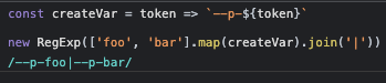
This file contains hidden or bidirectional Unicode text that may be interpreted or compiled differently than what appears below. To review, open the file in an editor that reveals hidden Unicode characters.
Learn more about bidirectional Unicode characters
| Original file line number | Diff line number | Diff line change |
|---|---|---|
| @@ -0,0 +1,79 @@ | ||
| .my-class { | ||
| // color | ||
| color: color('blue'); | ||
| color: color('blue', 'dark'); | ||
| color: color('green'); | ||
| color: color('green', 'dark'); | ||
| color: color('yellow'); | ||
| color: color('yellow', 'dark'); | ||
| color: color('red'); | ||
| color: color('red', 'dark'); | ||
| color: color('ink'); | ||
| color: color('ink', 'light'); | ||
| color: color('ink', 'lighter'); | ||
| color: color('ink', 'lightest'); | ||
| color: color('sky'); | ||
| color: color('sky', 'dark'); | ||
| color: color('sky', 'light'); | ||
| color: color('sky', 'lighter'); | ||
| color: color('black'); | ||
| color: color('white'); | ||
|
|
||
| // background | ||
| background-color: color('green', 'light'); | ||
| background-color: color('green', 'lighter'); | ||
| background-color: color('yellow', 'light'); | ||
| background-color: color('yellow', 'lighter'); | ||
| background-color: color('red', 'light'); | ||
| background-color: color('red', 'lighter'); | ||
| background-color: color('ink'); | ||
| background-color: color('ink', 'dark'); | ||
| background-color: color('sky'); | ||
| background-color: color('sky', 'light'); | ||
| background-color: color('sky', 'lighter'); | ||
| background-color: color('black'); | ||
| background-color: color('white'); | ||
|
|
||
| // border | ||
| border-color: color('green', 'dark'); | ||
| border-color: color('green'); | ||
| border-color: color('green', 'light'); | ||
| border-color: color('green', 'lighter'); | ||
| border-color: color('yellow', 'dark'); | ||
| border-color: color('yellow'); | ||
| border-color: color('yellow', 'light'); | ||
| border-color: color('yellow', 'lighter'); | ||
| border-color: color('red', 'dark'); | ||
| border-color: color('red'); | ||
| border-color: color('red', 'light'); | ||
| border-color: color('red', 'lighter'); | ||
| border-color: color('ink', 'lightest'); | ||
| border-color: color('sky', 'light'); | ||
|
|
||
| // fill | ||
| fill: color('green', 'dark'); | ||
| fill: color('green'); | ||
| fill: color('yellow', 'dark'); | ||
| fill: color('yellow'); | ||
| fill: color('red', 'dark'); | ||
| fill: color('red'); | ||
| fill: color('ink'); | ||
| fill: color('ink', 'light'); | ||
| fill: color('ink', 'lighter'); | ||
| fill: color('ink', 'lightest'); | ||
| fill: color('black'); | ||
| fill: color('white'); | ||
|
|
||
| // Remove color() fallbacks | ||
| color: var(--p-text, color('white')); | ||
|
|
||
| // Handle declarations with multiple values | ||
| border: var(--p-border-width-1) solid color('ink', 'lightest'); | ||
| background: border-box color('sky', 'light'); | ||
|
|
||
| // Skip color() with a for-background argument | ||
| color: color('ink', 'lighter', #f2ece4); | ||
|
|
||
| // Skip replacing color() within a function | ||
| background: rgba(color('black'), 0.5); | ||
| } |
Oops, something went wrong.
Add this suggestion to a batch that can be applied as a single commit.
This suggestion is invalid because no changes were made to the code.
Suggestions cannot be applied while the pull request is closed.
Suggestions cannot be applied while viewing a subset of changes.
Only one suggestion per line can be applied in a batch.
Add this suggestion to a batch that can be applied as a single commit.
Applying suggestions on deleted lines is not supported.
You must change the existing code in this line in order to create a valid suggestion.
Outdated suggestions cannot be applied.
This suggestion has been applied or marked resolved.
Suggestions cannot be applied from pending reviews.
Suggestions cannot be applied on multi-line comments.
Suggestions cannot be applied while the pull request is queued to merge.
Suggestion cannot be applied right now. Please check back later.
Uh oh!
There was an error while loading. Please reload this page.