[Layout foundations] Add alpha Box component
#7000
Conversation
size-limit report 📦
|
 laurkim
force-pushed
the
lo/add-box-component
branch
2 times, most recently
from
laurkim
force-pushed
the
lo/add-box-component
branch
2 times, most recently
from
9c6f853 to
6e8f158
Compare
laurkim
changed the title
Box componentBox component
 laurkim
force-pushed
the
lo/add-box-component
branch
from
laurkim
force-pushed
the
lo/add-box-component
branch
from
42f8403 to
13b0d4e
Compare
laurkim
changed the title
Box componentBox component
Co-authored-by: Aaron Casanova <[email protected]>
Including the `margin/padding` property was causing overrides when combining with `marginTop` or `paddingLeft`, for example.

Co-authored-by: Aveline Thelen <[email protected]>
Co-authored-by: Alex Page <[email protected]>
laurkim
force-pushed
the
lo/add-box-component
branch
from
456480e to
20380ce
Compare
|
Example usage of Copy-paste this code in
|
laurkim
changed the title
Box componentBox component
| shadow?: DepthTokenScale; | ||
| } | ||
|
|
||
| type PolymorphicBox = Polymorphic.ForwardRefComponent<'div', BoxBaseProps>; |
There was a problem hiding this comment.
Would we want to start with a more opinionated list? Then add flexibility later?
There was a problem hiding this comment.
I originally tried building Box out that way but was running into a lot of TS errors. I can revisit and see if I can get it working without @radix-ui/react-polymorphic package if we prefer that approach?
There was a problem hiding this comment.
I think initially if we can get this working without allowing all the HTML elements that would be ace.
 kyledurand
left a comment
kyledurand
left a comment
kyledurand
left a comment
There was a problem hiding this comment.
This looking good so far! One other thing I noticed is that I can make a box with a dark background but can't change the text color. So the text gets lost. Can that be addressed within the Text component? (I haven't looked at it recently)
@kyledurand The |
I didn't try the text component but I think we should allow the same colors we do for background in a color prop for Box. Especially if we're limiting text to just those four variants. |
|
Here are the two issues I've created to track the work discussed on this PR. I'll create subsequent PRs to address them. |
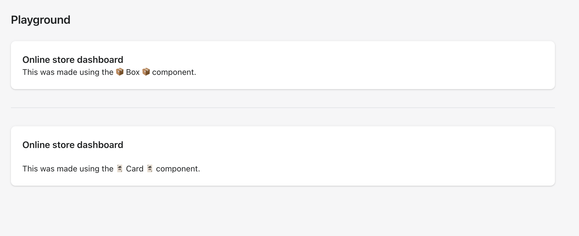
### WHY are these changes introduced?

Resolves #6892.

<!--
  Context about the problem that’s being addressed.
-->

### WHAT is this pull request doing?

Adds a new alpha `Box` component.
    <details>
      <summary>Using `Box` to recreate the `Card` component</summary>
      <img src="https://user-images.githubusercontent.com/26749317/187263883-0e8194f5-fbd8-4227-bdf5-66e868ffa573.png" alt="Using `Box` to recreate the `Card` component">
    </details>

### How to 🎩

🖥 [Local development instructions](https://github.com/Shopify/polaris/blob/main/README.md#local-development)
🗒 [General tophatting guidelines](https://github.com/Shopify/polaris/blob/main/documentation/Tophatting.md)
📄 [Changelog guidelines](https://github.com/Shopify/polaris/blob/main/.github/CONTRIBUTING.md#changelog)

<!--
  Give as much information as needed to experiment with the component
  in the playground.
-->

<details>
<summary>Copy-paste this code in <code>playground/Playground.tsx</code>:</summary>

```jsx
import React from 'react';

import {Page, Card, Text, Box} from '../src';

export function Playground() {
  return (
    <Page title="Playground">
      {/* Add the code you want to test in here */}
      <Box
        background="surface"
        borderRadius="radius-2"
        padding="5"
        shadow="card"
      >
        <Text as="h2" variant="headingMd">
          Online store dashboard
        </Text>
        <Text as="p" variant="bodyMd">
          This was made using the 📦 Box 📦 component.
        </Text>
      </Box>
      <div
        style={{
          borderTop: 'var(--p-border-divider)',
          marginTop: 'var(--p-space-8)',
          marginBottom: 'var(--p-space-8)',
        }}
      ></div>
      <Card title="Online store dashboard" sectioned>
        <Text as="p" variant="bodyMd">
          This was made using the 🃏 Card 🃏 component.
        </Text>
      </Card>
    </Page>
  );
}
```

</details>

### 🎩 checklist

- [ ] Tested on [mobile](https://github.com/Shopify/polaris/blob/main/documentation/Tophatting.md#cross-browser-testing)
- [ ] Tested on [multiple browsers](https://help.shopify.com/en/manual/shopify-admin/supported-browsers)
- [ ] Tested for [accessibility](https://github.com/Shopify/polaris/blob/main/documentation/Accessibility%20testing.md)
- [ ] Updated the component's `README.md` with documentation changes
- [ ] [Tophatted documentation](https://github.com/Shopify/polaris/blob/main/documentation/Tophatting%20documentation.md) changes in the style guide

Co-authored-by: Aaron Casanova <[email protected]>
Co-authored-by: Aveline Thelen <[email protected]>
Co-authored-by: Alex Page <[email protected]>
Co-authored-by: Kyle Durand <[email protected]>
Resolves #6892.

<!--
  Context about the problem that’s being addressed.
-->

Adds a new alpha `Box` component.
    <details>
      <summary>Using `Box` to recreate the `Card` component</summary>
      <img src="https://user-images.githubusercontent.com/26749317/187263883-0e8194f5-fbd8-4227-bdf5-66e868ffa573.png" alt="Using `Box` to recreate the `Card` component">
    </details>

🖥 [Local development instructions](https://github.com/Shopify/polaris/blob/main/README.md#local-development)
🗒 [General tophatting guidelines](https://github.com/Shopify/polaris/blob/main/documentation/Tophatting.md)
📄 [Changelog guidelines](https://github.com/Shopify/polaris/blob/main/.github/CONTRIBUTING.md#changelog)

<!--
  Give as much information as needed to experiment with the component
  in the playground.
-->

<details>
<summary>Copy-paste this code in <code>playground/Playground.tsx</code>:</summary>

```jsx
import React from 'react';

import {Page, Card, Text, Box} from '../src';

export function Playground() {
  return (
    <Page title="Playground">
      {/* Add the code you want to test in here */}
      <Box
        background="surface"
        borderRadius="radius-2"
        padding="5"
        shadow="card"
      >
        <Text as="h2" variant="headingMd">
          Online store dashboard
        </Text>
        <Text as="p" variant="bodyMd">
          This was made using the 📦 Box 📦 component.
        </Text>
      </Box>
      <div
        style={{
          borderTop: 'var(--p-border-divider)',
          marginTop: 'var(--p-space-8)',
          marginBottom: 'var(--p-space-8)',
        }}
      ></div>
      <Card title="Online store dashboard" sectioned>
        <Text as="p" variant="bodyMd">
          This was made using the 🃏 Card 🃏 component.
        </Text>
      </Card>
    </Page>
  );
}
```

</details>

- [ ] Tested on [mobile](https://github.com/Shopify/polaris/blob/main/documentation/Tophatting.md#cross-browser-testing)
- [ ] Tested on [multiple browsers](https://help.shopify.com/en/manual/shopify-admin/supported-browsers)
- [ ] Tested for [accessibility](https://github.com/Shopify/polaris/blob/main/documentation/Accessibility%20testing.md)
- [ ] Updated the component's `README.md` with documentation changes
- [ ] [Tophatted documentation](https://github.com/Shopify/polaris/blob/main/documentation/Tophatting%20documentation.md) changes in the style guide

Co-authored-by: Aaron Casanova <[email protected]>
Co-authored-by: Aveline Thelen <[email protected]>
Co-authored-by: Alex Page <[email protected]>
Co-authored-by: Kyle Durand <[email protected]>
3 participants
WHY are these changes introduced?
Resolves #6892.
WHAT is this pull request doing?
Adds a new alpha
Boxcomponent.Using
Boxto recreate theCardcomponentHow to 🎩
🖥 Local development instructions
🗒 General tophatting guidelines
📄 Changelog guidelines
Copy-paste this code in
playground/Playground.tsx:🎩 checklist
README.mdwith documentation changes