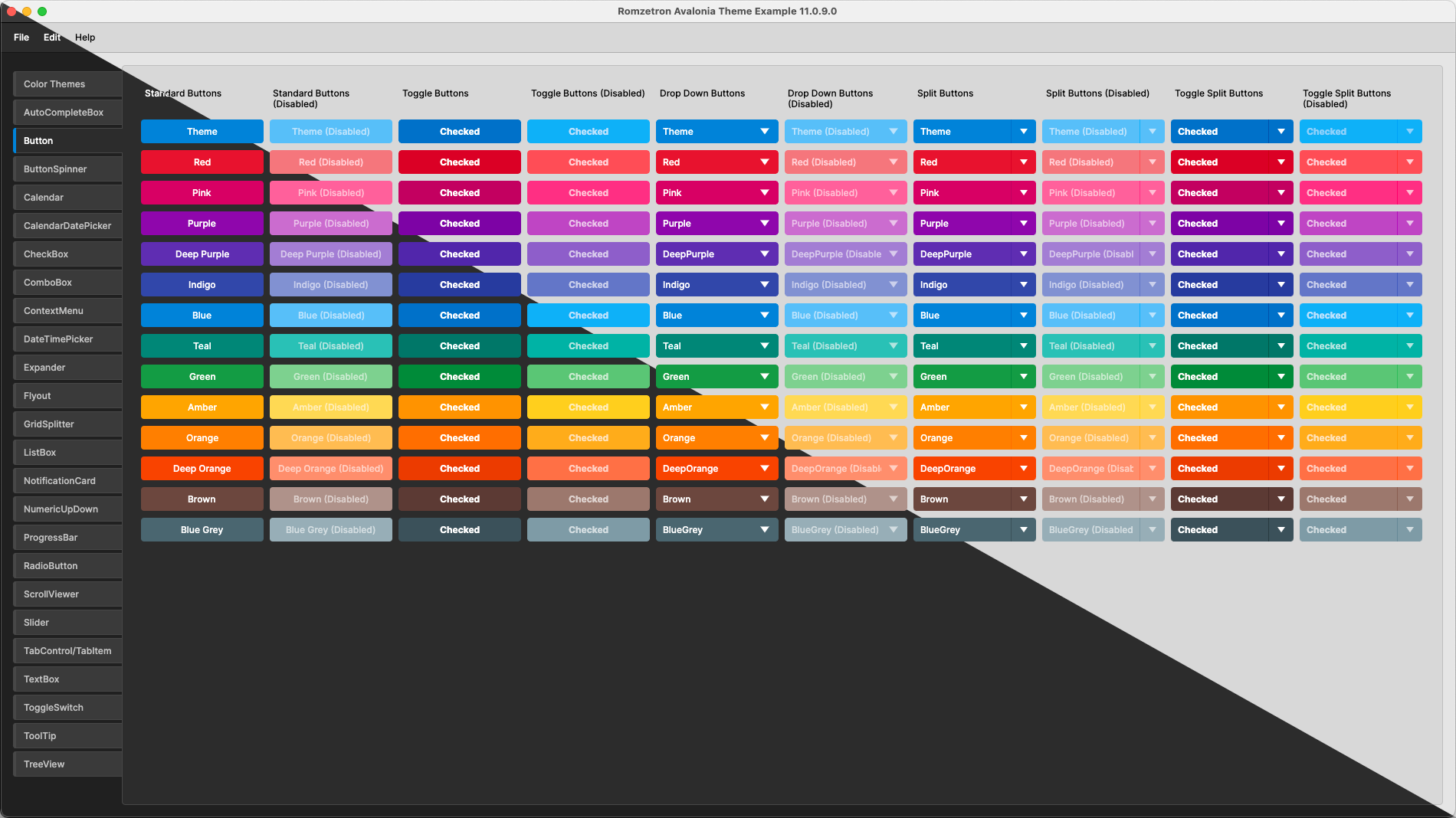
Romzetron.Avalonia is a UI theme library designed to work with the Avalonia cross-platform UI framework. Light and dark modes are supported, and one of several color themes can be chosen that apply to most controls. Some of the controls can have their color set explicitly to override the theme color.
The Romzetron.Avalonia theme library is available on nuget.org and can be added to your project with using the Nuget Package Manager within Visual Studio or Jetbrains Rider, or with the following terminal command:
dotnet add package Romzetron.AvaloniaThe theme can be added to an application by modifying App.axaml to add <RomzetronTheme /> to the <Application.Styles> tag. The default color theme is Blue.
<Application xmlns="https://github.com/avaloniaui">

    <Application.Styles>
        <RomzetronTheme />  <!-- Theme is added here. -->
    </Application.Styles>

</Application>The color theme can be set application wide on startup by setting the ColorTheme property.
<Application.Styles>
    <RomzetronTheme ColorTheme="Green" />
</Application.Styles>
The color theme can be set to one of the following values.
- Red
- Pink
- Purple
- DeepPurple
- Indigo
- Blue
- Teal
- Green
- Amber
- Orange
- DeepOrange
- Brown
- BlueGrey
In order to set the color theme during runtime, the following method can be added to a view model to find the RomzetronTheme style.
private static RomzetronTheme? GetRomzetronAvaloniaTheme()
{
    // Get a reference to the current application.
    if (Application.Current is not App app)
        return null;

    // Loop through the styles in the application.
    foreach (var style in app.Styles)
    {
        // Return RomzetronTheme if it is found.
        if (style is RomzetronTheme theme)
            return theme;
    }

    return null;
}
This method is then used to change the color theme dynamically during runtime. The following example property demonstrates how to use the method.
private ColorTheme _selectedColorTheme;
public ColorTheme SelectedColorTheme
    {
        get => _selectedColorTheme;
        set
        {
            this.RaiseAndSetIfChanged(ref _selectedColorTheme, value);

            // Use the helper method to get a reference to the RomzetronTheme style.
            var theme = GetRomzetronAvaloniaTheme();

            // Set the color theme if the RomzetronTheme style is found.
            if (theme is not null)
                theme.ColorTheme = value;
        }
}Note: It would be preferable to change the color theme at runtime using a
Bindingto adhere to the MVVM rules, but a workable solution has not been found... yet.
Alternatively, the theme can be applied to the application in code behind by modifying App.axaml.cs and creating an instance of the RomzetronTheme style that can be added to the list of App styles. Doing it this way allows the SetColorTheme() method to be accessed directly through the code behind.
public class App : Application
{
    // Create instance of the theme library.
    private readonly RomzetronTheme _theme = new();

    public override void Initialize()
    {
        AvaloniaXamlLoader.Load(this);

        // Get the current application instance.
        var app = (App) Current!;

        // Add theme to the application styles.
        app.Styles.Add(_theme);
    }

    // Optional function that can be used to change the theme color at runtime.
    public void SetTheme(ColorTheme theme)
    {
        _theme.SelectColorTheme(theme);
    }

    public override void OnFrameworkInitializationCompleted()
    {
        if (ApplicationLifetime is IClassicDesktopStyleApplicationLifetime desktop)
            desktop.MainWindow = new MainWindow();

        base.OnFrameworkInitializationCompleted();
    }
}Some controls have the ability to have their color set explicitly, which overrides the application color theme. This can be achieved by adding a dependency property to the control that sets the desired color.
<!-- Setting the Theme.ColorTheme property overrides the application color theme, -->
<!-- and in this example forces the button color to red. -->
<Button
    Theme.ColorTheme="Red"
    Content="Red Button" />
The following controls support this feature, with more possibly being added in the future.
- CheckBox
- CircularProgress
- Button
- DropDownButton
- ProgressBar
- RadioButton
- Slider
- SplitButton
- TabItem
- TabStripItem
- ToggleButton
- ToggleSwitch
Romzetron.Avalonia supports dark and light variations that can be set explicitly, or to follow the system theme. Set the RequestedThemeVariant tag in App.axaml to one of the following values.
<Application
    xmlns="https://github.com/avaloniaui"
    xmlns:x="http://schemas.microsoft.com/winfx/2006/xaml"
    xmlns:local="using:Romzetron.Avalonia.Example"
    x:Class="Romzetron.Avalonia.Example.App"
    RequestedThemeVariant="Default">  <!-- Set the requested theme variant to Light, Dark, or Default (system theme). -->

    <Application.DataTemplates>
        <local:ViewLocator />
    </Application.DataTemplates>

</Application>An example application is included in the solution that demonstrates the look & feel of most of the controls. I may add more detail in the front end of the example application that explains how to customize the controls, but for now the best method to figure out how things work is to look at the source code.


