feat(web-shell): show context usage as a mini progress pill in the status bar - #8794
Conversation


 qwen-code-ci-bot
left a comment
qwen-code-ci-bot
left a comment
qwen-code-ci-bot
left a comment
There was a problem hiding this comment.
Thanks for the PR, @wenshao!
The description doesn't follow the PR template — all of the required sections are missing:
## What this PR does## Why it's needed## Reviewer Test Plan— with### How to verify,### Evidence (Before & After), and### Tested on## Risk & Scope## Linked Issues- a Chinese translation inside
<details><summary>中文说明</summary>
Could you update the PR body to fill in the template? The summary and test plan content you already wrote maps cleanly onto it. One section matters especially here: Evidence (Before & After). This is a user-visible status bar change, and the screenshots section currently says real-stack verification is still in progress — before/after screenshots (or a short recording) of the pill, ideally including the warning/error color states above 60% / 80%, would make this much easier to review.
中文说明
感谢提交 PR,@wenshao!
PR 描述没有使用 PR 模板,所有必填章节都缺失:
## What this PR does## Why it's needed## Reviewer Test Plan——包含### How to verify、### Evidence (Before & After)、### Tested on## Risk & Scope## Linked Issues<details><summary>中文说明</summary>中的中文翻译
请更新 PR 描述,填写模板。你已经写好的 summary 和 test plan 内容可以直接对应填进去。其中 Evidence (Before & After) 部分尤其重要:这是用户可见的状态栏改动,而 Screenshots 部分目前写着真实环境验证仍在进行中——补上 before/after 截图(或短视频),最好包含 60% / 80% 以上时的 warning/error 颜色状态,会让 review 容易得多。
— Qwen Code · qwen3.8-max
🖼️ web-shell visual previewRendered against a mock daemon (no real backend): the PR base vs this PR head Screenshots · before / afterℹ️ No screenshot changed against the PR base — but this PR edits 7 render-shaping files:
Either the change has no visual effect (logic, plumbing, a state the scenarios never reach), or no scenario renders this UI — in which case the preview cannot see it, and an empty result is a coverage gap rather than a clean bill of health. To make it visible, add a scenario to Full-resolution recordings (.webm) are attached to the workflow run. — Qwen Code · web-shell visuals |

Code Coverage Summary
CLI Package - Full Text ReportCore Package - Full Text ReportFor detailed HTML reports, please see the 'coverage-reports-22.x-ubuntu-latest' artifact from the main CI run. |

…atus bar

Replace the plain "X% context used" text in the status bar with a compact
pill: a 52px progress bar plus the bare percentage. The fill follows the
same thresholds as the /context panel (>60% warning, >80% error), the fill
width caps at 100% while the number keeps reporting overflow, and the full
wording moves to aria-label so the accessible name is unchanged. Clicking
still opens the /context breakdown.

986fb96 to
e226bf9
Compare
|
Please do not rebase or force-push to an active PR as it invalidates existing review comments. Note for future reference, the bots always squash all changes into a single commit automatically as part of the integration. 中文请勿对活跃的 PR 执行 rebase 或 force-push,因为这会使已有的评审评论失效。另外,供日后参考:作为集成流程的一部分,机器人始终会自动将所有改动压缩(squash)为单个提交。 |
The ui normalizer had no case for the usage_update session update, so the
frame fell through to the debug default and every model round appended a
raw-JSON bullet to the assistant turn in the web UI. Context occupancy is
surfaced by the status bar pill; the transcript drops the frame like
current_mode_update.

|
整体方向赞同:
建议补充测试覆盖:indicator 位于 voice action 之前; 当前 SDK 对 |

 doudouOUC
left a comment
doudouOUC
left a comment
doudouOUC
left a comment
There was a problem hiding this comment.
Reviewed — no blockers. Suggestions are inline.
中文说明
已审查——无阻断问题。 建议见行内评论。
— deepseek-v4-flash via Qwen Code /review (v0.21.8)
| const contextFillClass = | ||
| pct > 80 | ||
| ? `${styles.contextFill} ${styles.contextFillError}` | ||
| : pct > 60 | ||
| ? `${styles.contextFill} ${styles.contextFillWarning}` | ||
| : styles.contextFill; |
There was a problem hiding this comment.
[Suggestion] Threshold constants (80/60) duplicated between StatusBar.tsx and ContextUsageMessage.tsx — Failure scenario: A developer changes the thresholds in ContextUsageMessage.tsx (e.g., to 85/65) but forgets to update StatusBar.tsx. The status bar pill and the /context panel then show different colors for the same usage percentage — a silently inconsistent UX. The comment is a hint, not a compile-time or lint-time guard, so no tool catches the drift.
| const contextFillClass = | |
| pct > 80 | |
| ? `${styles.contextFill} ${styles.contextFillError}` | |
| : pct > 60 | |
| ? `${styles.contextFill} ${styles.contextFillWarning}` | |
| : styles.contextFill; | |
| const contextFillClass = | |
| pct > CONTEXT_ERROR_THRESHOLD | |
| ? `${styles.contextFill} ${styles.contextFillError}` | |
| : pct > CONTEXT_WARNING_THRESHOLD | |
| ? `${styles.contextFill} ${styles.contextFillWarning}` | |
| : styles.contextFill; |
中文说明
建议: 阈值常量(80/60)在 StatusBar.tsx 和 ContextUsageMessage.tsx 之间重复。
失败场景: 开发者在 ContextUsageMessage.tsx 中修改阈值(例如改到 85/65)但忘记更新 StatusBar.tsx。状态栏胶囊和 /context 面板在同一百分比下显示不同颜色——无声的视觉不一致。注释只是提示,不是编译期或 lint 期保障,没有任何工具能检测到漂移。
建议修复: 将阈值提取到共享模块,让两个组件共同引用。
— deepseek-v4-flash via Qwen Code /review (v0.21.8)
There was a problem hiding this comment.
此评论针对的 StatusBar pill 实现已按 maintainer review 整体移除(9934b1f 起指示改为 composer 工具栏圆环,StatusBar 还原为 main 版本)。对应关切在新实现中已覆盖:阈值常量共享(utils/contextUsage.ts)、60/80 双侧边界用例、0/未知窗口不渲染用例、完整 aria-label 与 tooltip。
| it('escalates the fill color at the /context panel thresholds', () => { | ||
| mockConnection.contextWindow = 100; | ||
|
|
||
| mockConnection.tokenCount = 61; | ||
| mount(); | ||
| let fill = contextButton()!.querySelector<HTMLSpanElement>('span > span')!; | ||
| expect(fill.className).toContain('contextFillWarning'); | ||
| act(() => root!.unmount()); | ||
| container!.remove(); | ||
|
|
||
| mockConnection.tokenCount = 81; | ||
| mount(); | ||
| fill = contextButton()!.querySelector<HTMLSpanElement>('span > span')!; | ||
| expect(fill.className).toContain('contextFillError'); |
There was a problem hiding this comment.
[Suggestion] Missing boundary value tests for fill color thresholds — Failure scenario: Someone changes pct > 60 to pct >= 60 (or pct > 80 to pct >= 80). The existing tests at 61 and 81 pass unchanged. At the boundary, 60.0% now incorrectly shows warning colour and 80.0% shows error colour. The /context panel's ContextUsageMessage uses strict >, so the two components drift apart.
| it('escalates the fill color at the /context panel thresholds', () => { | |
| mockConnection.contextWindow = 100; | |
| mockConnection.tokenCount = 61; | |
| mount(); | |
| let fill = contextButton()!.querySelector<HTMLSpanElement>('span > span')!; | |
| expect(fill.className).toContain('contextFillWarning'); | |
| act(() => root!.unmount()); | |
| container!.remove(); | |
| mockConnection.tokenCount = 81; | |
| mount(); | |
| fill = contextButton()!.querySelector<HTMLSpanElement>('span > span')!; | |
| expect(fill.className).toContain('contextFillError'); | |
| it('keeps normal fill colour at exactly 60%', () => { | |
| mockConnection.contextWindow = 100; | |
| mockConnection.tokenCount = 60; | |
| mount(); | |
| const fill = contextButton()!.querySelector<HTMLSpanElement>('span > span')!; | |
| expect(fill.className).toContain('contextFill'); | |
| expect(fill.className).not.toContain('Warning'); | |
| }); | |
| it('keeps warning fill colour at exactly 80%', () => { | |
| mockConnection.contextWindow = 100; | |
| mockConnection.tokenCount = 80; | |
| mount(); | |
| const fill = contextButton()!.querySelector<HTMLSpanElement>('span > span')!; | |
| expect(fill.className).toContain('contextFillWarning'); | |
| expect(fill.className).not.toContain('Error'); | |
| }); |
中文说明
建议: 阈值颜色切换缺少边界值测试。
失败场景: 有人将 pct > 60 改为 pct >= 60(或 pct > 80 改为 pct >= 80)。现有测试在 61 和 81 处仍然通过。但在边界处,60.0% 会错误地显示警告色,80.0% 会显示错误色。/context 面板的 ContextUsageMessage 使用严格 >,两个组件会不一致。
建议修复: 添加两个边界值测试用例:精确在 60% 时显示普通色,精确在 80% 时显示警告色。
— deepseek-v4-flash via Qwen Code /review (v0.21.8)
There was a problem hiding this comment.
此评论针对的 StatusBar pill 实现已按 maintainer review 整体移除(9934b1f 起指示改为 composer 工具栏圆环,StatusBar 还原为 main 版本)。对应关切在新实现中已覆盖:阈值常量共享(utils/contextUsage.ts)、60/80 双侧边界用例、0/未知窗口不渲染用例、完整 aria-label 与 tooltip。
| it('stays hidden until a token count arrives', () => { | ||
| mockConnection.contextWindow = 1000; | ||
| mockConnection.tokenCount = 0; | ||
| mount(); | ||
| expect(contextButton()).toBeNull(); |
There was a problem hiding this comment.
[Suggestion] No test for contextWindow = 0, tokenCount > 0 state — Failure scenario: If someone accidentally removes the contextWindow > 0 check (e.g., refactoring to (tokenCount > 0)), the button would appear when contextWindow=0, tokenCount>0, showing "0.0%". The existing tokenCount=0 test would still pass. The correct behaviour is to hide the button when no context window size is known — a "0.0%" pill is misleading without a known capacity.
| it('stays hidden until a token count arrives', () => { | |
| mockConnection.contextWindow = 1000; | |
| mockConnection.tokenCount = 0; | |
| mount(); | |
| expect(contextButton()).toBeNull(); | |
| it('stays hidden when context window is unknown even if tokens arrive', () => { | |
| mockConnection.contextWindow = 0; | |
| mockConnection.tokenCount = 100; | |
| mount(); | |
| expect(contextButton()).toBeNull(); | |
| }); |
中文说明
建议: 缺少 contextWindow=0, tokenCount>0 状态下的测试。
失败场景: 如果重构时不小心移除了 contextWindow > 0 检查,按钮会在 contextWindow=0 时显示,展示 "0.0%"——在上下文窗口大小未知时,这个百分比是有误导性的。现有 tokenCount=0 的测试仍然会通过。
建议修复: 添加测试用例,验证 contextWindow=0 时按钮保持隐藏。
— deepseek-v4-flash via Qwen Code /review (v0.21.8)
There was a problem hiding this comment.
此评论针对的 StatusBar pill 实现已按 maintainer review 整体移除(9934b1f 起指示改为 composer 工具栏圆环,StatusBar 还原为 main 版本)。对应关切在新实现中已覆盖:阈值常量共享(utils/contextUsage.ts)、60/80 双侧边界用例、0/未知窗口不渲染用例、完整 aria-label 与 tooltip。
| <button | ||
| type="button" | ||
| className={styles.contextButton} | ||
| onClick={onShowContext} | ||
| title={t('contextUsage.title')} | ||
| aria-label={t('status.contextUsed', { pct: pctDisplay })} | ||
| > |
There was a problem hiding this comment.
[Suggestion] Missing aria-haspopup on the context button — Failure scenario: A screen-reader user navigating the StatusBar hears "33.8% context used, button" with no indication that activating it opens a dialog. The other interactive buttons in the same bar — all of which open dialogs or listboxes — announce their popup role, making this omission inconsistent.
| <button | |
| type="button" | |
| className={styles.contextButton} | |
| onClick={onShowContext} | |
| title={t('contextUsage.title')} | |
| aria-label={t('status.contextUsed', { pct: pctDisplay })} | |
| > | |
| aria-haspopup="dialog" | |
| aria-label={t('status.contextUsed', { pct: pctDisplay })} |
中文说明
建议: 上下文按钮缺少 aria-haspopup 属性。
失败场景: 屏幕阅读器用户会听到 "33.8% context used, button",但没有任何提示表明点击它会打开对话框。同一状态栏中的其他交互按钮(设置、模式、快捷键)都声明了弹出角色,此处的遗漏不一致。
建议修复: 添加 aria-haspopup="dialog" 属性。
— deepseek-v4-flash via Qwen Code /review (v0.21.8)
There was a problem hiding this comment.
此评论针对的 StatusBar pill 实现已按 maintainer review 整体移除(9934b1f 起指示改为 composer 工具栏圆环,StatusBar 还原为 main 版本)。对应关切在新实现中已覆盖:阈值常量共享(utils/contextUsage.ts)、60/80 双侧边界用例、0/未知窗口不渲染用例、完整 aria-label 与 tooltip。
| .contextButton { | ||
| display: inline-flex; | ||
| align-items: center; | ||
| padding: 0; | ||
| gap: 7px; | ||
| padding: 2px 8px 2px 6px; | ||
| margin: 0; | ||
| border: none; | ||
| border: 1px solid var(--border); | ||
| border-radius: 999px; |
There was a problem hiding this comment.
[Suggestion] CSS hunk has no visual regression test — Failure scenario: Reverting this CSS hunk on its own leaves every test green. The CSS changes (gap, padding, border-radius, hover states, new classes .contextBar, .contextFill, .contextFillWarning) are purely visual — no test asserts these styles. A future change that accidentally breaks the pill's appearance would not be caught by this test suite.
中文说明
建议: CSS 改动没有视觉回归测试。
失败场景: 单独回退这个 CSS 块不会导致任何测试失败。CSS 的改动(gap、padding、border-radius、悬停状态、新增的 .contextBar、.contextFill、.contextFillWarning 等类)纯粹是视觉层面的——没有测试断言这些样式。未来如果意外破坏了胶囊的外观,这个测试套件无法发现。
建议修复: 添加 Playwright 截图测试来验证胶囊外观,或确认已有 E2E 视觉测试覆盖了此场景。
— deepseek-v4-flash via Qwen Code /review (v0.21.8)
There was a problem hiding this comment.
此评论针对的 StatusBar pill 实现已按 maintainer review 整体移除(9934b1f 起指示改为 composer 工具栏圆环,StatusBar 还原为 main 版本)。对应关切在新实现中已覆盖:阈值常量共享(utils/contextUsage.ts)、60/80 双侧边界用例、0/未知窗口不渲染用例、完整 aria-label 与 tooltip。
… as a ring

Review rework: replace the status-bar pill with a compact circular
progress ring in the composer toolbar's right cluster, immediately left
of the voice actions. The ring keeps the /context thresholds (>60%
warning, >80% error) and the visual 100% cap, hovers a Tooltip with the
full used/total detail (e.g. 53.6k / 1.0M tokens (5.4%)), keeps the full
wording on aria-label, and still opens /context on click. It ships as a
new contextUsage entry in composerToolbarActions so embedders can hide
it, hides while usage or the window is unknown, and follows the
toolbar's mobile-voice hiding. The StatusBar changes are reverted so the
indicator lives in exactly one place.

|
感谢 review,五点已全部按建议落地(9934b1f):
测试按清单补齐 8 个用例:位于 voice 之前、 PR 描述中的截图已更新为圆环形态(浅色三态 + 深色 + tooltip 悬停 + |
|
看了 summary 里的原始截图,Tooltip 箭头确实没有对准圆环中心,不是视觉错觉:尖端大约落在圆环中心左侧 35–40px。 根因不在 建议不要给 context usage 单独加 修改后补一张右侧边界 hover 的截图,确认箭头尖端与 context ring 中心对齐即可。 |
qwen-code-ci-bot
left a comment
qwen-code-ci-bot
left a comment
There was a problem hiding this comment.
Reviewed — no blockers. Suggestions are inline.
中文说明
已审查——无阻断问题。 建议见行内评论。
— qwen3.8-max via Qwen Code /review (v0.21.8)
| const valueClass = | ||
| pct > 80 | ||
| ? `${styles.contextRingValue} ${styles.contextRingValueError}` | ||
| : pct > 60 |
There was a problem hiding this comment.
[Suggestion] R1-1: The >80%/>60% color thresholds are hardcoded in two places — ContextUsageRing here and ProgressBar in ContextUsageMessage.tsx (usedPercentage > 80 / > 60) — with parity maintained only by the comment above; no shared constant or helper exists. — Failure scenario: someone tunes the panel thresholds in ContextUsageMessage.tsx (e.g. warning to 70%, or aligns them with the autocompact buffer) and the composer ring keeps escalating at 60/80 — the toolbar ring and the /context panel disagree about severity for the same session. The new test pins 61/81/60 against the ring alone and never compares the panel's values, so the drift passes CI.
Suggested fix — extract a shared classifier/constants consumed by both components:
// in ContextUsageMessage.tsx (or a shared module)
export const CONTEXT_USAGE_WARNING_PCT = 60;
export const CONTEXT_USAGE_ERROR_PCT = 80;
// or: export function contextUsageSeverity(pct: number): 'normal' | 'warning' | 'error'
中文说明
[建议] 80%/60% 颜色阈值目前硬编码在两处——此处的 ContextUsageRing 与 ContextUsageMessage.tsx 的 ProgressBar(usedPercentage > 80 / > 60)——仅靠上方注释维持一致,没有共享常量或工具函数。失败场景:若有人在 ContextUsageMessage.tsx 中调整面板阈值(如 warning 改为 70%,或与自动压缩水位对齐),输入框圆环仍按 60/80 变色——工具栏圆环与 /context 面板对同一会话的严重程度判断会不一致。新增测试只固定了圆环自身的 61/81/60,无法发现这种漂移。建议抽取两处共用的常量/分类函数(如上)。
— qwen3.8-max via Qwen Code /review (v0.21.8)
There was a problem hiding this comment.
已处理(30d7248):新增共享工具 client/utils/contextUsage.ts,60/80 阈值与 getContextUsageLevel 由 composer 圆环和 /context 面板的 ProgressBar 共用,两处不会再漂移。
| export function formatContextUsageDetail(used: number, size: number): string { | ||
| const fmt = (n: number) => { |
There was a problem hiding this comment.
[Suggestion] R1-2: This adds web-shell's sixth token-count formatter, inlined in the component, while client/utils/formatTokenCount.ts is the dedicated shared utility. It also drifts from the /context panel: this formatter renders 1,000,000 as 1.0M, while the panel's formatTokens (ContextUsageMessage.tsx) has no M branch and renders the same value as 1000.0k. — Failure scenario: on a 1M-token context window, the ring tooltip shows the window as 1.0M while the /context panel shows 1000.0k — two surfaces describing the same session disagree. Every future formatting rule change (rounding, units, locale) must now hunt down six copies.
Suggested fix: host the formatting in the shared util and import it here — e.g. extend client/utils/formatTokenCount.ts with a one-decimal + M variant and reuse it in formatContextUsageDetail, so token formatting has one discoverable home.
中文说明
[建议] 这里新增了 web-shell 的第六个 token 数格式化实现,且内联在组件里,而包内已有专门的共享工具 client/utils/formatTokenCount.ts。它还与 /context 面板不一致:此格式化器把 1,000,000 渲染为 1.0M,而面板的 formatTokens(ContextUsageMessage.tsx)没有 M 分支,会把同一数值渲染为 1000.0k。失败场景:在 1M token 上下文窗口下,圆环 tooltip 显示窗口为 1.0M,/context 面板却显示 1000.0k——描述同一会话的两个界面不一致;以后任何格式规则变更(取整、单位、本地化)都要找齐六处副本。建议把格式化收敛到共享工具(如为 formatTokenCount.ts 增加一位小数 + M 的变体),在此处导入复用。
— qwen3.8-max via Qwen Code /review (v0.21.8)
There was a problem hiding this comment.
已处理(30d7248):formatter 移入共享的 client/utils/formatTokenCount.ts(formatContextTokens / formatContextUsageDetail),/context 面板的本地 formatTokens 一并替换为共享实现——1M 窗口现在两个界面都显示 1.0M,不再出现 1000.0k 的分歧。
| tokenCount={connection.tokenCount ?? 0} | ||
| contextWindow={connection.contextWindow ?? 0} | ||
| onShowContextUsage={handleShowContextUsage} |
There was a problem hiding this comment.
[Suggestion] R1-3: The new App-level wiring (connection → ring props, ring click → showContextUsage('/context', false), 'contextUsage' entering the default toolbar actions) has no test, although App.test.tsx already mocks ChatEditor, captures latestChatEditorProps, mocks getContextUsage, and asserts visibleToolbarActions for other actions. The test-efficacy probe confirmed the gap: deleting each ?? 0 fallback on these two props individually left every test green. — Failure scenario: ChatEditor's own tests inject these props directly, so a regression at this seam ships green — swapping the two props renders an inverted ring (arc capped at 100% with a nonsense >100% label on a near-empty session); rewiring the handler to the detail variant opens /context detail instead of the compact breakdown; removing a fallback renders NaN from undefined before the first usage frame arrives.
Suggested fix: add App.test.tsx cases asserting latestChatEditorProps receives the connection values and visibleToolbarActions contains 'contextUsage'; invoking onShowContextUsage calls getContextUsage with { detail: false }; and with the usage fields left undefined the ring stays hidden (pinning the ?? 0 / tokenCount > 0 guard).
中文说明
[建议] 新的 App 层接线(connection → 圆环 props、点击圆环 → showContextUsage('/context', false)、默认工具栏动作加入 'contextUsage')没有任何测试,而 App.test.tsx 已有现成脚手架:mock 了 ChatEditor、捕获 latestChatEditorProps、mock 了 getContextUsage,并对其他动作断言过 visibleToolbarActions。测试有效性探针证实了缺口:分别删除这两个 ?? 0 兜底,所有测试仍为绿色。失败场景:ChatEditor 自己的测试直接注入这些 props,因此这一层的回归会静默通过——两个 props 互换会渲染出颠倒的圆环(近空会话显示满环 + 大于 100% 的荒谬标签);把 handler 误接到 detail 变体会打开 /context detail 而非简版面板;删掉兜底则在首个 usage 帧到达前渲染 NaN。建议补充 App.test.tsx 用例(如上)。
— qwen3.8-max via Qwen Code /review (v0.21.8)
There was a problem hiding this comment.
已处理(30d7248):App.test.tsx 新增接线用例——默认 visibleToolbarActions 包含 contextUsage、connection.tokenCount/contextWindow 传导到 ChatEditor props、onShowContextUsage 点击触发 getContextUsage({ detail: false })。
The shared TooltipContent drew its arrow with a ::before pinned at the
content's horizontal center. Near a viewport edge Radix collision
avoidance shifts the content, so the arrow stopped pointing at the
trigger (about 35-40px off for the composer's context ring, which sits
at the far right). Replace the pseudo-element with TooltipPrimitive.Arrow,
which computes the offset from the trigger and the collision-shifted
content, keeping the tip on target for every tooltip and side.
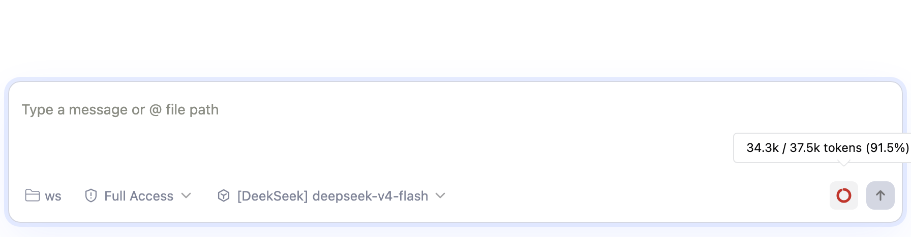
|
已按建议修复(ed5ea4d):共享 右侧边界 hover 实测(真实 daemon + 无头 Chromium,1180px 视口):
程序化测量:ring 中心 x=1102,箭头尖端中心 x=1101.97,偏差 0px;同一帧里 content 几何中心 x=1086.5(被碰撞回避左移约 15.5px),确认箭头不再跟随 content 中心而是锚定 trigger。并补了一个回归断言(tooltip 打开时必须存在 Radix |
qwen-code-ci-bot
left a comment
qwen-code-ci-bot
left a comment
There was a problem hiding this comment.
Reviewed. Suggestions are inline. Not reviewed: reverse audit — stopped before round 2 by the review time budget.
中文说明
已审查。 建议见行内评论。 未审查:反向审计——评审时间预算不足,未能开始第 2 轮。
— qwen3.8-max via Qwen Code /review (v0.21.8)
| .contextRingValue { | ||
| stroke: var(--agent-blue-500); | ||
| transition: stroke-dashoffset 0.25s ease; |
There was a problem hiding this comment.
[Suggestion] R2-1: The ring arc's transition: stroke-dashoffset 0.25s ease is not guarded by prefers-reduced-motion, although this same file already contains two @media (prefers-reduced-motion: reduce) blocks suppressing comparable decorative motion (.specularEffect::before { transition: none; } ~line 773 and the .loadingIcon / .sendBtnArmed animations ~line 1722) — Failure scenario: a user with prefers-reduced-motion: reduce set at the OS level sees the arc visibly sweep on every usage change; connection.tokenCount updates after each model round, so the decorative 250 ms animation re-fires every turn while streaming.
Fix: add to one of the existing reduced-motion blocks:
.contextRingValue {
  transition: none;
}
中文说明
圆环弧线的 transition: stroke-dashoffset 0.25s ease 未在 prefers-reduced-motion 下关闭,而同一文件已有两个 @media (prefers-reduced-motion: reduce) 块抑制同类装饰性动效(约 773 行 .specularEffect::before { transition: none; }、约 1722 行 .loadingIcon / .sendBtnArmed 动画)。失败场景:系统设置了 prefers-reduced-motion: reduce 的用户会在每次 usage 变化时看到弧线扫动;connection.tokenCount 每轮模型调用后更新,流式期间该 250ms 装饰动画每轮重播一次。修复:在现有 reduced-motion 块中加入 .contextRingValue { transition: none; }。
— qwen3.8-max via Qwen Code /review (v0.21.8)
There was a problem hiding this comment.
已处理(30d7248):为 .contextRingValue 增加 @media (prefers-reduced-motion: reduce) { transition: none; },与文件内其它装饰性动画的抑制方式一致。
| const warn = renderChatEditor({ tokenCount: 61, contextWindow: 100 }); | ||
| const error = renderChatEditor({ tokenCount: 81, contextWindow: 100 }); | ||
| const normal = renderChatEditor({ tokenCount: 60, contextWindow: 100 }); |
There was a problem hiding this comment.
[Suggestion] R2-2: The threshold tests pin the 60% boundary from both sides (60 → normal, 61 → warning) but the 80% boundary only from above (81 → error), so the one-line mutation pct > 80 → pct >= 80 in ContextUsageRing survives — a probe over all actual test inputs shows the mutant is observationally identical to the original across the whole suite — Failure scenario: with exactly 80.0% occupancy the mutant draws the arc in the error color instead of warning, diverging from ContextUsageMessage's usedPercentage > 80 that the comment above ContextUsageRing explicitly promises to mirror; no test input distinguishes the mutant from the original at that boundary.
Add a case pinning the boundary from below:
const exact = renderChatEditor({ tokenCount: 80, contextWindow: 100 });
// assert exact's arc class contains Warning and does not contain Error
中文说明
阈值测试对 60% 边界做了双侧钉住(60→normal、61→warning),但 80% 边界只从上侧钉(81→error),因此 ContextUsageRing 中的一行变异 pct > 80 → pct >= 80 可以存活——对全部现有测试输入的探针显示变异体与原实现行为完全一致。失败场景:恰好 80.0% 占用时,变异体会把弧线画成 error 色而非 warning 色,与 ContextUsageRing 上方注释承诺镜像的 ContextUsageMessage 的 usedPercentage > 80 分叉;没有任何测试输入能在该边界区分两者。修复:补一个恰好 80% 的用例(断言弧线含 Warning 类且不含 Error 类)。
— qwen3.8-max via Qwen Code /review (v0.21.8)
There was a problem hiding this comment.
已处理(30d7248):补了 80 整点用例,断言 exactly 80% 仍是 warning 且不是 error,把严格 > 的两侧边界都钉住(60 侧原有用例保持)。
| tokenCount={connection.tokenCount ?? 0} | ||
| contextWindow={connection.contextWindow ?? 0} |
There was a problem hiding this comment.
[Suggestion] R2-5: The two ?? 0 fallbacks feeding the new ring are untested — the test-efficacy probe (validated harness) deleted each one and every web-shell test stayed green — Failure scenario: no test renders the composer toolbar with a connection that has not yet received usage data (tokenCount/contextWindow undefined — the state right after connecting, or for sessions that never emit usage); if a future change lets undefined flow through, ContextUsageRing computes its percentage from undefined / window → NaN and renders a broken ring, with nothing in this diff's tests failing.
Add one test rendering the toolbar with undefined tokenCount/contextWindow and asserting the ring is hidden — a single case gates both fallbacks.
中文说明
喂给新圆环的两个 ?? 0 兜底没有测试覆盖——测试效力探针(已验证的 harness)分别删除两处变异体后 web-shell 全部测试仍绿。失败场景:没有任何测试渲染“连接尚未收到 usage 数据”(tokenCount/contextWindow 为 undefined——刚连接或会话从不发 usage 时的状态)的 composer 工具栏;若未来改动让 undefined 流入,ContextUsageRing 以 undefined/window 计算百分比得 NaN,渲染损坏的圆环,而本 PR 的测试不会失败。修复:补一个 undefined 态用例断言圆环隐藏——一个用例同时钉住两个兜底。
— qwen3.8-max via Qwen Code /review (v0.21.8)
There was a problem hiding this comment.
已处理(30d7248):App.test.tsx 新增用例——connection.tokenCount/contextWindow 为 undefined(刚连接、尚无 usage)时 ChatEditor 收到 0/0,圆环隐藏,?? 0 fallback 不再是测试盲区。
…ing (review)

Review round 3 suggestions:
- The 60/80 severity thresholds now live in one shared helper used by
  both the composer ring and the /context panel, so the two surfaces
  cannot drift.
- The ring tooltip's token formatter moves into the shared token-count
  utils and the /context panel uses it too, giving both surfaces the
  same k/M rendering (the panel previously showed a 1M window as
  1000.0k).
- The ring arc's transition is disabled under prefers-reduced-motion,
  matching the file's other decorative motion.
- New tests: exactly-80% stays warning (pins the strict threshold), the
  App wiring from connection usage to the ring props, click-through
  reaching the context-usage request, and the 0 fallbacks before any
  usage arrives.
The same normalizer fix landed on main via #8790 while this PR was in
review; the merge auto-combined both edits into a duplicate case and a
duplicate test. Keep main's version — this branch now carries no
sdk-typescript delta.
|
CI 说明: |
qwen-code-ci-bot
left a comment
qwen-code-ci-bot
left a comment
There was a problem hiding this comment.
Reviewed. Suggestions are inline. Not explored to full depth (tool budget reached): PR #8794 adds a context-window usage ring to the web-shel...: (none — all checks I started were completed)..
中文说明
已审查。 建议见行内评论。 未探索到全部深度(达到工具调用预算):PR #8794 adds a context-window usage ring to the web-shel...:(none — all checks I started were completed).。
— qwen3.8-max via Qwen Code /review (v0.21.8)
| export function formatContextTokens(count: number): string { | ||
| if (count >= 1_000_000) return `${(count / 1_000_000).toFixed(1)}M`; | ||
| if (count >= 1000) return `${(count / 1000).toFixed(1)}k`; |
There was a problem hiding this comment.
[Suggestion] R3-1: The new shared formatter leaves two pre-existing in-package copies behind — TasksStatusMessage.tsx:102-106 (formatTokenCount) is byte-for-byte identical to formatContextTokens, and MessageList.tsx:1852-1854 is a near-miss lacking only the M branch — although this PR exists to deduplicate exactly this logic. Failure scenario: any future rounding/units change in the shared helper silently diverges from the task-status copy, and the MessageList variant already differs today — a collapsed turn with ≥1M input tokens renders ↑1048.6k there while the ring tooltip and /context panel show 1.0M for the same session (reachable on 1M-context models).
Suggested fix: in TasksStatusMessage.tsx, replace the local formatTokenCount with import { formatContextTokens } from '../../utils/formatTokenCount' (the same swap this PR does in ContextUsageMessage.tsx), and consider adopting it in MessageList's collapsed-turn footer too to fix the 1048.6k vs 1.0M discrepancy.
中文说明
新的共享 formatter 在同包内遗留了两份既有副本:TasksStatusMessage.tsx:102-106(formatTokenCount)与 formatContextTokens 逐字节等价,MessageList.tsx:1852-1854 仅差一个 M 分支——而本 PR 的目的正是消除这类重复。失败场景:未来对共享 helper 的任何舍入/单位调整都会与 task-status 里的副本悄悄分叉;MessageList 的变体今天就已经不一致——在 1M 上下文模型上,折叠轮次输入超过 1M token 时那里显示 ↑1048.6k,而圆环 tooltip 与 /context 面板对同一会话显示 1.0M。
建议修复:在 TasksStatusMessage.tsx 中用 import { formatContextTokens } from '../../utils/formatTokenCount' 替换本地 formatTokenCount(与本 PR 在 ContextUsageMessage.tsx 中做的替换一致),并考虑让 MessageList 的折叠轮次页脚也采用它,以消除 1048.6k 与 1.0M 的分歧。
— qwen3.8-max via Qwen Code /review (v0.21.8)
| expect( | ||
| document.querySelector('[data-slot="tooltip-arrow"]'), | ||
| ).not.toBeNull(); |
There was a problem hiding this comment.
[Suggestion] R3-2: The only assertion over the new Radix arrow is this presence check — it pins the mechanism (an element exists), not the effect the diff's own comment names (the arrow keeps pointing at the trigger). Probe: stripping the arrow's positioning classes (translate-y-[calc(-50%_-_2px)] rotate-45 border-r border-b) from ui/tooltip.tsx keeps the full web-shell suite (173 files / 2984 tests) green. Failure scenario: a follow-up edit or an npx shadcn@latest add regeneration drops or reorders those classes; the element still exists, so this test stays green while the arrow renders detached/misaligned — worst near viewport edges, exactly the collision case the change was made for.
| expect( | |
| document.querySelector('[data-slot="tooltip-arrow"]'), | |
| ).not.toBeNull(); | |
| expect( | |
| document.querySelector('[data-slot="tooltip-arrow"]')?.getAttribute('class'), | |
| ).toContain('rotate-45'); |
中文说明
针对新 Radix 箭头的唯一断言是这个存在性检查——它钉住的是机制(元素存在),而不是 diff 注释所说的那个效果(箭头始终指向 trigger)。探针验证:从 ui/tooltip.tsx 中删除箭头的定位类(translate-y-[calc(-50%_-_2px)] rotate-45 border-r border-b)后,web-shell 全量套件(173 文件 / 2984 用例)依然全绿。失败场景:后续修改或 npx shadcn@latest add 重新生成该组件时丢掉或调换这些类;元素仍然存在,测试保持绿色,但箭头渲染会脱离/错位——在视口边缘最严重,正是本次改动要解决的碰撞场景。
上方 suggestion 将断言改为对定位类名的检查,让机制测试至少覆盖它所守护的机制;如需覆盖真实几何,可在现有 Playwright harness 中补充视觉/e2e 断言(jsdom 没有布局)。
— qwen3.8-max via Qwen Code /review (v0.21.8)
…copies (review)

Review round 4: the task-status panel's local formatter was
byte-identical to the shared one, and the collapsed-turn footer's copy
lacked the M branch — a collapsed turn with a >=1M-token input rendered
1048.6k while the ring tooltip and /context panel said 1.0M for the same
session. Both now import the shared formatter. Also pin the tooltip
arrow's positioning classes in the test, so a shadcn regeneration that
drops them fails instead of passing on a bare existence check.

|
R3 两条建议已处理(88276e4,行内回复被 GitHub 限流,统一在此答复):
web-shell 全量 173 文件 / 2984 用例通过,typecheck / lint / prettier 干净。 |
qwen-code-ci-bot
left a comment
qwen-code-ci-bot
left a comment
There was a problem hiding this comment.
Reviewed. Suggestions are inline. Not explored to full depth (tool budget reached): PR #8794 adds an always-on context-window usage ring to t...: run npx vitest run for ChatEditor.test.tsx / App.test.tsx (new ring + wiring tests) — not run, dependencies not installed.; PR #8794 adds an always-on context-window usage ring to t...: inspect installed radix-ui Arrow rendering/rotation to settle the side-flip border question — not run, dependencies not installed.; PR #8794 adds an always-on context-window usage ring to t...: e2e visual/screenshot specs not run (need browser + baselines) — the tooltip arrow geometry change could shift tooltip-related visual baselines; jsdom tests can….
中文说明
已审查。 建议见行内评论。 未探索到全部深度(达到工具调用预算):PR #8794 adds an always-on context-window usage ring to t...:run npx vitest run for ChatEditor.test.tsx / App.test.tsx (new ring + wiring tests) — not run, dependencies not installed.;PR #8794 adds an always-on context-window usage ring to t...:inspect installed radix-ui Arrow rendering/rotation to settle the side-flip border question — not run, dependencies not installed.;PR #8794 adds an always-on context-window usage ring to t...:e2e visual/screenshot specs not run (need browser + baselines) — the tooltip arrow geometry change could shift tooltip-related visual baselines; jsdom tests can…。
— qwen3.8-max via Qwen Code /review (v0.21.8)
| export function getContextUsageLevel(pct: number): ContextUsageLevel { | ||
| if (pct > CONTEXT_USAGE_ERROR_PCT) return 'error'; |
There was a problem hiding this comment.
[Suggestion] R4-1: The new shared threshold utility (and the two new exports added to utils/formatTokenCount.ts) has no colocated test file — its boundary tests live two directories up in components/ChatEditor.test.tsx, breaking the colocated-tests convention (file.test.ts next to file.ts) that utils/ otherwise follows (~23 colocated test files). The strict-> invariant is covered today, but only by ring render tests whose name never mentions this utility. — Failure scenario: a maintainer touching contextUsage.ts — or adding a third consumer of the levels — greps for a test next to the file, finds none, and can plausibly flip > to >= without noticing coverage lives in a component test; the ring and the /context panel then silently disagree at the 60%/80% boundaries — the exact divergence this utility's doc comment promises to prevent. Fix: move the pure-logic tests into colocated utils/contextUsage.test.ts (boundary cases 60/61/80/81) and utils/formatTokenCount.test.ts (the formatContextUsageDetail block); keep the DOM-render tests in ChatEditor.test.tsx.
中文说明
新的共享阈值工具(以及 utils/formatTokenCount.ts 新增的两个导出)没有同目录测试文件——边界用例位于两层之外的 components/ChatEditor.test.tsx,与 utils/ 一贯遵循的同目录测试约定(file.test.ts 紧邻 file.ts,该目录已有约 23 个同目录测试)不一致。严格 > 不变量目前确有覆盖,但只存在于名称完全未提及该工具的圆环渲染测试里。——失败场景:维护者修改 contextUsage.ts(或新增第三个 level 使用方)时会在文件旁边 grep 测试,一无所获,可能在不察觉覆盖位于组件测试的情况下把 > 改成 >=;圆环与 /context 面板就会在 60%/80% 边界悄悄分叉——正是该工具文档注释承诺要防止的分歧。修复:把纯逻辑测试移入同目录的 utils/contextUsage.test.ts(60/61/80/81 边界用例)与 utils/formatTokenCount.test.ts(formatContextUsageDetail 块);DOM 渲染测试保留在 ChatEditor.test.tsx。
— qwen3.8-max via Qwen Code /review (v0.21.8)
| const usedLevel = getContextUsageLevel(usedPercentage); | ||
| const usedClass = | ||
| usedPercentage > 80 | ||
| usedLevel === 'error' |
There was a problem hiding this comment.
[Suggestion] R4-2: The /context-panel half of the new shared-threshold contract has no test — nothing asserts which color class the panel's progress bar renders at any usage level. Probe-verified: swapping styles.error/styles.warning in this ternary keeps all 44 tests in the two relevant suites green (a comparator mutation correctly fails, so the harness is alive). — Failure scenario: that one-line mutation survives the whole suite while the panel renders the warning color above 80% occupancy where the ring shows error — the two surfaces diverging exactly at the most urgent threshold, against this PR's stated intent that they never disagree. Fix: add cases to ContextUsageMessage.test.tsx rendering statuses at e.g. 61% and 81% (the existing makeStatus helper with contextWindowSize: 100 makes this trivial) and assert the filled bar segment carries the warning/error class, mirroring the ring's boundary test.
中文说明
新共享阈值契约中 /context 面板这一半没有测试——没有任何用例断言面板进度条在各占用水平下渲染的颜色类。探针验证:把这个三元表达式里的 styles.error/styles.warning 互换,两个相关套件的全部 44 个用例仍然全绿(对照突变会正确失败,说明测试框架工作正常)。——失败场景:这一行突变在整个套件存活,而面板会在占用超过 80% 时渲染 warning 色、圆环却显示 error——两个界面恰好在最紧迫的阈值处分叉,与本 PR "两者永不分歧" 的声明意图相悖。修复:在 ContextUsageMessage.test.tsx 中新增例如 61% 与 81% 的用例(用现有 makeStatus 辅助函数配 contextWindowSize: 100 即可),断言已填充的进度条段带 warning/error 类名,与圆环的边界测试对齐。
— qwen3.8-max via Qwen Code /review (v0.21.8)
| type WebShellAssistantTurnFooterRenderInfo, | ||
| } from '../customization'; | ||
| import { useI18n } from '../i18n'; | ||
| import { formatContextTokens as formatTokenCount } from '../utils/formatTokenCount'; |
There was a problem hiding this comment.
[Suggestion] R4-3: This alias renames formatContextTokens to the exact name of the same module's other export, formatTokenCount, which behaves differently (floor-based k above 10k, no M unit). Measured divergence: 47,851 → 47k vs 47.9k; 1,234,567 → 1234k vs 1.2M. — Failure scenario: a maintainer adding another token display to this file sees formatTokenCount(…) calls already present and imports formatTokenCount from the same module (IDE autocomplete offers both names); no type error fires, but the output diverges from the adjacent UI — exactly the per-surface inconsistency the shared formatter was created to prevent. An engineer grepping formatTokenCount to learn what this footer renders also lands on the wrong function body. Fix: drop the alias and call formatContextTokens(…) directly (same pattern in TasksStatusMessage.tsx).
中文说明
这个别名把 formatContextTokens 重命名为同模块另一个导出 formatTokenCount 的确切名字,而两者行为不同(后者 10k 以上向下取整为 k、没有 M 单位)。实测分歧:47,851 → 47k vs 47.9k;1,234,567 → 1234k vs 1.2M。——失败场景:维护者在本文件新增一个 token 展示时,看到文件里已有 formatTokenCount(…) 调用,便从同一模块导入 formatTokenCount(IDE 自动补全会同时给出两个名字);不会报类型错误,但输出与相邻 UI 分歧——正是共享 formatter 要消除的界面间不一致。grep formatTokenCount 想了解该页脚渲染逻辑的工程师也会落到错误的函数体上。修复:去掉别名,直接调用 formatContextTokens(…)(TasksStatusMessage.tsx 同理)。
— qwen3.8-max via Qwen Code /review (v0.21.8)
| import { useDelayedGlobalKeyDown } from '../../hooks/useDelayedGlobalKeyDown'; | ||
| import { useI18n } from '../../i18n'; | ||
| import { formatRuntime } from '../../utils/formatRuntime'; | ||
| import { formatContextTokens as formatTokenCount } from '../../utils/formatTokenCount'; |
There was a problem hiding this comment.
[Suggestion] R4-3: Same pattern as MessageList.tsx — this alias renames formatContextTokens to the exact name of the same module's other export, formatTokenCount, which behaves differently (floor-based k above 10k, no M unit; measured: 47,851 → 47k vs 47.9k, 1,234,567 → 1234k vs 1.2M). — Failure scenario: a maintainer adding another token display here imports the wrong same-named function; no type error fires, but the output diverges from the adjacent UI — exactly the per-surface inconsistency the shared formatter was created to prevent. Fix: drop the alias and call formatContextTokens(…) directly.
中文说明
与 MessageList.tsx 相同的模式——这个别名把 formatContextTokens 重命名为同模块另一个导出 formatTokenCount 的确切名字,而两者行为不同(后者 10k 以上向下取整为 k、没有 M 单位;实测:47,851 → 47k vs 47.9k,1,234,567 → 1234k vs 1.2M)。——失败场景:维护者在此处新增 token 展示时导入了同名的错误函数;不会报类型错误,但输出与相邻 UI 分歧——正是共享 formatter 要消除的界面间不一致。修复:去掉别名,直接调用 formatContextTokens(…)。
— qwen3.8-max via Qwen Code /review (v0.21.8)
| <TooltipPrimitive.Arrow | ||
| data-slot="tooltip-arrow" |
There was a problem hiding this comment.
[Suggestion] R4-4: Adding the Radix Arrow child silently moves every web-shell tooltip ~10px farther from its trigger. Verified against the installed @radix-ui/react-popper@1.3.3 dist: the offset middleware computes offset({ mainAxis: sideOffset + arrowHeight }); the new arrow measures 10px (size-2.5), so the kept sideOffset = 8 (tuned for the removed pseudo-element, whose tip filled the 8px gap) puts the content edge at 18px while the rotated-diamond tip protrudes only ~5px — a ~13px tip-to-trigger gap where it was ~0 before. All 13 TooltipContent consumers inherit the default (no caller passes sideOffset), and jsdom tests cannot observe layout. — Failure scenario: every existing tooltip (ChatEditor toolbar, workspace/git indicators, markdown tables, skills/extensions/MCP/agents manager pages) renders visibly farther from its trigger after this PR, with no test to catch it. Fix: lower the TooltipContent default sideOffset from 8 toward 4 (the shadcn default this arrow design is tuned against — sibling ui/popover.tsx and ui/dropdown-menu.tsx already use 4), or compensate by moving the arrow outward (drop/adjust the -2px term in translate-y-[calc(-50%_-_2px)]) so the protrusion matches the height Radix reserves.
中文说明
加入 Radix Arrow 子元素会让 web-shell 的每个 tooltip 悄悄远离 trigger 约 10px。已对照安装的 @radix-ui/react-popper@1.3.3 dist 验证:offset 中间件按 offset({ mainAxis: sideOffset + arrowHeight }) 计算;新箭头实测 10px(size-2.5),于是保留的 sideOffset = 8(原本是为已删除的伪元素调的,其箭头尖端恰好填满 8px 间隙)使 content 边缘距 trigger 18px,而旋转菱形尖端只外凸约 5px——尖端到 trigger 的间隙从约 0 变为约 13px。全部 13 个 TooltipContent 使用方都继承默认值(无人传 sideOffset),jsdom 测试无法观测布局。——失败场景:本 PR 之后所有既有 tooltip(ChatEditor 工具栏、工作区/git 指示器、markdown 表格、skills/extensions/MCP/agents 管理页)都明显远离 trigger,且没有任何测试能捕获。修复:把 TooltipContent 默认 sideOffset 从 8 降到约 4(该箭头设计对应的 shadcn 默认值——同包的 ui/popover.tsx 与 ui/dropdown-menu.tsx 已用 4),或把箭头向外补偿(去掉/调整 translate-y-[calc(-50%_-_2px)] 中的 -2px 项),使外凸量与 Radix 预留的高度匹配。
— qwen3.8-max via Qwen Code /review (v0.21.8)
…ation (review)

Review round 5:
- With a Radix Arrow child, the offset middleware computes
  sideOffset + arrowHeight, so keeping the pseudo-element-era default of
  8 pushed every tooltip ~10px farther from its trigger. Default now 0;
  measured in a real browser the content edge sits 10px from the trigger
  (8px before the arrow change) with the tip 6px away.
- Drop the formatContextTokens-as-formatTokenCount aliases: the alias
  reused the exact name of the module's other, differently-behaving
  export, inviting wrong-import drift. Call sites use the real name.
- Colocate the pure-logic tests: utils/contextUsage.test.ts pins the
  strict-> boundaries, utils/formatTokenCount.test.ts owns the formatter
  cases (moved from ChatEditor.test.tsx), and ContextUsageMessage gains
  progress-bar color cases at 60/61/80/81 so the panel half of the
  shared-threshold contract is pinned too.
|
R4 五条已全部处理(68dd352):
web-shell 全量 175 文件 / 2988 用例通过,typecheck / lint / prettier 干净。 |
qwen-code-ci-bot
left a comment
qwen-code-ci-bot
left a comment
There was a problem hiding this comment.
Reviewed — no blockers. Suggestions are inline.
中文说明
已审查——无阻断问题。 建议见行内评论。
— qwen3.8-max via Qwen Code /review (v0.21.8)
| const DEFAULT_COMPOSER_TOOLBAR_ACTIONS = [ | ||
| 'approvalMode', | ||
| 'contextUsage', |
There was a problem hiding this comment.
[Suggestion] R5-1: The new contextUsage action only reaches the main composer — the split-view pane composers (ChatPane.tsx, PANE_TOOLBAR_ACTIONS = ['approvalMode', 'model', 'voice']) neither list it nor receive tokenCount/contextWindow/onShowContextUsage. The PR body declares split panes out of scope, which is fine — but the comment above PANE_TOOLBAR_ACTIONS still claims panes "get the same interactive composer controls as the main chat" while only enumerating the width-toggle omission, so the new exclusion is undocumented. — Failure scenario: a future reader trusts the stale parity comment (or a user files a bug when panes don't show the ring); a split-view user runs a pane session toward context exhaustion with no indicator while the main composer advertises one. Suggested fix: extend the PANE_TOOLBAR_ACTIONS comment in ChatPane.tsx to name the contextUsage exclusion, or wire the ring into panes.
中文说明
新的 contextUsage action 只进入主 composer——分屏 pane 的 composer(ChatPane.tsx,PANE_TOOLBAR_ACTIONS = ['approvalMode', 'model', 'voice'])既未列出它,也未接收 tokenCount/contextWindow/onShowContextUsage。PR 描述已声明分屏暂不在本次范围内,这没有问题——但 PANE_TOOLBAR_ACTIONS 上方的注释仍声称 pane“获得与主聊天相同的交互式 composer 控件”,且只列举了 width 切换一项例外,新增的排除项没有被记录。— 失败场景:未来读者相信这条过时的“平权”注释(或用户在 pane 不显示圆环时提 bug);分屏用户把某个 pane 会话用到接近上下文上限时没有任何指示,而主 composer 却展示着该功能。建议修复:在 ChatPane.tsx 的 PANE_TOOLBAR_ACTIONS 注释中写明 contextUsage 的排除,或把圆环接入 pane。
— qwen3.8-max via Qwen Code /review (v0.21.8)
| tokenCount={connection.tokenCount ?? 0} | ||
| contextWindow={connection.contextWindow ?? 0} | ||
| onShowContextUsage={handleShowContextUsage} |
There was a problem hiding this comment.
[Suggestion] R5-2: tokenCount={connection.tokenCount ?? 0} passes a raw primitive that changes on every usage-bearing daemon event (once per model round — updateConnectionFromDaemonEvent writes a fresh connection object and inputTokens grows each round). ChatEditor is memo(forwardRef(...)) with the default shallow comparator, and every other prop at this render site is stable across usage events — so before this PR these renders were skipped; now each model round forces a full composer re-render even though only the 16×16 ring value changes. — Failure scenario: during an agentic turn with many model rounds, the ~2,700-line composer re-renders once per round — the exact churn the adjacent handleShowContextUsage comment ("ChatEditor is memoized and an inline closure would re-render it on every app render") says this codebase avoids. Suggested fix: pass display-quantized values across the memo boundary (e.g. the preformatted formatContextTokens strings, or pct rounded to 0.1%), or give memo a custom comparator for these two props.
中文说明
tokenCount={connection.tokenCount ?? 0} 传入的是一个原始数值,每次带 usage 的 daemon 事件都会变化(每轮模型调用一次——updateConnectionFromDaemonEvent 会写入新的 connection 对象,且 inputTokens 逐轮增长)。ChatEditor 是带默认浅比较器的 memo(forwardRef(...)),而该渲染处其余所有 prop 在 usage 事件之间都是稳定的——因此本 PR 之前这些渲染会被 memo 跳过;现在每轮模型调用都会强制整个 composer 重新渲染,尽管只有 16×16 的圆环数值变了。— 失败场景:在多轮模型调用的 agentic 回合中,这个约 2,700 行的 composer 每轮都重新渲染——正是旁边 handleShowContextUsage 注释(“ChatEditor 已 memo 化,内联闭包会让它在每次 app 渲染时重渲染”)声明要避免的抖动。建议修复:跨 memo 边界传显示量化后的值(如预格式化的 formatContextTokens 字符串,或按 0.1% 取整的百分比),或为这两个 prop 给 memo 传自定义比较器。
— qwen3.8-max via Qwen Code /review (v0.21.8)
| const arc = button.querySelectorAll('circle')[1]; | ||
| expect(arc.getAttribute('stroke-dashoffset')).toBe('0'); |
There was a problem hiding this comment.
[Suggestion] R5-3: The ring's proportional arc fill — its core visual function — is only pinned at the capped 100% endpoint; no test reads stroke-dashoffset/stroke-dasharray at any intermediate percentage. — Failure scenario: verified surviving mutations — strokeDashoffset={C * (1 - capped / 100) * 2} renders an empty arc at 50% usage, and strokeDasharray={C * 4} renders a full ring at every pct; both pass the whole suite because at capped=100 the offset is 0 either way and nothing else reads these attributes. Suggested fix: add an intermediate case — render tokenCount: 50, contextWindow: 100 and assert Number(arc.getAttribute('stroke-dashoffset')) equals half of the element's own stroke-dasharray (within float tolerance), reading dasharray from the rendered DOM so the oracle stays effect-shaped ("half-filled ring").
中文说明
圆环按比例填充的弧线——它的核心视觉功能——只在封顶的 100% 端点被钉住;没有任何测试在中间百分比读取 stroke-dashoffset/stroke-dasharray。— 失败场景:已验证可存活的变异——strokeDashoffset={C * (1 - capped / 100) * 2} 在 50% 占用时渲染出空弧,strokeDasharray={C * 4} 在任何百分比都渲染满环;两者都能通过全部用例,因为 capped=100 时两种写法 offset 都是 0,且没有别处读取这些属性。建议修复:补一个中间值用例——渲染 tokenCount: 50, contextWindow: 100,断言 Number(arc.getAttribute('stroke-dashoffset')) 等于该元素自身 stroke-dasharray 的一半(浮点容差内),dasharray 从渲染出的 DOM 读取,让判据保持“半满圆环”这一效果形状。
— qwen3.8-max via Qwen Code /review (v0.21.8)
| function TooltipContent({ | ||
| className, | ||
| sideOffset = 8, | ||
| sideOffset = 0, |
There was a problem hiding this comment.
[Suggestion] R5-4: The sideOffset 8→0 override — the round-4 regression fix — is pinned by no test. There is no unit test for ui/tooltip.tsx, and the only e2e tooltip assertion (composer-tag viewport bounds) cannot detect a ~10px spacing shift; the diff's own test comment anticipates a shadcn regeneration of this exact file and pins the arrow classes, but not the spacing they depend on. — Failure scenario: npx shadcn@latest add tooltip (the repo-blessed workflow in AGENTS.md) regenerates the file, restoring upstream's nonzero default sideOffset; the arrow-class assertions fail and get restored, but with the offset middleware computing sideOffset + arrowHeight every tooltip in the shell silently moves ~10px farther from its trigger — the exact regression round 4 reported. Suggested fix: pin the geometry at the primitive level (e.g. render an open tooltip in jsdom and assert the popper content's inline transform carries no main-axis offset, or pin trigger-to-tooltip spacing in an e2e hover flow).
中文说明
sideOffset 8→0 的覆盖——第 4 轮回归的修复——没有任何测试钉住。ui/tooltip.tsx 没有单测,唯一的 e2e tooltip 断言(composer 标签 tooltip 的视口边界)无法感知约 10px 的间距变化;diff 自己的测试注释预见到了 shadcn 会重新生成这个文件,并钉住了箭头类名,却没钉住这些类名所依赖的间距。— 失败场景:npx shadcn@latest add tooltip(AGENTS.md 中仓库认可的工作流)重新生成该文件、恢复上游非零的默认 sideOffset 时,箭头类名断言会失败并被还原,但 offset 中间件按 sideOffset + arrowHeight 计算,shell 里所有 tooltip 会悄无声息地远离 trigger 约 10px——正是第 4 轮报告的回归。建议修复:在 primitive 层钉住几何(如在 jsdom 渲染打开的 tooltip 并断言 popper content 的内联 transform 无主轴偏移,或在 e2e hover 流程中钉住 trigger 与 tooltip 的间距)。
— qwen3.8-max via Qwen Code /review (v0.21.8)
| }} | ||
| disabled={!onShowContextUsage} | ||
| aria-label={t('status.contextUsed', { |
There was a problem hiding this comment.
[Suggestion] R5-5: The disabled={!onShowContextUsage} branch is never asserted — the four tests that render the ring without a handler only read presence, classes, aria-label and stroke-dashoffset. — Failure scenario: ChatEditor is exported and onShowContextUsage is optional; if the guard regresses (removed or inverted), an embedder host omitting the handler renders a ring that looks clickable and does nothing on click (onShowContextUsage?.() is a no-op), and no test fails. Suggested fix: in one of the existing handler-less renders (e.g. the threshold test), add expect(ring(container)!.disabled).toBe(true);
中文说明
disabled={!onShowContextUsage} 分支从未被断言——四个不带 handler 渲染圆环的用例只读取元素存在性、类名、aria-label 和 stroke-dashoffset。— 失败场景:ChatEditor 是导出组件且 onShowContextUsage 可选;若该守卫回归(被删除或写反),不传 handler 的宿主会渲染出一个看似可点、点击却无反应(onShowContextUsage?.() 是空操作)的圆环,且没有测试失败。建议修复:在现有不带 handler 的渲染之一(如阈值用例)中补 expect(ring(container)!.disabled).toBe(true);
— qwen3.8-max via Qwen Code /review (v0.21.8)
| it('reports 0.0% for an unknown window instead of dividing by zero', () => { | ||
| expect(formatContextUsageDetail(100, 0)).toBe('100 / 0 tokens (0.0%)'); |
There was a problem hiding this comment.
[Suggestion] R5-6: formatContextUsageDetail is tested for normal values and the zero-window edge, but never for overflow (used > size) — although overflow is a designed, exercised state (the ring's cap test uses 150/100, and the component comment documents that the label keeps reporting real overflow). — Failure scenario: someone "tidies" the formatter with Math.min(pct, 100); a session at 150% occupancy then shows a tooltip of (100.0%) while the pinned aria-label says 150.0% context used — two surfaces of the same ring contradicting each other, and nothing in the suite fails. Suggested fix: add expect(formatContextUsageDetail(150, 100)).toBe('150 / 100 tokens (150.0%)');
中文说明
formatContextUsageDetail 测了常规值和零窗口边界,但从未测过溢出(used > size)——尽管溢出是设计内的、被实际执行的状态(圆环封顶用例用了 150/100,组件注释也写明标签会如实报告溢出)。— 失败场景:有人用 Math.min(pct, 100)“顺手整理”这个 formatter;150% 占用的会话 tooltip 会显示 (100.0%),而钉住的 aria-label 却是 150.0% context used——同一圆环的两个表面互相矛盾,套件中没有任何用例失败。建议修复:补 expect(formatContextUsageDetail(150, 100)).toBe('150 / 100 tokens (150.0%)');
— qwen3.8-max via Qwen Code /review (v0.21.8)
| usageConnection.tokenCount = 338; | ||
| usageConnection.contextWindow = 1000; |
There was a problem hiding this comment.
[Suggestion] R5-7: These tests mutate the module-scoped shared mockConnection, and the file's exhaustive beforeEach reset block (sessionId, gitStatus, capabilities, …) was not extended to clear tokenCount/contextWindow — cleanup happens only by accident because the adjacent second test sets both back to undefined. — Failure scenario: a maintainer inserts a test between the two new ones, reorders the describe block, or .skips "defaults the composer ring props to 0"; from then every subsequent test in this ~15k-line file renders App with tokenCount=338/contextWindow=1000 still set. Both the composer ring and the StatusBar context indicator gate on exactly those two fields, so an extra ring button and a status-bar segment silently appear in every later full-App render, breaking unrelated assertions with no pointer back here. (The same mutate-shared-connection pattern exists pre-diff later in this file; resetting both fields in the existing beforeEach covers both at once.) Suggested fix: add mockConnection.tokenCount = undefined; mockConnection.contextWindow = undefined; to the existing beforeEach reset block.
中文说明
这些用例直接修改模块级共享的 mockConnection,而文件里详尽的 beforeEach 重置块(sessionId、gitStatus、capabilities 等)没有扩展去清理 tokenCount/contextWindow——目前的清理纯属巧合:依赖相邻的第二个用例把两个字段设回 undefined。— 失败场景:维护者在两个新用例之间插入用例、调整 describe 顺序或 .skip 掉 "defaults the composer ring props to 0";此后这个约 1.5 万行文件里的每个后续用例渲染 App 时都带着 tokenCount=338/contextWindow=1000。composer 圆环和 StatusBar 上下文指示恰好都以这两个字段为门控,于是之后的每个完整 App 渲染都会悄悄多出一个圆环按钮和一段状态栏指示,弄坏无关断言且毫无指向本用例的线索。(同样的“修改共享 connection”模式在 diff 之前就存在于本文件后部;在现有 beforeEach 里重置这两个字段可一次性覆盖两处。)建议修复:在现有 beforeEach 重置块中补 mockConnection.tokenCount = undefined; mockConnection.contextWindow = undefined;
— qwen3.8-max via Qwen Code /review (v0.21.8)
|
R5 七条均为 Suggestion 级、无 Critical。本 PR 已经历 5 轮 review,按 AGENTS.md 的收敛规则(约 5 轮后仅落 Critical 修复,其余延后并在线程记录),R5 全部延后到 follow-up,逐条记录如下:
如 maintainer 认为其中某条应升级为本 PR 阻塞项,说一声我立即落。 |
|
@qwen-code /triage |
|
Sandboxed verification: ✅ passed — merge-ready (agent verdict) - workflow run Ran the PR in an isolated, token-free container: A/B against the base build, mock-free harness assertions, targeted gates. Advisory evidence for human reviewers — not a review, an approval, or a CI check. Scripted assertions: 3091 passed · 0 failed · 3091 total 中文 — 判定:✅ 通过 · 可合入(agent 判定)沙箱验证在隔离、无凭证的容器中执行了该 PR 的代码(与 base 构建 A/B 对照、无 mock harness 断言、定向门禁)。仅作为评审证据,不构成评审、批准或 CI 检查。 脚本断言:3091 通过 · 0 失败 · 3091 总计 Verification reportPR #8794 Deep Verification — composer context-usage ring (web-shell)Verdict: 中文摘要
Scope selection
Out of scope by construction: everything outside Central claim — A/B load-bearing proofOne probe file (
Head 7/7 green; base 6/7 red on the feature spec — the flip is total. The flip run is witness-only in the tally; the scripted absence-spec on base (12 expects) encodes the control expectation. App-level wiring ( Evidence: Verified premise (description claim confirmed, with mechanism)The PR says occupancy was invisible before it. Base does contain a StatusBar context button ( Mutation matrix (vacuity) — no survivorsEvery mutation was applied in a scratch worktree at HEAD, run against the pinning suite, and reverted (tree verified clean afterwards).
All six kills fail the intended value assertion (expected-vs-actual quoted), not an import/compile break. The positive control (M6) proves the harness can make suites fail. Secondary claim 1 — formatter consolidation equivalenceBase implementations extracted verbatim from
Secondary claim 2 — shared tooltip rework
Targeted gates
Reviewer Test Plan, per step
FindingsNone blocking. Informational:
Not covered
MethodologyEnvironment: CI merge-ref checkout ( Evidence images
Harness scripts and raw logs are in the workflow run artifacts (7-day retention). — Qwen Code · sandboxed verification |


|
Full gate re-run on
Moving on to code review. 🔍 中文说明在
进入代码审查 🔍 — Qwen Code · qwen3.8-max Reviewed at |
Code reviewMy independent baseline before opening the diff: pipe the already-flowing per-round usage into the composer area, reuse the
No correctness, security, or regression findings. The remaining notes are non-blocking:
Test evidence — the PR's own CI at
|
| Check | Conclusion |
|---|---|
| Test (ubuntu-latest, Node 22.x) | ✅ success |
| web-shell E2E Smoke (ubuntu-latest, Node 22.x) | ✅ success |
| Desktop Shell (ubuntu-22.04) | ✅ success |
| Desktop Shell (windows-2022) | ✅ success |
| Capture web-shell visuals (ubuntu-latest, Node 22.x) | ✅ success |
| Post Coverage Comment (ubuntu-latest, 22.x) | ✅ success |
| Classify PR | ✅ success |
| Test (macos-latest / windows-latest, Node 22.x) | ⏭️ skipped |
All substantive jobs are green on the reviewed commit: the full unit suite, the web-shell E2E smoke, desktop shell builds on both OSes, and the visual capture. 92 check-runs on this SHA in total — 13 success, 79 skipped (bot orchestration and conditional jobs), none failing or pending. The macOS/Windows unit-matrix jobs are skipped by workflow configuration; the same skip pattern holds across every push of this PR, so that's pre-existing wiring, not this commit. Not verified: actual pixel rendering of the ring and the repositioned tooltip arrow — CI proves the tests pass, not what either looks like; see the lane below.
Sandboxed verification would settle this: @qwen-code /verify — that the ring actually renders at the right thresholds and click-through works end-to-end is currently substantiated only by unit tests plus the author's local screenshots, because no visual scenario reaches the composer ring yet. An A/B run against the base build would pin the behaviour (or a ring scenario added to screenshots.spec.ts would let the visuals pipeline cover it on every future push).
中文说明
代码审查
打开 diff 之前我的独立思路:把已经在流动的每轮 usage 数据接进 composer 区域,复用 /context 面板的阈值语义和 token 格式化而不是另写一套,仅在 usage 已知且非零时显示,挂进现有的 toolbar-action 配置,点击直达 /context。PR 与这个思路一致,并且做得更进一步:
- 新增的共享阈值 helper(
utils/contextUsage.ts)同时驱动 composer 圆环和/context面板进度条——面板里原有的内联> 60/> 80判断被替换,严格边界语义两侧都有测试钉死(恰好 60% 仍为正常,恰好 80% 仍为警告)。 - 三个几乎重复的 token 格式化函数(
MessageList、ContextUsageMessage、TasksStatusMessage)合并为既有utils/formatTokenCount.ts中的formatContextTokens。一个有意为之的附带变化:超过 1M 时,轮次 token 指标和面板现在显示1.2M而非1234.6k,与TasksStatusMessage原有行为一致。 - 圆环数学正确:16×16 viewBox、r=6、描边 2.5 放得下;弧线用 dasharray/dashoffset 实现并旋转到 12 点方向起始;视觉上封顶 100%,而
aria-label保留真实溢出值(150.0% context used)。数值从不只靠颜色传达,prefers-reduced-motion下关闭弧线过渡。 - tooltip 影响面已核查:共享
TooltipContent约 12 处使用,均未显式传sideOffset(composer 标签 tooltip 是独立的TooltipPrimitive.Content原生路径,不受影响)。因此 8→0 默认值加 Radix 定位箭头对所有 tooltip 一致生效——与代码注释所述一致(Radix 的 offset 中间件会在主轴上加上箭头高度)。旧伪元素箭头在碰撞回避时无法跟随触发元素,所以这是对全部 tooltip 的真实修复,不只是为圆环做的管道改动。 App.tsx的接线保住了ChatEditor的 memo(handler 用useCallback;usage 到达前?? 0兜底避免圆环计算出现 NaN——两者均有测试钉住)。
无正确性、安全或回归问题。其余均为非阻塞备注:
- composer 圆环在
screenshots.spec.ts中没有视觉回归场景——可视化预览确认没有场景渲染此 UI。描述中的实拍截图来自作者自己的 Playwright 运行:细节充分、有实测值,但属于作者自述证据,不是独立验证。 - 标题仍写 "status bar",而圆环实际在 composer 工具栏。
测试证据 —— 本 PR 自身在 68dd352 上的 CI,经 API 获取(无人值守运行;此处未构建或执行任何 PR 代码)
全部实质任务在被审提交上为绿:完整单测、web-shell E2E smoke、两个操作系统的 desktop shell 构建、可视化采集。该 SHA 共 92 个 check-run:13 成功、79 跳过(机器人与条件任务),无失败、无进行中。macOS/Windows 单测矩阵任务为工作流配置性跳过——本 PR 每次推送均如此,属既有配置,与本提交无关。未验证项:圆环与新版 tooltip 箭头的实际像素渲染——CI 只能证明测试通过,无法证明视觉效果;见下方沙箱验证通道。
沙箱验证可以补上这一环:@qwen-code /verify —— 圆环在真实阈值下的渲染与点击直达行为,目前只有单测加作者本地截图支撑,因为可视化流水线还没有能触达 composer 圆环的场景。对 base 构建做 A/B 验证可以钉住该行为(或在 screenshots.spec.ts 增加圆环场景,让可视化流水线在后续每次推送时覆盖它)。
(上方英文部分的 CI 表格为机器可读区域,此处不重复。)
— Qwen Code · qwen3.8-max
Reviewed at 68dd35218cf276f03f3a41f32264491082cf2764 · re-run with @qwen-code /triage
|
Confidence: 4/5 — clean gate, green CI on the reviewed commit, and no critical findings of my own; the residual gap is coverage, not correctness. Honest read: this is a well-scoped feature that does what it says. My independent proposal was essentially what landed, and the implementation goes further in the direction I'd want — shared thresholds between the ring and the The two reservations, both non-blocking: (1) nothing in the visuals pipeline renders the composer ring yet, so live rendering rests on the author's screenshots — I'd like the deferred follow-up to include a ring scenario in The Stage 1a template gate from the first commit is resolved by the now-complete description, and all substantive CI jobs are green on Verdict: approve. ✅ 中文说明置信度:4/5 —— 门检查干净、被审提交 CI 全绿、我自己没有发现关键问题;剩余缺口是覆盖面,不是正确性。 直说:这是一个范围得当、说到做到的功能。我的独立方案基本就是最终落地的形态,而实现还更进一步:圆环与 两点保留意见,均不阻塞:(1)可视化流水线还没有任何场景渲染 composer 圆环,实际渲染效果目前依赖作者截图——希望延后的 follow-up 在 首个提交上的 Stage 1a 模板门已被现在完整的描述消解; 结论:批准。✅ — Qwen Code · qwen3.8-max Reviewed at |
qwen-code-ci-bot
left a comment
qwen-code-ci-bot
left a comment
There was a problem hiding this comment.
LGTM, looks ready to ship. ✅


|
Released in v0.21.9. |
4 participants


What this PR does
Adds an always-on context-window indicator to the Web UI composer: a compact circular progress ring in the toolbar's right cluster, immediately left of the voice actions and the send button. The ring's arc fills with occupancy and follows the same thresholds as the
/contextpanel (accent up to 60%, warning above 60%, error above 80%), with the arc visually capped at 100% while the accessible label keeps reporting real overflow. Hovering shows the full detail in a tooltip (e.g.53.6k / 1.0M tokens (5.4%)), clicking opens the/contextbreakdown, and the full "X% context used" wording stays on the accessible name so the value is never conveyed by color alone. The indicator ships as a newcontextUsageentry in the composer toolbar's public action list, so embedders can hide it the same way as other toolbar actions; it stays hidden while usage is zero or the context window is unknown, and it follows the toolbar's existing mobile-voice hiding behavior. No new i18n keys.A related transcript glitch — the per-round
usage_updateframe having no normalizer handler and leaking into the assistant turn as a raw-JSON debug bullet (visible in the Before screenshot) — was originally fixed in this PR and has since landed onmainindependently via #8790; after mergingmain, this branch carries no SDK delta and the toolbar ring remains the sole surface for context occupancy.Why it's needed
Context occupancy is invisible in the stock Web UI until the user types
/context, so long sessions drift toward auto-compaction with no warning. A glanceable indicator inside the composer toolbar — the same area as the other input-related live controls — lets users see how full the context window is while a turn is streaming, and the threshold colors give an early nudge before hitting the limit. The data was already flowing (usage arrives with every model round); only the presentation was missing.Reviewer Test Plan
How to verify
qwen serveand open the Web UI, then send any prompt. After the first model round completes, a small progress ring appears in the composer toolbar right cluster, left of the voice/send buttons. Before this PR, nothing appears there and/contextis the only way to see occupancy.used / total tokens (pct%). Click it — the/contextpanel opens and its "Used ... (X%)" line agrees with the ring.contextWindowSizeoverride in the model'sgenerationConfigsettings), the arc turns warning orange above 60% and error red above 80%; above 100% the arc closes fully while the accessible label keeps the real percentage.composerToolbarActionslist withoutcontextUsagehides the ring; with usage 0 or an unknown context window it never renders.mainby fix(sdk): hide ACP usage updates from transcripts #8790): the assistant turn must not contain a rawusage_update: { ... }bullet after the reply — the Before screenshot shows the pre-fix(sdk): hide ACP usage updates from transcripts #8790 behavior.Evidence (Before & After)
Real stack:
qwen servebuilt from this branch (and frommainfor Before) + real model (deepseek-v4-flash) + headless Chromium, one real prompt per screenshot; percentages are live values fromusage_updateafter the round.Before (
main) — no context indicator anywhere in the default layout, and the rawusage_updatedebug bullet leaks into the assistant turn:After — ring in the toolbar with hover tooltip (34.3%, accent):
After — above 60% (68.6%, warning):
After — above 80% (91.5%, error):
After — dark theme (all colors come from the existing semantic tokens, so the ring adapts with no theme-specific code):
After — click-through to
/context(ring at 34.3% agrees with the panel's Used 34.3k/100.0k = 34.3%, and the assistant turn is clean — no debug bullet):The shared tooltip's arrow is now positioned by Radix (review round 2), so it keeps pointing at the ring even when collision avoidance shifts the content at the right viewport edge — measured tip-to-ring-center misalignment 0px with the content center shifted ~15px left. Measured live values during the runs: arc stroke
rgb(0,51,255)(accent) at 34.3%,rgb(154,106,0)(warning) at 68.6%,rgb(192,54,44)(error) at 91.5% in light theme andrgb(252,129,129)in dark; tooltip text34.3k / 100.0k tokens (34.3%)/34.3k / 50.0k tokens (68.6%)/34.3k / 37.5k tokens (91.5%).Unit evidence: 8 new tests — ring position before the voice actions,
composerToolbarActionsshow/hide, hidden at zero/unknown usage, click-through to/context, tooltip detail on focus, threshold classes, >100% cap with real overflow on the label, and the tooltip formatter — theusage_updatetranscript-drop test now lives onmain(#8790). Full web-shell suite (173 files / 2984 tests after merging main), webui (454), and sdk-typescript suites pass; typecheck, eslint, prettier clean.Tested on
Environment (optional)
macOS,
qwen servefrom the branch build (Web UI served from its owndist), real Anthropic-protocol model endpoint, headless Chromium via Playwright, isolatedQWEN_HOME.Risk & Scope
contextUsagetoolbar action (embedders can hide it) and by not rendering until real usage arrives; the percentage source (tokenCount / contextWindow) is unchanged, so models without a known context window never show the ring.composerToolbarActionsis additive (contextUsagejoins the default list), and embedders passing an explicit list keep their current set — they opt in by addingcontextUsage.Linked Issues
None.
中文说明
本 PR 做了什么
为 Web UI 输入框增加常驻的上下文窗口指示:composer 工具栏右侧、语音操作与发送按钮左边的紧凑圆形进度环。环形弧线按占用比例填充,阈值与
/context面板一致(60% 以下主题色、60% 以上警告色、80% 以上错误色);超过 100% 时弧线视觉封顶,但无障碍标签继续如实报告溢出。悬停显示完整详情 tooltip(如53.6k / 1.0M tokens (5.4%)),点击打开/context明细,完整的"X% context used"措辞保留在无障碍名称上,数值不单靠颜色或环形传达。指示以新的contextUsage项加入 composer 工具栏公开 action 列表,embedder 可以像其他工具栏项一样隐藏它;usage 为 0 或上下文窗口未知时不渲染,并沿用工具栏现有的 mobile voice 隐藏策略。没有新增 i18n key。相关的转录缺陷——每轮
usage_update帧在归一化器中无对应分支、以原始 JSON 调试行泄漏进助手回复(见 Before 截图)——最初由本 PR 修复,期间已经由 #8790 独立落到main;合并main后本分支不再携带 SDK 改动,上下文占用统一由工具栏圆环呈现。为什么需要
默认 Web UI 中上下文占用完全不可见,只能手动输入
/context查看,长会话会在毫无预警的情况下滑向自动压缩。把指示放进 composer 工具栏——与其他输入相关的实时状态和操作同区——让用户在对话流式进行时一眼看到窗口占用,阈值配色在逼近上限前给出提醒。数据链路本来就有(每轮模型调用都会带 usage),缺的只是呈现。审阅者测试计划
如何验证
qwen serve打开 Web UI,发送任意提示。首轮模型调用结束后,composer 工具栏右侧、语音/发送按钮左边出现小进度环。本 PR 之前该位置没有任何显示,/context是唯一入口。used / total tokens (pct%)形式显示完整详情。点击后打开/context面板,其 "Used ...(X%)" 应与圆环一致。generationConfig设置里覆盖contextWindowSize),超过 60% 弧线变警告橙色,超过 80% 变错误红色;超过 100% 弧线闭合但无障碍标签保留真实百分比。contextUsage的composerToolbarActions列表可隐藏圆环;usage 为 0 或窗口未知时不渲染。main上的 fix(sdk): hide ACP usage updates from transcripts #8790 覆盖):助手回复后不得再出现usage_update: { ... }原始 JSON 行——Before 截图即 fix(sdk): hide ACP usage updates from transcripts #8790 之前的表现。证据(Before & After)
真实栈:本分支构建的
qwen serve(Before 用main构建)+ 真实模型(deepseek-v4-flash)+ 无头 Chromium,每张截图对应一次真实对话;百分比为该轮usage_update的实时值。截图见上方英文部分:Before 无任何指示且转录泄漏调试行;After 依次为工具栏圆环 34.3% 蓝(含悬停 tooltip)、68.6% 橙、91.5% 红、深色主题 91.5% 红(配色全部来自既有语义 token,无主题特判代码),以及点击圆环打开的/context面板(数字一致、转录干净)。运行中实测:弧线颜色浅色主题下依次为rgb(0,51,255)/rgb(154,106,0)/rgb(192,54,44),深色主题错误态为rgb(252,129,129);tooltip 文本依次为34.3k / 100.0k tokens (34.3%)、34.3k / 50.0k tokens (68.6%)、34.3k / 37.5k tokens (91.5%)。第二轮 review 后共享 tooltip 的箭头改由 Radix 定位:右侧视口边缘 content 被碰撞回避左移约 15px 时,实测箭头尖端与圆环中心偏差 0px。单测证据:新增 8 个用例——圆环位于语音操作之前、
composerToolbarActions显隐、0/未知 usage 不渲染、点击直达/context、聚焦展示 tooltip 详情、阈值类名、超 100% 封顶且标签保留真实溢出、tooltip 格式化函数——转录丢弃usage_update的用例现随 #8790 在main上。web-shell 全量(合并 main 后 173 文件 / 2984 用例)、webui(454)、sdk-typescript 套件全部通过;typecheck、eslint、prettier 干净。已测试平台
macOS ✅;Windows / Linux 依赖 CI⚠️ 。
环境
macOS,分支构建的
qwen serve(Web UI 由其自带dist提供)、真实 Anthropic 协议模型端点、Playwright 无头 Chromium、隔离QWEN_HOME。风险与范围
contextUsage工具栏 action(embedder 可隐藏)和"真实 usage 到达前不渲染"缓解;百分比数据源(tokenCount / contextWindow)未变,窗口未知的模型不会显示圆环。composerToolbarActions为增量变化(contextUsage加入默认列表),显式传入列表的 embedder 保持现状,按需自行加入contextUsage。关联 Issue
无。