Change the background and foreground colors in the PMUI to increase contrast ratio in Light theme and use the correct colors for doc well UI #3858
Conversation
This file contains hidden or bidirectional Unicode text that may be interpreted or compiled differently than what appears below. To review, open the file in an editor that reveals hidden Unicode characters.
Learn more about bidirectional Unicode characters
…ontrast ratio in Light theme and use the correct colors for doc well UI
donnie-msft
requested changes
Jan 22, 2021
Contributor
 donnie-msft
left a comment
donnie-msft
left a comment
donnie-msft
left a comment
There was a problem hiding this comment.
I'm not convinced we should change this bgcolor.
Our window matches the VS bg in Light theme. Changing it to white is a deviation.
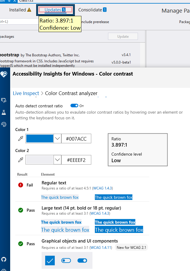
I also played with AccessibilityInsights and believe the problem isn't the Bgcolor, but is the Blue hover-color font on our tab. Can we tweak that color just a bit to resolve this bug?
donnie-msft
approved these changes
Jan 23, 2021
Contributor
donnie-msft
left a comment
donnie-msft
left a comment
There was a problem hiding this comment.
Learned some history with theming: PMUI generally should have had a white background all along, so it's not really deviating.
We should call out that this PR is correcting a separate bug as well where the main window was using a gray toolbar color incorrectly.
Sign up for free
to join this conversation on GitHub.
Already have an account?
Sign in to comment
Add this suggestion to a batch that can be applied as a single commit.
This suggestion is invalid because no changes were made to the code.
Suggestions cannot be applied while the pull request is closed.
Suggestions cannot be applied while viewing a subset of changes.
Only one suggestion per line can be applied in a batch.
Add this suggestion to a batch that can be applied as a single commit.
Applying suggestions on deleted lines is not supported.
You must change the existing code in this line in order to create a valid suggestion.
Outdated suggestions cannot be applied.
This suggestion has been applied or marked resolved.
Suggestions cannot be applied from pending reviews.
Suggestions cannot be applied on multi-line comments.
Suggestions cannot be applied while the pull request is queued to merge.
Suggestion cannot be applied right now. Please check back later.
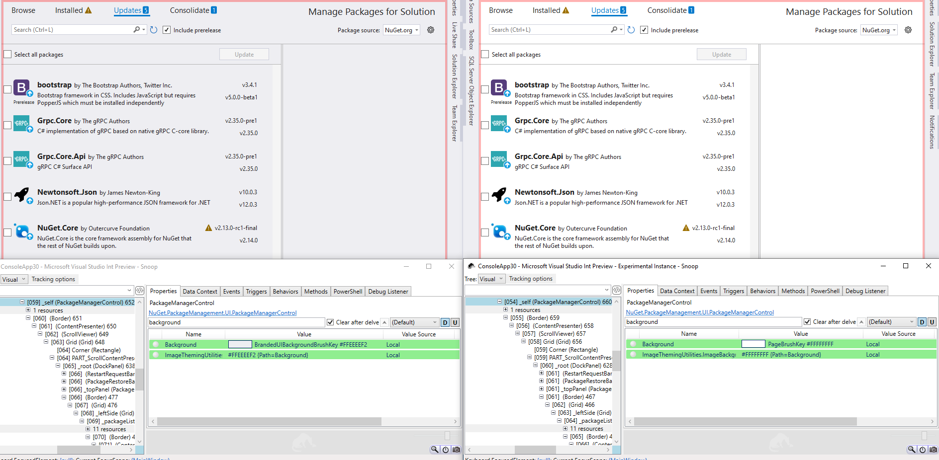
Change the background and foreground colors in the PMUI to increase contrast ratio in Light theme and use the correct colors for doc well UI. In addition, the background and foreground of the PMUI was using colors from the BrandedUI category not intended for this type of UI and also resulted in a gray background in the Light theme that resembled the color of the VS toolbar. The light theme is intended to have a center stage area that is white so the grayish background was violating the design idea for the light theme which this PR also fixes.
Bug
Fixes: https://github.com/NuGet/Client.Engineering/issues/714
Regression: No
Fix
Details: Updated the mapping of color tokens to use the CommonDocument Page background and foreground for the PMUI which are the colors that should be used for doc well UI. This has the desirable effect of making the background White (instead of grayish) in the Light theme and slightly darker in the Dark theme.
Testing/Validation
Tests Added: Yes/No No
Reason for not adding tests: UI color changes
Validation: Tested in Blue, Light, and Dark themes visually and with Accessibility Insights to ensure contrast ratio tests passed.