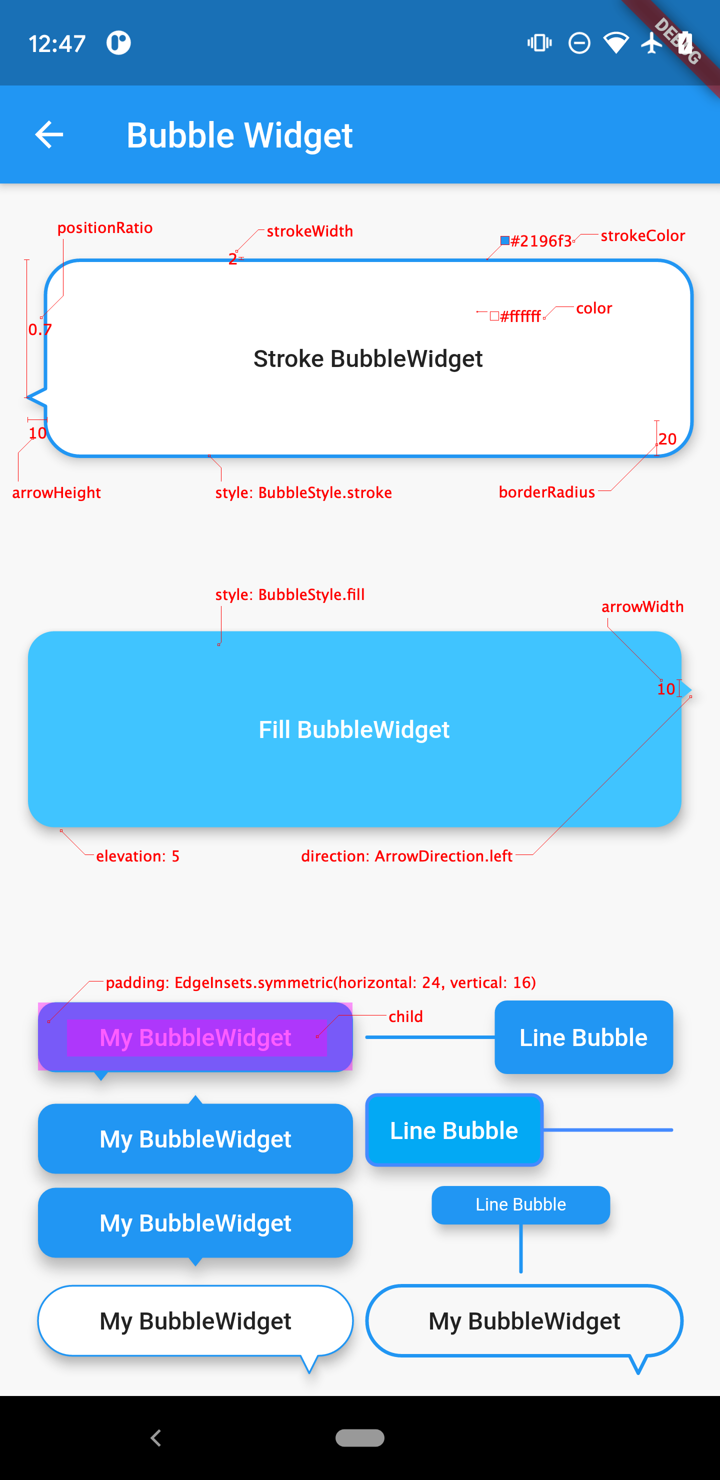
A bubble shape widget.
A bubble shape widget.
Supports common bubble style parameters: stroke, fill, arrow direction, size and so on.
dependencies:
bubble_widget: ^0.0.2class BubbleWidgetExample extends StatelessWidget {
@override
Widget build(BuildContext context) {
return Scaffold(
appBar: AppBar(title: Text('BubbleWidgetExample')),
body: Center(
child: BubbleWidget(
padding: EdgeInsets.all(8),
color: Theme.of(context).primaryColor,
child: Text('I\'m a bubble'),
),
),
);
}
}| Parameter | Type | Default Value | Info |
|---|---|---|---|
| child | Widget | Null | required |
| padding | EdgeInsetsGeometry | Null | Empty space to inscribe inside the bubble content. Thechild if any, is placed inside this padding. |
| color | Color | Colors.transparent | The color to paint behind the child |
| elevation | double | 5.0 | The z-coordinate at which to place this material relative to its parent. Default value is 0, whencolor = Colors.transparent. |
| style | BubbleStyle | BubbleStyle.fill | Bubble style |
| strokeColor | Color | Colors.transparent | Only valid on style = BubbleStyle.stroke |
| strokeWidth | double | 0.5 | Only valid on style = BubbleStyle.stroke |
| direction | ArrowDirection | ArrowDirection.bottom | Bubble arrow's direction relative to itself |
| positionRatio | double | 0.5 | Bubble arrow's position ratio, mast be 0.0~1.0, relative to top-left zero coordinate,0.5 represents the center of the bubble arrow edge |
| arrowHeight | double | 5.0 | Height of the bubble arrow |
| arrowWidth | double | 8.0 | Width of the bubble arrow |
| borderRadius | double | 10.0 | The corners of the bubble content |
- Parameter Auto-fix. To make it easier to use, the parameters
arrowHeight,borderRadius,arrowWidth, andpositionRatioare automatically corrected if invalid. childandpaddingofBubbleWidgetonly fill the bubble body except for the bubble arrow.- When
arrowWidth = 0andstyle = BubbleStyle.stroke, the arrow of the bubble will be displayed as a lead.
