Bar Chart View
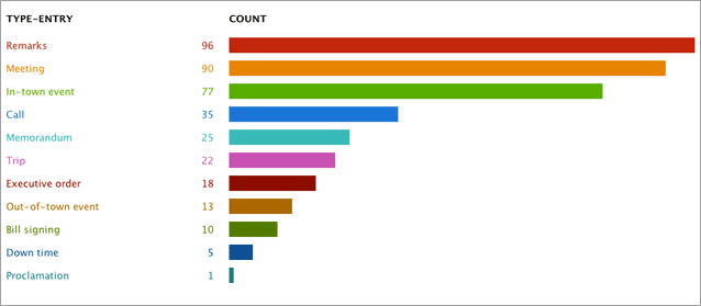
The bar chart in TimeFlow shows aggregate views of data. For example, if I’m viewing the events in the First 100 Days by type (as tracks in the timeline), this view will show me a bar chat of how many remarks, meetings, calls, trips there are in the entire data set:
Bar Chart Controls
The bar chart a flexible and powerful way of looking at all sorts of distributions in a data set. Users can choose the category by which to bin the data and the units by which to compute the bar (by amount, number of events, etc). Any of the categories that can be used as “tracks” in the timeline, can be used as bins in the bar chart.
Used with TimeFlow’s filtering controls, the bar chart can be surprisingly informative. For example, if you are looking at a dataset of political contributions, you can use the bar chart to quickly see things like which occupation gave the most; which politicians got the most money; which politicians got the most money just from attorneys; etc.