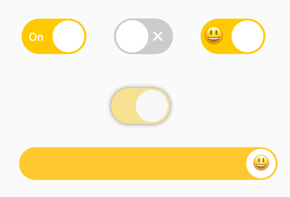
An interesting and practical switch component.
Supports setting tips, slider decorations, shadows, and good interaction.
Author:Newton([email protected])
English | 简体中文
Like it? Please cast your Star 🥰 !
-
Support opening and closing tips
-
Support setting decoration for Slider
-
Support flexible configuration available state
-
More sense of space Shadow
-
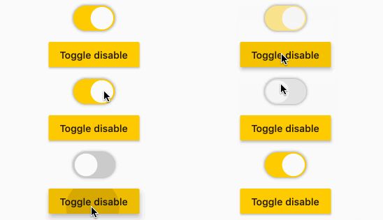
Good switch interactive experience
| Param | Type | Necessary | Default | desc |
|---|---|---|---|---|
| open | bool | false | false | Whether it is open. The default is false. |
| onChanged | ValueChanged | true | null | This function will be called back when the switch state changes. |
| width | double | false | 59.23 | width. Default 59.23, in line with aesthetics 😃 |
| height | double | false | null | height. By default, it will be calculated according to [width], which is in line with aesthetics 😃 |
| offset | double | false | null | Distance between slider and edge |
| openChild | Widget | false | null | Prompt style of open state |
| closeChild | Widget | false | null | Prompt style of closed state |
| childOffset | double | false | null | Tip to edge distance |
| color | Color | false | null | Background color when off |
| openColor | Color | false | null | Background color when open |
| sliderColor | Color | false | null | Slider color |
| enable | bool | false | true | it's usable or not |
| sliderChild | Widget | false | null | The component in the slider. Beyond the range will be cropped. |
| shadowColor | Color | false | null | Set component shadow color |
| shadowOffset | Offset | false | null | Set component shadow offset |
| shadowBlur | double | false | 0.0 | Set the standard deviation of the component Gaussian and shadow shape convolution |
FSwitch(
  onChanged: (v) {},
)
FSwitch needs to always set onChanged in order to respond to the switch status.
FSwitch(
  onChanged: (bool value) {
    value_1 = value;
  },
  open: value_1,
  enable: enable_1,
  shadowColor: Colors.black.withOpacity(0.5),
  shadowBlur: 3.0,
),
You can change the available status of FSwitch through enable. Once FSwitch becomes available, the switch state cannot be changed.
In addition, FSwitch provides flexible and convenient shadow configuration support.
/// #1
FSwitch(
  width: 65.0,
  height: 35.538,
  onChanged: (v) {},
  closeChild: Text(
    "Off",
    style: TextStyle(
        color: Colors.white, fontSize: 11),
  ),
  openChild: Text(
    "On",
    style: TextStyle(
        color: Colors.white, fontSize: 11),
  ),
),

/// #2
FSwitch(
  open: true,
  onChanged: (v) {},
  closeChild: Icon(
    Icons.close,
    size: 16,
    color: Colors.white,
  ),
  openChild: Icon(
    Icons.check,
    size: 16,
    color: Colors.white,
  ),
),

/// #3
FSwitch(
  width: 65.0,
  height: 35.538,
  onChanged: (v) {},
  closeChild: Text(
    "😒",
    style: TextStyle(fontSize: 20),
  ),
  openChild: Text(
    "😃",
    style: TextStyle(fontSize: 20),
  ),
  childOffset: 3.0,
),
The open and closed status indicators can be set for FSwitch through openChild and closeChild, respectively.
FSwitch(
  width: 300,
  height: 38,
  onChanged: (bool value) {},
  sliderChild: Text(
    "😃",
    style: TextStyle(fontSize: 20),
  ),
)
sliderChild will allow developers to set child decorations for Slider.
It's interesting!
Add dependencies in the project pubspec.yaml file:
dependencies:
  fswitch: ^<version number>
⚠️ Attention,please go to pub to get the latest version number of FSwitch
dependencies:
  fswitch:
    git:
      url: '[email protected]:Fliggy-Mobile/fswitch.git'
      ref: '<Branch number or tag number>'
⚠️ Attention,please refer to FSwitch official project for branch number or tag.
Copyright 2020-present Fliggy Android Team <[email protected]>.

Licensed under the Apache License, Version 2.0 (the "License");
you may not use this file except in compliance with the License.
You may obtain a copy of the License at following link.

    http://www.apache.org/licenses/LICENSE-2.0

Unless required by applicable law or agreed to in writing, software
distributed under the License is distributed on an "AS IS" BASIS,
WITHOUT WARRANTIES OR CONDITIONS OF ANY KIND, either express or implied.
See the License for the specific language governing permissions and
limitations under the License.


