-
Notifications
You must be signed in to change notification settings - Fork 727
Accessibility in Semi Design
TL;DR This article mainly introduces how to support accessibility as a website designer and the accessibility design done by Semi Design, the estimated reading time is 15–20 min
Any front-end open source UI component library that does not support accessibility is a disaster. -- From a Zhihu user
Semi design has received extensive attention and comments from industry insiders since it was open-sourced, and the comment above caught our attention.
Based on the population reported by the Sixth National Population Census, the proportion of disabled persons and the proportion of different types of disabled persons reported by the Second National Sample Survey on Disability, it is estimated that there are 85.02 million disabled persons in China by the end of 2010, of which about 12.63 million are visually impaired. It means that if accessible design is not considered part of the design system, our design system may exclude this large group of population.
As designers, we have the responsibility to create products easily accessible to everyone. That's why Semi launched its A11y project to remove barriers and create inclusive product experiences that work for everyone.
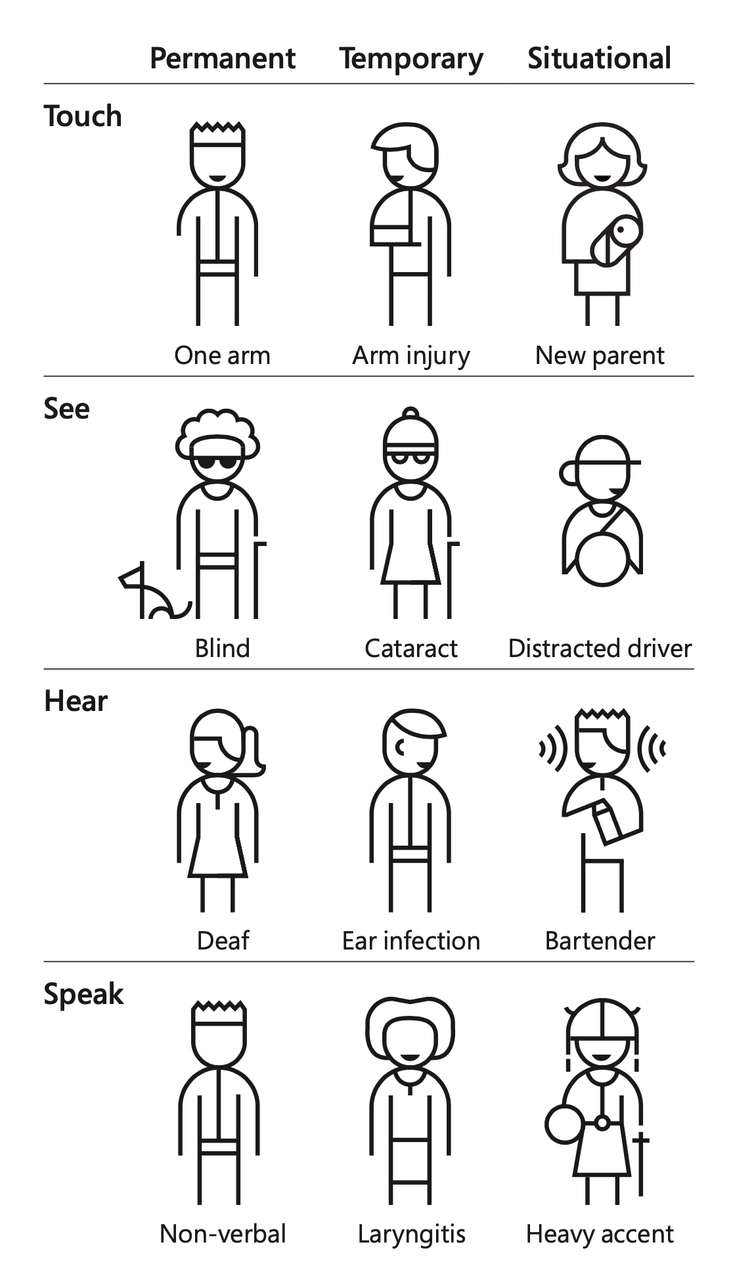
A11y stands for Accessibility, or accessible design. Although it is generally considered for people with disabilities, accessible design is actually about providing an equal experience for all. Because each of us may have moments of disability. For example, you cannot use your eyes 👀 temporarily because you just have myopia surgery. Or you cannot see clearly when being exposed to strong light. These are situational disabilities.
Therefore, the ultimate goal of accessible design is to make the Internet accessible to all regardless of their background, ability, or situation. Here's something you might want to know: The second Thursday of November is World Usability Day. On this day, events occur around the world that bring together different communities to celebrate how people from all walks of life can make our world easy for all. Now that we understand what A11y is, what should we do next?
Designing and developing inclusive products starts with understanding the different needs of different users and their assistive devices. At present, the main types of impairment are visual impairment, hearing impairment, physical impairment and cognitive impairment. Below is what we need to pay attention to when people with each type of impairment use products.
There are three categories of visually impaired people: blind people, people with low vision, and colorblind people. Colorblind users and people with low vision experience similar barriers while accessing websites. You can see the world in the eyes of people with color vision impairments through Coblis, the color-blind emulator.
Blind users rely on screen readers to access websites, often navigating pages by browsing specific elements such as titles, links, or forms. It should be noted that such users generally do not use a mouse. Instead, they use a specially designed keyboard to access websites.
Low vision users have different needs depending on the nature of their visual impairment. Some users cannot distinguish text or other content without magnification, especially small text; some users have difficulty distinguishing text and images with low color contrast; some users may not be able to distinguish colors (the same problem is encountered by colorblind users). These users typically use screen amplifiers, contrast enhancement or color inversion software, and assistive tools such as screen readers to access websites.
Hearing-impaired users can access websites with the help of technological products such as hearing aids or cochlear implants. As a result, accessible design does not pay much attention to hearing-impaired users compared with other types of users with disabilities, but it should be noted that when we use media tools such as videos, subtitles should be added to improve the access experience of hearing-impaired users. Subtitles can also help non-native speakers. In addition, we need to avoid unnecessary autoplay, and give users the option to turn off the sound in case that it causes disturbance.
Users whose mouse no longer works or who suffer a broken arm, and those with chronic medical conditions such as repetitive stress injury (RSI) should limit or avoid mouse use, They use only the keyboard to navigate websites, usually relying on the Tab key and other keys to navigate between interactive elements.
Users with cognitive impairment have difficulty concentrating on long, dense texts and understanding complex structures.

After understanding the needs of users, we need to discuss what to do. After reading the Web Content Accessibility Guidelines (WCAG), we decided to complete Semi Design's A11y from the following aspects.
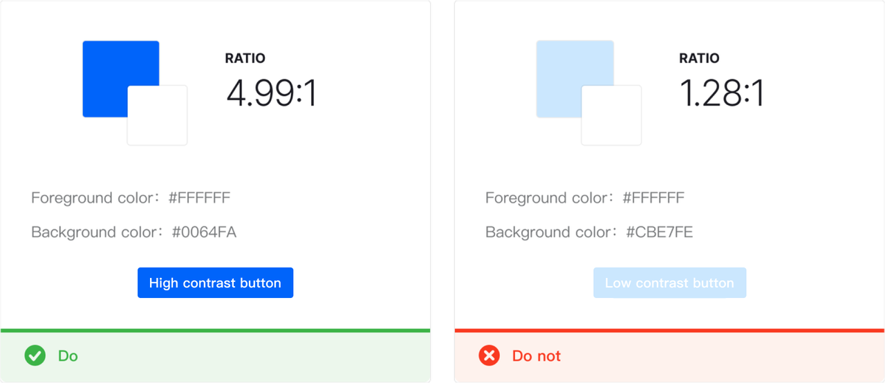
Contrast is a very important aspect of accessibility. High contrast makes visual elements stand out from the background. The contrast we are talking about here mainly refers to the contrast of text elements and the contrast at the component level.
According to the WCAG, the contrast ratio between texts (including texts within components) and background color should be at least 4.5:1. The requirement can be lowered to 3:1 for texts of 18px or larger. Disabled text is not subject to the contrast requirements.
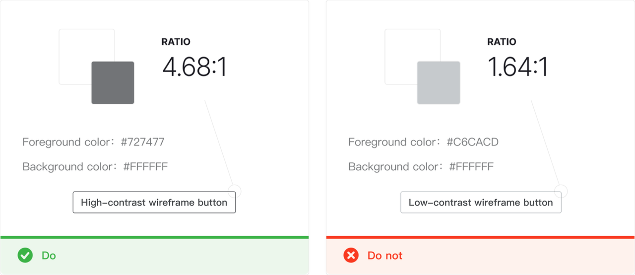
All operable components need to have a focus . The active, hover, and focus status of components all need to have a contrast ratio of at least 3:1 with adjacent colors. But there is no requirement for contrast ratio between different status. For components with strokes, only a 3:1 contrast ratio is required between the stroke color and the base color. There is no requirement for contrast ratio between the fill color and the stroke color.
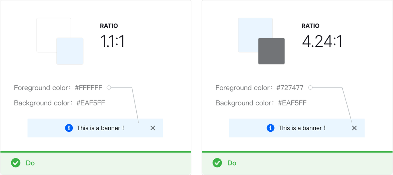
Reading-oriented components can be accessed by disabled users through screen readers such as Message, Banner, etc., and therefore do not need to strictly follow the AA standard. But in order to ensure operability, the actionable items within the components still need to meet the contrast ratio requirements.
In order to better support accessibility, we launched the A11y theme package. It should be noted that the contrast ratio of the orange hue has always been a complicated issue under the WACG 2.0 standard. Because any color with more than 50% yellow will naturally reflect more light. High-risk colors such as yellow, orange, green, and teal should be used with caution when accessibility is considered.
We support changing themes, and in order to ensure that all colors can be covered when changing themes, this version of theme package has not removed the orange hue.
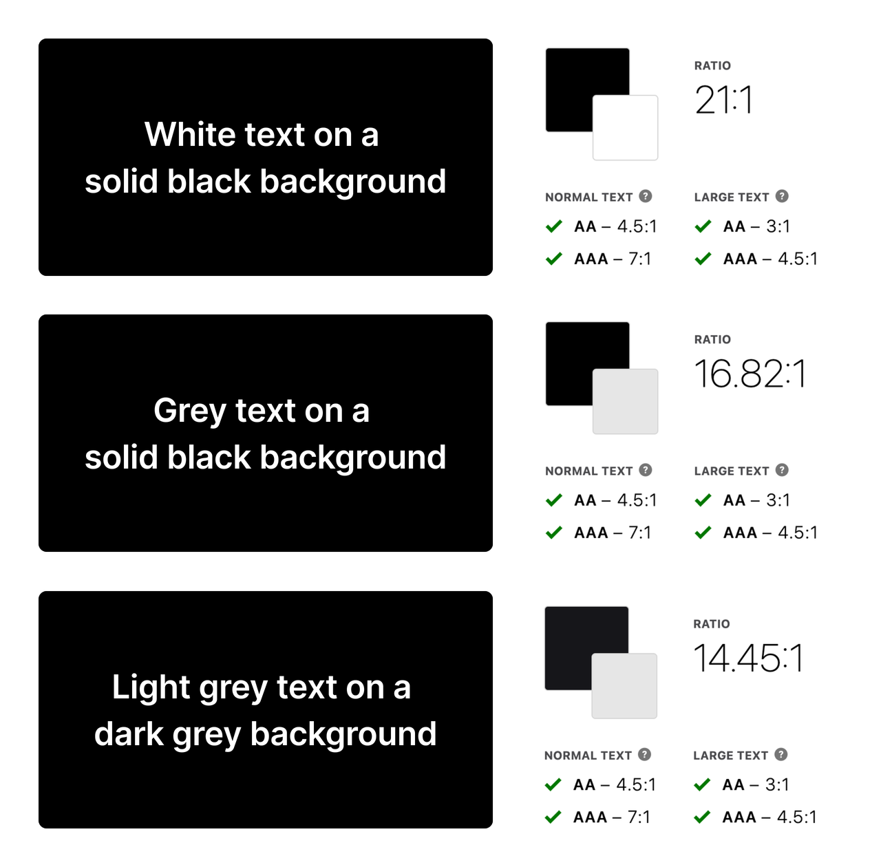
For dark mode, avoid using solid black as the primary background color. This is because placing white text on a solid black background will create halos that make reading difficult. It can be more difficult when it comes to large text or when the user suffers from astigmatism.
Therefore, although the contrast of solid black is high, text-0 and bg-0 in Semi Dark mode are light gray text on a dark gray background, which also increases readability while ensuring high contrast.
Halo: The effect caused by light propagating beyond its boundaries, forming fog around the edges of a bright image
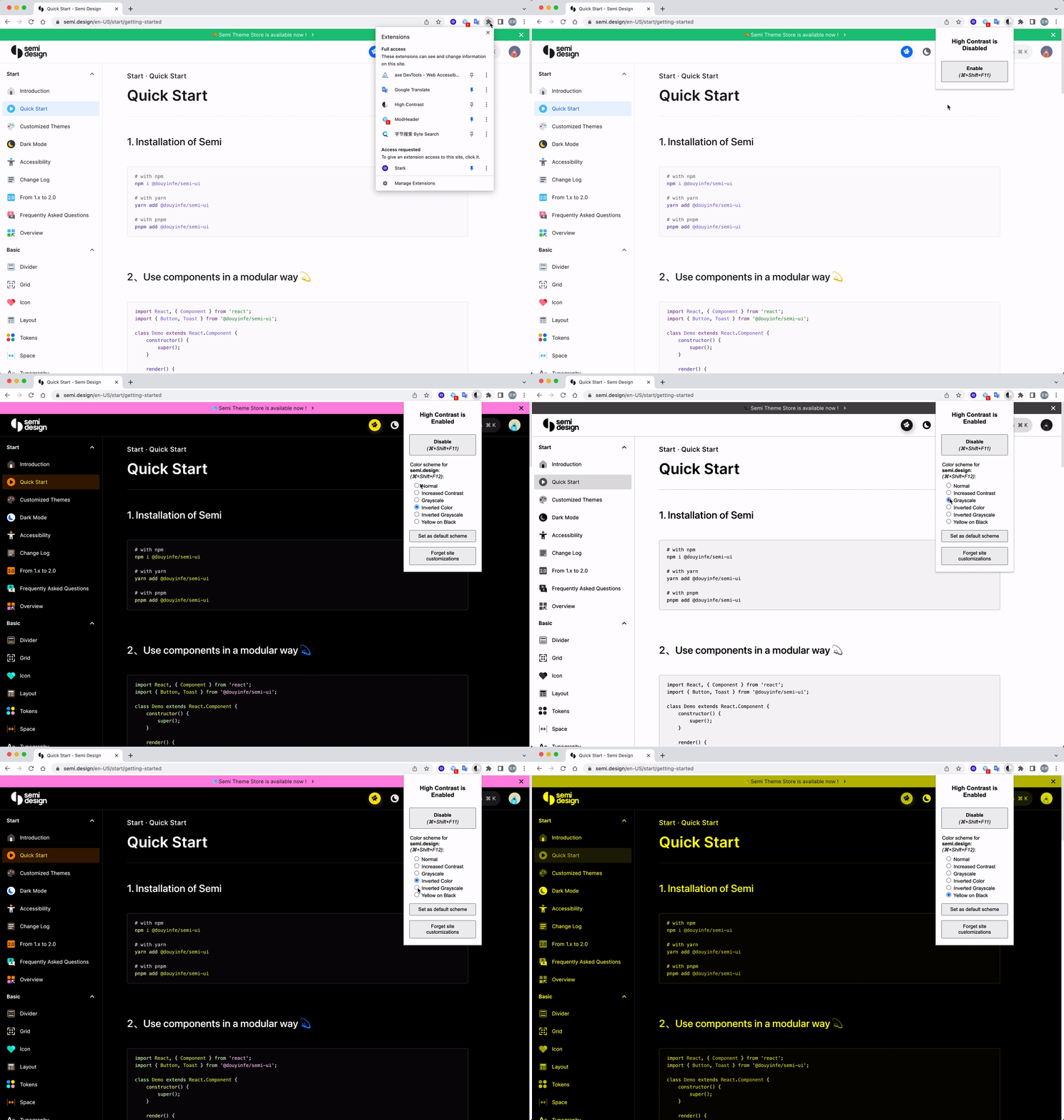
In addition to the A11y theme pack, visually impaired users are also recommended to use the chrome extension High Contrast Mode to access websites. This extension provides a variety of modes that support increasing contrast, gray scale, inverting colors, etc. to meet the needs of all types of visually impaired users.
When you're sending important message or feedback information, don't use color as the only way to convey information. Users with low vision or color blindness may have difficulty understanding what you are trying to say. Try adding icons, text, underscores, etc. to make sure everyone receives the same information. A typical example is error message prompts for forms.
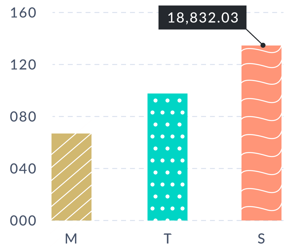
Adding textures and labels to charts can also help users distinguish elements within them. Despite that they add distractions to data analysts and therefore do not meet the data analysis standard, textures help improve accessibility.
This type of users can browse websites through keyboard shortcuts:
- Switch focus with the Tab key : The focus-switching order by pressing the Tab key should be predictable and follow a particular pattern, such as: top to bottom, left to right. When some key elements are focused, the prompt information should be displayed; after losing focus, the prompt should disappear;
- Arrows: Navigate between radio buttons, menu items, or widget items;
- Enter: activate button, submit form, etc.;
- Space: Activate button, select switch, etc.;
- Esc: Exit pop-up layers;
The most important thing about using the keyboard tab to navigate through web interactive elements is their focus state, which allows keyboard users to know where the focus is. Therefore, Semi Design has designed focus states for each interoperable component. In order to ensure that users who rely solely on keyboard can have the same browsing experience as ordinary users, The focus of Semi components needs to follow the following principles:
-
Initial Focus: To enable users to complete tasks, always set an initial focus for tasks. When the focus is switched, if the current focus control is covered, the focus needs to automatically switch to the first focus area of the new page. When setting the initial focus, note:
- The initial focus is normally set to the first logical interaction element or the first element in the task;
- When the task involves the last step of an irreversible process such as deleting data, it's best to set the initial focus on the least destructive interactive element, e.g., the close button;
- If the task is reading or continuing the current process, it is recommended to set the initial focus on the most likely used interaction element, e.g., the OK button.
- Navigation reversible: if a user can switch to the next focus through the Tab key, he should be able to switch back to the previous focus through Shift + Tab;
- Focus return to previous position: If the currently focused element disappears, the focus should return to the previous position. For example, closing a modal might mean that your focus is on the close button; when the modal is closed, focus should be returned to the button that opens the modal.
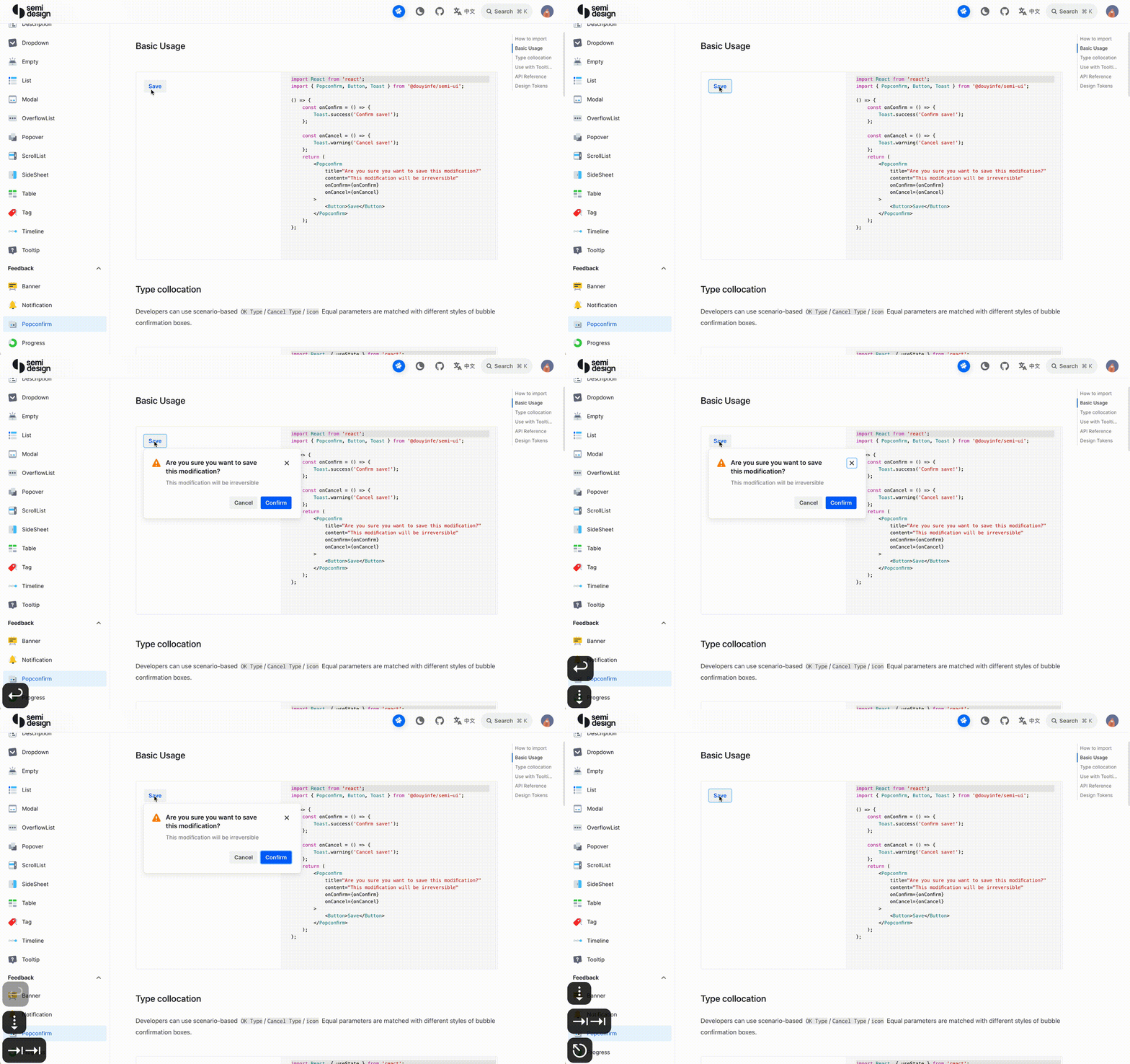
Detailed keyboard and focus instructions are provided for every component of Semi. You can go to Semi's website to experience it for yourself. The following is an example of Popconfirm keyboard interaction:
Native elements have built-in semantics in the browser (e.g., buttons have a built-in role of button). But for custom components, Semi uses ARIA (Accessible Rich Internet Applications) to add semantic information to help screen reader users better interact with the component. ARIA supports the following auxiliary features:
- Let users know what the focused element is and what it does.
- Let users know its current status; whether it can be selected; whether it is disabled; whether there is a pop-up layer, etc.;
- Let users know the number of items in the list, and the whereabouts of the focused element. Semi provides semantic information for all of its components. Coupled with keyboard interaction, it allows people with disabilities to access websites more smoothly.
People with low vision access websites with the help of screen readers. When screen readers read an image that is not processed, a visually impaired user can only hear that there is an image here. But there is no way for him to know the message conveyed by it. What's worse, he might only be able to hear the file name of this image.
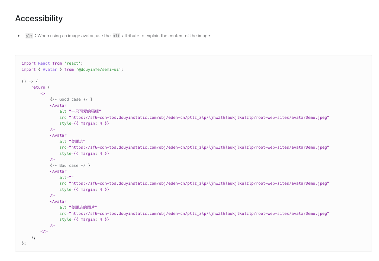
To avoid the above-mentioned situation, we provide alternative text for image elements. Semi uses the alt attribute to interpret Image-type components such as avatars.
Provide subtitles for audio or video content, and screen readers can read the text aloud, so that hearing-impaired users can have good access to such information.
When producing animations or videos, flashing content should be avoided. Nothing on the screen page should flash more than 3 times per second, as it may trigger seizures in some users. Unless the flashing area is small and the contrast of the content is low and does not contain too much redness. I wonder if you have heard of such a case. In the 38th episode Electric Soldier Porygon of the Japanese cartoon Pokémon (1997), Pikachu used electric shocks to destroy missiles. After the missile exploded, there were unusually bright and flashing red and blue alternating images, inducing epileptic seizures in nearly 700 children. As content designers, we are obligated to ensure the security of the content we produce.
Reasonable and concise layout allows users to easily explore the content. When designing the interface, designers should ensure that
- Information is clear, concise and easy to navigate;
- Content is divided into short, relevant sections, and long paragraphs are avoided for the sake of visual hierarchies;
- The browsing order of the overall layout is linear and consistent;
- It's still readable at a 200% amplifier. They are helpful for users who rely on screen readers, screen amplifiers, and users with cognitive impairments without losing information or functionality.
The above introduces some of Semi's efforts in accessible design. What else can designers do for accessibility in daily work? Designers and engineers can compare whether their products meet the accessibility standards aforementioned. Here are a few tips and precautions.
If you want to verify whether your design meets the standard of "color is not the only visual cue", you can use the chrome plugin - High Contrast Mode, select the mode to [Inverse Gray] to change the interface to a de-colored one, and then test whether you can accurately obtain all the information in that case.
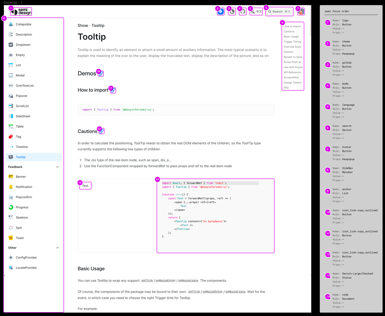
Page-level focus order is important for the overall keyboard interaction to work smoothly. You can use Figma to insert plugin A11y - Focus Orderer to mark the focus order. After your marking, engineers can realize your demands through tabIndex.
For some Semi controlled components like Popover, the focus will be lost after the user closes Popover through esc as Semi cannot confirm the trigger mode of the trigger of the controlled component. It requires the developer to manually handle it and switch the focus to the next interactive element.
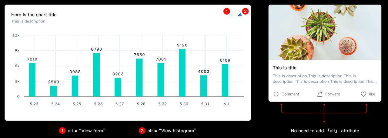
When your design includes images or icons, use the alt tag to replace the text. Of course, if your designed buttons contain icons and labels, you do not need to add the alt attribute, otherwise the screen reader will broadcast the same information twice, which will disturb concentration and do harm to user experience.
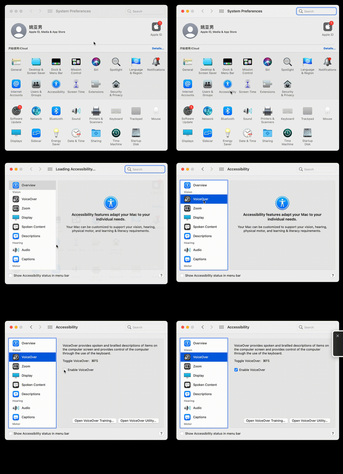
When you are using some screen readers, do you find them a little difficult to get started?Here are some tips for using the narrator of the screen reader that comes with your Mac computer. Open [System Preferences], click [Accessibility], select [Voice], and check [Enable Voiceover] . You can experience this function, and you can also click [Open Voiceover Training...] to learn how to use it initially.
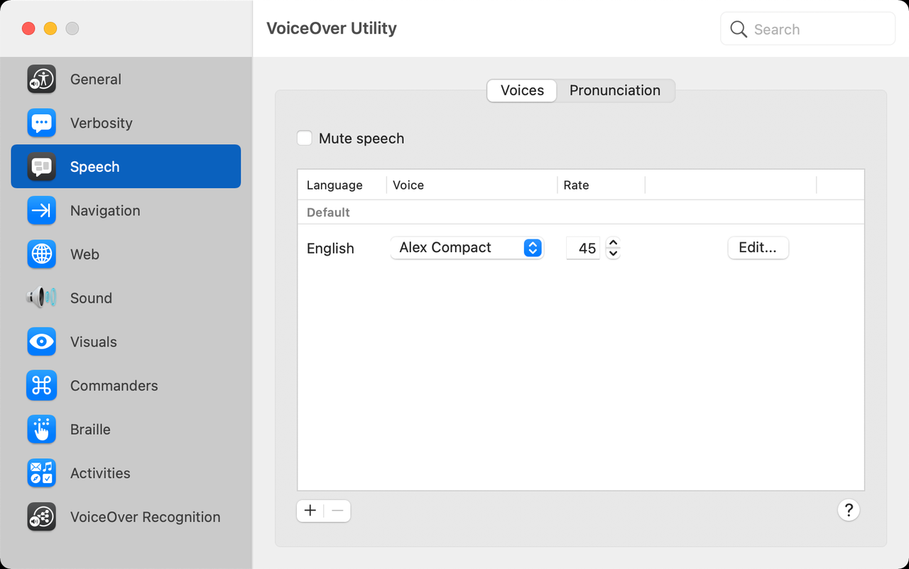
Click [VoiceOver Utility] can also customize some narration preferences, such as the voice of the broadcast, etc.
Here are some shortcut keys for everyone to use quickly:
| operation | shortcut keys |
|---|---|
| Open / Close VoiceOver | Command + F5 |
| Read the title and have the narration jump through the title text of the page | Control + Option + Command + H |
| Navigating a web page (eg: when you want to read the text under the title after focusing on the title) | Control + Option + Right Arrow |
| Adjust the narration reading rate | Control + Option + Command + Down Arrow / Up Arrow |
| Start narration on the current page | Control + Option + Shift + Down Arrow |
| Browse through all the navigation items on the web page and open the rotor | Control + Option + U |
There are some limitations of WCAG 2.0, such as the orange hue mentioned above. We will continue the iterative optimization to WCAG 3.0, and simultaneously update the contrast standard in the DSM editor and documents.
The new color contrast standard APCA optimizes the ratio of the 2.0 version to a numerical value, and the higher the value, the higher the contrast. The new standard takes into account font-size and font-weight, contrast changes after text and background colors are exchanged, and most importantly, addresses the issue of tonal perception, so that the long-standing orange hue problem is solved.
Finally, I would like to say that we still have a lot to learn about accessible design. And the Semi team will continue to work on design for accessibility. At the same time, I hope we could work together and bring accessible design to more users, providing them a better work and life experience while maximizing the benefit of technology.

