LG-7073 Hint text on the form fields for screen readers#6747
LG-7073 Hint text on the form fields for screen readers#6747
Conversation
 eric-gade
force-pushed
the
LG-7073-hint-text
branch
2 times, most recently
from
eric-gade
force-pushed
the
LG-7073-hint-text
branch
2 times, most recently
from
623ba1b to
efb9bfa
Compare
|
@aduth Check out the latest changes, which should address all of your inline issues. I pulled a better way to do this from some other work and it's much simpler. |
There was a problem hiding this comment.
I suspect it won't be an issue, but since the IDs are shared with all other elements on the page, the idea with prefixing the error ID with validated-field- was to try to namespace it a bit. What would you think of doing the same here?
| id: "hint-#{unique_id}" | |
| id: "validated-field-hint-#{unique_id}" |
There was a problem hiding this comment.
Is the title necessary here, or is the aria-label achieving what we want? My understanding is that the title attribute should rarely be used.
See: https://silktide.com/blog/i-thought-title-text-improved-accessibility-i-was-wrong/
There was a problem hiding this comment.
No, it's not necessary. I will remove and find an alternative way to perform the corresponding frontend tests. Thanks for the link that is informative
There was a problem hiding this comment.
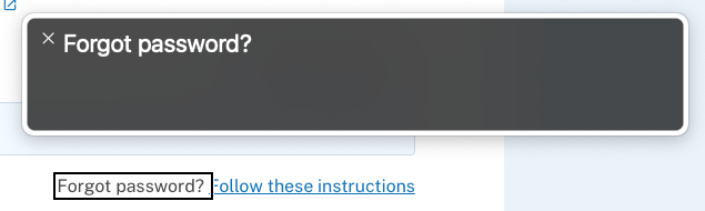
I'm trying to understand this change. Reading the ticket, it sounds like it was suggested that the "Forgot password?" text was not being read by the screen reader, but it seems like it is correct in my testing? It's not focusable nor directly associated with the field, but it is reachable content.
My concern with this change then is that...
- The text would be present and read twice: "Forgot password? Forgot password?"
- This would create a disconnect between the visible and accessible name (G211), making it difficult for users who use dictation software to interact with the link
I do think the link could be improved though, since its purpose isn't really clear by the link alone (SC 2.4.9), which may make it difficult to use for those who use a tool like web rotor to navigate links or who navigate by tabbing with a screen reader. A label like "Follow these instructions to reset your password" or just "Reset your password" could help make it clearer.
There was a problem hiding this comment.
Reading the ticket, it sounds like it was suggested that the "Forgot password?" text was not being read by the screen reader, but it seems like it is correct in my testing?
I can confirm that when the whole page is read (on main), the "Forgot password?" text is also being read. And I agree that the ticket could be more specific. My assumption was that the issue referred to the forgot password text being associated with the link that follows (when focused).
The same applies to the other part of the ticket, the social security example. It's reachable by the normal reading of the page but will not be read when either the input field or its label is selected/focused (again, on main).
The text would be present and read twice: "Forgot password? Forgot password?"
Yes, this definitely happens on a full page read (but not when tabbing to the link). Perhaps there is another strategy we could use here.
I do think the link could be improved though, since its purpose isn't really clear by the link alone (SC 2.4.9), which may make it difficult to use for those who use a tool like web rotor to navigate links or who navigate by tabbing with a screen reader. A label like "Follow these instructions to reset your password" or just "Reset your password" could help make it clearer.
It might be worth kicking the design back to UX real quick also, since as you've said the link is not ideal for accessibility purposes by its design.
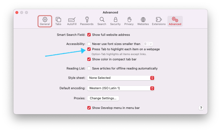
Side Note: I just noticed that the "Follow these instructions" link cannot be focused with tab in Safari for some reason.
There was a problem hiding this comment.
Side Note: I just noticed that the "Follow these instructions" link cannot be focused with tab in Safari for some reason.
Yeah this is unfortunately a default behavior in Safari, one which you can correct in Preferences > Advanced.
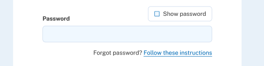
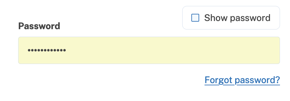
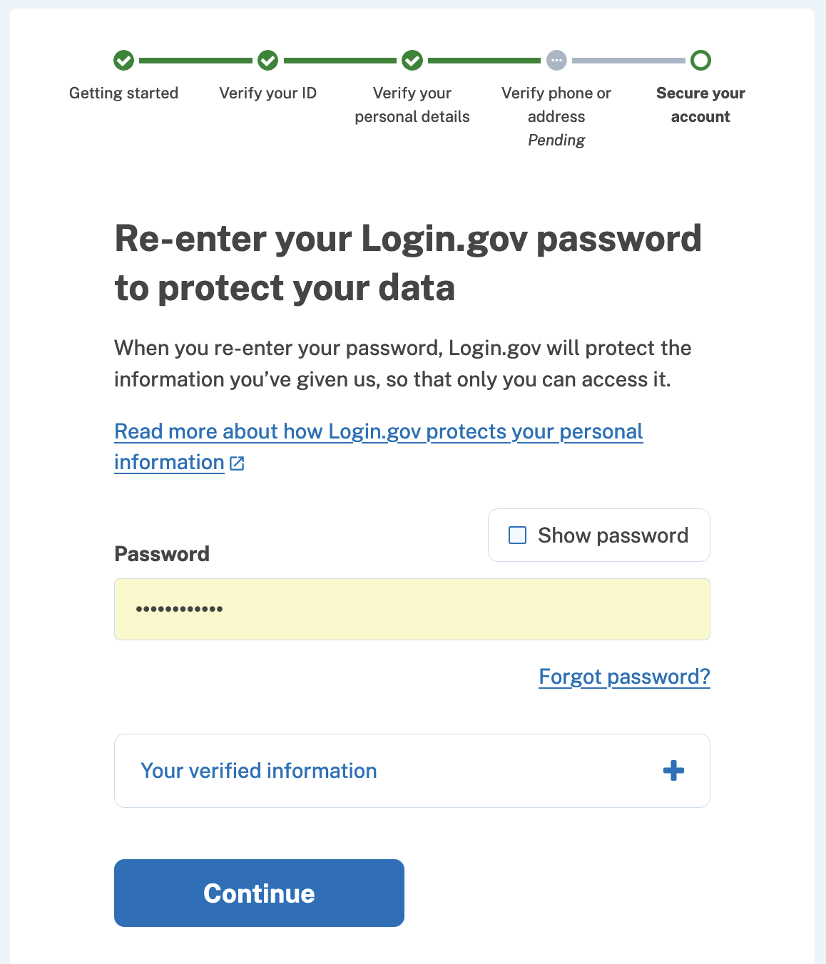
Update@aduth After discussing this with some of the team (esp. @artfulaction), we decided to just change the text of the link so that it is in line with the rest of the application and better described. This applies to the confirm password page that appears after entering your SSN during IdV. Here the before screenshot: And here's the updated after version: (Full page here for context) MiscHowever, we're not quite done. I have modified this template to be in line with the component that was modified for the above change, but I don't know where this template is rendered in the flow so haven't been able to test it for real. Additionally, I have some un-pushed changes where I've removed the now unused localization entries for "Follow these instructions" and the original "forgot password" entry. |
|
Based on #6807, I wonder if you'd already found your way there, but I'm guessing the issue may be related to how this template is rendered in two different places:
I expect we'll want to update both. |
-- What
By updating the simple_form initializer wrappers and the configuration
of the output in the validated_form template, we ensure that the hints
-- if present -- are caught by screen readers. We do this by making
the hints a <label> instead of a <div>, and pointing that label to the
same input element as the main form's label. This way both the main
label and the hint are read by screen readers.
-- What
On the Re-Enter Password screen for GPO verify, the text "Forgot
password?" that precedes the password reset link is not readable by
screen readers. To deal with this, we add the localized text of
"Forgot password?" to the `title=` attribute of the link itself inside
of the corresponding React component. This ensures that screen readers
will read both the link text and the forgot password hint.

changelog: Improvements, Accessibility, updating password hint
changelog: Improvements, Accessibility, updating aria-label forgot password
changelog: Improvements, Linting, fixing template formatting
-- What
Instead of using two <label> elements to refer to the same input
field (which might cause issues and is in a grey area when it comes to
correcness), we simply give the hint div a generated id and prepend
that id to the input's `aria-describedby` attribute value.

(This is in the context of validated field components)

changelog: Improvements, Accessibility, simplifying validated field
hint accessibility
changelog: Improvements, Formatting, fixing erb linting errors
-- What
After some discussion regarding the accesibility/descriptive
properties of the "Forgot password?" aria label and subsequent "Follow
these instructions" link on the SSN confirmation password entry page
of IdV, we decided to change the link text and remove the non-link
description entirely.

This commit makes that change and updates the localizations (which
already existed elsewhere) to match other "forgot password" text
around the site. Additionally, we have updated some test assumptions
about querying.
-- What
Because the FSMv2 was still enabled for the React component locally, I
was not seeing the template version. This commit updates the template
and also removes now unused localizations from the config.

I am also updating a couple of Ruby component tests that assumed a
single aria-describedby value on labelled validation components with
hints, whereas now we supply two values to that attribute
eric-gade
force-pushed
the
LG-7073-hint-text
branch
from
8dc59af to
48ee2ad
Compare
app/javascript/packages/verify-flow/steps/password-confirm/password-confirm-step.tsx
Outdated
Show resolved
Hide resolved
Co-authored-by: Andrew Duthie <andrew.duthie@gsa.gov>
…sword-confirm-step.tsx

Co-authored-by: Andrew Duthie <andrew.duthie@gsa.gov>
changelog: Improvements, Accessibility, element ids
| "validated-field-hint-#{unique_id}", | ||
| "validated-field-error-#{unique_id}", |
There was a problem hiding this comment.
Curious: Does the order matter here, i.e. if a field had both an error message and a hint, is one read before the other? Do we care for it to be?
There was a problem hiding this comment.
That's a good catch actually. The order does matter. I think the error message should be read before the hint (if it is present)
There was a problem hiding this comment.
I think the error message should be read before the hint
Makes sense to me 👍
-- What
Previously, the order of the aria-describedby attribute values was
reversed from what we would probably want, meaning that if a
validation error was present, the error would be read after the
hint. We want the error to be read first so users know that something
was not right, then provide the hint.
Co-authored-by: Andrew Duthie <andrew.duthie@gsa.gov>
changelog: Improvements, Accessibility, emtpy commit for gitlab ci
changelog: Improvements, Accessibility, updating inline linting
changelog: Improvements, Accessibility, general improvements
2 participants
No description provided.