LG-3879: Use design system grid for account header#5953
Conversation
|
The header portion is just the Login.gov logo and Welcome/Sign out, right? If so, that change looks fine to me. IIRC I mostly mocked up the Figma based on the live implementation so I don't think we need to adhere to closely to that, and can switch to design system defaults if it doesn't break anything. Personally I would align the logo to the left edge of the sidebar, and the Welcome/Sign out button and text to the right edge of the main - so |
This might simplify things actually, since we could set a single consistent grid container width. |
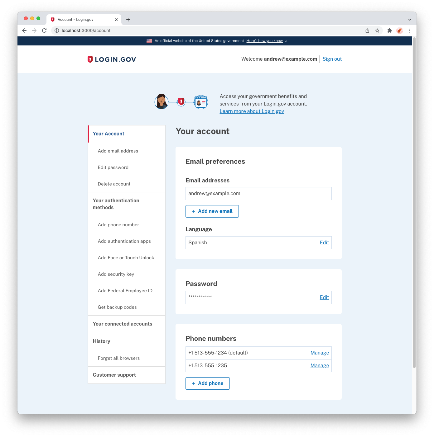
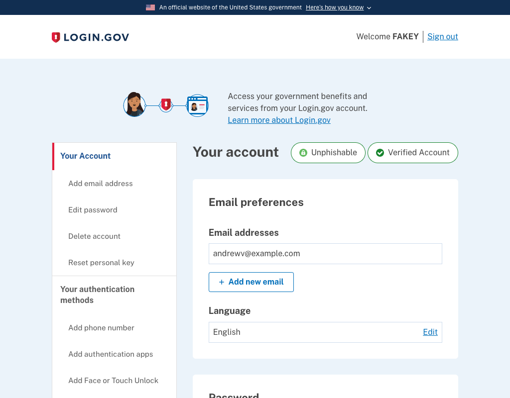
Looking into this, the configurability of this in the design system is through the To get to a number closer to what we have currently for the main content area, we can change the max-width to @anniehirshman-gsa What would you think about a content area of 816? We could tinker with increasing Preview at 816:
|
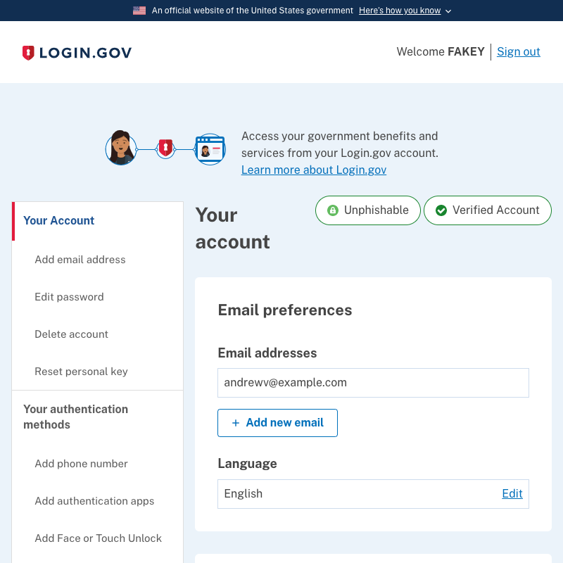
This sounds good to me and the screenshot looks good - though would you be able to push it to your personal env so I can check the responsiveness/breakpoint? ETA: The illustration/intro text block is off-center, but I think it was like that before? Would be great to fix either now or when other parts of the BassCSS grid are removed from the Account page. |
Good point! I recall asking about this when it was first implemented, and it was semi-intentional, though maybe undesirable at least with the updated grid sizing. I'll see about centering it. |
Updated grid in 146c5bd and centered the illustration intro block in 430d73f, both of which are available to take for a spin now in my sandbox. |
 aduth
force-pushed
the
aduth-lg-3879-nav-auth-grid
branch
from
aduth
force-pushed
the
aduth-lg-3879-nav-auth-grid
branch
from
b029111 to
e9db138
Compare
 anniehirshman-gsa
left a comment
anniehirshman-gsa
left a comment
anniehirshman-gsa
left a comment
There was a problem hiding this comment.
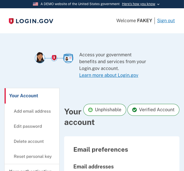
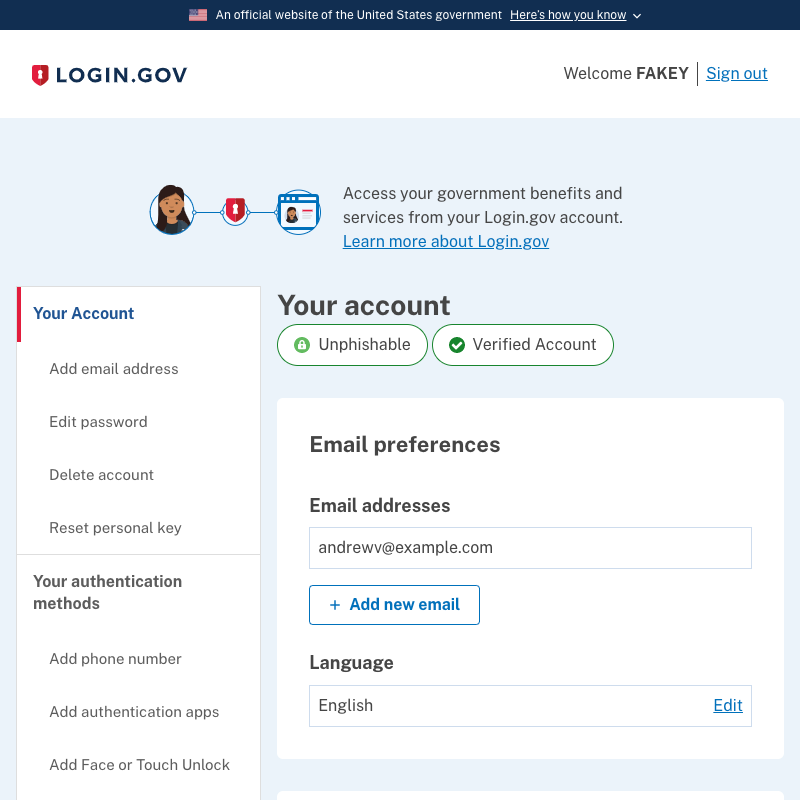
Account page breakpoints and tablet view look awesome now! 👏
Only thing would be the visual issue that Doug found - what happens when both "Verified" and "Unphishable" badges appear. I would just move both them below the Your Account h1 at the tablet breakpoint (or all breakpoints) to keep it simple, but open to other ideas.
|
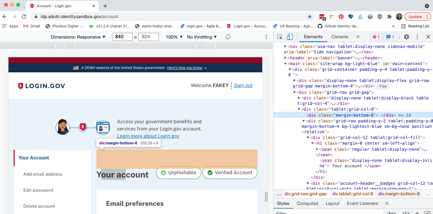
Oh also - there's this extra margin that I think can go away or be reduced? But lmk if you think that would cause issues (on mobile or elsewhere)
|
The branch in my sandbox is a bit out of sync with main, but this was fixed with #5954. |
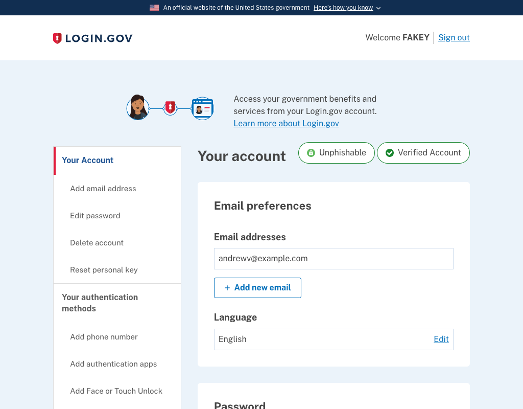
Sure, I updated collapsing behavior so that it'll move under if it runs out of space. It's also on its way to my personal sandbox, along with the fix of #5954.
|
 aduth
force-pushed
the
aduth-lg-3879-nav-auth-grid
branch
2 times, most recently
from
aduth
force-pushed
the
aduth-lg-3879-nav-auth-grid
branch
2 times, most recently
from
7322497 to
3bf0378
Compare
**Why**: To simplify markup and to standardize on design system utilities.
Content is already padded, centered within
Still used in email stylesheets
changelog: Improvements, Layout, Use design system for layout
aduth
force-pushed
the
aduth-lg-3879-nav-auth-grid
branch
from
efec055 to
16a55ca
Compare
| 'mobile-lg': true, | ||
| 'tablet': true, | ||
| 'tablet-lg': false, | ||
| 'desktop': false, |
There was a problem hiding this comment.
Disabling this will have a nice performance impact, reducing the size of the generated stylesheet by a fair bit, since each of these breakpoints generates a lot of utility styles.
Overall, this pull request reduces the size of the stylesheet by ~11% (62.2kb to 55.4kb gzipped).
3 participants
Why: To simplify markup and to standardize on design system utilities.
For design review (cc @anniehirshman-gsa):
Screenshots: