Refactor registration form to use ValidatedFieldComponent#5656
Conversation
There was a problem hiding this comment.
To an earlier comment, I wonder if these keys should be expected to be given as snake_case, then converted to camelCase internally in the implementation of the component.
On one hand, it's more Ruby-ish, and also matches a similar behavior for passing other HTML attributes like data: { foo_bar: 1 } ➡️ data-foo-bar="1" ➡️ dataset.fooBar.
On the other hand, it may be valuable and easier to understand these as mapping one-to-one with the specific ValidityState properties.
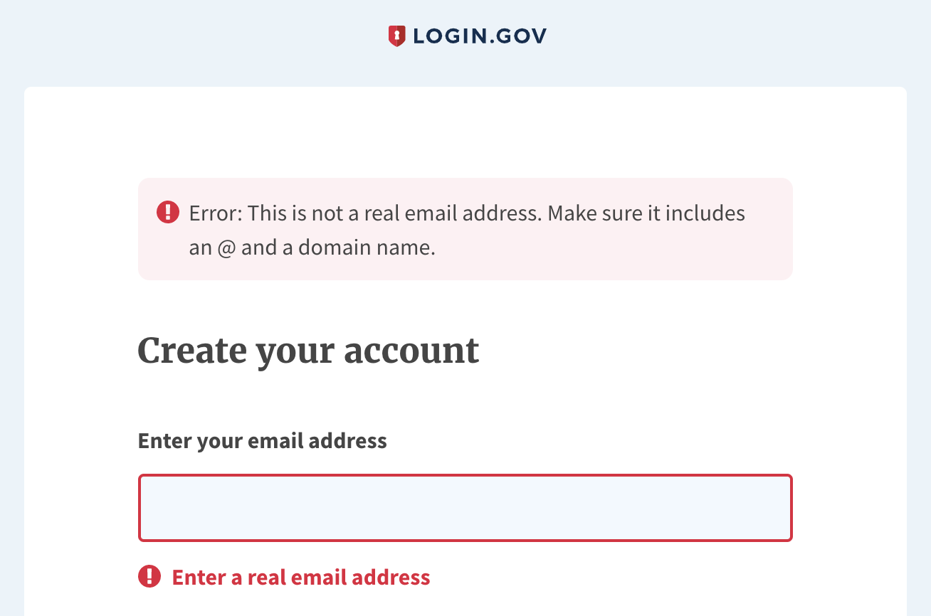
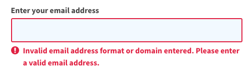
Also worth noting that the server-side validation uses a different error message: "Invalid email address format or domain entered. Please enter a valid email address." (screenshot) It might be nice to bring these in sync and use a single error message text. |
IMO the in-line error field is sufficient to resolve an email validation issue, and I'm comfortable removing the "Make sure it includes an @ and a domain name." @Danielle-Lee feel free to confirm or disagree :) From a general UX perspective: there are almost always just one or two fields on the page on the IdP, so we can use in-line error messaging only for those. We would only need an alert banner at the top if 1) we had a long form and we needed to summarize a bunch of errors, or 2) we had a long error description that would look bulky as in-line messaging. |
|
Thanks @anniehirshman-gsa . Just to be super clear, are you suggesting the following wording for the error message: ?
Or keep it how it is was?
To my previous comment, I had tried adapting the server validation message as well, to a single new message, though I'm not attached to it:
|
|
@aduth Hm, for phone number we use "Phone number is not valid"... so we could change it to "Email address is not valid"? "Valid" is less plain language than "real", but I feel like "real" implies that we are checking to see if it's an email address that actually exists, when I imagine we are just checking to make sure that the format matches an email address. That said, I am also fine with keeping "Enter a real email address" if that's easier. |
Technically we do a bit of light, but "real-ish" validation on the server-side, both to check that the email domain has a valid MX record and isn't a disposable email service, but yeah, generally we're pretty light on validation, and I'd lean toward a single message between our front-end and server-side validations, plus "valid" also being used elsewhere already. |
**Why**: In the case of form validation where multiple fields are errors, the first input with an error should be the one to receive focus.
**Why**: To avoid ad-hoc validations (`email-validation.js`, `accept-terms-button.js`), leverage standardized field component, and show Submit button as enabled by default.
**Why**: To parse out the rendered strings to more easily assert against

See: #5656 (comment)
 aduth
force-pushed
the
aduth-validated-field-registration
branch
from
aduth
force-pushed
the
aduth-validated-field-registration
branch
from
c515dce to
721866a
Compare
**Why**: Per UX feedback
|
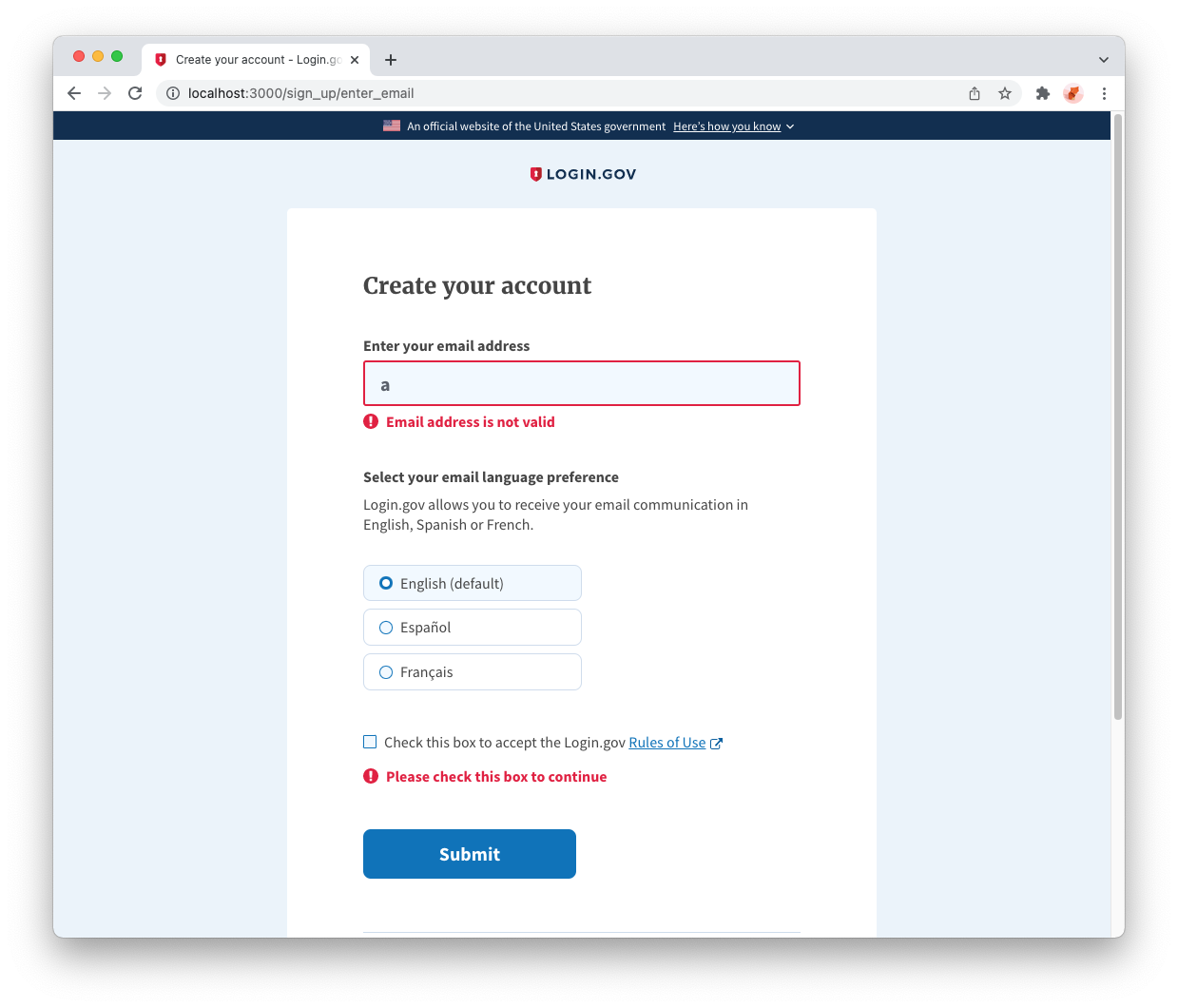
Based on feedback, I updated the invalid error message text to "Email address is not valid" in 07a88c9.
|
4 participants
Why: To avoid ad-hoc validations (
email-validation.js,accept-terms-button.js), leverage standardized field component, and show Submit button as enabled by default.Review with whitespace changes hidden:
?w=1Expected changes in behavior:
Screenshots: