LG-5115:Refactor the check/select box behavior across the IAL2 flow#5417
LG-5115:Refactor the check/select box behavior across the IAL2 flow#5417
Conversation
 jmdembe
changed the title
jmdembe
force-pushed
the
jd-LG-5115-check-select-box-behavior
branch
3 times, most recently
from
jmdembe
changed the title
jmdembe
force-pushed
the
jd-LG-5115-check-select-box-behavior
branch
3 times, most recently
from
ba1f01b to
925931d
Compare
|
Just a heads-up that I merged #5279 which updated the markup for the agreement checkbox to use the design system checkbox, and might introduce some conflicts for your branch. Let me know if I can help sort those out. |
jmdembe
force-pushed
the
jd-LG-5115-check-select-box-behavior
branch
2 times, most recently
from
3e2f179 to
ab00f4f
Compare
 aduth
left a comment
aduth
left a comment
aduth
left a comment
There was a problem hiding this comment.
For a similar error message in #4968, we implemented and used a "display-if-invalid" helper for the form validation, so that the message can be shown before the user hits "Continue". Could we use that here as well?
I think we'd just need to add display-if-invalid to the message and required: true to the input:
diff --git a/app/views/idv/doc_auth/agreement.html.erb b/app/views/idv/doc_auth/agreement.html.erb
index d801ffebe..1e29d93cd 100644
--- a/app/views/idv/doc_auth/agreement.html.erb
+++ b/app/views/idv/doc_auth/agreement.html.erb
@@ -25,14 +25,15 @@
           true,
           false,
           class: 'usa-checkbox__input',
+          required: true,
         ) %>
     <label class="usa-checkbox__label" for="ial2_consent_given">
       <%= t('doc_auth.instructions.consent') %>
       <%= new_window_link_to t('doc_auth.instructions.learn_more'), MarketingSite.security_and_privacy_practices_url %>
     </label>
-    <% if flow_session[:error_message] %>
-      <%= render 'shared/ial2-alert' %>
-    <% end %>
+    <div class="usa-error-message usa-error-message--with-icon display-if-invalid" role="alert">
+      <%= t('sign_up.agree_to_rules_of_use_and_continue') %>
+    </div>
   </div>
   <%= f.button :button, t('doc_auth.buttons.continue'), type: :submit,
class: 'usa-button--disabled usa-button--big usa-button--wide' %>There was a problem hiding this comment.
The partial is quite small and not very reusable. Could we just render the markup inline here instead?
There was a problem hiding this comment.
I considered rendering inline, but the rails documentation deems this to be a bad practice. Also, it makes the code hard to maintain for future us.
There was a problem hiding this comment.
Sorry, I was unclear. By "inline", I just mean having the markup here, i.e.
| <%= render 'shared/ial2-alert' %> | |
| <div class="usa-error-message usa-error-message--with-icon" role="alert"> | |
| <%= t('sign_up.agree_to_rules_of_use_and_continue') %> | |
| </div> |
There was a problem hiding this comment.
Since we're reusing this text outside of sign-up, maybe we should move / rename it to something more generic? In forms for example?
The message flips if |
jmdembe
force-pushed
the
jd-LG-5115-check-select-box-behavior
branch
4 times, most recently
from
541fa69 to
322b6d1
Compare
There was a problem hiding this comment.
I remember now we intentionally didn't apply usa-button--disabled until JavaScript has run, since otherwise the button always appears disabled in browsers where JavaScript is disabled, even after checking the checkbox (screenshot).
Was there a reason for adding it, or can we leave it out?
| class: 'usa-button--disabled usa-button--big usa-button--wide' %> | |
| class: 'usa-button--big usa-button--wide' %> |
There was a problem hiding this comment.
We can leave it out. I think I was having a weird experience with the JavaScript and I forgot to take this out.
There was a problem hiding this comment.
Per the previous comment, can we move / rename this string so it's not referencing "sign up" and "rules of use" if we intend to use it wherever there's a required checkbox to be checked? Maybe something like forms.validation.required_checkbox ?
 jmdembe
force-pushed
the
jd-LG-5115-check-select-box-behavior
branch
from
jmdembe
force-pushed
the
jd-LG-5115-check-select-box-behavior
branch
from
322b6d1 to
c5f63ed
Compare
2 participants
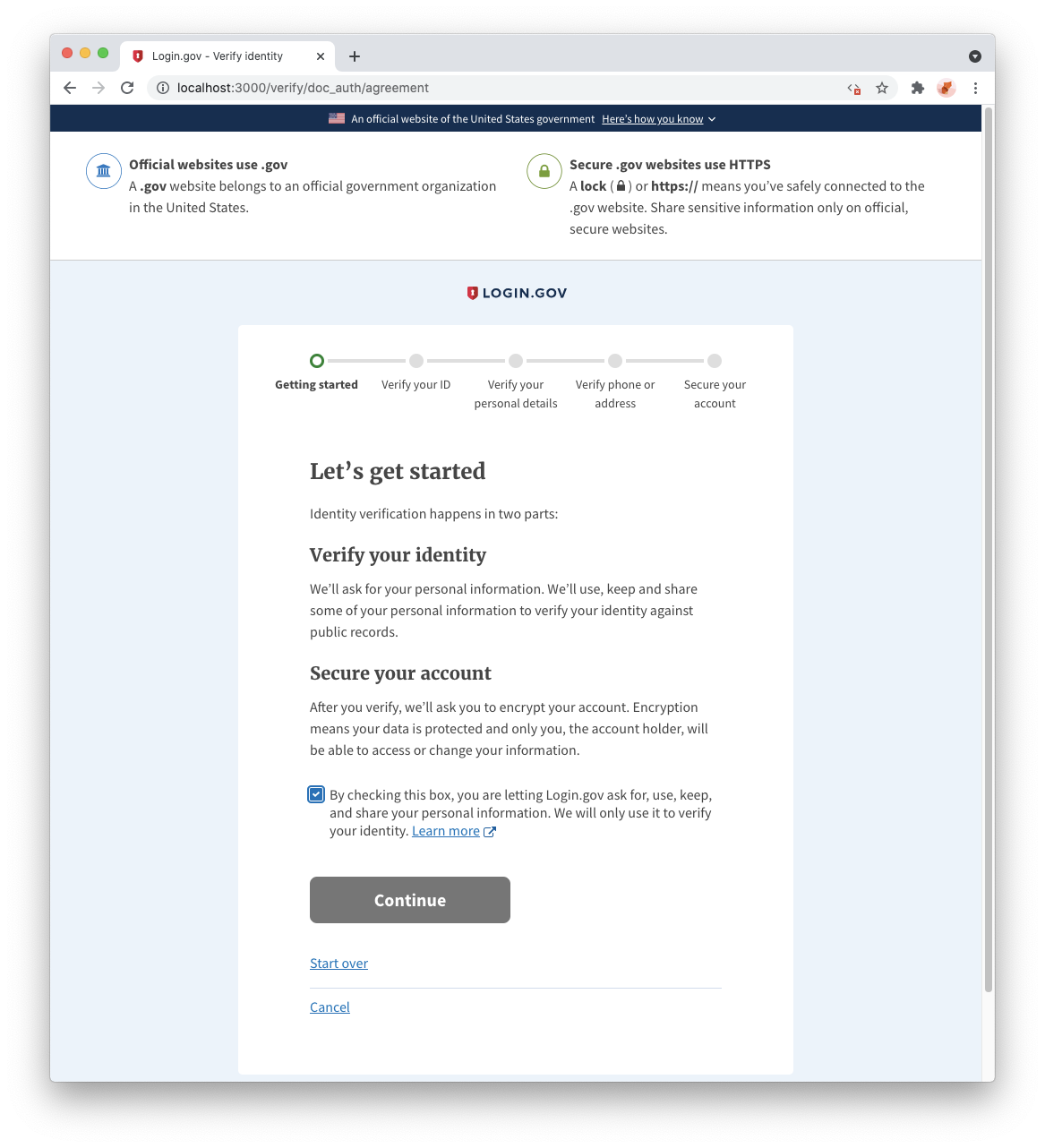
This PR adds a "please check this box to continue" warning to the doc auth agreement page.
Why: So that users are error messages are more consistent and easily identifiable to the user.