UX Design Philosophy #325
Comments
|
Wow thanks for the kind words, and for taking the time to write up such good feedback! I really love the idea of the little ongoing tutorial bubbles that pop up whenever you're about to do something new or you're looking at a new screen, pointing out the important features and how they might be used. This was initially explored in issue #146, and I'd love to add this type of thing to the potential 2.0 release of the app (we're wrapping up the summer of bitcoin 2023, and I should be ready to release a 1.0 version of the app this fall). I have labels for issues that are marked as 2.0, (you can find them here). The small little problem I'm always facing with Padawan is that a major feature of the app is that it's free for everyone, and so I don't make any money from it. Consequently the amount of time and resources I can dedicate to it is fairly limited. This sort of new approach to teaching and tutorials would be a fairly big rewrite of some of the user interface, but I'm always happy to see outside contributions! If you know of anyone interested in taking a deep dive into this sort of thing, let me know. I might also get another student for next summer and might consider this a good summer project, not sure yet. Some of the short term goals for the app is translation into a few different languages, and a solidifying of the UI so that it works well and looks great on bigger and smaller devices. Thank you for the video on gaming! That's the sort of stuff I find super interesting. |
|
I am most familiar and comfortable with Ruby, but I think I can adapt to Kotlin. I've also never worked on an Android app or a large repo like this before.... |
I think this is a great wallet. I've started using it as my go to suggestion for people new to Bitcoin to start learning without risking any money. However, there are a few elements about the design philosophy right now that, if I may, I would like to challenge.
Right now, the app has these walls of text explaining Bitcoin. It rewards these walls of text with an increasing progress bar. Maybe video gaming out learning with XP progression and leveling isn't a bad design decision, but I don't think the walls of text are necessary.
Rather, text pop ups that ask the user to "try this" and "try that" as its relevant and not showing it again once its been dismissed would be a more natural way forward.
So, for example, at app start up, you have this neat welcome message. Then you can lead into a "Lets get you started" dialog which leads you to the main wallet screen. The exception here, is that a dialog box and an arrow will point at the menu item for receiving testnet Bitcoin. The process for receiving testnet Bitcoin could be similar to receiving Bitcoin at all. You could ask the user to hit the receive button, then simulate copying the Bitcoin address and sending it out for the system to then send coins to. Maybe this is best accomplished with a companion website or something that simulates messaging a friend or something.
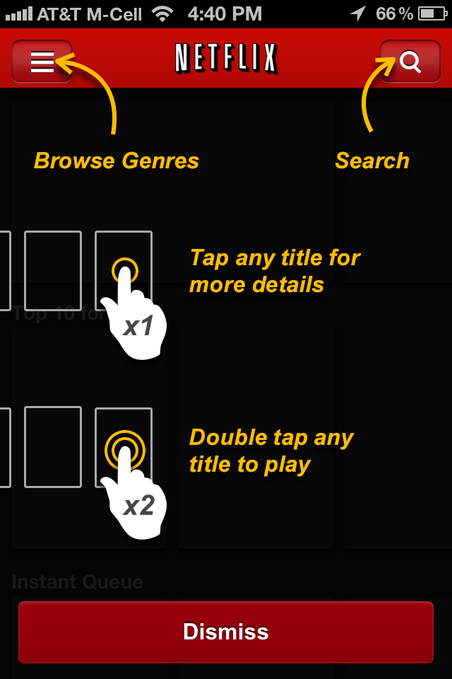
An example of one of many how to tutorials that have been built into applications
Its sort of important that these tutorial dialogs only come up when the user is doing something for the first time and not when the user isn't trying to do something. For example, a tutorial on testnet would only come after the user has sent Bitcoin somewhere and is waiting for it to confirm. An overview of https://mempool.space/testnet could show the user what's going on with their Bitcoin, explain the dynamics of the fee market, and have a link to explain the importance of these dynamics if they choose to further their education on the subject.
Then, after you've spent all this time with the user onboarding them to the app, it would be nice if it had a main net network as well as a sort of official "Thanks for completing the tutorial". Whether this is a link to a separate app or whatever is determined to be appropriate. I also wish other Bitcoin wallets like electrum or noncustodial lightning wallets like Breez, Phoenix or even Blixt taught their users this way before sending them off to main net (with the option to opt out of the tutorial of course), but maybe I should be posting about that on their respective github pages.
As strange as it may seem, this post was largely inspired by "Gaming for a non gamer": https://www.youtube.com/watch?v=ax7f3JZJHSw and discussions with UX designers and developers I've spoken with on a few sites now, which was basically that good UX was more about teaching your users about how to pick up on the cues you're trying to give them, rather than taking away user agency as many apps that claim "good UX" tend to do.
The text was updated successfully, but these errors were encountered: