feat: new JSV design #103
feat: new JSV design #103
Conversation
|
Amazing! So this is solving stoplightio/elements#657 and just happens to do a little bit of stoplightio/elements#667 and stoplightio/elements#668 but is leaving them to be finished separately? Fantastic, works for me. |
It does do part of #668 as those validations have big impact on way of rendering rows. |
|
Ok great, because an end goal for this epic will be to have no more oneOf, anyOf, or OpenAPI keywords showing here at all. Keep up the awesome work! |
There was a problem hiding this comment.
Not reviewing the entire thing or anything - but just dropped some comments re canonical usage of Mosaic for the first few files I looked at. We should start removing usage of tailwind classes as much as possible - instead opting for the typed props available on most mosaic components. Of course there are still areas we have to use tailwind classes, that's ok - but eventually we're going to want to remove ui-kit which means no non prefixed tailwind classes.
You can find a list of most of the core style props at https://mosaic.vercel.app/docs/style-props.
Yup, I'm doing that in my next comit. I just shared first draft so it could be checked. |
src/components/shared/Caret.tsx
Outdated
| iconSize={size} | ||
| icon={isExpanded ? 'caret-down' : 'caret-right'} | ||
| className="text-darken-9 dark:text-lighten-7" | ||
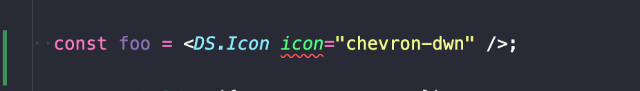
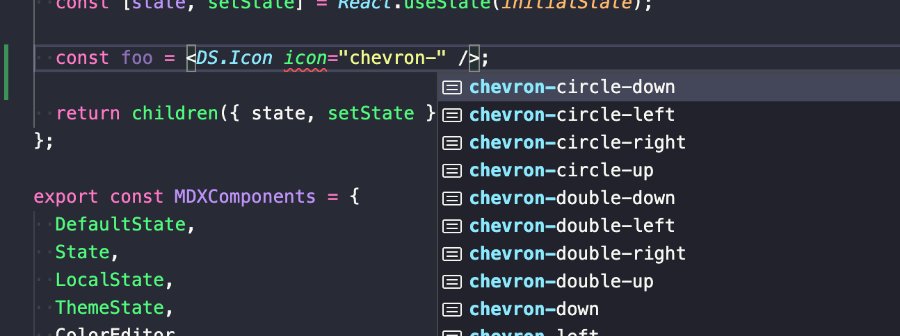
| icon={isExpanded ? 'chevron-down' : 'chevron-right'} |
There was a problem hiding this comment.
The reason I'm worried about this usage of icons is that there's an implicit dependency here that is hidden. We depend on mosaic importing faChevronDown and faChevronRight into its library which is the case right now, but
- It may change. Is the list of imported icons part of the mosaic's SEMVER contract? We don't know. It's not documented, so the safe assumption would be that it's not.
- If you use strings another developer may - in the future - assume that they are free to change the icons. While in reality they are not. This can lead to hard-to-find bugs.
- Type safety is nonexistent,
mosaicwill happily take'chevron-dwn', and readability is worse, too, when reading the code you have to go to the docs to figure out what these strings are supposed to be.
I had a discussion about these doubts of mine with @marbemac before, and while he didn't agree completely, we were given the opportunity to use icons in an explicit and type-safe way. If you mark the FA dependency explicitly, then you can import and use the icons:
import {faChevronDown, faChevronRight} from '@fortawesome/free-solid-svg-icons';
///....
<Icon icon={isExpanded ? faChevronDown : faChevronRight} //...
(Adding the FA dependency doesn't increase the bundle size in this case as mosaic already depends on it, just makes it a direct dep rather than a transient.)
There was a problem hiding this comment.
I'm not 100% convinced but I see the point and it's reasonable so I've updated it this way :)
There was a problem hiding this comment.
FWIW the mosaic icon component will not accept arbitrary strings:
If going the import {faChevronDown, faChevronRight} from '@fortawesome/free-solid-svg-icons'; route, careful re resulting bundle and tree-shakability. It's very easy to end up with the entire fortawesome iconset, which is huge, in downstream bundles.
There was a problem hiding this comment.
Re dropping bundled icons question - we would treat that as a breaking change. And in any case each individual icon is so small there is little incentive to drop icons in the future. A list of the bundled icons is documented in the Icon article - https://mosaic.vercel.app/docs/media/icon (we've added a few since the article was created, I'll get it up to date).
One other note is that in certain cases I hope we can use the (pro only) "regular" icons - for example in the JSV figma design it's using the "regular" font awesome icon for the chevrons on the left rather than the thicker "solid" icon. By passing in the icon name without a specific prefix, it gives us the option to adjust the default to "regular" in our ecosystem, via https://mosaic.vercel.app/docs/media/icon#changing-the-default-icon-style. Of course if an icon is meant to have a specific prefix, such as solid, we should include the prefix so that it is not affected by a change to the default icon style.
Not a huge deal, and ya'll are still free to pass in imported icons, but I wanted to make sure you had all the considerations.
|
@marcelltoth speaking of ui-kit removal, I've noticed that TreeList component is using it as a peer dependency so even though we don't use it anymore we still need to keep that dependency or at least document its requirement. |
src/components/shared/Property.tsx
Outdated
|
|
||
| return ( | ||
| <> | ||
| {schemaNode.subpath.length > 0 && shouldShowPropertyName(schemaNode) && ( |
There was a problem hiding this comment.
Could you assert subpath.length > 0 here instead? I know subpath and schemaNode.subpath are the same, but this is something you need to check for, when looking at this at first I am worried if this is a potential OOB condition
There was a problem hiding this comment.
You didn't write this, I see. Well in that case it's fully optional. 😄
| import { RegularNode } from '@stoplight/json-schema-tree'; | ||
| import { Flex, Text } from '@stoplight/mosaic'; | ||
| import { Dictionary, Primitive } from '@stoplight/types'; | ||
| import { capitalize, keys, omit, pick, pickBy, uniq } from 'lodash'; |
There was a problem hiding this comment.
keys - any reason we can't just use Object.keys?
There was a problem hiding this comment.
Only to be consistent with other lodash functions that we needed to use.
|
🎉 This PR is included in version 4.0.0 🎉 The release is available on: Your semantic-release bot 📦🚀 |
6 participants
Resolves stoplightio/elements#657
New JSE multi-row design replacing ui-kit with mosaic components.
Description and validations are displayed within a row and row height is calculated based on its number.
The naming format of validations is subject of different issue so I just put them the way they are in schema using similar method they are displayed in Elements. Number validations could be moved next to property and type.
Object types are displayed same way they were previously. The final goal is to include a dropdown next to type and allow selecting and displaying proper type but that's out of scope of this issue.
The remaining problem is multiline description and wrapped elements in validations that should make the row grow dynamically depending on their size - though there's separate issue for that.