Toolbar fixed instead of sticky? #148
Comments
|
Why ? position: sticky; simplifies things a lot |
|
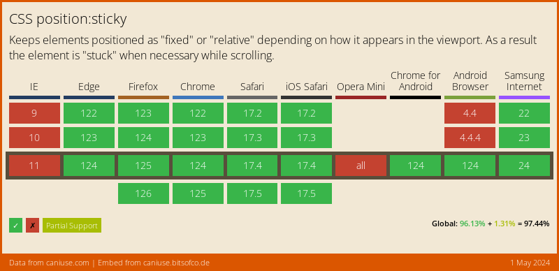
Yeah but http://caniuse.com/#feat=css-sticky the compatibility of this is really crappy. |
|
@kCenk Just tried position: fixed, and it needs lots of bug fixes unfortunately. I don't have much time to fix this, but feel free to :) |
|
The reason i use frameworks specially CSS based ones is my CSS Skills are crappy :) Could try to fix it with JS :) |
|
@kCenk Let's not use JS for these kinds of issues ;) One other solution though, is to wrap all contents under the header, remove position: sticky, and use flexbox so the header stays fixed. This solution is cross browser, but I hate using too much elements. The header styles aren't part of the framework anyway (although they should be), they are part of the demo.css file. |
|
I see, well i needed it to be fixed cause i make a header show/hide toggle that works like the one in Android. Where you scroll down in a document and the moment you scroll up again the header slides down. |
|
@kCenk If your header takes the full viewport width (that's usually the case for android apps), you can simply use position: fixed; width: 100%; on .header, then add 50px top padding on the content. |
|
Oh, wait, so you also need the header to show when the users scrolls back up, that isn't possible without JS, even position: sticky doesn't provide that. |
|
Yeah i have the JS part ready. |
|
@kCenk My suggestion from my previous comment should work if the header takes the the full width of the screen then. |
|
Should i drop the module as a commit to materialize.js? |
|
@kCenk Sure :) |
|
Most modern browsers support sticky now - most problems are related to |
Is there a way to make the Toolbar fixed instead of sticky, without breaking the sidebar & stuff?
The text was updated successfully, but these errors were encountered: