-
Notifications
You must be signed in to change notification settings - Fork 30.6k
New issue
Have a question about this project? Sign up for a free GitHub account to open an issue and contact its maintainers and the community.
By clicking “Sign up for GitHub”, you agree to our terms of service and privacy statement. We’ll occasionally send you account related emails.
Already on GitHub? Sign in to your account
Intellisense suggestions should display an horizontal scrollbar if needed #29757
Comments
|
I am not sure how well a horizontal scroll bar would work. How difficult would it be to increase the width to accomodate these longer strings, if the string is longer than would fit in the default width? The problem with the scroll bar is that once you scroll to the right, you need to scroll back to the left if you arrow down and the next item is much shorter in length. A solution to that would be to auto scroll back to the left after making another selection but then that could run into problems if the list looks like the screenshot above. |
This is the behaviour I see in Eclipse. With a trackpad, it's absolutely manageable. |
|
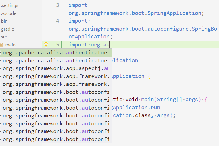
One of my colleague shows me that, in the css that drives the suggestion list, there is a width:50% that is set. when forced to 100%, the width of the suggestion list is then ok (no cropping). It could be great if the suggestion-list max width could be parameterized directly in the workspace settings |
|
This is definitely a usability issue and please take care of it. I am pretty sure you can solve it in a good way. Also as @fbricon said in eclipse and others there is horizontal scroll bar appears if horizontal scroll bar needed. Also you can resize the suggestion bubble with catching it and dragging from bottom right corner. |
|
@hdorgeval mentioned a quick hack, i will try to explain this quick hack until a solution is shipped in later releases. I also want to say that, suggestions became way better for me after this hack, especially while programming in java. Steps:
|
|
Hi @hopbalabi , for some reason the hack didn't work for me.
|
|
@darkgem666 please make sure you are editing |
|
Hi @hopbalabi. Thanks for the tip. I even set it to 200%. Wish we could customize this using the settings or something. |
|
REALLY NEEDED! +1 At the very least have tooltip hover show the fully value when the mouse is hovering over a item... |
|
+1 |
|
This hack works for me, but the VS Code version: 1.23.1 seems to have broken something. I want to configure without the hack |
|
Here to share a related issue microsoft/vscode-java-pack#255. Java classes often have longer full names. And the current completion list is showing ellipsis which omits the most important message, e.g. the class name. Showing the horizontal scroll bar is definitely a nice workaround. But it would be nicer to ask the language server. Here are two options:
|
|
@akaroml Did you experiment with only using the last part as label, e.g. That would allow to type package names and type names and would make the IntelliSense widget less busy. |
The directory structure on v1.40.2 seems to have changed. The css files in the stated directory are named differently. Also setting it to 100% did not work for me. Not sure why. |
Just tried to put the short name in the front and it looks good enough for me. What do you think? @fbricon |
|
Further playing with my modification, there is actually a new problem. As I keep on typing "spring" to limit the search scope, the highlighting works in a weird way. I was expecting the term "org.spring" to be highlighted, but only "spring" is. I guess it has something to do with the string match algorithm in vscode. |
|
In case anyone wants to use the hack above, on Mac and vscode (1.41.0-insider) file name is changed to
|
|
To everyone resorting to the CSS hack, upvote #30140 to make bottom suggestion details permanent. |
|
To anyone having trouble getting the CSS hack to work, one more detail that finally made it work for me: I had to change the Editor: Suggest Font Size from zero to something smaller than my default font. I had almost given up on getting the CSS hack to work. After I did that the change from 50% to 100% worked. This is on MacOs Catalina. It seems I can make it bigger, smaller, or zero and the CSS hack now works. Something about changing it made the change start working. |
|
waiting for feature request #29126 |
.monaco-editor .suggest-widget.docs-side{
  left: 32px !important;
  right: 32px !important;
  width: calc(100vw - 64px) !important;
}

  .monaco-editor .suggest-widget.docs-side .tree {
    width: 34% !important;
  }

  .monaco-editor .suggest-widget.docs-side .details {
    width: 66% !important;
  }
  "vscode_custom_css.imports": [
    "file://C:/Users/jckod/vscode.css"
  ],
  "vscode_custom_css.policy": true
Nice full screen intellisense, with no jumping. See? Is not that hard, Microsoft. I don't care if it is not right on the cursor position. I just care about being able to read the f☠ documentation ¬¬ |
|
The suggestions and the details part are going to be resizable (see #29126 (comment)). I am closing this as a related/duplicated issue. |


Steps to Reproduce:
import o, wait for suggestions to show upsuggestions are truncated because the package names don't fit in the suggestion window, there's no way to scroll horizontally
See redhat-developer/vscode-java#249

Reproduces without extensions: Maybe
The text was updated successfully, but these errors were encountered: