Change config navigation to tabs#4630
Conversation
|
Icon suggestions are welcome |
| @property({ type: String, attribute: "back-path" }) public backPath?: string; | ||
| @property() public backCallback?: () => void; | ||
| @property({ type: Boolean }) public hassio = false; | ||
| @property({ type: Boolean }) public showAdvanced = false; |
There was a problem hiding this comment.
Please add docstrings to each property. It's not clear to me what this property does.
| if (isComponentLoaded(this.hass, "cloud")) { | ||
| this._updateCloudStatus(); | ||
| } | ||
| this.style.setProperty( |
There was a problem hiding this comment.
Why can't we put this in the CSS?
There was a problem hiding this comment.
Now it applies to all config pages, and this is a router element
|
|
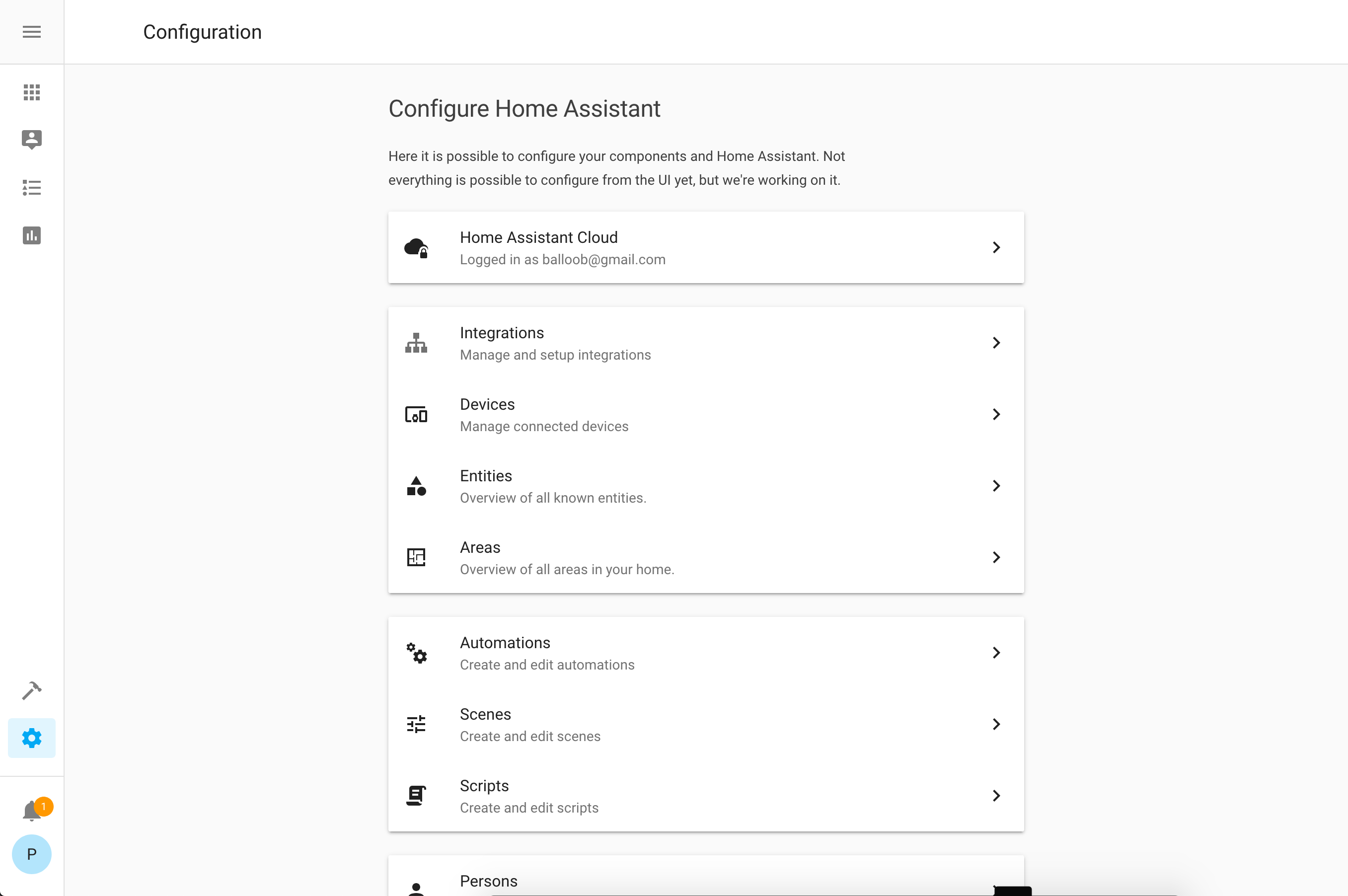
I think that maybe the icons should maybe be colored with secondary text color (so gray in this case). I feel the icons stand out a tad too much currently, it's taking attention away from the text rather than complementing it. For the bottom tabs on mobile, I think it'd be a little nicer if they all had text and not just the active tab. Makes it look more consistent and removes any guesswork on what an icon represents. Some icon suggestions and reasonings Cloud Integrations Areas I would do Automations Scenes Persons |
|
fyi, automation/scene/person icons are based on their domain icons. They need to stay in sync. So it can be changed, but we need to change both. @SeanPM5 please copy paste the picture of icons besides just mentioning the name, so much easier ! 👍 |
Some of these like scenes and integrations have "outline" versions available too. |


|
I like all your suggestions except for the cloud and the person one. For Cloud, the main use case is remote UI and I like to emphasize that it's encrypted and secure. For persons. Since it's also the domain icon, picking an icon with 2 persons on it might be weird if it's shown for a single person in an entity row |
|
Can we ditch the top bar coloring on the main screen and on subpages in narrow mode and just render the icon with the same background color? Ditch the title "Configuration" on main screen too.
Also, the fab on the mobile screenshot is not equally away from bottom and right edge. |
|
looking great 🎉 nothing constructive to add 😜 |
This reasoning makes perfect sense, although I do think the meaning of the lock can potentially be misinterpreted, for example being "locked out" of your cloud account (did I pay my bill this month?), or being "locked out" of some features during your free trial period. I suspect those cases will be rare, just something to consider. I like it though and think it's fine to keep the current choice.
Yeah, if it's also the domain icon, it's gonna feel a little bit weird in one place or the other I guess. 🤷♂ Current icon choice is more commonly associated with a profile settings page (image results). On mobile which doesn't have the text underneath the tab icons, I would think that most people are going to assume that goes to their personal profile page. Plus the title of the panel is Persons plural, and when you click on it you get a listing of multiple people.. so it feels weird to not have the icon represent that? But as you mentioned, if it gets changed here, it's gonna look weird in an entity row. So I dunno maybe it's best to leave it alone. |
5 participants
Uh oh!
There was an error while loading. Please reload this page.