Change config panel navigation#4377
Conversation
|
❤️ Love it! Maybe not for now, but we could consider adding icons to each item in the list, which makes is visually recognizable. |
|
Yeah that would be nice, have to make sure there stays enough room for the content though, especially the data tables need the horizontal space. |
|
Can we make the menu component be shown underneath the toolbar of the page? So automations is above the menu. And we highlight the current section? |
|
Or, we drop the toolbar sharing between menu and content completely. Make the page really stand on their own |
|
Like, start with dropping the automations toolbar first. Since there is a title underneath, should look ok? |
|
Like this?
(btw |
|
Not a fan of dropping the toolbar, it gets messy with subpages, etc. |
|
Not sure how I feel about this. The sidebar | config nav seem to conflict with each other. I assume this wouldn't show if I had the sidebar expanded? |
|
Depends how wide your screen is right now, if we have the space we do |
|
Something like that, but drop the blue and align the word "Configuration" with the text in the menu. No need to draw attention to something that's not important. |
|
Here's another potential idea / mockup tweaked from the screenshot in OP. This keeps the toolbar intact but tweaks the left config navigation a little bit. Changed the background color to match with the hamburger menu so it no longer sticks out, centered the "Configuration" text, and added a subtle breadcrumb icon ( |

|
Not sure about that arrow, feels like something I could click on? |
|
|
|
I would ditch the blue and just have a header like you do in the list of possible configs like you did here and align it left |
c8ec0a1 to
844b12b
Compare
Yeah, agreed. Was going for a breadcrumbs-style look and thought it'd be kinda neat if the design reflected how people actually talk about it (the docs for example saying "Go to Configuration > Automation" etc). But you're right, that arrow would probably just confuse people into thinking it's a clickable button. I do like your latest revision. I'm not convinced the blue toolbar should be dropped, it's there for literally every other section. I think it'd feel a bit weird and inconsistent if it's gone from just this one place? Makes it feel kinda like a bug or that the page didn't load properly IMO. Also people like to theme their HA and now it wouldn't be using their colors if they had a larger width? Not sure about that. |
yeah, i think you're right |
| </style> | ||
| <hass-subpage header="[[localize('ui.panel.config.cloud.caption')]]"> | ||
| <hass-subpage | ||
| back="[[!isWide]]" |
There was a problem hiding this comment.
| back="[[!isWide]]" | |
| .back="[[!isWide]]" |
| <hass-subpage header="[[localize('ui.panel.config.cloud.caption')]]"> | ||
| <hass-subpage | ||
| back="[[!isWide]]" | ||
| header="[[localize('ui.panel.config.cloud.caption')]]" |
There was a problem hiding this comment.
| header="[[localize('ui.panel.config.cloud.caption')]]" | |
| .header="[[localize('ui.panel.config.cloud.caption')]]" |
| </style> | ||
| <hass-subpage header="[[localize('ui.panel.config.cloud.caption')]]"> | ||
| <hass-subpage | ||
| back="[[!isWide]]" |
|
|
||
| <hass-subpage header="[[localize('ui.panel.config.core.caption')]]"> | ||
| <hass-subpage | ||
| header="[[localize('ui.panel.config.core.caption')]]" |
|
Does any one know if this will work? |
|
Add the whole prefix to both the search and replace values. |
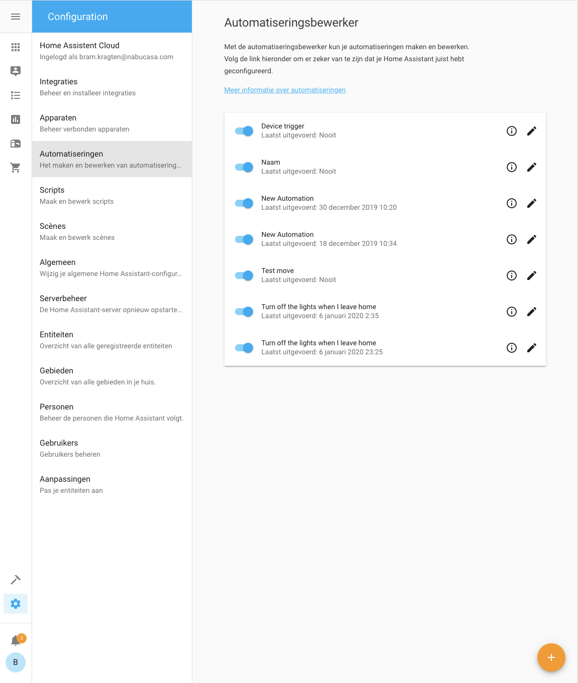
The way we used the available space in the config panel was a bit useless at a lot of places so I thought we could use if for better things.
When we have enough space we now show the config navigation on the left.
It can use more fine tuning, this is a start.