This is a non-exhaustive overview of how we handle frontend coding at bitcrowd. It is geared towards new starters, aiming to help people get a feeling for what we do, and to point them at useful resources. A basic level of CSS knowledge & experience is assumed, as is understanding of Sass’ SCSS syntax.
We don’t actually write CSS, we use…
All the example CSS shown here is in the SCSS format of Sass (Syntactically Awesome Stylesheets) — this is a CSS-like language (CSS is valid SCSS) that is compiled to CSS. It can therefore offer us more power to build & organise our styles in a DRYer and more consistent way.
Back in the days before we had CSS, presentation was intermingled with data & semantics through such horrors as table-based layouts, spacer gifs, and visual HTML elements & attributes:
<font size="12px" color="purple" align="right">Conceptually awful *and* ugly :'(</font>Never do any of these things.
CSS was introduced to separate the presentation layer from both the data & semantics of a document, leading to easier maintenance, smaller filesizes through reuse of code, and the ability to make global layout changes with a single edit.
CSS has long a bad reputation for being a convoluted & confusing mess of interdependencies — make one small change and everything else falls down around you. Seemingly commonly-requested & simple tasks ('centre this please') have taken years of experimentation and hacks to achieve (until flexbox), and many cannot be made to work in older browsers without javascript.
In general we want all our code (CSS or otherwise) to be modular, self-contained, predictable and reusable. There are many ways in which CSS doesn’t encourage these things…
There is no concept of scope in CSS so making even a small change can break other styles unexpectedly. Changing the order of your selectors can break everything, as source order is important in CSS — the latest selector overrides previous selectors of the same specificity. This oft-problematic feature is called the Cascade, and is the ‘c’ in CSS.
CSS is a land ravaged by specificity wars. With its global nature, every time you want to override previous styles you need to arm yourself with higher specificity selectors. The only way is up, and you end up with nuclear CSS like .sidebar > div.sidebar-top-section > ul.sidebar-list > li > a > *. Or even worse, !important.
Bonus question: Is there an upper limit on the length of a selector?
Just because your styling is now in a separate file doesn’t mean it’s not tied to the HTML in some way. Using element names (.sidebar h1, .menu li…) in CSS means you cannot change one without also changing the other — if the title in your sidebar should become an h2, the developer making the change needs to find out that this change will break the styling, and know where to look to fix it.
General rule: the HTML structure should never need to change unless the content does; the structure is there to describe the content, to give it semantics. Changing the semantics of a document should not be required to change its appearance. In practice there are many exceptions to this rule — we often in fact change the structure e.g. adding a grid system normally requires adding <div>s around your content to divide it up.
As with any tool, Sass enables developers to shoot themselves in the foot more easily than ever before. For example the nesting functionality keeps things so nicely organised that developers initially found it tempting to nest everything:
.sidebar {
  .sidebar__header {
    .button {
      …
    }
    .title {
      …

      .icon {
        …
      }
    }
  }
}
Even though the apparent encapsulation is attractive (it’s a trap!), the nesting means that if we ever want to change the styling of the .icon in this example, we have to beat the specificity of .sidebar .sidebar__header .title .icon. And the time after that?
Much better is to apply styling on single classes, and create new classnames to create each of the versions we need instead of changing styles based on the parent element:
.sidebar {

}

.sidebar__header {

}

.button {

}

.button--icon {

}

.title {

}

.title--large {

}

.icon {

}

.icon--large {

}

.icon--small {

}
For more detail on this, see BEM below.
We never style IDs (#article-header). No IDs in CSS, ever; they are more specific than classes, so are even harder to override. IDs are suitable for javascript hooks and little else.
Bonus question: What other useful purposes do IDs have?
Dividing our classes to be as simple as possible — to perform one task only — means we can reuse the class anywhere without fear of stepping on other styles.
A common example is padding. The padding around blocks or columns of text is usually the same throughout an app or site. If we declare the padding for every element that uses this common style we end up with lots of repetition.
.sidebar div {
  padding-left: 1em;
  padding-right: 1em;
  …
}

.blog-post div {
  padding-left: 1em;
  padding-right: 1em;
  …
}

header div {
  padding-left: 1em;
  padding-right: 1em;
  …
}
Bonus question: What is the specificity of each of these selectors? Are they the same, and what difference would that make?
Instead we create a class that handles only the padding, then we apply it to every element that needs those styles:
.box {
  padding-left: 1em;
  padding-right: 1em;
}
This aids consistency, re-usability, & predictability, and also leads to smaller & more easily-understood CSS.
OOCSS differs subtly from SRP as it dictates that we should specifically separate ‘structure from skin’ i.e. properties related to layout (width, margin, padding…) should always be factored out into classes separate from those affecting non-layout appearance (color, background, opacity, border, gradients, drop-shadows…). Our .box example above fits this principle; it’s a good guideline that we occasionally break in the interests of simplicity (not everything needs to be reusable, all the time).
If we’re not using IDs or element names as styling hooks, our last option is classnames — we give a classname to every element that we want to style. But we need to do this in a predictable way so that any developer can jump in and see what’s happening and make changes.
<button class="button button--large">
  <span class="button__label">Save me</span>
</button>
A block can be thought of as an object or component of the app/site e.g. .button. This is the base class that every button block shares. The element is a child of the block — .button__label in the example. The double underscore __ is used to mean child/element-of. The button has a modifier button--large that makes some changes to the styles of the base button component. The double dash -- is used to denote a modifier.
Just looking at these classnames (in CSS or in the HTML) a developer can quickly recognise:
- there is a component here called
button - this button is a large variation of the standard button (
button--large) - the
button__labelis a child of the button component - the styles for all these will be found within the button object
The CSS for this would be written something like:
.button {
  padding: 1em;
  …
}

.button--large {
  font-size: 200px;
  …
}

.button__label {
  line-height: 1;
  …
}
Note that each of these selectors is exactly one classname. No .button.large-style chaining, certainly no .button .button__label nesting, just super-simple equal specificity across all classes with no war necessary.
Not to be confused with Atomic CSS.
This is a methodology for organising & deciding on exactly how to define components to ensure reusability, and follows logically from SRP/OOCSS. It mimics chemistry — staring with the simplest and most basic objects or Atoms (input, label, .button, .icon) we can combine them to create Molecules (buttons containing icons, an input & label paired). These molecules can be combined to create Organisms.
We don’t use the atom/molecule/organism categories from Atomic CSS to organise our sourcefiles, but we do make use of the concept of building large and complex layouts out of smaller building blocks. This minimises the propensity for CSS components to become huge, monolithic & scary places.
Organising the files making up our CSS codebase is a matter of some discussion. Some people prefer a very flat structure, others order files strictly based on the type of contents. We follow Harry Roberts’ Inverted Triangle CSS (ITCSS):
- sass/
  - settings/   <-- Sass variables
  - tools/      <-- Mixins, functions
  - generic/    <-- Reset/normalize
  - base/       <-- Unclassed elements
  - objects/    <-- Low-level abstractions
  - components/ <-- Chunks of UI
  - trumps/     <-- Overides & helpers
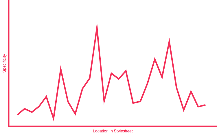
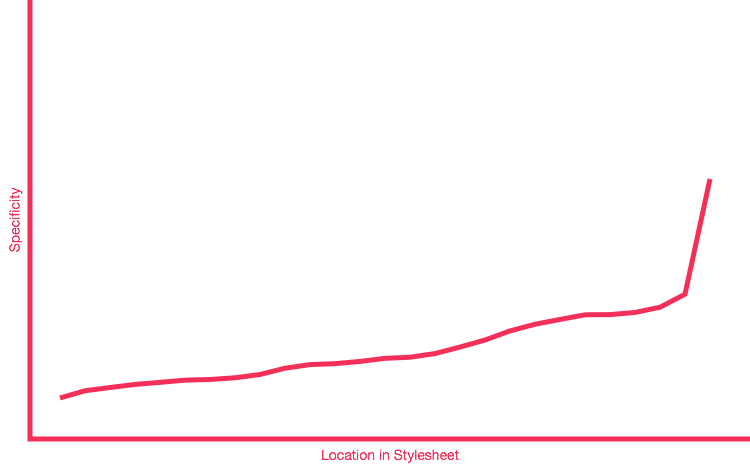
Specificity starts low and ends high; earlier styles are wide-ranging, ending with very focused styles. This ordering is another method that helps us avoid specificity wars — see the following specificity graphs. The first shows CSS that has early spikes of high-specificity, that later have to be overridden by higher specificity. And so it begins. The second shows a graph with no spikes of specificity, just a gentle slope upwards, ending with all the high-specificity selectors in one place at the end of the CSS. No wars were started.
See a specificity graph showing poor distribution
See a specificity graph showing better distribution
settingsandtoolsoutput no CSS, they are background & setup for some Sass niceness and DRYness.genericis the first CSS output, it includes the normalize & possibly a global box-sizing changebasecovers unclassed HTML elements e.g. base rules for inputs, paragraphs, imagesobjectsare the lowest-level abstractions e.g. .button, .media, .iconcomponentsare chunks of UI built from objects. Could be a page-type (.profile-page), could be a distinct block or collection (.sidebar,.author-bio). There should be no ‘reaching inside’ objects to tweak styles here (that should be achieved using --modifiers on the object directly), rather just styles to define how each object should be laid out next to the others.trumps(named after the 'trump suit' in card games, nothing to do with Donald) are high-specificity overrides and helper classes e.g..hidden,.text--center. Use of!importantis acceptable here; these classes are designed to override all other component classes.
Every object and component has an eponymous file in the settings folder that contains all variables used for the component. In a slight break from ITCSS principles, these settings files are imported at the head of that object file:
// bitstyles/objects/_buttons.scss

@import "../settings/buttons";

.button {
  …
}
Global settings are still imported at the top of the manifest. As the objects’ settings (which will very likely depend on global settings) are self-imported, we can simply import the objects with one line:
// bitstyles/bitstyles.scss

@import 'bitstyles/objects/button';- Harry Roberts - Managing CSS Projects with ITCSS
- Manage large-scale web projects with new CSS architecture ITCSS
- Managing CSS projects with ITCSS (PDF)
- CSS Specificity Generator
- The Specificity Graph
Following the structure of ITCSS, we add prefixes to our classnames to aid in readability. At a glance you can see which strata the class belong to.
.l-- layout.o-- object. An abstraction that could be used anywhere. Changes to styles here can affect many elements..c-- component. These are implementation-specific. Changes to styles here should only affect appearances in easily-predictable ways..t-- trump. Single-purpose classes that could be used anywhere. Changes to styles here can affect many elements.
This not only helps you find the relevant source Sass more easily, it also helps avoid clashes between class styles. For example layout classes should almost always be alone on an element; objects, trumps, and components should be nested within the layout structure rather than part of it. Component classes from multiple components should probably not be mixed on one element.
More transparent UI Code with Namespaces
Putting this all together results in an expressive system of reusable & composable components:
<header class="c-header o-box o-box--grey">
  <h1 class="c-header__title o-h3">
    <svg class="c-header__icon o-icon">…</svg>
    Page title
  </h1>
  <h2 class="c-header__subtitle o-h5">Page subtitle</h2>
</header>
Here we’ve got atomic design (the larger header component is built using several OO/SRP objects — box, icon, hX), and BEM naming scheme. ITCSS specifies the order in which we include each mixin, function, component class and so on, so you’ll just have to trust that’s what happened in the production of this example.
Note that many implementations of OOCSS principles (and hence also Atomic OOBEMITSCSS) make heavy use of Sass’ @extend feature to compose several CSS component classes in CSS, and then only include one class name on an element. We avoid using @extend as it changes the source order of our output CSS, often in ways which can be hard to reason about, and which can break the specificity-ordering introduced by ITCSS, with no performance gains (see Read more section below).
Thus the example above shows that we compose several component classes in HTML not CSS, and keep them separate in our Sass & output CSS. Instead of @extend, we keep our sourcecode DRY using mixins.
There is one exception to the ‘do not nest’ rule — states. :hover, :focus, :visited etc. are of course all declared nested (look at the example below — could they be declared another way?), but also any non-HTML-standard states we define. For our own states the naming convention is to use is- & has- as prefixes e.g. .is-active, .has-child
.o-button {
  padding: 1em;

  &[disabled] {
    cursor: not-allowed;
  }

  &:hover,
  &:focus {
    background-color: red;
  }

  &.is-active {
    animation: spin-me-around 1s infinte;
  }

  &.has-been-clicked {
    …
  }
}A select few features of Sass (The Good Parts™?) can really help DRY up & organise the codebase.
CSS has no variables! Yet! Sass does, though be aware they don’t exist in the browser — they are different to CSS variables. Much like magic numbers in javascript functions, specifying styles using inline values leave other developers wondering where the numbers came from and whether they can be safely changed. They also need to find the declaration in the first place. Instead, any values used in an object/component should be declared in the settings file for that component. Developers then know where to look, the value can be reused elsewhere and in calculations. A common example is a global margin/gutter/padding/spacing variable — we define this once, then use it throughout the site for consistent spacing — and colours.
// settings/global.units.scss
$general-margin: 1.5rem;


// objects/button.scss
.o-button {
  padding-left: $general-margin;
  padding-right: $general-margin;
}


// layout/content.scss
.l-content {
  padding-left: $general-margin;
  padding-right: $general-margin;
}All good developers aim for DRY code and CSS is no exception. Mixins and functions reduce the amount of CSS we manually write so reduce errors, speed up development and so on. It’s important to realise that they do not exist in the browser — the output of the mixins will be output to the final CSS every time you use them. This may seem like a waste of bits, and even very WET (so much repetition of the same CSS!) but is actually totally fine.
GZIP is your friend. In development mode we don’t have GZIP turned on so yes: your CSS will appear to be larger due to repeated CSS from mixin use. In production mode GZIP will be enabled, and this kind of totally consistent repetition is where GZIP excels — any extra weight from repetition will disappear.
DRY only refers to source files. Repetition in source files == bad for maintainability, readability and so on. What your code looks like after any compile step is totally unrelated to this principle.
@import is such a reviled feature of CSS that many people don’t even know it exists (the browser makes a new, blocking request for each file @imported in your main CSS file. In HTTP1 that’s a total and unthinkable performance killer). In Sass it concatenates the CSS output of the files into one, giving good performance and also allowing us to create one CSS object or component per file.
If we nest our selectors, we limit the reusability of our classes, and make it hard to predict the appearance of an element:
.o-title {
  color: blue;
}

…

.c-sidebar {
  .o-title {
    color: red;
  }
}
If a developer places/copies a o-title into different parts of the app/site, it will have a different appearance, one that’s hard to predict without finding every instance of .o-title within the CSS. And if we suddenly need red titles somewhere else, do we duplicate these styles for each such instance?
Much better would be something like:
.o-title {
  color: blue;
}

.o-title--alt {
  color: red;
}
Now when a developer places a .o-title it’ll behave consistently — every .o-title--alt looks like every other .o-title--alt without any magic rules based on where you place it.
Of course nesting does happen sometimes — there are definitely occasions where the alternative results in over-engineering classes. If a little nesting actually keeps CSS simpler than the alternative, do it.
Most of the techniques & conventions described here were developed in public, so you can still follow the threads through blog posts & tweets. These people are clever and worth reading. Find them on Twitter too, it’s still probably the most useful resource for following & joining the discussion.
- Nicole Sullivan’s articles - She started the ball rolling by creating OOCSS & the ubiquitous Media object.
- Harry Roberts’ articles - We use some of his Inuit.css objects & helpers, and ITCSS is his child. He has lots of thoughts about CSS architecture & organisation.
- Lea Verou — awesome experiments & exploration
- Chris Coyier’s CSS-Tricks - Although the name may seem cheesy these days (it was created when CSS was relatively new and copy-and-paste tricks was all anyone wanted) there are lots of great consistently-updated articles here ranging from straightforward descriptions of new CSS properties to ongoing discussions about best practices. See especially this longform piece on SVG icons vs icon-fonts and the clearest guide to flexbox I’ve seen.
- Brad Frost’s articles
- We use stylelint to lint our Sass. You can find our standard config files for Stylelint at linting/stylelint-config-bitcrowd/.
- We are currently using SC-5 Styleguide to generate a styleguide/codeguide from our inline documentation.
- We use a collection of post-css plugins to automate processing of our css output. This includes Autoprefixer which generates browser-specific prefixes at build-time, based on our browser support requirements (meaning we almost never need to add any browser prefixes to our source). For our full build process, see the package.json from bitstyles.