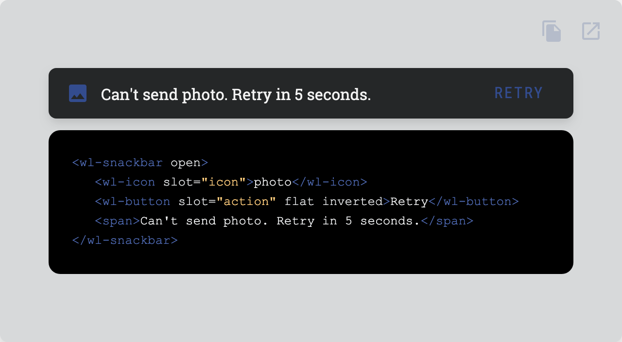
Provide brief messages at the bottom of the screen.

| Property |
Attribute |
Type |
Default |
Description |
backdrop |
backdrop |
boolean |
false |
Whether the backdrop is visible or not. |
blockScrolling |
blockScrolling |
boolean |
false |
Whether the overlay blocks the scrolling on the scroll container. |
disableFocusTrap |
disableFocusTrap |
boolean |
false |
Whether the focus trap be disabled. |
duration |
duration |
number |
200 |
The duration of the animations. |
fixed |
fixed |
boolean |
false |
Whether the overlay is fixed or not. |
hideDelay |
hideDelay |
number |
5000 |
Time in ms before the snackbar is hidden automatically. |
open |
open |
boolean |
false |
Whether the overlay is open or not. |
persistent |
persistent |
boolean |
false |
Whether the overlay is persistent or not. When the overlay is persistent, ESCAPE and backdrop clicks won't close it. |
role |
role |
AriaRole |
"banner" |
Role of the snackbar. |
scrollContainer |
scrollContainer |
EventTarget |
|
The container the overlay lives in. |

| Event |
Description |
didhide |
Dispatches after the overlay has been hidden. |
didshow |
Dispatches after the overlay has been shown. |

| Name |
Description |
|
Default content. |
action |
Action content (you can have multiple slots named action). |
icon |
Icon content. |

| Property |
Description |
--snackbar-bg |
Background |
--snackbar-border-radius |
Border radius |
--snackbar-color |
Color |
--snackbar-content-padding |
Padding of the content slot |
--snackbar-elevation |
Box shadow |
--snackbar-fixed-padding |
Padding of the container when fixed |
--snackbar-icon-color |
Color of the icon slot |
--snackbar-icon-margin |
Margin of the icon slot |
--snackbar-padding |
Padding |

Go here to try the demo.


Licensed under MIT.

