Add a delay to the block type label on hover #9197
Conversation
When a user mouses over a block, they're currently presented with a dark blue outline and text label. This can be jarring, and add to a feeling of Gutenberg being "heavy" with its UI. This PR explores replacing that blue outline with a light gray outline initially, and introducing the blue outline and label after a short delay.
|
CC: @nosolosw for draggable handle. I don't imagine this changes anything other than having to wait a millisecond for the drag handle to appear. |
|
This seems a good one for noise reduction. I know the gif rendering is not ideal, but also seeing this I'm wondering if we should get away from the delay entirely. Fade in/outs are nice, but in certain contexts might introduce a feeling of "sluggishness" that is subtle but perceivable. What if we reduce the animation time or remove it entirely? Would it feel more snappy? |
I totally might be missing something but isn't adding the delay the entire point of this PR? 😅 Removing it would just revert to the behaviour that's live in 3.6.2, right…? |
😄 @folletto is just referring to the animation speed. Right now, there's a 0.5s delay, and then the label fades in over the course of 0.1s. So he's just suggesting we remove/trim that 0.1s fade in. I'll give it a try and see what it's like. |
|
Argh sorry yes, it was very ambiguous. It's not about delay, thanks for the clarification. |
|
I sped up the animation from 0.1s to 0.06s. This feels nice and quick. The GIF frame rate isn't quick enough to really represent the change, but here's a GIF anyway. 😄
I'd recommend giving the PR a spin to see it in realtime. |

(Note: This is an alternate to #8836. It includes the block label hover delay but does not change the blue outline.)
Description
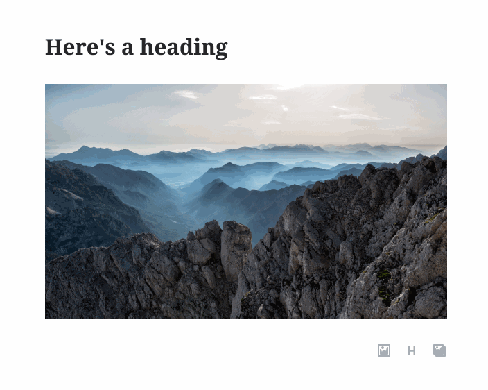
Currently, if you move your mouse around a Gutenberg document, each block will quickly present you with a dark blue outline and text label:
As noted in #8524, this can get jarring when you're just casually moving your mouse around the document. Additionally, I've wondered if that text label is a case of Gutenberg going to a little too far to answer a question the user hasn’t asked yet: "What type of block is this?"
Small, prominent UI elements like these contribute to an overall "heaviness" in the UI of Gutenberg. Especially when they're repeated on every block — these bits of UI add up quickly.
This branch adds a slight delay to the breadcrumb. This accomplishes a few things:
It does that without sacrificing discoverability of the label — the delay is short enough that the user is likely to trigger it during normal usage. They'll still know it exists.
How has this been tested?
Mac OS 10.13.6, in Chrome 68.0.3440.106 + Firefox 61.0.2
Windows 7, IE 11.0.9600.19080
iOS 11.4, in Safari (This PR has no effect on iOS, but I checked to be safe. 🙂)
Screenshots
Current:

Proposed: