Try: Refactor contextual toolbar to work better with floats #11357
Conversation
|
Didn't test it, but it looks promising.
Bring the dragons now before 5.0. |
There was a problem hiding this comment.
Design functionality looks good here. I think there are some enhancements around floats that we can tackle in the future to make the overall experience better, but that's a bigger issue. I can't speak to the difficulty of thoroughly testing this in re: considerations for 5.0 release vs. pushing to 5.1.
|
I tested @jasmussen I'm not sure if this is a thorough enough test, but I did find that it solves the test case noted in #4764. |
|
I found an issue.
This PR: The next block after a floated block is pushed below the floated block, rather than appearing below the previous non-floated block. The front-end still works properly, as you would expect: Aside from that unfortunate issue, however, this works great! This fixes #7491 and makes the UI around floated blocks feel so much nicer! I wonder... could you bring back the movement controls with this change? Along with fixing the aforementioned issue, that would practically perfect the floated block UI! |


|
Thanks for that report, Zeb, will take a look. I will also add some comments to the code, for specific parts that I'm slightly nervous about and want code sanity checks on.
Really appreciate your testing, so thorough, much appreciated. Things that I would want us to make sure are solid:
|
| @@ -84,6 +86,12 @@ | |||
| } | |||
|
|
|||
| .edit-post-visual-editor { | |||
| // If the first block is floated, it needs top margin, unlike the rule in line 69. | |||
There was a problem hiding this comment.
This is a little awkward to have a special rule like this. But it is due to the negative margins that every block, except floats, have. It would be nice to refactor this rule to be unnecessary in the future. Whether this is through removing all the negative margins by making them unnecessary (unlikely) or whether it's through changing even floats so they behave the same as other blocks.
If the title was an actual block, then it would be a non issue.
|
|
||
| @include break-small() { | ||
| width: auto; | ||
| // This rule ensures that any blocks that are not a Paragraph, that follows any aligned block, clears them. |
There was a problem hiding this comment.
I don't like that we are creating special rules on a per-block basis.
In this case, it was the only way I could think of, to ensure that the following worked as intended:

To elaborate — unless this bottom placeholder block explicitly clears the preceding floats, then the block outline will be painted all the way up to before the first float. This is because the block techically floats after the first two, so the outline starts all the way at the top. Except this is not the user expectation.
On the flipside, we explicitly allow the Paragraph block to not clear the preceding floats, so that this can work:

This is the normal floats behavior, and it "looks correct" for the user because the text snakes in between the floats.
|
@ZebulanStanphill Can you help clarify or expand on the steps to reproduce the issue you're seeing? I'm having a hard time reproducing, or maybe I'm misunderstanding the issue. I read it as there being a right floated image, a paragraph and a paragraph, and that the 2nd paragraph clears the float. Is that correctly understood? Because this is what I'm seeing:
Which theme are you using? It's possible that an editor style is interfering, and if you can identify the theme and help me reproduce I can submit a patch for that. To be clear, there are some z-index issues in that GIF, and the toolbar doesn't stack superbly next to a floated image. But these are worth looking at separately. I'm purely talking about the specific issue you mentioned. |

We are going to bring the movers back. Hiding them was an iterative measure. I know how passionately people want these, I like them too. But sadly this branch doesn't make any changes that make it particularly easier to bring them back. The specific issue issue is stacking. Imagine a small image, floated left, followed by a long paragraph that snakes to the right of it. Now when you select the image and hover to the left of it to make the movers appear, they will appear right on top of the movers for the paragraph below. They might still work, but if you intended to move the paragraph, you will instead be moving the image when clicking in that spot. That's why the proposed solution for floats is to surface the movers below the block when floated, like they are on mobile. |
56d8735
to
b373c58
Compare
|
There are legitimate test failures around multi selection. Specifically it seems you can't select two blocks, and click the ellipsis menu. It's keyboard but not mouse accessible. I'm looking into it, but it appears to be related to the issue we've been seeing with floated images in general, where it can be very easy to invoke a multi selection even just clicking a float. It would be nice if I could solve both issues at the same time, but on the flipside, this bug is also a blocker for this branch, and needs to be fixed for it to be merged. @iseulde do you have time to lend your eyes? |
|
Okay, so I think I managed to fix the issue outlined here, but I did so by adding yet another div. Outside of it working for me now, we'll know as well as the tests should come out green when they're finished. The relevant code is here: 312921f#diff-8b707a252d7b6da3af477595c2ce11dcR525 As you can see, this is yet another wrapping div. To explain why it's there on a high level, it's because if we need the toolbar to be positioned in proximity to the block content, it has to be part of the div that gets floated, or otherwise manipulated. But the element that previously had the Is this additional div bad? You tell me. I know that additional markup is intrinsic complexity, small though it may be. In this case, though, it I feel it might make sense to be able to group additional elements in visual proximity of the content, especially as we move into phase 2. In other words, it feels worth it to me. |
312921f
to
d26fb51
Compare
|
@jasmussen I'm actually using my own custom child theme for Divi that ports its Classic Editor TinyMCE styling to Gutenberg. However, I tried switching to Twenty Seventeen and the issue still occurred there, so it definitely isn't a theme styles issue. Here is the markup of the post: <!-- wp:image {"id":495,"align":"right","width":251,"height":140} -->
<div class="wp-block-image"><figure class="alignright is-resized"><img src="https://zebulan.com/wp-content/uploads/2018/10/blog-looking-back-sgz-plays-minecraft-e1.png" alt="" class="wp-image-495" width="251" height="140"/></figure></div>
<!-- /wp:image -->
<!-- wp:paragraph -->
<p>blah blah blah blah blah blah blah blah blah blah blah blah blah blah blah blah blah blah blah blah blah blah blah blah blah blah blah blah blah blah blah blah blah blah blah blah blah blah blah blah blah blah blah blah</p>
<!-- /wp:paragraph -->
<!-- wp:paragraph -->
<p>blah blah blah blah blah blah blah blah blah blah blah blah blah blah blah blah blah blah blah blah blah blah blah blah blah blah blah blah blah blah blah blah blah blah blah blah blah blah blah blah blah blah blah blah</p>
<!-- /wp:paragraph -->I updated to the latest version of the branch, but the issue is still happening. Also, with regard to the multi-selection issue and wrapping |


|
I really want to test this, but I'm AFK (and trying really hard to stay that way!) until Monday. That said, it looks like a good iterative improvement. Keep it up 👍 |
d26fb51
to
7cb149c
Compare
|
Okay, after a good old food poisoning, I managed to give this a good rebase. @ZebulanStanphill I still can't reproduce your issues. Tried in 4.9.8 and 5.0 with TwentySeventeen and without. Tried in Chrome, Firefox, Safari, all seeing the same, which is that the 2nd paragraph block clears the image. Here's what I see:
I even tried adding a wide main editor style:
Is there any chance you could try temporarily disabling divi and see if that fixes the issue?
This is a separate issue, which I think is tracked separately. There are ideas for how to fix this, but it's not easy, and I don't know that this wrapping div I'm creating (which is on a per block basis) will help. I think we need to on the fly create a wrapping div around a multi selection, which is complex. |


|
The failing tests are confounding me. I would appreciate any help in fixing them. For all intents they should pass, but they fail for me locally.
|

|
@youknowriad @mtias If any of you have time to look at this branch, code wise, and experience wise, I'd appreciate input on whether you'd like to see this in the 5.0 release or if it should be punted. I'm personally increasingly liking this approach, but I'm also very much aware that it's major surgery. Here's some good demo content to test: |
|
@jasmussen I tried with Twenty Seventeen and the issue still happened. I found the CSS causing the issue: .editor-block-list__block-edit::after {
display: block;
content: "";
clear: both;
}Which is coming from line 19 of Removing either the Tested in both Firefox Developer Edition 64 and Chromium 70. |
|
Wait, that line seems to stem from a plugin called If it does, then that's a clearing rule they're adding to every block, and they probably shouldn't be, and we can submit a bug report to their plugin. |
|
Yep, just tried. I can confirm that Editor Blocks is causing this issue. With Editor Blocks activated:
Without:
I've reached out to the developer to suggest a fix. |

7cb149c
to
02c12c0
Compare
|
Classic block regresses in this PR: Is this intentional that border is missing for the floated block? vs
The same question applies to the hover state:
vs
|


|
It's very hard to use Gallery block when it's floated. See:
|

|
Fixed a small regression with the classic block ellipsis menu. It now looks right again:
Yes. This is the same in master, and goes back to a limitation on how floats work in general. I could see us exploring a refactor in the future, but it would be very complex due to how floats work.
This looks like a longstanding issue with multi select being slightly too easy to invoke in some sitautions. Can you confirm whether or not this behavior is regressed in this branch vs. master? Last I checked the behavior was the same. |

|
Thank you Riad! Merging. |
|
Did this PR cause this: In an alignfull block, the nested block's toolbar is off and so is the hover label. Tested on frontenberg, this is the source: I'm also having a really hard time selecting nested blocks now but can't really pinpoint it. Sometimes I hover a block, the blue borders of highlight appear, I left click, nothing happens. I left click some more, nope, dead clicks, won't select the block... |

|
Possibly, yes. But a fix for that is on my list.
Can you elaborate a bit? Which block(s) are you testing with? |
Any blocks, really. For example the same setup with columns: No blocks are selected, The intuitive expectation would be, that for what ever block the blue border is being displayed, then a left click should activate that block. And that's how it worked before already. |

|
Looks like this is the case with even the simplest blocks.
Now here's a crude example of a nested block: As you can see the parent block barely has any green area. It would be the parent block's red area where you used to be able to activate the it, but it no longer works. You can sometimes select the parent block by hovering in the child block's blue area though, since for some reason it won't count as child block. Maybe that's by design, but not very intuitive. |


|
Thanks for the added context. I'm working right now on improvements to the columns block, and will have something to show in a bit. That should fix the offset toolbars you've seen. Regarding the clickability of individual blocks, I will look at improving that separately. I'm have a suspicion it's been like this for quite a while, as nothing has touched those margins recently. That doesn't make it not an issue, of course, and I suspect revisiting #8350 is the real solution. In the mean time, I have some ideas for an interim fix. Stay tuned. |
|
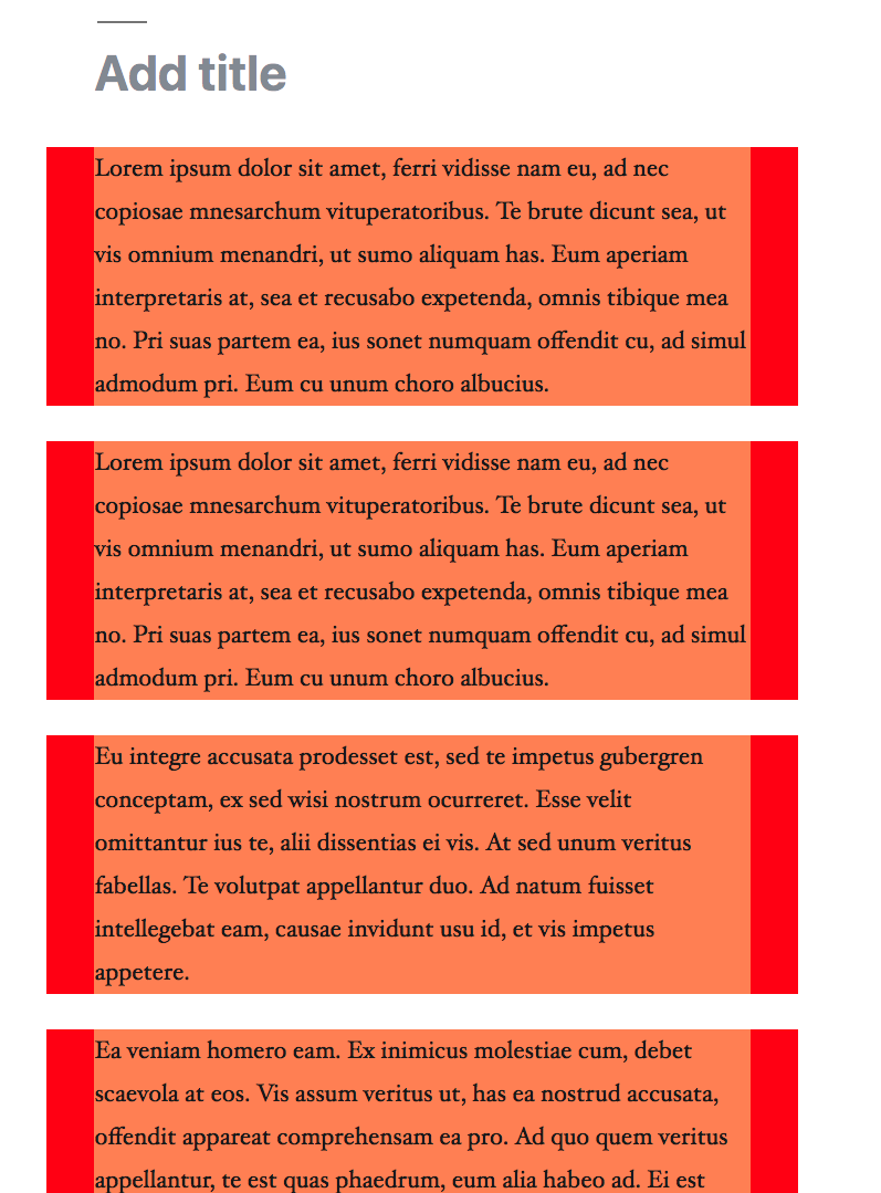
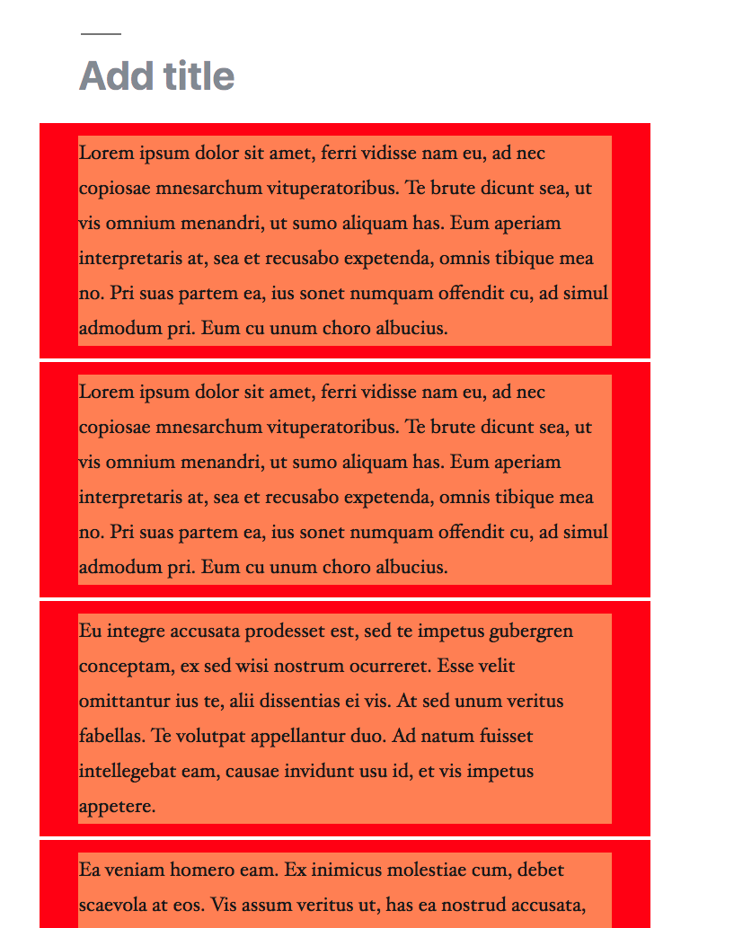
I took a look at this today, and learned a few things from it. Take a look at this:
The coral area is the content. The red area is the hoverable/clickable area. We can, with seemingly no side effects, change the hoverable/clickable area to look like this:
But that doesn't benefit us a ton, because we have the sibling inserter between every block. The green area here is the hoverable area that reveals the clickable plus in the middle:
This green area incidentally enables the hovering of a block, but not the clicking. And even if we expand the red clickable area, the sibling inserter blocks clicks between the blocks. This leads us to three potential ways forward: 1: Acknowledge that the sibling inserter can't coexist with a larger click area that lets you select a block even when clicking on its margins. To expand on 3, it's important to remember that blocks need to be able to exist in a variety of contexts — mobile, desktop, in various editor styles, and with various margins before and after. We know from past experieces that people really love the sibling inserter, so I'm both reluctant to make its hit area smaller, and worried about changing its behavior too much since usage of it seems to have stabilized. I'm curious of your thoughts on how best to approach this. |

|
@jasmussen My best guess for a solution would be what I suggested back in #9202. The hover area at the bottom of the block would redirect clicks to the block it is attached to, and since it is only part of one block, it wouldn't run into issues where you have to calculate whether you clicked on the top or bottom half of it, which would be the case with the current inserter. It would also completely solve all issues of the sibling inserter overlapping content, since you would always be able to access the top of a block without the sibling inserter overlapping, since your mouse has to first move into the bottom of a block for the sibling inserter to appear. I consider this to be essential in the long run, if Gutenberg intends to have an editing experience that matches the front-end. |
|
@jasmussen Currently clicking on the green is a dead click. Doesn't do anything. That wasn't the case in 4.1.1. It should activate the block, unless I specifically click the + in the middle. Side note: the + in the middle also has a dodgy hitbox, sometimes it get's the |
|
Interesting, I can't recall clicking through the green zone ever working. @aduth can you recall any details here? |
This PR seeks to fix #4764.
But it is also a rather expansive refactor, and big surgery, this late in the phase. I believe it is a good refactor and relatively solid. But because it has the potential to cause breakage in many aspects, like editor styles and exotic combinations of blocks, RTL, probably other aspects too, not only will this need a lot of testing, but there may be enough dragons that it could be worth punting this to phase 2.
This PR does a number of things:
This moving around of things caused subsequent issues, which means this PR also:
Screenshots of what it fixes. The hover label is now correctly positioned on floats:
The toolbar of the 2nd floated block is now correctly positioned:
The boundaries and toolbar of a 3rd block that follows 2 floated blocks, is now correct:
Text following one or more floated blocks will now have correct boundaries and toolbar:
However there is a new issue with multi-selection. It may be hard to fix for technical reasons, but it means the multi select indicator for floats is currently not super visible. This branch:
Master:
However we can do something else for multiselected floats. But before I do that, I'd like feedback on this PR first. Please give it a thorough shake.