Grid empty space issue in Columns block #5351
Comments
 samikeijonen
changed the title
samikeijonen
changed the title
|
Can you give more details on the content produces. Is this two columns block with two columns each, or just a single columns block with two columns? |
|
Actually, I justed tested and it's possible to have this result with only a single block. And I agree with you if we want to keep using CSS grid here we need another container div but also diminish the need for CSS Grid at all because we will have a single dimension grid. |
|
Two columns block with three blocks inside each column. In the editor markup is like this: <div class="wp-block-columns has-2-columns">
<div class="layout-column-1">...</div>
<div class="layout-column-2">...</div>
</div>But in the front-end columns are not wrapped in their own <div class="wp-block-columns has-2-columns">
<h3 class="layout-column-1">...</h3>
<p class="layout-column-1">...</p>
<h3 class="layout-column-2">...</h3>
<p class="layout-column-2">...</p>
</div> |
|
I also have this problem. I just have a two column block with a heading and a text on the left side and a image on the right side. There is a big gap between the heading and the text because of the grid-auto-flow: dense. Furthermore I didn't see any possibility to align the contents with custom css and the given HTML. |
|
cc @aduth |
|
This markup also makes it impossible, as far as I can tell, to make the columns responsive. Like @samikeijonen, you also can't use |
|
I was looking at this a bit last night, and I agree this is a problem and a common shortcoming of CSS grid. To clarify its use, the implementation of nested blocks wasn't aimed specifically at columns, but rather at this general idea of assignable layout areas that CSS grid promotes. It has a primary advantage of simplifying the implementation for block authors who don't need to manage individual blocks but rather assign a single area where the markup of inner blocks is inserted (take a look at the original implementation of Columns to see how managing this manually can be extremely cumbersome). This is only possible because of the machinery of CSS grid in allowing elements to assign themselves into layout locations, rather than relying on the parent element dictating or otherwise having awareness of its children. One idea that could be worth exploring for Columns in particular is, paired with #5448, introducing a separate "Column" block as insertable only within the Columns wrapper. This way, the grid would be one-dimensional (X columns, 1 row) where each child is the Column, and a Column would in turn allow its own nesting. The downside here is that this would sacrifice any UX we'd hoped to get from the layouting, e.g. "Move block from Column 1 to Column 2" |
|
@aduth What about having as much InnerBlocks as columns? Then we could wrap the several columns in a grid-column-container and it would work out? |
|
Pardon my late entry. I don't have the entire history of this particular block. From what I see in the output, there is a larger problem here around the semantic order of the elements within the columns that must be sorted out before the visual layout is handled. Right now, in a two-column layout the elements from the 1st and 2nd column are intermingled and output in a odd/even order. This is counter to the author's intention which is to make two blocks of content, one on the left and one on the right. <div class="wp-block-columns has-2-columns">
<figure class="wp-block-image layout-column-1"></figure>
<p class="layout-column-1"></p>
<figure class="wp-block-image layout-column-2"></figure>
<p class="layout-column-2"></p>
<p class="layout-column-1"></p>
<p class="layout-column-2"></p>
</div>Ignoring this issue, the block as a whole suffers from "flattening" of the semantic elements to make them available as grid items. The way this block works, it is reasonable to assume the author intended for the items contained in each column to be grouped. This should be reflected in the HTML markup. Something like: <section class="wp-block-columns has-2-columns">
<div class="wp-column-block">
<figure class="wp-block-image"></figure>
<h2></h2>
<p></p>
</div>
<div class="wp-column-block">
<figure class="wp-block-image"></figure>
<h2></h2>
<p></p>
</div>
</section>This begs the question if the columns shouldn't be flex instead of grid with grid used inside each column instead. This of course also means uncommon layouts where the contents from two different columns are somehow intermingled like in this example becomes impossible (or at least much harder). The question is if such layouts make sense in the context of columns containing nested blocks. I say no, but that's just my opinion. See next comment for some thoughts around what that kind of approach would entail. |
|
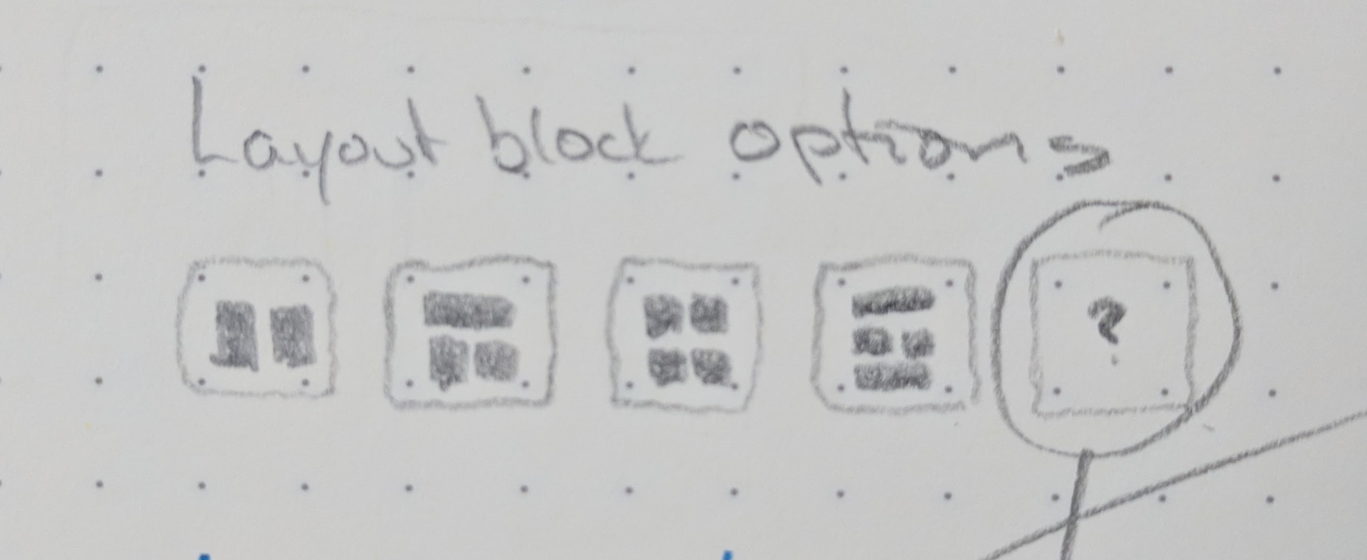
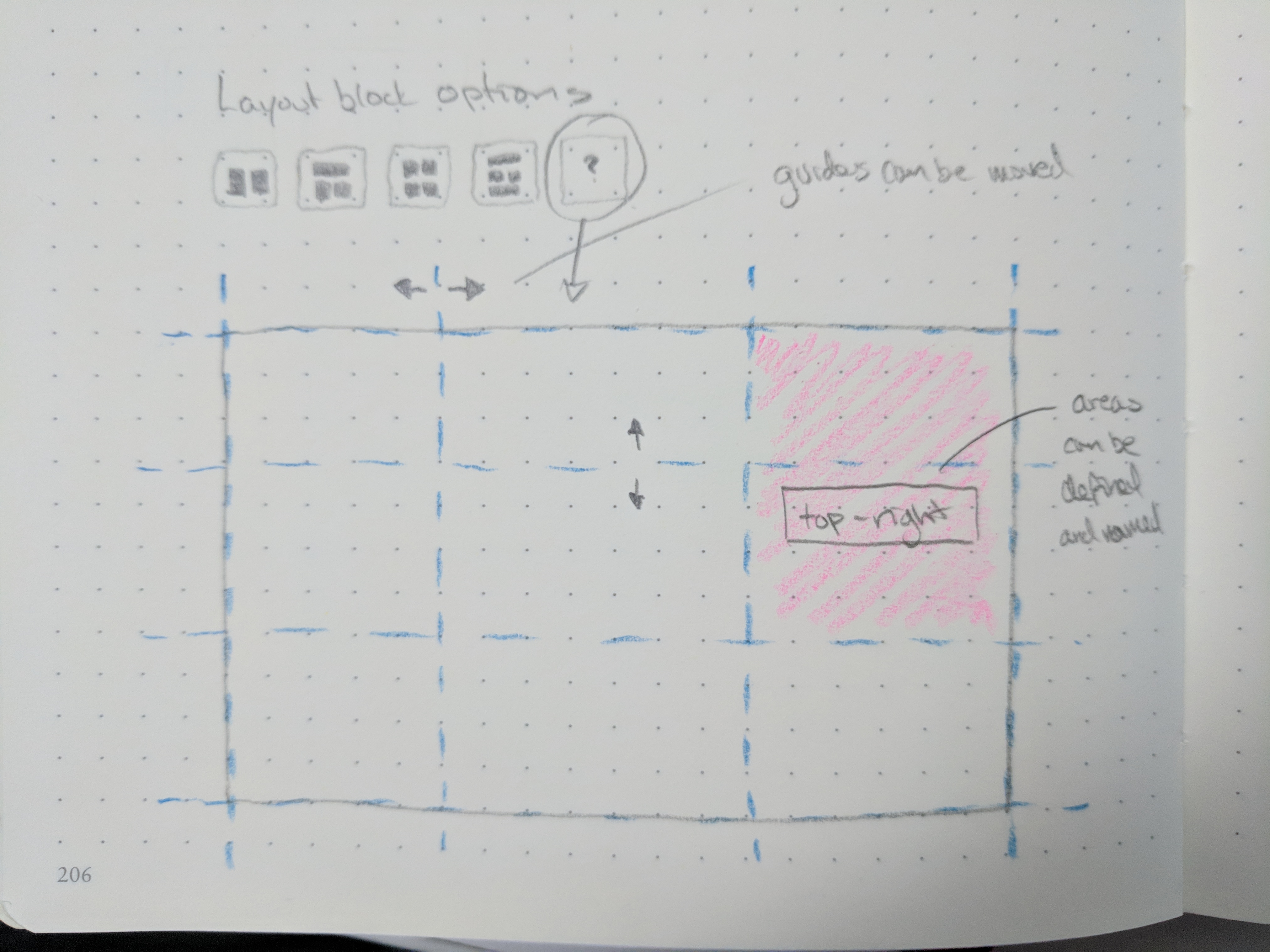
Let's throw out the "columns" terminology for a moment and look at this block as a grid into which blocks can be placed in a usual or unusual configuration. The example use case:
Within the scope of the current project I think the pre-defined layout areas are doable. The custom grid option probably needs to wait. The key here is to think of the Layout Block as a grid container in which blocks can be added and displayed. Each of the main grid items within the layout is self-contained meaning sub-items like the example with an image, a heading, and a paragraph are contained within an element (probably a nested block). This allows for full layout flexibility while preserving block-level control of each element and proper semantic structuring and output. |
|
I’ve been following this issue trying to understand the reason for using CSS grid for a columns block, and now understand that perhaps the intent for the columns block is too be able to support more varied content layout, not just columns? Semantic ordering and grouping of content (in the HTML) is important and should logically follow the users intention. @mor10 has made the clearest explanation of this in saying “each main grid item (column) should be self contained”. I’ve not played with or tested this functionality yet, but just had a thought... ... If the grid outputs markup in an illogical grouped flow, what happens in RSS feeds or if the content is consumed/displayed in an environment with minimum or no CSS? The content needs to be presented in the correct order. |
|
Should this Column block stay as "classic" Columns block (with markup and css fixes outlined in previous comments)? And then have a separate Layout block? I'm saying yes. |
|
That makes sense. Make a Column block with regular horizontal equal-height columns and a Layout block where the theme / plugin / author can create advanced layouts with Grid. |
|
The mixed arrangement of markup for columns is a bug, one I suspect is caused by the default block appender. The documentation for |
|
In a current project, I ended up implementing a separate "box" block similar to what @aduth mentioned above. Technically it works but it isn't exactly an elegant editor experience.
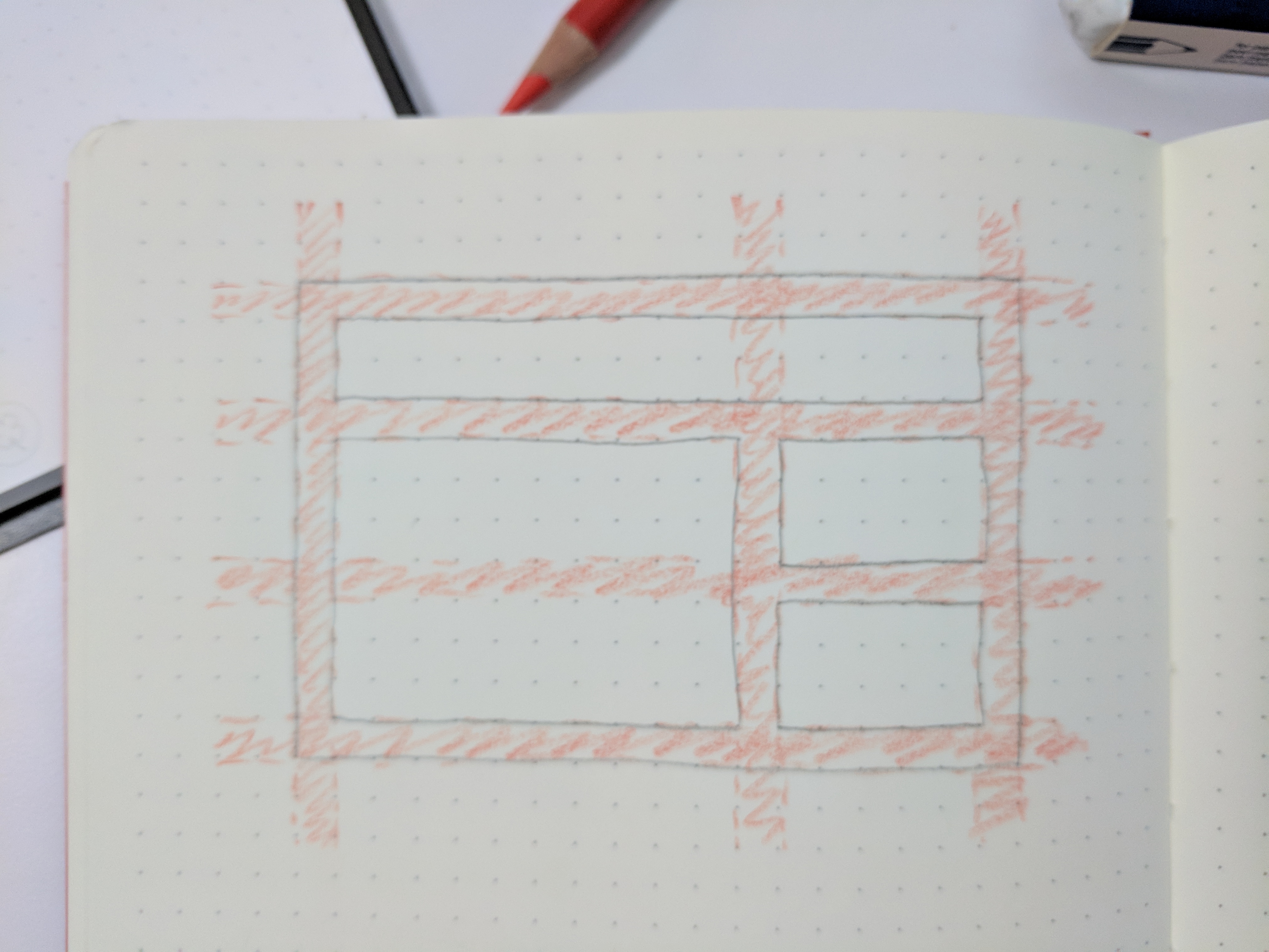
Even being the one who set it up I still get confused where to click! I think some of that will be improved with the refinements to the nested block UI (#5658) and collapsable margins but it's still a cumbersome addition. Would it work to have something like a wrapper argument that gets passed in with the layouts to choose what type of markup gets returned? If it's technically feasibly, something like this would give the flexibility to create 'classic' columns with wrapper elements or more complex grid layouts with only direct children (or both?) |


|
@aduth I've been trying to catch up on this particular issue — and get a better understanding on the specifics of nested blocks implementation at the same time. If I'm following properly, it seems like part of the issue here is that the current columns block is a simple implementation of the |
|
@joemcgill As originally implemented, the real bug is that the editable renderings apply a wrapper, as there was never expected to be a wrapping element at all for each layout's block. Through course of this discussion, I'm finding that it's inevitable we'd need a wrapper for columns in particular, though it's unclear to me whether that occurs automatically in <!-- wp:columns -->
<div class="wp-block-columns">
<!-- wp:column -->
<div class="wp-block-column">
<!-- wp:heading -->
<h2>Kappas vaan</h2>
<!-- /wp:heading -->
<!-- wp:paragraph -->
<p>Are you looking for simple, fast, accessible...</p>
<!-- /wp:paragraph -->
</div>
<!-- /wp:column -->
<!-- wp:column -->
<div class="wp-block-column">
<!-- wp:image -->
<img src="...">
<!-- /wp:image -->
</div>
<!-- /wp:column -->
</div>
<!-- /wp:columns --> |
Interesting that this was an unintended side-effect, but I understand what you're getting at. Personally, I think that for grouped layouts, it makes sense to set them inside a wrapper. I could imagine a similar scenario for a "grid" block, where you would have a set of layout groups that relate to grid x/y positions. It seems more intuitive (and easier to style consistently) if each grid area (i.e., layout group) was wrapped in its own wrapper, which could be used for style/positioning when rendering grouped layouts, specifically. Implementing as nested nested blocks could have the advantage of being able to add controls to the group container, but the UI could get noisy really quickly (one of the problems I've encountered with various page builders). I'd lean towards trying to keep things simpler to start. |
 danielbachhuber
added
the
[Feature] Nested / Inner Blocks
danielbachhuber
added
the
[Feature] Nested / Inner Blocks
|
Going to be good:) |
|
I've worked with the experimental columns block for a few hours now. Here are my thoughts:
|
|
Just a quick thought.
Edit: It seems my gif encoder messed it up a little. Sorry about that. |

Issue Overview
Columns block have this CSS Grid:
This can result to this kind of layout with lot's of empty spaces:
I'm all for using CSS Grid but we might need add extra
<div>wrapper around columns.The text was updated successfully, but these errors were encountered: