-
Notifications
You must be signed in to change notification settings - Fork 4.3k
New issue
Have a question about this project? Sign up for a free GitHub account to open an issue and contact its maintainers and the community.
By clicking “Sign up for GitHub”, you agree to our terms of service and privacy statement. We’ll occasionally send you account related emails.
Already on GitHub? Sign in to your account
Iterate on "Update Design" Flow #20421
Comments
|
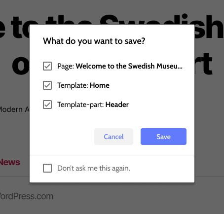
Just making the text more user-centric is a great step! Based on some of the work @shaunandrews has done here, I edited it a bit to meet some of @mtias' suggestions.
This shows the varying parts that might be displayed upon save. First is the page itself, second is the template applied to that page, while third is a template-part within that template. @shaunandrews was also doing further explorations around how we might communicate the changes that were made to the user. Here's an iteration with an option, "Don't ask me this again." |
I agree with this and think users will expect anything they edit to be saved without a prompt. The current modal interrupts user flow. It's also confusing because users have to work out why they're being prompted to save the things they just edited, or things they did not edit in some cases. Saving everything by default would mirror the current experience elsewhere in WordPress. If a user edits three meta boxes in the Classic editor, we don't prompt them to confirm which of the things they edited they would like to save. Same with multiple edits to blocks in the block content editor. They click Update and anything they changed is saved. The modal may also interrupt the mental model of site editing that the user has. To the user, they are just editing their full site. We present no visual separation between templates, parts, and content in the editor. When they save their content, we suddenly ask them to understand that everything they've been editing is actually separate components, just split up in invisible ways that weren't apparent during the editing process. As a user, I don't have enough information to know which parts I edited were part of which template or template part; I just want to save all the content I edited. (How would a user know which parts they edited were part of the home template and which were part of the page in the mockup above, for example?) |
I suspect this should be the default. When a user wants to publish their changes, let them publish. I can't think of any other product I've used that lets the user save just parts of documents. Showing the individual parts being saved feels like a solution to a problem we don't even know we have yet. |
|
I would love to see 2 additional options as well, as part of this flow:
|
|
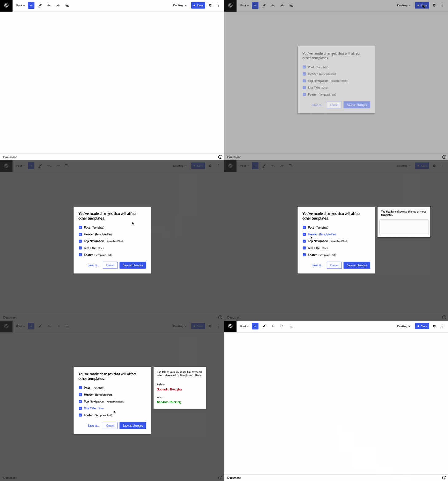
Here's a quick mockup that shows what it could look like if we add a preview of the entity when hovering: I also added a "Save as..." (hat tip @MichaelArestad) that could let you save these changes as a new template. (Though, to be honest, I'm not sure it makes a whole lot of sense in the context of saving template parts or site entities.) |
|
I realise this is in iteration mode, so please take this comment as something to explore later, even much later. In seeing the above prototype I began thinking of having this in a side panel wouldn't be better than a modal. It feels a more intense experience when the hover visual is displayed. |
|
Even if we end up making "save all" the default, I'd like to avoid the easy route of just artificially simplifying what is inherently a complex task. We'll make poor decisions if we just force simplicity and don't design for it.
It's important to recognize there will be quite complicated flows for large sites, where updates should happen more atomically and we need to support that at its foundation. We can always tune the default UX to what we think is best for the majority, but we need to design properly for the full experience. Separation of concerns is an important part of a site structure and it's crucial we don't just cast aside the issue. It will also be important if we want to schedule changes. This is also a good place to teach good practices and inform about how things work. If a user spends a lot of time on these templates and saves, the consequences could be unexpected and significant. It's important we help convey what is happening.
I would say that this has been historically confusing, particularly with things like custom fields, where adding the field seems like an action that is propagated even without saving the whole post but remains unclear when it is committed. This stage is also a good chance to confirm that global changes are intended to be global instead of the user wanting to fork a template for a specific use (like a specific page). |
|
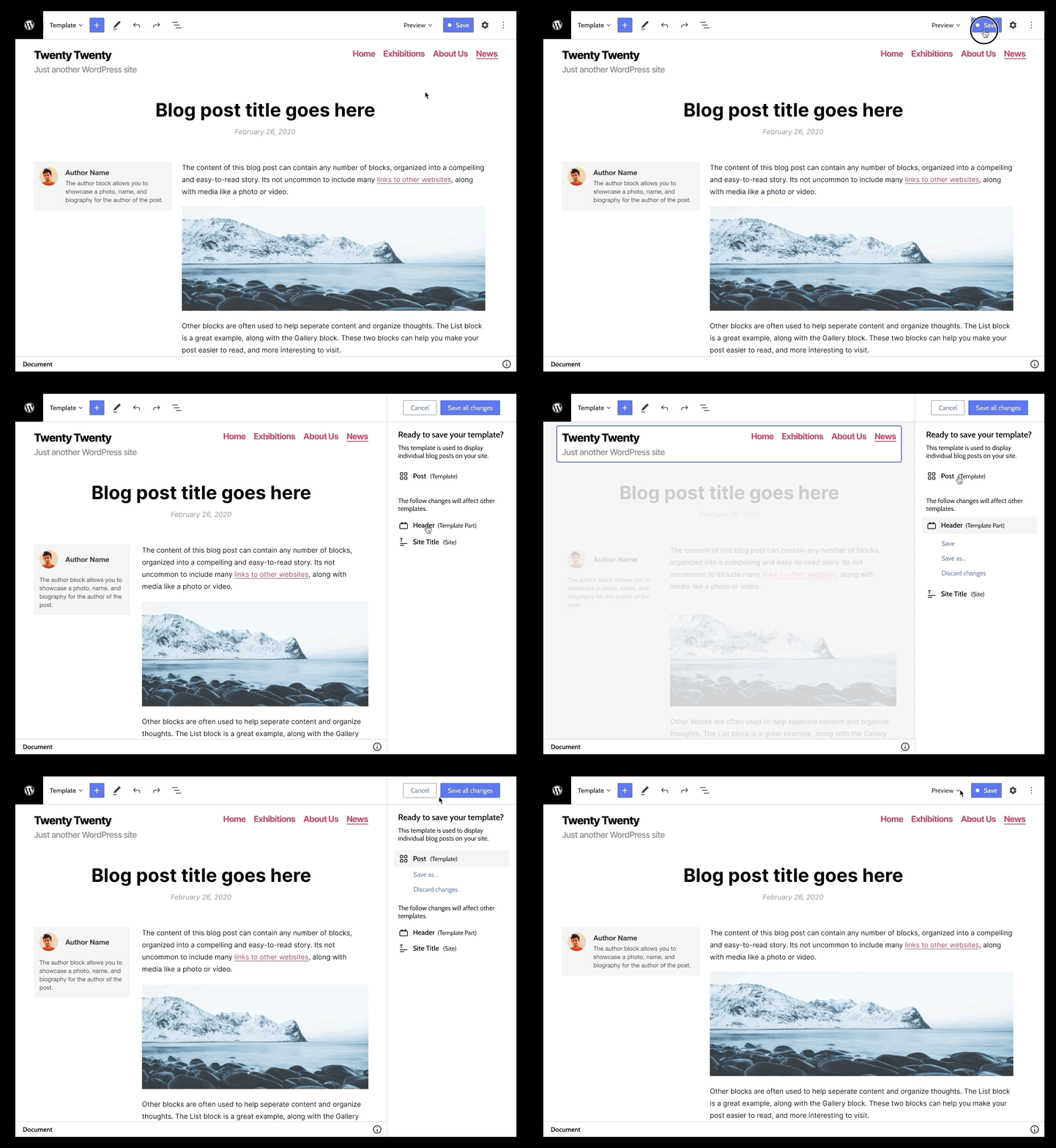
Here's another exploration: This one took some cues from the Block Navigator, and ditches the checkbox UI. Instead, the default is to save all changes, and then you can click on individual changes to preview and undo them. This would also let you save your changes as a new Template or Template Part. |
|
Another iteration (riffing off @shaunandrews) that utilizes a sidebar (notably not pre-publish). Try out the Prototype. ScreenshotsNotes
|
|
I really like the sidebar option here! A user is able to see the list of items edited, click them, and view the parts (ie Header) highlight in the editor. This feels more informative because I see the actual page and parts that changed! Would this UX carry over to updating and editing posts/pages as well? I ask this because I'm curious about how the "Publish" button works in this scenario. |
|
I think the highlighted header is a big improvement! I do feel like the |
|
I too really like the use of the sidebar. As it is an area we are used to interacting with. Having save options there keeps a nice consistent experience. |
|
The sidebar has won me over too. It uses the same design conventions as the existing WP experience and presenting it as contextual info alongside the content feels less disruptive than the modal. Nice work! |
|
Here's another iteration with a few goals:
Try out the prototype Screenshots
Notes:
|
|
Hey Michael. That is a really nice and clear prototype! This is what I notice. Thinking out loud... Clicking Save (Publish) "Are you ready to save the Save Front page template?" For I believe when the adjustment/merge happens that the content page title will be moved from the layout area to the top toolbar. Giving us the option to add the page title to for instance the Cover Block (or a featured image future block), or not having the page title in the layout at all. That means that seeing the Front page - Welcome to the Swe.... could just as well be the page content. That also means there needs to be a way to move from the page content and upward in the hierarchy to the Full Front page editing that also includes the Header, content and footer. Noticing a visual sign somewhere in the top toolbar at which level one is editing will be of great help. Right now it was just not clear for me. -- Back to Save/Publish sidebar. "Review changes" I really like being able to hover over the Header and Page and see the blue highlight around the areas. A really nice job! |
|
Because this issue is the same as #20304, it's causing a split in the conversation. @MichaelArestad which one shall we close? I'm totally fine closing mine. I dropped some feedback on the other one regarding the similar prototype above. #20304 (comment) |
|
The work done in #21522 is a great start, but work needs to be done to bring the design more in line with the mockup. This includes:
I actually like using the accordions to show each category of saved entity so I wouldn't change that. |


The setup right now in
edit-siteshows every template part that has been modified separately. This is very useful during development, but we need to start thinking about a better presentation (more intuitive) and better defaults.Iterations can include a less robotic presentation:
Better defaults:
More context:
The text was updated successfully, but these errors were encountered: