Site navigation when full site editing #19204
Comments
|
I like the ideas explored in #1 — it reminds me a lot of the way documents are saved/browsed in OS X. |
|
Idea # 1 feels like the better route for me as well. Although having this positioned top-center is pretty extreme. As "modes" become more of a thing, would it make sense to bring it closer in vicinity to those controls? While I like Idea # 2, it doesn't feel right in the sidebar under the "Document" tab. Maybe it's its own slideout sidebar. I don't want to overdo this slideout thing though either.
|

|
It'd be interesting to explore another cursor / mode as part of (3):
|

|
It's also good to keep in mind when adding item to the Top Toolbar that we have a Top Toolbar mode that appends the block's toolbar in that area. Sometimes that can get very full like in this example:
|

|
I added an "Edit Page Template" button through a slot in the link viewer:
It will only render in the site editor, on local links, and if a template match is found. |

|
I like Matías idea for a "Navigate Site" tool, because for each of the tools avaiable, we also attach a mode switch, and in this mode switch you could click anything, without having to create extra, often different, affordances for every single followable link. |
What do you mean by different affordances? |
|
By different affordances I mean we have a lot of different interfaces in the canvas that link places, enough that we might need different buttons to take you to that destination, if we are to follow the pattern from Google Docs.
Adding a button to a generic URL dialog is not a bad interface, but it's just not everywhere. A "Navigation tool" might not be the most perfectly intuitive solution (let's keep thinking) — but at least it provides a single interface for clicking any link, and knowing whether it will open a new tab, or navigate to the template in question. |
I think we are refactoring all link UIs to use the same component used in the format library. A separate mode could be a nice addition to this. |
|
Idea #1 seems to be the most intuitive from what I've seen users using Gutenberg for the first time. As @shaunandrews mentioned, it reminds me of File management systems like Safari and others, so we can use that to our advantage too. |
I like this option. Here's a quick mockup of what it could look like.
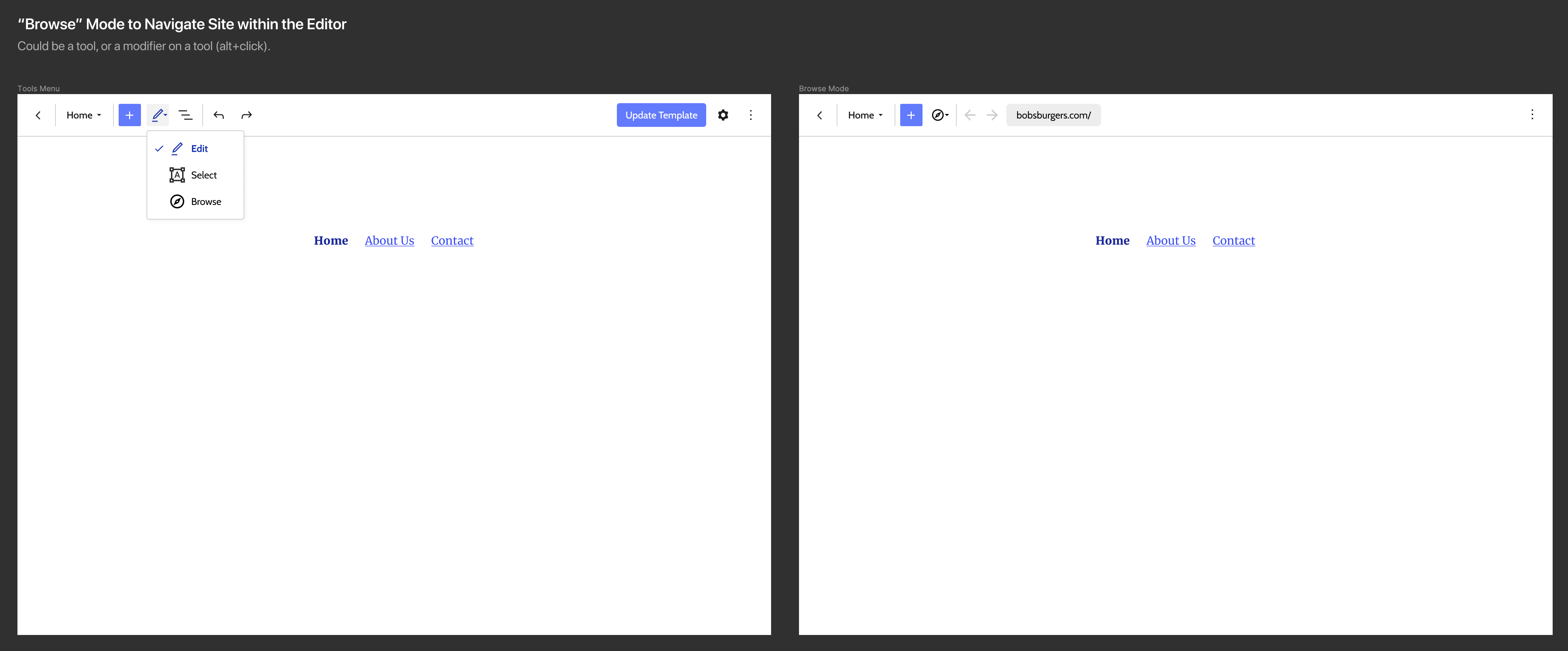
Switching to Browse mode could adjust the top bar by removing irrelevant UI (like undo/redo) and adding other functions like back/forward and a URL bar. |
|
Browse is almost like a preview there. Edit a page, switch to browse, look at another page, switch to edit mode, and so on. It could feel really natural. |
|
Here's a few variations I explored for the tools menu:
I think the icons help connect the options with the icon in the top bar. I was worried adding descriptions would weigh things down too much, but I don't think its too bad. |

|
Shaun, nice! I wonder, what would the dropdown look like with a checkmark on the right? In #19082 (comment) there's a menu with a check on the right in effort to reduce general icon usage in menus (per #18667 conversations) — though I would suggest icons are important in the tools menu otherwise. |
|
I don't hate it, but its not a pattern I see very often. I worry people might miss it as an indicator of selection in a list — the icon will often appear to be "floating" away from the context of the label its connected with. |

@epiqueras This is great! Pretty much exactly what I was hoping for.
@shaunandrews your mocks here are ace. The third option with Icons, Labels, and Descriptions feels like the right amount of information to help the user understand the purpose while being brief enough to identify at a glance. Do you think we're ready to start a set of PRs for:
|
I think for 1 (browse mode) a PR would be great. The menu already exists, and there's little additional UI to add to the default experience. For 2 (page selector) I think we need to consider the implication of adding a new menu to the top bar. There's already two other proposals that would add/affect menus in the top bar; #19252 is looking at adding a template menu, and #19253 is looking to incorporate template parts into the upcoming changes to the preview button in #19082 |
|
#19252 #19252 (comment) includes template parts in the template menu which I think is the preferred alternative to the page selector shown here. I don't see how this relates to the preview button though. |
Its related only in that its yet-another-dropdown being added to the top bar. I wanted to note that we should look at changes to the top bar holistically and consider if more dropdowns are good/needed, and how we can be a consistent with the patterns introduced. |
Got it! I thought that meant to put them literally into the preview button somehow. |
@shaunandrews That's a good point. Perhaps exploring page navigation using a similar tool to the template selector (or even revisiting that design to free up top bar space) would be a good idea. |
|
Page navigation could happen at the Query/Post/Page block levels. |
|
Regarding navigation. |
|
@shaunandrews great to see the cursor mode explored. I think it's definitely promising and worth trying to see if we can make the switching smooth. I could see using something like pressing "shift" while no blocks are selected as a quick switch of cursor mode so when you click it navigates. |
|
Howdy! I iterated on previous prototypes and ideas above to come up with another prototype. You can test it yourself here. Link UI & HotkeysFurther exploration:
I changed the link from opening in a new tab to simply navigating to that page in the editor. I also think using a hotkey could be, by far, the most efficient way to click around a site in the editor. I'd suggest something simple like Command/Control + a click. This way if they hold command, it will highlight the links giving them an indication they can click them. Browse mode
I still am hesitant about the location of the browse mode navigation in the top toolbar, but this works okay for now. I think we could also iterate on what is shown in the URL/dropdown. For now, a simple search (like when adding a link) seemed like the simplest solution. I also mirrored it in a persistent popover in the bottom info bar. I don't know that we need this many ways of navigating in full site editing mode. The single most efficient method would be a hotkey. It also requires the least amount of UI (if any). However, these continue to explore the logical angles of approach to the challenge of navigating a site in full site editing mode. |


|
I think both are useful. You might want to navigate to a page you are not linking to yet. |
Simple. I like it. Important to note that this should only be the behavior for links that are actually editable.
A hot-key is definitely a good improvement. I'm not sure what key should trigger it, but I've heard Highlighting clickable elements in a very nice touch. Would love to see this explore with a more hi-fi mockup, or in code.
I dig it, using a similar UI as the Link UI is smart.
This feels unnecessary. It kind of breaks the way the breadcrumbs work. |
Yeah. This seems like one I'd prefer to explore in code with a variety of link types and themes to test with.
That's all I needed to hear. I'm comfortable ditching it. |
|
Nice explorations! 😍 My takeaways... Hotkeys are quick, easy... but hard to remember. I believe people would respond better to a more discoverable UI. This shouldn't negate hotkeys, but add to it. The Browse mode is fun because it acts like a "preview" mode in a way. It definitely doesn't work on its own and needs that extra search feature. Without it, I couldn't really get to my 404 page. So that makes me think the search dropdown is the crux of it all. I agree with @shaunandrews about the breadcrumb as well. |
|
For this ticket, we should focus on navigating to what is visible on the page and keep navigating to templates or specific posts separate (in the other FSE tickets). It'd be interesting to mock something where the top-left element (where we have the back) slides out and then back after a moment when you've navigated to a new area. |
|
Aside: this might be late or for another ticket reading just above where the conversation went (also, I admit I just skimmed the replies) but I want to throw in two other ideas:
|
|
Other site navigation efforts are being done in #22191. By allowing the user to click the "W" and navigate to a page or post without leaving the full-site editing experience, this could be the primary way to navigate between these. |
|
Closing this in favor of individual proposals here: |
Problem to solve
How can a user navigate to another post or page when editing their site in Gutenberg?
Some rough ideas
B. Perhaps there could be a hotkey one could hold down while clicking to click on a link rather than to edit it. This seems like an ideal solution for a power user.
Initial mockups
These are by no means fully worked out ideas, but I think they are a good starting point. I intentionally made the mockups lower fidelity as I'm interested in the base concept/flow more than the details (at least initially).
Figma file (feel free to comment or iterate on it)
Idea 1 - Page selector
I started by adding the title of the page as a dropdown in the top bar. I think the weakest part of this design is that it takes up space in the top bar.
Then, if clicked, will expose UI nearly identical to the block picker (for familiarity and reusability):
This would allow a user to search for a page much like searching for a block OR they could see every page. I'm not sure it would be great for a site with thousands of posts/pages.
An additional benefit here is it could be a gateway into creating/editing layouts. (has not been designed yet)
Idea 2 - meta box
This iteration would expose a meta box in the Inspector (sidebar) when in full site editing mode. The meta box would essentially contain all posts and pages similar to the previous mockup (though I only put pages in this particular wireframe).
I don't feel this one is as strong as it relies on the sidebar.
Idea 3 - hotkey navigation
This idea could be used with really any direction we go as far is visual interface. It makes sense to add hotkey navigation. Perhaps by holding down a specific key while clicking on a link would take you directly to that page.
Idea 4 - Expose a clickable link
If you are familiar with Google Docs, this concept should be familiar. In Google Docs, if you click a link, a popover shows up with editing controls and a clickable link. We could do something similar. Here's how it looks in Google Docs:
The text was updated successfully, but these errors were encountered: