Add block: Navigation menu #13690
Comments
|
In exploring solutions, @melchoyce and I narrowed down to two paths. These particular prototypes focus on creating a new menu from scratch. Not every state or setting has a mockup — the focus right now is to go broad, not deep, in this exploration. We'll test these two approaches and then narrow down in iterations, based on your feedback as well as user feedback. Concept: Going all-in on child blocks
This approach takes advantage of some smart patterns introduced by the Jetpack contact form block and WooCommerce products blocks. Each page type is its own child block. We focused on two things: using as many established Gutenberg patterns as possible for consistency, and retaining existing navigation menu features so the block can be a direct port for backwards-compatibility purposes. Questions:
Concept: Menus are just links
Desktop prototype: https://www.figma.com/proto/2boguPnkQ8r2aCeovzBHwY/Menus-are-just-links?node-id=83%3A15896&viewport=402%2C418%2C0.5&scaling=min-zoom
Mobile prototype: https://www.figma.com/proto/2boguPnkQ8r2aCeovzBHwY/Menus-are-just-links?node-id=83%3A15896&viewport=402%2C418%2C0.5&scaling=min-zoom Inspired by Material Design’s chips, this option aims to present the menu as closely as possible to the way it looks on your live site. This uses the some interface as adding links elsewhere (when creating an inline link, or when adding a button) so there’s consistency any time users add a link. (Note that this only works if users think of navigation in the same way they think of inline links, which may not be the case.) This is a good opportunity to refine and unify how this interface works (#6392) as well as evaluating other search interfaces. We can unify these experiences across the entirety of the product whilst also making a teensy accessibility win. It tries to make as many smart default guesses as possible for the user: it allows for converting menus if you already have some saved, but if you don’t, it defaults to a small menu based on existing pages. Finding items to add to the menu is primarily based around a smart search that searches across all types of content on your site, as well as including pages for archives and recognising and adjusting for social media links. Pasting a link will work as expected, so the interaction will be immediately accessible in as few inputs as possible. Questions:
What do you think?At this point, we'd especially appreciate overall feedback about:
Leaving comments directly in Figma would be great, and you can also comment here. We'll work on refining these prototypes and running some lightweight usability testing to get a sense of how natural the interactions are. |


|
Login, Logout, RSS etc. should be a "Meta" type, NOT "Page" XFN should be kept, since it must be possible to optionally set these meta params for ANY menu item link:
|
Can this be applied to the entire menu, or does it have to be on a menu-item-by-menu-item basis?
Is this something WordPress should handle by default, rather than leaving it up to the menu creator? |
Yes, that was what I meant. I often times have a few menu items which I explicitely set to
In my opinion yes, for all links that open in a new tab/window ( Also, the option to set an optional link target (to open in new tab/window) must be kept - at it is currently. This is an essential user option. |
|
"Meta" may not have any meaning to the majority of non-technical end users, but you're right that log in, log out, and RSS links aren't the same as static pages. What's a way to communicate this clearly to users? Maybe the login and logout could be classified as "action" links? Perhaps the RSS feed is a special "feed" type, or maybe it acts the same way as a social media link (basically as a special type of link.) XFN is pretty user-hostile as it currently stands, but it's helpful to get a sense of how that feature might be being used. It's actually intended to show a personal relationship and used to be more explicit when Blogrolls were still a Thing. I wonder if exposing those options directly (nofollow, dofollow, noopener and noreferrer) in the Inspector (since these are rather advanced settings, but we could include them in the link interface if we think they're important to all users) might be the way to approach this. |
That would also allow for some inline explanations, which would definitely help. |
|
Thank you so much for this. Great to see this moving along. Some thoughts... Concept: Going all-in on child blocksTechnically feasabilityEverything I see looks doable. Experience
Concept: Menus are just linksTechnically feasabilityEverything I see looks doable. Experience
General: Settings & functionalities
Relationship to "Social Links"There is an existing Issue for Social Links. I (and others) don't believe the Menu Block precludes the need for a dedicated Social Links block. Most users won't cognatively assiociate "Menu" with "Social Logos". When searching Blocks they'll expect "Social Icons/Logo/Links" not "Menu". I appreciate at a deep level Social Links and Menu Items are similar in concept but to me they feel like distinct Blocks. I fear that if we get too "meta" on our Blocks and try and require overconfiguring them then UX may suffer. I'm very interested in hearing your thoughts on this as I am (was going to be) taking on the Social Links Issue... Again, thanks for moving this conversation forward. |
|
Some of the accessibility concerns that come to mind would be: Keeping control of user focus throughout the flow When clicking the Add a Menu Item button, a dropdown appears which then provides a search input as well as several sections to locate a page or pages to add to the navigation. Once a page or pages have been added to the menu, the dialog closes and returns the user back to the block. That is a lot of moving around between different components on the page. The most important thing here is to make sure that we are updating the focus and placing it in the next logical spot. I also wonder to what extent focus might need to be trapped within these elements because it might be really easy to escape the component before the workflow of adding a page has been completed. Providing Additional Context to Assistive Technology When selecting any number of menu items, having some way to inform assistive devices about their current selection state is crucial. This could be notifying them that the number of selected items changed from 3 to 5 for example. Another area of consideration is the approach to nested page structures. To a user who is not blind, it is easy to infer the hierarchy of content when adding a category and pages under that category for example. This might become an issue for those using assistive technology. Am I adding these pages inline?, how do I know that the pages I am adding will be children of the parent they are currently under. This is especially the case if selecting the parent could potentially also select the children (solved again by announcing the selection to the assistive device). I'll spend some more time thinking about this experience and please let me know if you have any questions about my comments. Thank you for all of this! |
|
My hypothesis is that there are three primary types of user intent when inserting a nav menu:
I also suspect number 1 is the most common, and that users who are in the number 1 category have the highest likelihood of not being experts. I was originally thinking that we could give users a choice between 1, 2, and 3, like option A in the sketch below. However, it occurred to me that instead of confronting the user with a choice, number 1 could just be the smart default, and you could make it easy to infinitely customize from there. I imagine most “custom” menus are actually just variations on one of the first two, so having that populate as a default and then be able to take out a link here, add a link there, add a social button, etc. is likely easier than starting from scratch anyway. So, in option B below, the user inserts a menu and it defaults to a menu of all the top-level pages, with an easy toggle to switch to categories. Each menu item is selectable, editable, movable. You can add new items. And the sidebar could support lots of more advanced options like adding additional levels to the navigation.
|

|
Thanks for the feedback! We're going to keep collecting more feedback and then iterate on these designs based on feedback and testing. A few quick-ish notes: @getdave We've definitely seen some evidence that indicates users tend to think of adding pages (building their site structure) and building a menu as an intertwined process, and they can often become confused when pages they've created don't automatically appear in their menu. The social links is just a hunch, though, and it might be based on the existing pattern of themes registering social menu areas, so it's worth evaluating if that's how users see things. I'm going to see if I can test these hypotheses a bit when we usability test these designs. If you have any insights on users' thought processes around these components, it'd be super useful to incorporate those! @LukePettway Thank you so much for the accessibility feedback! For the focus consideration, do you think either of these methods of adding a menu item (the child block interface vs the link interface) presents fewer hurdles? Your point about nested page structures is especially helpful, since nested structures are a bit tricky to design for. Thinking about how to non-visually indicate this hierarchy to users of assistive technology may actually be key to unlocking some good ideas here—I'm adding to the list of "things to explore more". @alexislloyd it sounds as though what you're suggesting here is similar to the "auto-populate" option presented in the "Menus are just links" option, where users who haven't already created menus are given a menu populated from their pages, rather than an empty menu, and users with existing menus are shown those menu.
The idea here is that we'd try to make smart guesses for what they'd want in their menu, but immediately allow for customisation of those items, which I suspect most people would immediately want to do. I think we could possibly take this a step or two further and try to add other helpful, smart defaults, so rather than just including top-level pages, leverage certain common naming patterns to determine order, or which pages to include or exclude. My suspicion, based on a cursory evaluation of common menu patterns across blogs, is that #2 is actually a less likely scenario than we might think, and that most blogger sites use a combination of categories and pages in their menu. Rather than asking users to reckon with the choice between pages and categories, we can skip this step altogether and provide them with a ready-to-go menu that includes pages as well as categories (perhaps above a certain threshold), along with other suggested links based on common patterns and their existing site structure. I have a few thoughts for how this might work, but I'm going to look for some data to back them up and explore a few alternate ideas. This should also allow us to test if our smart defaults will actually feel smart for the majority of people. |
|
Following on from @alexislloyd's point, something I have seen in usability tests and research, time and again, is that users conflate their navigation with their site structure. If they add a page they expect it to appear in the navigation. If they add an item to their navigation, they expect a page to be created. I wonder if we should consider creating two different blocks. One very simple "page navigation" block, which maps 1:1 to a user's pages - when they add an item to the navigation a new page is created; when they add a page to the site, its added to the navigation. Then we can add a second "custom navigation" block which will allow for all of the complexity that many users need. |
|
@scruffian you make a very good point about the conflation of navigation and site structure. That might be a secondary problem to try and solve once the fundamental insertion of the block is nailed down. As to insertion, I still think we could do it with one block — I think the ideal experience would be one where someone doesn't have to stop and think "Do I want a page navigation block or a custom navigation block?" Ideally, we can remove any friction that makes someone stop and wonder if they understand the choices. If we provide something relatively smart but make it incredibly easy to modify, it seems like it would be able to satisfy everyone's needs, whether simple or custom, without having to create any friction or potential confusion for the user up front. @sarahmonster I like how you're going even further with the smart defaults idea — the approach you're suggesting also really supports users who don't know the difference between pages and categories (and shouldn't have to!). |
|
Thanks for all the helpful feedback here! In the interests of maintaining focus and ensuring that we've fully explored all parts of the problem before moving toward a solution, we're going to break the problem into smaller parts to explore individually:
We’re going to discuss each of these problem areas individually in more detail, then return here with the resolution once we’ve reached a consensus. (Links coming as new issues are created!) We’re also going to do some additional research to inform these explorations:
If anyone would be interested in helping with any of these tasks, we'd definitely appreciate the help! |
|
Hi, while working on implementing the block itself I found it quite challenging to figure out how nesting should work. Thinking about it I have explored simple linear interaction that would allow both nesting and menu item creation and arrived at this sketch:
The advantages of this approach to the creation flow would be:
This is JUST A SKETCH not an actual design :) of course. Thanks and let me know any thoughts you might have on it. |

This is interesting. I think a mode that represented the menu as a tree will be needed (might open it in a modal instead of inline, but we'll see) and using the "block navigator" makes a lot of sense, as we'll get interactions for free. Particularly once we allow dragging elements in the navigator to reorder blocks. |
|
After a discussion between @sarahmonster, @melchoyce, @karmatosed, @mtias and myself, we've decided to make a few design pivots on this block. I'll outline them here with the goal of closing this particular issue. A new issue #16821 has been created to track these changes. Native block patterns
Refinements
Adding a new block & Block Library
Nesting blocks
URL and permalink structure
Customize options
Backward compatibility
|
|
Would it be possible to accelerate the feature with an interim deployment of a part which simply deploys/displays an existing menu sourced from the WP menus functionality? |
|
@WayneAnderson I am totally onboard with this, and was completely baffled not being able to select the native WP menu that I already spent 10 minutes making. It seems a lot of effort going into recreating an existing, battle tested WordPress pattern. Native WordPress menus already solve so many of these challenges. While they don't provide much in the way of styling, they handle all of the questions about structure, custom links, categories, automatically adding of pages, attributes, etc. In my opinion, the Nav block should focus on providing styling options, which is actually the hard part of WordPress menus in this context. If adding the current page to a menu while in the edit context is a priority, I feel like that is more of a WordPress core issue, as pages already have the ability to select parents in the sidebar, thereby affecting site structure, so I think it makes sense to be able to add the current page to a menu in the same context. A use-case that I commonly encounter is a "Section Sub-menu", that is, a page that is the parent for several child pages, where a menu is needed for the child pages, rather than an entire site structure. The site I am working on right now has "Services", with several child pages, each with their own child pages, so 3 levels, a total of 12 pages so far and more to come.
What we want is a menu of this particular tree, which is very easy to build using existing WordPress menus, however, its more than a little painful to create in the current Nav block. For starters, the search auto complete does not distinguish page hierarchy at all, so it's trial and error to ensure you are selecting the correct page level for similarly named pages. We have two pages titled "Buyers", but they are under different services. Impossible to tell which is which in the autocomplete as they have the same top level parent. Secondarily, the Nav block does not allow for leveraging the existing ecosystem of WordPress menu enhancing plugins, such as ones that allow for setting classes, adding icons, etc. Third, we now have two completely unrelated and incompatible methods of creating menus. This is very confusing and frustrating. I understand the desire for creating a navigation in the page context, but I strongly recommend the Nav block at least support rendering a native WordPress menu. |
|
Will it soon be possible to add native wordpress menus as a block in a post or even in the post and category editor? |
|
Yes, there's a PR in the works, @javierlorente! 😄 #18869 |
|
I would like to add an existing menu as a block inside a page... Any updates on this? I can't find any "Navigation menu" block :( |
|
Howdy @collimarco The Navigation block is still considered experimental and it exists only when using the Gutenberg plugin. Right now the new block is on track for WordPress 5.9 to be released out of experimental and available as a core block in standard WordPress installations. |
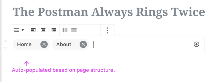
Since creating a block for navigation menus is one of the priorities for 2019, @melchoyce and I have been spending some time working on some ideas for a navigation menu block.
Lots of great work toward exploring a navigation block has already happened in #1466. In the interests of refocussing the conversation, I'm opening a new issue for this as we attempt to reach a solution.
First, let's establish a framework for understanding and evaluating the proposed solutions.
1. What’s the problem we’re trying to solve?
Building navigation menus for a website is a fragmented process that’s difficult to understand and visualise. It relies on a pre-existing understanding of the model WordPress uses to organise menus and doesn’t map to users’ understanding of how navigation menus should work. There are multiple different ways to create a menu (Customizer, Appearance > Menus, widgets) that all offer slightly different experiences, increasing confusion. Creating a link to certain parts of your site often requires manual work.
2. What existing research do we have?
Menus came up a few times in our sitebuilding research. Relevant takeaways: some people model the structure of their menus on the structure of their sitemap (or vice-versa).
Competitive analysis: http://simp.ly/publish/fTQTQB
Mel reviewed existing explorations to compile the discussion and ideas that have emerged around navigation blocks over the years.
Functionalities to consider:
3. What are our guiding principles?
After discussion with developers, accessibilities, and other designers, we've decided that in order to support the problem:
4. How do we choose a successful solution?
Using prototypes, we’ll test and time the creation of a simple menu and a complex menu. We’ll also ask users to rate their experience from a scale of 1-5.
This quantitative data (experience rating and time to creation) will be used alongside the qualitative data (user feedback, your feedback!) to determine which solution is the most effective and should be pursued. @melchoyce will be responsible for this selection. We'll then iterate on the solution until we hit on what we think is the best approach.
The text was updated successfully, but these errors were encountered: