[Layout foundations] Prototype Box usage in existing components
#7096
Conversation
This file contains hidden or bidirectional Unicode text that may be interpreted or compiled differently than what appears below. To review, open the file in an editor that reveals hidden Unicode characters.
Learn more about bidirectional Unicode characters
Contributor
size-limit report 📦
|
 laurkim
changed the title
laurkim
changed the title
Box usage in existing componentsBox usage in existing components
laurkim
force-pushed
the
layout-foundations-prototype
branch
2 times, most recently
from
dc71d65 to
a67605f
Compare
laurkim
force-pushed
the
lo/use-box-component
branch
6 times, most recently
from
cdb7563 to
ee0387b
Compare
laurkim
changed the title
Box usage in existing componentsBox usage in existing components
kyledurand
reviewed
Sep 8, 2022
kyledurand
reviewed
Sep 8, 2022
laurkim
force-pushed
the
lo/use-box-component
branch
2 times, most recently
from
193874a to
0661fce
Compare
laurkim
force-pushed
the
layout-foundations-prototype
branch
3 times, most recently
from
2375302 to
b30c61c
Compare
laurkim
force-pushed
the
lo/use-box-component
branch
2 times, most recently
from
9027efe to
8290d00
Compare
 laurkim
force-pushed
the
lo/use-box-component
branch
from
laurkim
force-pushed
the
lo/use-box-component
branch
from
8290d00 to
5fcebdc
Compare
5 tasks
Contributor
Author
|
Closing this in favor of the second prototype where we explored using |
laurkim
added a commit
that referenced
this pull request
Sep 29, 2022
…7279)

### WHY are these changes introduced?

Resolves #7134.
[Storybook
URL](https://5d559397bae39100201eedc1-bongofonfc.chromatic.com/?path=/story/all-components-toast--default).

An earlier [prototype](#7096)
explored adding `className` support to the `Box` component and keeping
it as an internal component.
This prototype explores keeping `Box` external without the `className`
prop and replacing custom divs in `Toast` with the `Box` component.

Even if we don't update `Toast` yet, there are some commits in this PR
I'd like to keep that cleans up some of the types and prop descriptions
in the `Box` component.

### WHAT is this pull request doing?
- Cleans up types and updates prop descriptions in `Box`
- Adds `color` and `maxWidth` support to `Box`
- Updates `Toast` to use `Box` where custom `div` are being used

    <details>
      <summary>Toast original</summary>
<img
src="https://user-images.githubusercontent.com/26749317/192353275-5ca804db-0873-4e13-9061-59ee13425538.gif"
alt="Toast original">
    </details>
    <details>
      <summary>Toast refactored with Box</summary>
<img
src="https://user-images.githubusercontent.com/26749317/192353264-6eff870c-ddfb-4583-8d57-6a93f15daf94.gif"
alt="Toast refactored with Box">
    </details>

<!-- ℹ️ Delete the following for small / trivial changes -->

### How to 🎩

🖥 [Local development
instructions](https://github.com/Shopify/polaris/blob/main/README.md#local-development)
🗒 [General tophatting
guidelines](https://github.com/Shopify/polaris/blob/main/documentation/Tophatting.md)
📄 [Changelog
guidelines](https://github.com/Shopify/polaris/blob/main/.github/CONTRIBUTING.md#changelog)

<!--
  Give as much information as needed to experiment with the component
  in the playground.
-->

<details>
<summary>Copy-paste this code in
<code>playground/Playground.tsx</code>:</summary>

```jsx
import React, {useState, useCallback} from 'react';

import {Page, Frame, Toast, Button} from '../src';

export function Playground() {
  const [active, setActive] = useState(false);

  const toggleActive = useCallback(() => setActive((active) => !active), []);

  const toastMarkup = active ? (
    <Toast content="It's toasty" onDismiss={toggleActive} />
  ) : null;

  return (
    <Frame>
      <Page title="Toast example using Box">
        <Button onClick={toggleActive}>Show Toast (with 📦)</Button>
        {toastMarkup}
      </Page>
    </Frame>
  );
}
```

</details>

### 🎩 checklist

- [ ] Tested on
[mobile](https://github.com/Shopify/polaris/blob/main/documentation/Tophatting.md#cross-browser-testing)
- [ ] Tested on [multiple
browsers](https://help.shopify.com/en/manual/shopify-admin/supported-browsers)
- [ ] Tested for
[accessibility](https://github.com/Shopify/polaris/blob/main/documentation/Accessibility%20testing.md)
- [ ] Updated the component's `README.md` with documentation changes
- [ ] [Tophatted
documentation](https://github.com/Shopify/polaris/blob/main/documentation/Tophatting%20documentation.md)
changes in the style guide

Co-authored-by: Kyle Durand <[email protected]>
laurkim
added a commit
that referenced
this pull request
Sep 30, 2022
…7279)

### WHY are these changes introduced?

Resolves #7134.
[Storybook
URL](https://5d559397bae39100201eedc1-bongofonfc.chromatic.com/?path=/story/all-components-toast--default).

An earlier [prototype](#7096)
explored adding `className` support to the `Box` component and keeping
it as an internal component.
This prototype explores keeping `Box` external without the `className`
prop and replacing custom divs in `Toast` with the `Box` component.

Even if we don't update `Toast` yet, there are some commits in this PR
I'd like to keep that cleans up some of the types and prop descriptions
in the `Box` component.

### WHAT is this pull request doing?
- Cleans up types and updates prop descriptions in `Box`
- Adds `color` and `maxWidth` support to `Box`
- Updates `Toast` to use `Box` where custom `div` are being used

    <details>
      <summary>Toast original</summary>
<img
src="https://user-images.githubusercontent.com/26749317/192353275-5ca804db-0873-4e13-9061-59ee13425538.gif"
alt="Toast original">
    </details>
    <details>
      <summary>Toast refactored with Box</summary>
<img
src="https://user-images.githubusercontent.com/26749317/192353264-6eff870c-ddfb-4583-8d57-6a93f15daf94.gif"
alt="Toast refactored with Box">
    </details>

<!-- ℹ️ Delete the following for small / trivial changes -->

### How to 🎩

🖥 [Local development
instructions](https://github.com/Shopify/polaris/blob/main/README.md#local-development)
🗒 [General tophatting
guidelines](https://github.com/Shopify/polaris/blob/main/documentation/Tophatting.md)
📄 [Changelog
guidelines](https://github.com/Shopify/polaris/blob/main/.github/CONTRIBUTING.md#changelog)

<!--
  Give as much information as needed to experiment with the component
  in the playground.
-->

<details>
<summary>Copy-paste this code in
<code>playground/Playground.tsx</code>:</summary>

```jsx
import React, {useState, useCallback} from 'react';

import {Page, Frame, Toast, Button} from '../src';

export function Playground() {
  const [active, setActive] = useState(false);

  const toggleActive = useCallback(() => setActive((active) => !active), []);

  const toastMarkup = active ? (
    <Toast content="It's toasty" onDismiss={toggleActive} />
  ) : null;

  return (
    <Frame>
      <Page title="Toast example using Box">
        <Button onClick={toggleActive}>Show Toast (with 📦)</Button>
        {toastMarkup}
      </Page>
    </Frame>
  );
}
```

</details>

### 🎩 checklist

- [ ] Tested on
[mobile](https://github.com/Shopify/polaris/blob/main/documentation/Tophatting.md#cross-browser-testing)
- [ ] Tested on [multiple
browsers](https://help.shopify.com/en/manual/shopify-admin/supported-browsers)
- [ ] Tested for
[accessibility](https://github.com/Shopify/polaris/blob/main/documentation/Accessibility%20testing.md)
- [ ] Updated the component's `README.md` with documentation changes
- [ ] [Tophatted
documentation](https://github.com/Shopify/polaris/blob/main/documentation/Tophatting%20documentation.md)
changes in the style guide

Co-authored-by: Kyle Durand <[email protected]>
Sign up for free
to join this conversation on GitHub.
Already have an account?
Sign in to comment
2 participants
Add this suggestion to a batch that can be applied as a single commit.
This suggestion is invalid because no changes were made to the code.
Suggestions cannot be applied while the pull request is closed.
Suggestions cannot be applied while viewing a subset of changes.
Only one suggestion per line can be applied in a batch.
Add this suggestion to a batch that can be applied as a single commit.
Applying suggestions on deleted lines is not supported.
You must change the existing code in this line in order to create a valid suggestion.
Outdated suggestions cannot be applied.
This suggestion has been applied or marked resolved.
Suggestions cannot be applied from pending reviews.
Suggestions cannot be applied on multi-line comments.
Suggestions cannot be applied while the pull request is queued to merge.
Suggestion cannot be applied right now. Please check back later.
WHY are these changes introduced?
Resolves #7055.
Tests implementation of the alpha
Boxcomponent in existing Polaris components.WHAT is this pull request doing?
Uses
Boxin theToast,ContextualSaveBar, andBannercomponents.div/button/spanelements from above components to useBoxinsteadAdds API support for:
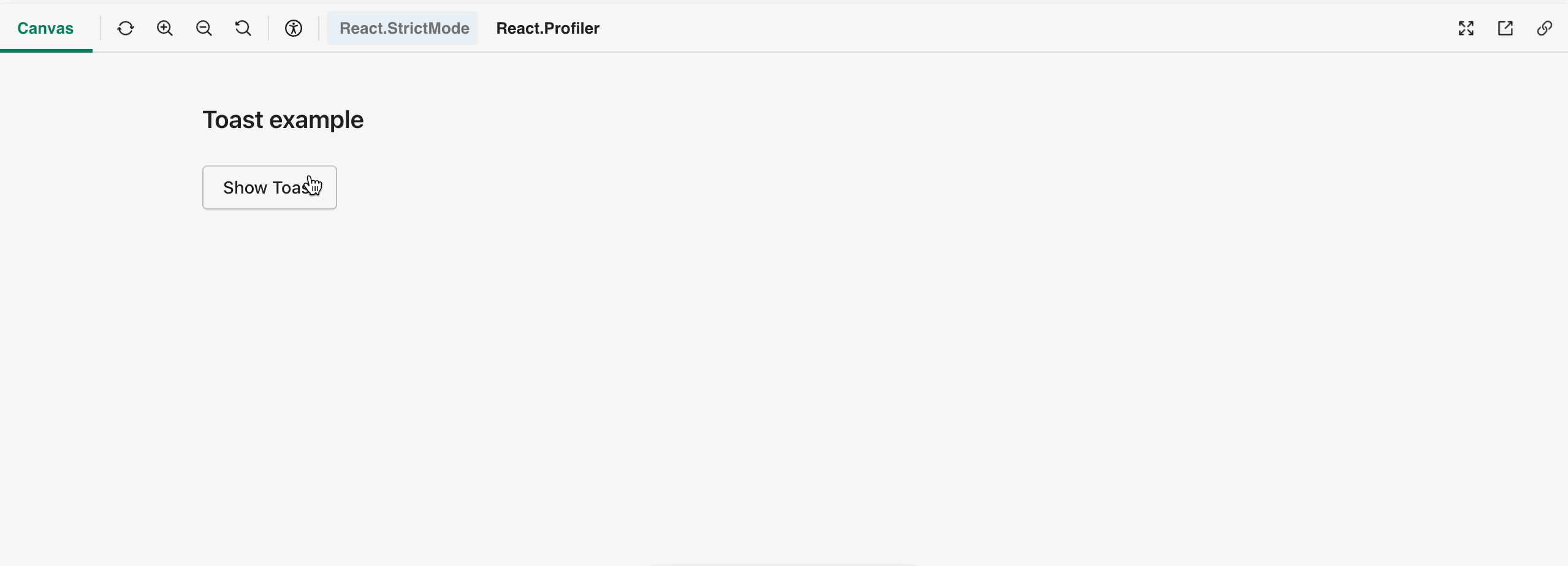
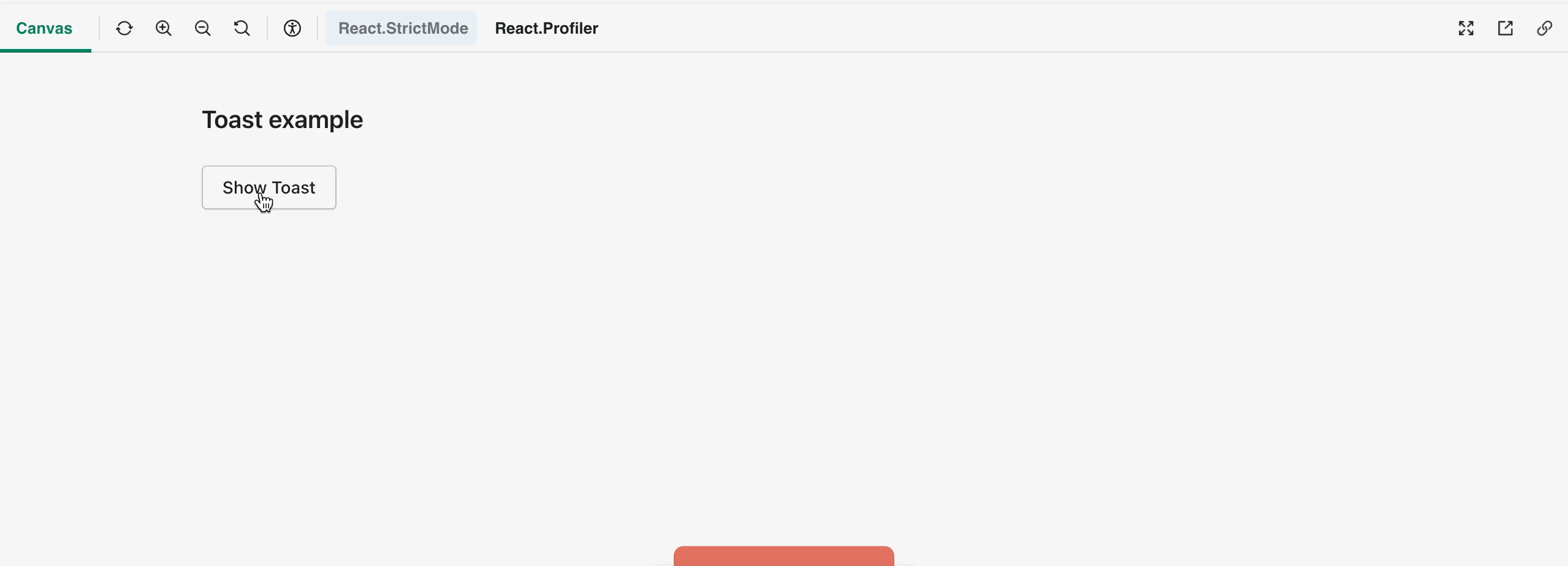
buttonon theasprop inBoxclassNameprop inBoxand as a result, removesBoxfrom exports to have it as an internal componentonBlur,onClick,onKeyUp,onMouseUp)disabledstateididentifiertabIndexToast example using Box
ContextualSaveBar example using Box
Banner example using Box
How to 🎩
🖥 Local development instructions
🗒 General tophatting guidelines
📄 Changelog guidelines
Copy-paste this code in
playground/Playground.tsx:🎩 checklist
README.mdwith documentation changes