[VideoThumbmail] Improve VideoThumbnail play button #7319
There are no files selected for viewing
This file contains hidden or bidirectional Unicode text that may be interpreted or compiled differently than what appears below. To review, open the file in an editor that reveals hidden Unicode characters.
Learn more about bidirectional Unicode characters
| Original file line number | Diff line number | Diff line change |
|---|---|---|
| @@ -0,0 +1,5 @@ | ||
| --- | ||
| '@shopify/polaris': patch | ||
| --- | ||
|
|
||
| Update the `VideoThumbnail` play button user experience |
This file contains hidden or bidirectional Unicode text that may be interpreted or compiled differently than what appears below. To review, open the file in an editor that reveals hidden Unicode characters.
Learn more about bidirectional Unicode characters
This file contains hidden or bidirectional Unicode text that may be interpreted or compiled differently than what appears below. To review, open the file in an editor that reveals hidden Unicode characters.
Learn more about bidirectional Unicode characters
| Original file line number | Diff line number | Diff line change |
|---|---|---|
| @@ -1,14 +1,17 @@ | ||
| import React from 'react'; | ||
| import {PlayMinor} from '@shopify/polaris-icons'; | ||
|
|
||
| import {useI18n} from '../../utilities/i18n'; | ||
| import { | ||
| secondsToTimeComponents, | ||
| secondsToTimestamp, | ||
| secondsToDurationTranslationKey, | ||
| } from '../../utilities/duration'; | ||
| import {useMediaQuery} from '../../utilities/media-query'; | ||
| import {Icon} from '../Icon'; | ||
| import {Stack} from '../Stack'; | ||
| import {Text} from '../Text'; | ||
|
|
||
| import styles from './VideoThumbnail.scss'; | ||
|
|
||
| export interface VideoThumbnailProps { | ||
|
|
@@ -49,6 +52,7 @@ export function VideoThumbnail({ | |
| onBeforeStartPlaying, | ||
| }: VideoThumbnailProps) { | ||
| const i18n = useI18n(); | ||
| const {isNavigationCollapsed} = useMediaQuery(); | ||
| let buttonLabel; | ||
|
|
||
| if (accessibilityLabel) { | ||
|
|
@@ -73,13 +77,19 @@ export function VideoThumbnail({ | |
| } | ||
|
|
||
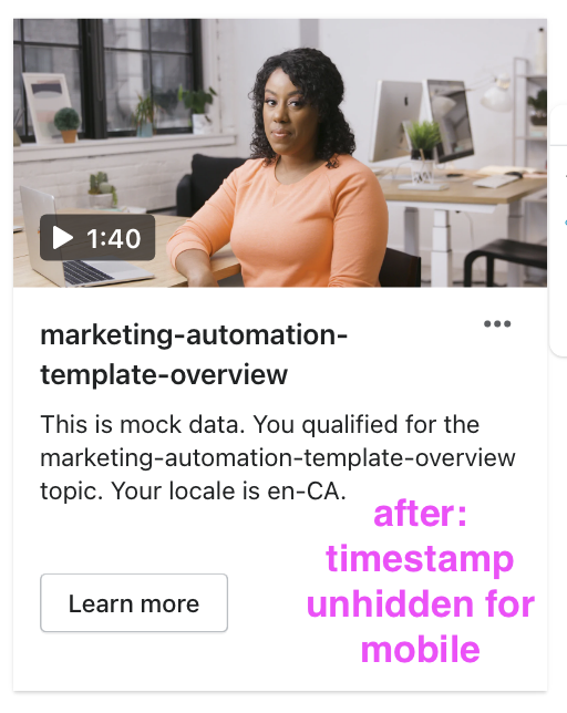
| const timeStampMarkup = videoLength ? ( | ||
| <p className={styles.Timestamp}> | ||
| <Stack alignment="center" spacing="extraTight"> | ||
| <span className={styles.PlayIcon}> | ||
| <Icon source={PlayMinor} /> | ||
| </span> | ||
| <Text | ||
|
Contributor
There was a problem hiding this comment. We have a
Member
There was a problem hiding this comment. Yesssssss. Spread the word @mrcthms 🚀 |
||
| variant={isNavigationCollapsed ? 'bodyLg' : 'bodyMd'} | ||
| as="p" | ||
| fontWeight="semibold" | ||
| > | ||
| {secondsToTimestamp(videoLength)} | ||
| </Text> | ||
| </Stack> | ||
| </p> | ||
| ) : null; | ||
|
|
||
|
|
@@ -109,10 +119,11 @@ export function VideoThumbnail({ | |
| } | ||
|
|
||
| return ( | ||
| <div className={styles.ThumbnailContainer}> | ||
| <div | ||
| className={styles.Thumbnail} | ||
| style={{backgroundImage: `url(${thumbnailUrl})`}} | ||
| /> | ||
|
Contributor
Author
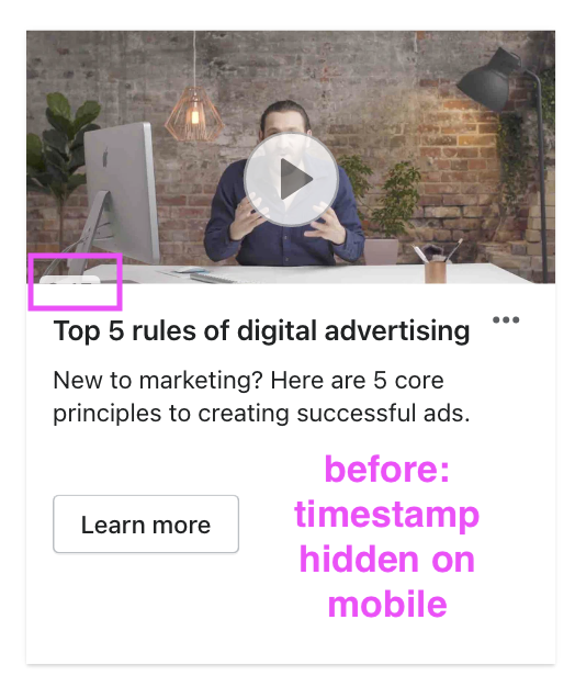
There was a problem hiding this comment. separated out the background image from the wrapping div so that the image overflow wouldn't hide the play buttons when the image cover had to be cropped. For example, on mobile:
|
||
| <button | ||
| type="button" | ||
| className={styles.PlayButton} | ||
|
|
@@ -122,9 +133,8 @@ export function VideoThumbnail({ | |
| onFocus={onBeforeStartPlaying} | ||
| onTouchStart={onBeforeStartPlaying} | ||
| > | ||
| {timeStampMarkup} | ||
|
Contributor
Author
There was a problem hiding this comment. Moving this inside since it changes opacity on hover and the button is the whole thumbnail |
||
| </button> | ||
| {progressMarkup} | ||
| </div> | ||
| ); | ||
|
|
||
This file contains hidden or bidirectional Unicode text that may be interpreted or compiled differently than what appears below. To review, open the file in an editor that reveals hidden Unicode characters.
Learn more about bidirectional Unicode characters
Add this suggestion to a batch that can be applied as a single commit.
This suggestion is invalid because no changes were made to the code.
Suggestions cannot be applied while the pull request is closed.
Suggestions cannot be applied while viewing a subset of changes.
Only one suggestion per line can be applied in a batch.
Add this suggestion to a batch that can be applied as a single commit.
Applying suggestions on deleted lines is not supported.
You must change the existing code in this line in order to create a valid suggestion.
Outdated suggestions cannot be applied.
This suggestion has been applied or marked resolved.
Suggestions cannot be applied from pending reviews.
Suggestions cannot be applied on multi-line comments.
Suggestions cannot be applied while the pull request is queued to merge.
Suggestion cannot be applied right now. Please check back later.
There was a problem hiding this comment.
Choose a reason for hiding this comment
The reason will be displayed to describe this comment to others. Learn more.
This wasn't used
Uh oh!
There was an error while loading. Please reload this page.
There was a problem hiding this comment.
Choose a reason for hiding this comment
The reason will be displayed to describe this comment to others. Learn more.
I wish there was a tool to find unused scss class names. Could be impactful across multiple repos.
There was a problem hiding this comment.
Choose a reason for hiding this comment
The reason will be displayed to describe this comment to others. Learn more.
I was actually looking into something like that this morning :D Definitely possible and would be so useful